Advanced Baby & Kids E-Commerce Professional Website Template
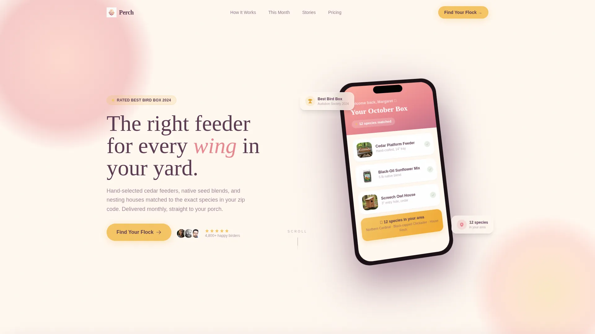
Sprout is a bento grid landing page built for baby and kids organic and natural stores. It pairs a UGC photo wall header, swipeable before/after ingredient reveal cards, and a clean peach-to-mango color system to guide trust-driven parents straight to the catalog. One primary call to action and a secondary quiz path keep the journey frictionless.
by Rocket studio
Quick summary
Sprout is a single-page landing page template for organic and natural baby product stores. It uses an asymmetric bento grid layout, a warm Dopamine Pop color palette, and tactile before/after reveal cards to communicate ingredient honesty. The design is built for parents who read every label, and the layout moves them confidently toward a product catalog click.
Who this template is for
This template is designed for founders and store owners selling clean, natural, or organic products for babies and young children. It speaks directly to an audience of cautious, research-driven buyers who need more than a tagline to feel ready to purchase.
- First-time parents sourcing safe everyday baby products
- Small-batch or independent organic baby brand owners
- Daycare directors and family-gift buyers looking for trusted clean options
What problem this template solves
Parents shopping for baby products carry real anxiety about ingredient safety. Generic store templates look polished but do nothing to dissolve that worry. Sprout replaces vague "natural" claims with visible ingredient proof, building the kind of quiet certainty that turns a browser into a buyer.
- No design to communicate what makes products actually safe or different
- No clear path from curiosity to catalog without friction or noise
- No visual format that earns trust at a glance for skeptical caregivers
What you get with this template
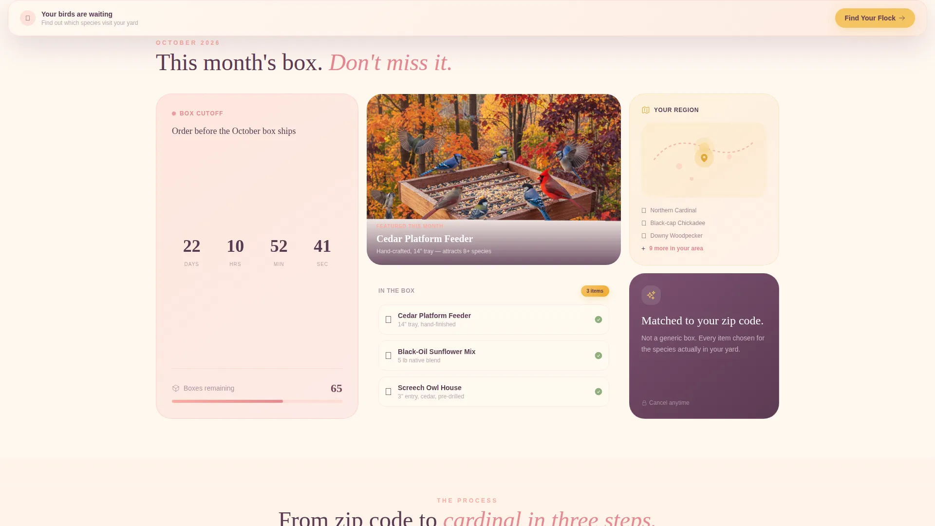
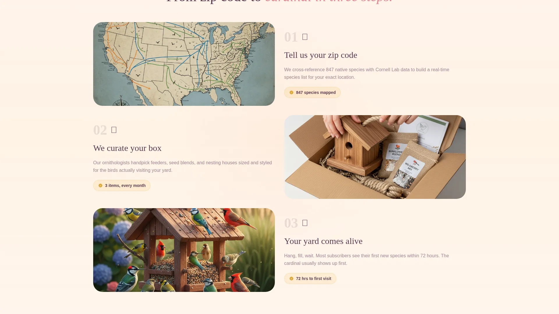
You get a fully structured landing page that is ready to adapt for your store. The layout combines large hero product cards, small testimonial tiles, ingredient close-ups, and certification badge spaces inside one cohesive bento grid.
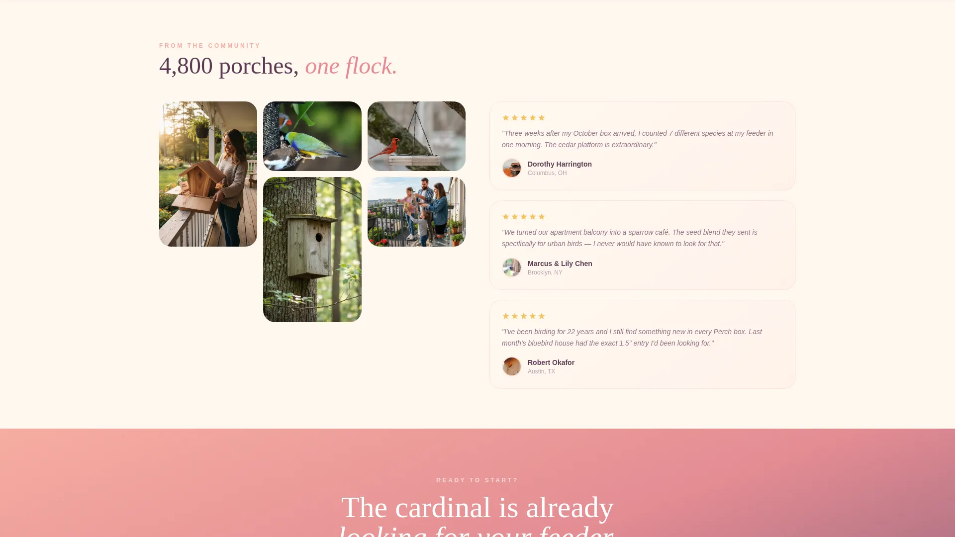
- A UGC-style photo wall header with an asymmetric mosaic arrangement and gradient headline overlay
- Swipeable before/after bento cards that compare conventional ingredient lists with clean alternatives
- A primary "Shop the Clean Shelf" call-to-action button and a secondary "Take the Nursery Quiz" text link path
Feature list
This landing page is built around a focused set of purposeful design features. Each one is drawn directly from the template brief and serves a specific role in earning parent trust and driving catalog clicks.
Bento Grid Layout
The page uses a modular card grid where large hero product cards alternate with smaller testimonial tiles, ingredient close-ups, and badge spaces. The grid breathes visually so the eye moves playfully rather than in rigid rows.
UGC Photo Wall Header
The header fills the full viewport with an asymmetric mosaic of parent-submitted style snapshots. Images carry warm white balance and natural window light. A soft peach-to-mango gradient overlays the bottom third, where the headline fades in over the image wall.
Before/After Ingredient Reveal Cards
Bento cards flip or slide to expose what is inside conventional baby products versus what is inside these. Each reveal lands with a micro-animation that mimics peeling back a label. Cards are swipeable on mobile for a tactile feel.
Dual Call-to-Action Path
The primary call-to-action button appears inside the header bento grid and repeats as a sticky bottom bar on mobile. A secondary mango-highlighted text link floats beneath featured product cards, routing visitors to a guided quiz based on the baby's age and sensitivities.
Soft Gradient Color System
The palette runs from warm peach through ripe mango on a creamy oat milk base, with garden-leaf green on interactive elements. Gradients wash across card backgrounds and section dividers in a watercolor-style flow that feels warm and trustworthy rather than clinical.
Page sections overview
| Section | Purpose |
|---|---|
| UGC Photo Header | Fills viewport with real parent imagery and headline |
| Before/After Cards | Reveals ingredient comparisons through swipeable flips |
| Hero Product Cards | Showcases key products with large visual emphasis |
| Testimonial Tiles | Embeds small social proof across the bento grid |
| Ingredient Close-Ups | Highlights individual clean ingredients visually |
| Certification Badge Area | Displays trust markers inline with product content |
| Secondary Quiz Link | Offers a guided product recommendation path |
| Sticky call to action Bar | Keeps primary action accessible on mobile scroll |
Design & branding system
The visual identity follows a Soft Gradient theme expressed through a Dopamine Pop color system. The palette is warm, joyful, and intentionally edible-looking without feeling artificial or loud.
- Core colors: warm peach (#FFAD9E), ripe mango (#FFD166), creamy oat milk base (#FFF8F0), garden-leaf green (#7EC4A5) for buttons, badges, and hover states
- Typography uses soft charcoal (#3D3D3D) for body text, giving a hand-printed feel rather than an industrial one
- Gradients flow peach-to-mango across card backgrounds and section dividers in a gentle watercolor wash
Mobile & speed optimization
The bento grid layout is built to translate naturally to smaller screens. Before/after reveal cards are swipeable on mobile, and the sticky bottom bar keeps the primary call to action within thumb reach at all times.
- Swipeable card interactions replace hover-based reveals on mobile touchscreens
- Sticky mobile call-to-action bar persists through full-page scroll for constant catalog access
- Asymmetric grid adapts from a multi-column desktop view to a single-column mobile flow
How this template helps you convert
Every design and copy decision in this template is aimed at reducing the one thing that stops parent buyers from clicking: doubt. The layout shows proof before it asks for anything.
- Before/after ingredient reveal cards dissolve skepticism one comparison at a time, so the final call-to-action tap feels like relief rather than risk.
- The dual-path structure meets two distinct buyer mindsets at once: parents who are ready to browse go straight to the catalog, while uncertain shoppers take the nursery quiz for guided recommendations.
- The sticky mobile call-to-action bar removes the need to scroll back up, keeping the purchase path open at every point in the page journey.
Other information about this template
This template sits within the Retail and E-Commerce category, specifically designed for the Baby and Kids E-Commerce subcategory. It is built as a click-through landing page, meaning its single job is to route visitors to a product catalog or recommendation flow with the least possible friction.
- Template style: Card Grid (Modular), using a bento arrangement of varied card sizes
- Theme: Soft Gradient with a Dopamine Pop color system for a warm, joyful feel
- Creative direction: Before/After Reveal, using ingredient comparison as the core trust-building mechanic
- Header concept: UGC Photo Wall, featuring a mosaic of real parent-submitted imagery
- Landing page direction: Click-Through, with one primary catalog path and one secondary quiz path
- Intersection match score: 9 out of 10, indicating strong alignment between the template structure and the Baby and Kids E-Commerce niche
Theme
Soft Gradient
Creative direction
Before/After Reveal
Color system
Cloud Canvas
Style
Card Grid (Modular)
Direction
Click-Through
Page Sections
Bento Grid Modular Layout
UGC Photo Wall Header
Before/after Ingredient Reveal Cards
Dual Call-to-action Path
Sticky Mobile Action Bar
Soft Gradient Color System
Related questions
Can I change the colors to match my own brand?
Does this template include the before/after card animation?
Is this template suitable for a store that sells a small product range?
Do I need to use the nursery quiz feature?
What kind of imagery works best in the UGC photo wall header?



