Millennial Finance Pricing Website Template
The Stash Secure Zero-Fee Millennial Savings Landing Page Template is a single-column, click-through landing page built for fintech savings products targeting adults aged 28 to 40. It combines a dark hero with a live annual percentage yield calculator, a frequently asked question-driven scroll, an APY comparison table, and FDIC trust signals, all wrapped in a Scandinavian clinical design system.
by Rocket studio
Quick summary
This landing page template is purpose-built for a zero-fee savings account aimed at skeptical, debt-carrying adults who want their cash somewhere safe and growing. The design speaks in plain language, answers hard questions before asking for anything, and routes every user toward one action: opening an account. It is direct, clean, and built around radical transparency.
Who this template is for
This template serves fintech companies, digital banks, and savings product teams that need a high-converting landing page to reach a mobile-first, financially cautious audience. It is especially well-suited for teams who want to save time by starting from a tested, structured layout rather than creating every section from scratch.
- Product teams building a save money landing page for a zero-fee or high-yield savings account
- Fintech companies targeting adults aged 28 to 40 who carry student debt and side-hustle income
- Digital bank brands that need to build trust through transparency before asking a user to apply
What problem this template solves
People in their late twenties to early forties have learned hard lessons about financial products. They watched what happened to their parents' retirement funds during market downturns, and many still feel nervous putting cash anywhere near a stock market they do not fully understand. The challenge is not just getting their attention. It is earning enough trust in a few scroll steps that they feel safe enough to act.
- Skeptical users search for plain-language answers and leave confusing pages immediately
- A generic landing page cannot address the specific fears around fees, bank safety, and fund access
- Most save money landing page designs ask for commitment before delivering enough confidence to earn it
What you get with this template
You get a fully structured, single-column landing page with every section laid out and ready for content. No guesswork about order, spacing, or hierarchy. The template gives your team a clear starting place so you can focus on messaging rather than layout decisions, and every section is designed to perform a specific conversion job.
- A dark full-bleed hero with a live annual percentage yield calculator and pulsing electric blue glow
- A frequently asked question-driven scroll with expandable accordion answers and a persistent call-to-action bar
- An APY comparison table, a real-time deposits counter, and a full-width final call-to-action section with trust indicators
Feature list
This template includes purpose-built sections and interactive components. Each one is grounded in what skeptical users need to see before they feel prepared to open a savings account.
Live APY Balance Calculator Hero
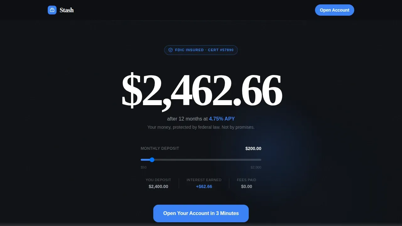
The hero opens on a dark full-bleed background in near-black with a radial electric blue glow. The glow pulses slowly, like a heartbeat, behind a single live number showing the user's projected balance after one month and one year at the current annual percentage yield. A default deposit of $200 per month is set automatically, and users can adjust it. Below the number, one line reads: "Your money, protected by federal law. Not by promises." This section instantly communicates security and value before anyone scrolls.
frequently asked question-Driven Anxiety-Disarming Scroll
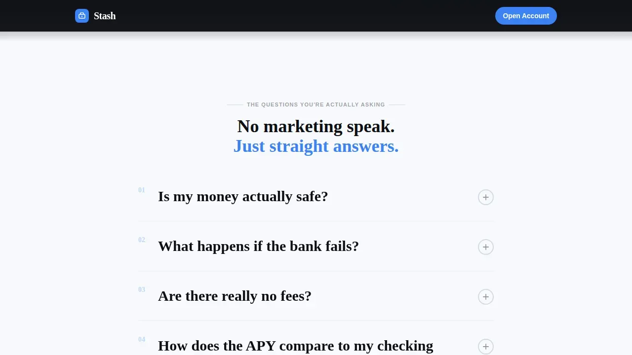
Five full-width frequently asked question blocks guide the scroll. Each question matches what a real user types into a search engine at midnight: "Is my money actually safe?", "What happens if the bank fails?", "Are there really no fees?", "What's the catch?", and "How do I get started?" Each block shows a short, plain-language answer with space for linked legal citations and expandable fine print via accordion. The content does not persuade. It disarms, one anxiety at a time, building trust through clarity.
APY Comparison Table Section
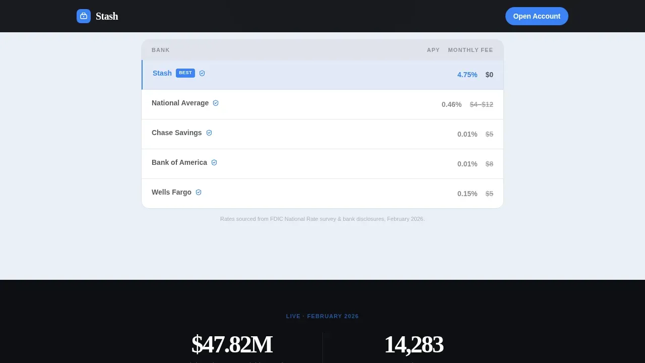
Between the third and fourth frequently asked question blocks, a dedicated section displays a side-by-side market comparison. It shows the account's annual percentage yield against big-bank averages, making the value of putting cash here immediately obvious. This section helps users understand the real cost of leaving funds in a standard checking account and reinforces that high rates exist at online-focused financial services rather than traditional brick-and-mortar banks.
Persistent Bottom Call-to-Action Bar
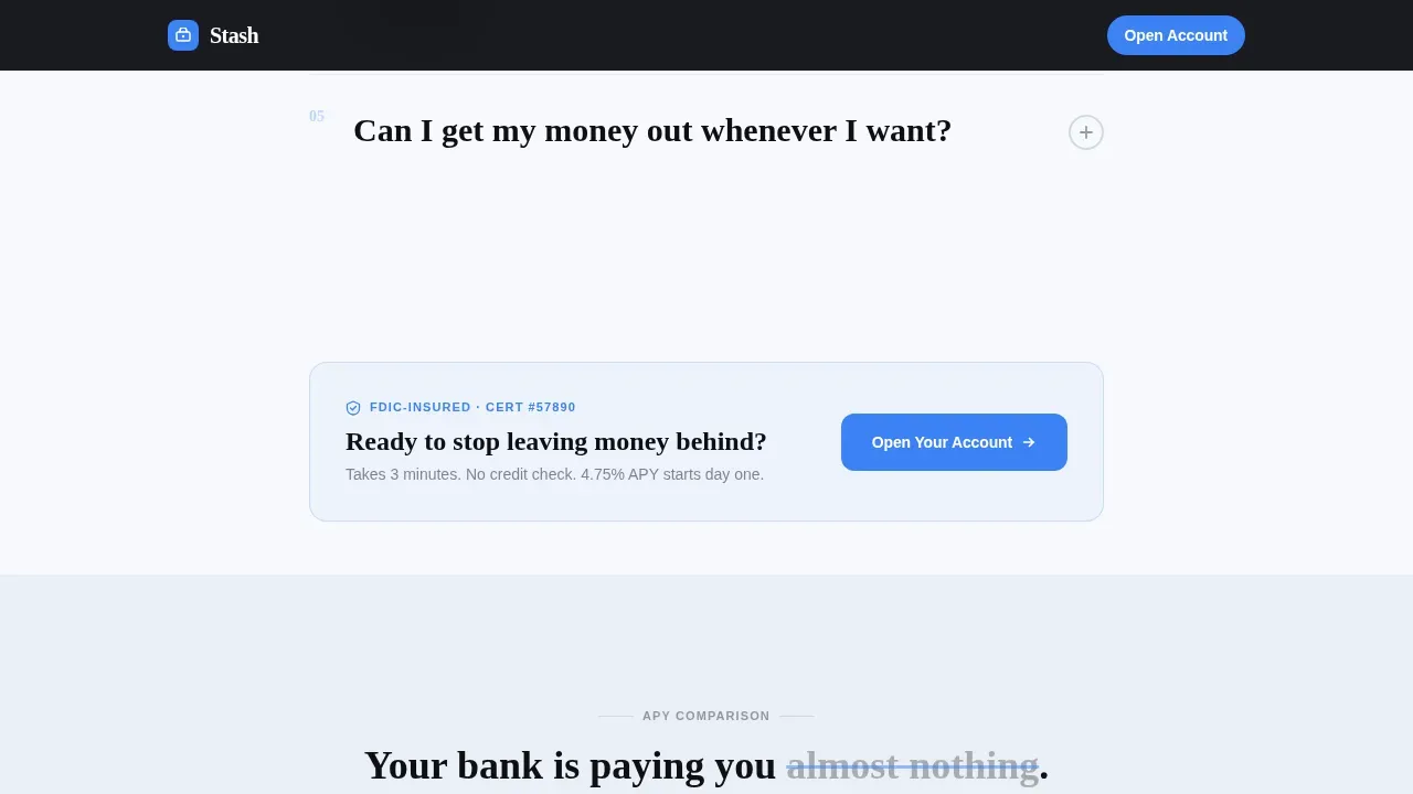
After the fifth frequently asked question answer, a sticky bottom bar appears and stays visible as the user continues scrolling. It carries the primary call-to-action button: "Open Your Account in 3 Minutes." The bar is set in electric blue and remains high-contrast against the permafrost white background. No form exists on the landing page itself. The click routes directly to the bank's onboarding flow, keeping the page clean and the user's path simple.
Real-Time Deposits Counter
A live counter shows the total amount of cash currently protected in the platform this month. This social proof element runs in real time and answers the silent question every cautious user carries: "Are other people actually using this?" Seeing a growing number updated live provides the kind of visible evidence that words alone cannot deliver. It reinforces that this is a real, active financial service, not a concept.
Trust Indicator Layer
FDIC certification numbers, security badge icons, and the anchor line "Your money, protected by federal law" appear at multiple points across the page. The template places these indicators near the call-to-action sections, consistent with best practice for financial landing pages where security signals should sit close to the moment of commitment. The design keeps these elements in electric blue so they carry visual authority without cluttering the layout.
Page sections overview
| Section | Purpose |
|---|---|
| Dark Hero Calculator | Show live projected savings balance and FDIC anchor line |
| frequently asked question Block One | Answer "Is my money actually safe?" with plain language |
| frequently asked question Block Two | Address "What happens if the bank fails?" with legal grounding |
| frequently asked question Block Three | Confirm "Are there really no fees?" with zero-fee breakdown |
| First call to action Placement | Route user to account application after third frequently asked question answer |
| APY Comparison Table | Compare account rate against big-bank market averages |
| frequently asked question Block Four | Answer "What's the catch?" with radical transparency |
| frequently asked question Block Five | Explain "How do I get started?" in under a minute |
| Deposits Counter | Display real-time total funds protected this month |
| Final call to action Section | Full-width call to action with trust indicators |
| Linear Footer | Single-row footer with legal and navigation links |
Design & branding system
The design follows a Legal Shield theme with Scandinavian clinical minimalism. Every surface communicates that nothing is hidden. The color system uses Arctic White tones so clean they feel institutional, and the only warm element is the electric blue that marks every trust signal and action point. Typography pairs Fraunces as the serif display face with Manrope for all body copy, creating a tone that feels premium but plain-spoken.
- Color palette: permafrost white (#F7F9FC) for backgrounds, glacier gray (#D1D9E6) for dividers and secondary text, deep obsidian (#0D0F13) for all headlines and body copy, and cold electric blue (#3B82F6) reserved exclusively for calls to action and trust indicators
- Typography: Fraunces serif for display headlines, Manrope sans-serif for body and user interface text, keeping information readable and hierarchy clear
- Visual approach: generous white space, soft radial gradients on the hero, and scroll-reveal animations with staggered frequently asked question entries to guide the eye without overwhelming it
Mobile & speed optimization
Over half of all users arrive on a landing page through a phone. This template is designed mobile-first, with a single-column flow that needs no horizontal adjustment. Touch-friendly buttons, accordion-style frequently asked question blocks, and a sticky bottom call-to-action bar all perform correctly on small screens. The interactive calculator and real-time counter use client-side rendering while static sections use server-side components, keeping the initial load lightweight.
- Mobile-first single-column layout with touch-friendly buttons and responsive type scaling
- Client-side rendering for the live calculator and deposits counter; server-side components for all static content sections
- Staggered scroll-reveal animations that work on mobile without layout shifts or content jumps
How this template helps you convert
A save money landing page only works if it removes every reason to leave before the user reaches the call to action. This template structures the entire scroll as a trust-building sequence, not a sales pitch. By the time someone reaches the "Open Your Account in 3 Minutes" button, they have already had five hard questions answered in plain language.
- The hero delivers projected savings in real numbers on first view, giving the user an immediate, personal reason to keep reading and a sense of what their cash could do on a regular basis
- The frequently asked question scroll dismantles fear one question at a time, with expandable fine print and space for legal citations, so users feel informed rather than sold to
- The persistent call-to-action bar, real-time deposits counter, and FDIC trust indicators stack credible social proof at the moment of decision, reducing drop-off at the final step
Other information about this template
This template sits at the intersection of fintech product design and millennial financial education. It is built specifically for the kind of people who know how to spot a bad deal and want full information before sharing anything. A few additional details are worth noting for anyone evaluating this template for their project.
- The template is categorized under Finance and Insurance, with a subcategory in Millennial Finance, making it a focused tool for a specific market segment
- The stash secure zero fee millennial savings landing page template is the reference template in this niche, meaning it was designed around the exact audience behavior and anxiety patterns described by the source brief
- The creative direction is frequently asked question-driven, which is distinct from hero-led or feature-led landing page structures and is especially effective for high-trust financial services where users need guidance before they act
- Stash, as a platform, has focused on delivering educational value and providing guidance so people feel confidence rather than confusion when engaging with financial products for the first time
- The template supports video content placement within the scroll for teams that want to add a short explainer, consistent with the fact that video is increasingly essential in fintech marketing
- Design choices like sharing security badge placements and providing visible FDIC certification numbers are baked into the layout, so teams do not have to guess where trust signals belong
- For teams putting together their own messaging, the template provides a clear source structure: question, answer, citation, and action, making it easy to set up content without starting from a blank page
- The footer uses Pattern 1, a linear single-row layout, keeping the bottom of the page clean and uncluttered so the final call to action remains the last thing the user sees before leaving
Theme
Legal Shield
Creative direction
FAQ-Driven
Color system
Arctic White
Style
Single Column Flow
Direction
Click-Through
Page Sections
Live APY Balance Calculator
Faq-driven Anxiety Scroll
APY Comparison Table
Persistent Bottom Call to Action Bar
Real-time Deposits Counter
Layered Trust Indicator System
Related questions
Can I use this template for any type of savings account product?
Does the landing page include a sign-up form?
What makes the frequently asked question-driven scroll structure effective for this audience?
Is the APY calculator interactive or static?
What trust signals does this template include?



