Gen Z Finance Cost Calculator Website Template
The Stacks Gen Z savings account landing page template is a dark, high-energy split-screen design built for FinTech brands targeting young savers. It centers on an interactive compound interest calculator, a progressive three-step sign-up form, and neon-mint micro-animations. The design system uses deep navy, electric indigo, and neon mint to create a cockpit-style atmosphere that feels native to late-night phone sessions.
by Rocket studio
Quick summary
Stacks is a Gen Z savings account landing page template that leads with an interactive calculator, not a hero image. Visitors type their income, goal, and timeline, then watch a real-time compound interest graph draw itself in neon mint. Every section below the fold deepens the case for switching, and a progressive three-step sign form captures leads even from people who are not yet ready to open an account.
Who this template is for
This landing page template is built for FinTech companies and financial services brands that want to speak directly to young savers. It suits product teams, growth agencies, and independent designers who need a Gen Z-focused banking page without starting from scratch. The template works especially well for anyone working on a savings account launch, a rate-comparison campaign, or a lead generation push targeting first-time savers.
- FinTech startups and banking brands launching Gen Z savings products
- Growth agencies and creative studios building finance landing pages for clients
- Freelance designers who need a production-ready, mobile-first design to customize and deliver quickly
What problem this template solves
Most savings account landing pages feel like they were designed for people who already trust banks. Gen Z does not. This generation values honesty, transparency, and tools they can interact with before they commit. A generic landing page with stock photography and a buried sign-up form will not move them. This template solves that by making the value visible from the first second on the page.
- Legacy banking pages bury the Annual Percentage Yield (APY) comparison and fee description deep in the copy, losing impatient visitors before they ever reach the call to action
- Gen Z users expect mobile-first pages that load fast and reward interaction, not long-form brochure pages that ignore how this generation actually browses
- Standard templates do not include gamification elements like streak counters, milestone badges, or savings goal visualizations that motivate Gen Z to sign up and stay engaged
What you get with this template
You get a fully structured, single-page landing design with every section already planned and styled. The template is ready to customize with your own branding, copy, and account details. You can easily create a polished, on-brand savings page without writing a single line of code, because the layout, design system, and component hierarchy are already built for you.
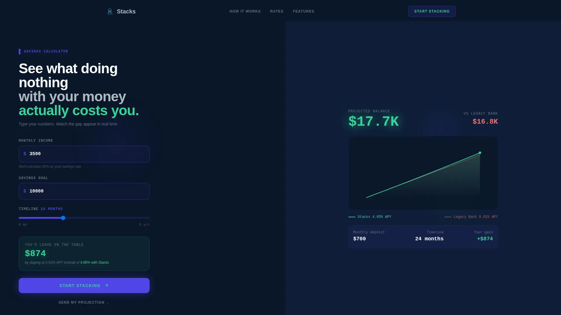
- A split-screen hero section with a live compound interest calculator on the left and a self-drawing SVG projection graph in neon mint on the right
- Five fully designed page sections covering the calculator hero, APY comparison, fee breakdown, social proof wall, and a progressive three-step sign-up form with ripple micro-animations
- A complete Midnight Blue design system with defined color tokens, DM Sans typography for headings, and JetBrains Mono for all numerical data displays
Feature list
Interactive Split-Screen Calculator Hero
The header is a full-bleed dark canvas with a live savings calculator already active before the visitor scrolls. The left panel takes inputs for monthly income, savings goal, and timeline. The right panel draws a compound interest projection graph in real time using neon mint. Visitors understand the cost of inaction before they read a single line of sales copy.
Progressive Three-Step Sign Form
The sign-up flow is deliberately staged. The first screen asks only for an email address. The second asks for age range and current banking provider. The third asks for a monthly savings target. Each step triggers a ripple micro-animation in neon mint when completed, rewarding users for moving forward. This design reduces friction and improves completion rates for lead generation pages.
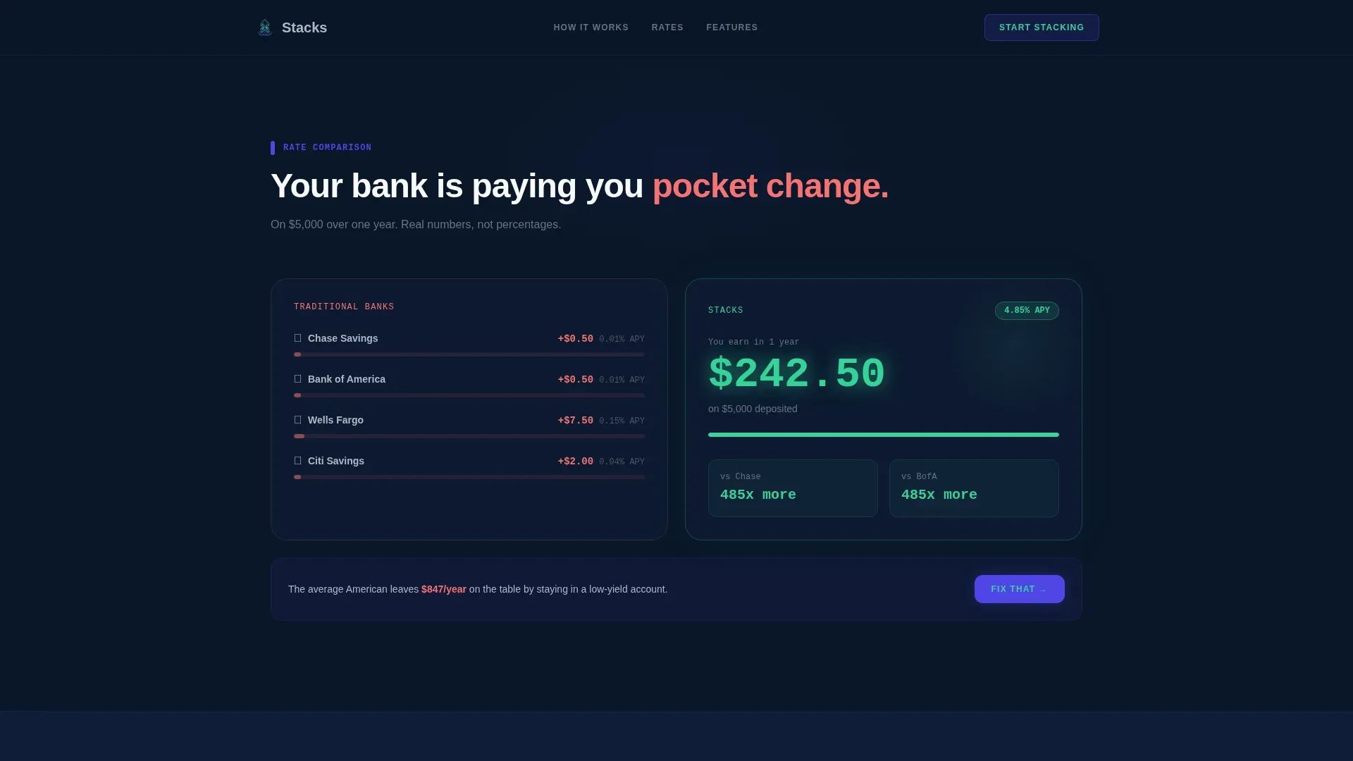
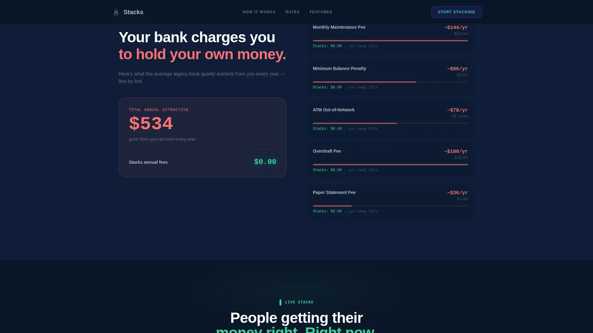
APY Comparison and Fee Breakdown Sections
Two dedicated landing page sections sit below the calculator. The first compares the visitor's current bank's rate against the Stacks rate, rendering the real dollar difference in mint so the gap is impossible to ignore. The second section is a fee autopsy that shows exactly how much legacy banking extracts annually. Both sections use the 50/50 split-screen layout to keep the design consistent and scannable.
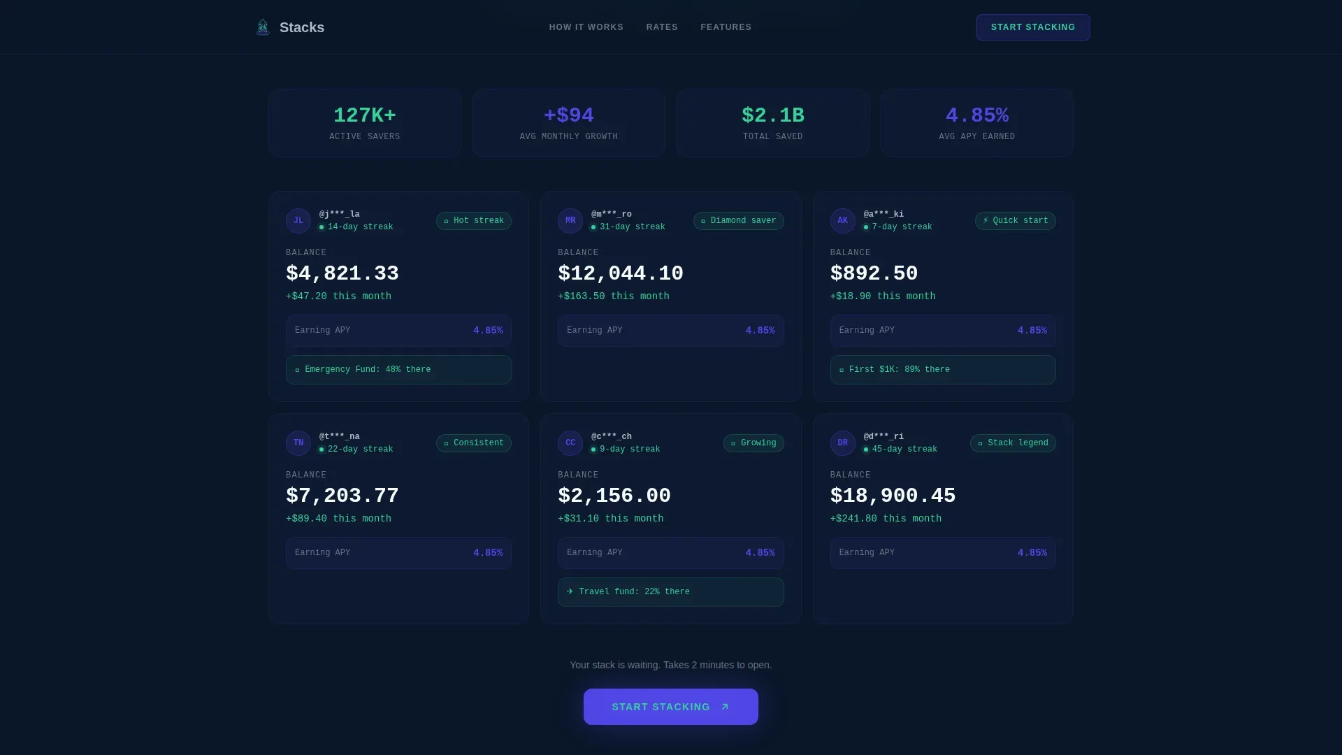
Social Proof Wall with Milestone Badges
A social proof section displays anonymized balance cards, savings streak counters, and milestone badges. Gen Z relies on peer validation, and this section delivers it without fake testimonials. The design draws on the same visual language as the rest of the page, keeping branding cohesive and the content easy to read at a glance.
Mobile-First Sticky Call to Action
The primary call to action, "Start Stacking," appears immediately after the calculator result and repeats as a sticky bottom bar on mobile. A secondary path, "Send My Projection," emails the calculator output to the visitor, capturing a lead even if they are not ready to open an account. Both calls to action are simple, direct, and placed where Gen Z users are most likely to act.
Secondary Lead Capture via Email Projection
The "Send My Projection" button gives visitors a low-commitment way to stay connected with your company. It emails the calculator results directly to the user, creating a second touchpoint that keeps the conversation going. This is especially useful for freelancers and recent grads who are interested but not ready to commit in a single session.
Page sections overview
| Section | Purpose |
|---|---|
| Calculator Hero | Interactive split-screen compound interest tool with real-time SVG graph |
| APY Rate Comparison | Side-by-side rate display showing real dollar differences in neon mint |
| Fee Autopsy | Visual breakdown of legacy banking fees extracted annually |
| Social Proof Wall | Anonymized balance cards, streak counters, and milestone badges |
| Progressive Sign Form | Three-step lead capture with ripple micro-animations per step |
| Linear Footer | Single-row footer with links, copyright notice, and brand sign-off |
Design & branding system
The Midnight Blue color system gives this landing page its core identity. Every color in the palette serves a specific purpose: the deep navy background creates focus, the electric indigo drives interaction, the lunar gray carries secondary text, and the neon mint exclusively signals positive money moments. The result is a cockpit-style design that feels premium, purposeful, and native to the way Gen Z uses finance apps. Branding stays consistent from the first pixel to the final call to action.
- Color tokens: #0A1628 background, #4F46E5 interactive indigo, #34D399 neon mint for positive moments, #B0B8C1 lunar gray for secondary text
- Typography pairing: DM Sans for all headings and body copy, JetBrains Mono for every number, balance figure, and data point across the page
- Visual style: dark terminal cockpit with backlit indigo glows, pulsing input borders, staggered section reveals, and vector-based SVG animations throughout
Mobile & speed optimization
With 98% of Gen Z owning smartphones and spending over 8 hours online daily, mobile optimization is not optional for this landing page. The template is designed mobile-first, with large touch targets, a sticky call to action bar at the bottom of the screen, and a layout that reads cleanly on small screens without requiring the visitor to zoom or scroll sideways. The SVG-based animation approach keeps the page lightweight compared to canvas or video alternatives.
- Mobile-first layout with large tap targets and a persistent sticky call to action bar for small-screen visitors
- CSS GPU-accelerated animations and a canvas-free SVG graph approach that keeps the page performant on any device
- Snackable section pacing: essential information appears first on each screen, with detail revealed as the user scrolls, matching how Gen Z browsers consume content
How this template helps you convert
A landing page is a standalone web page with one job: turning visitors into customers or leads. This template is engineered around that single goal. The calculator creates personal stakes before any pitch is made. The fee comparison removes doubt. The social proof adds credibility. And the progressive form removes the biggest barrier of all: the intimidation of a long sign-up flow.
- The interactive calculator engages visitors immediately, giving them a personal money projection that makes abstract savings goals feel real and achievable before they read any sales copy
- The progressive form breaks the sign process into three small steps, each rewarded with a micro-animation, which increases the likelihood that visitors agree to complete the flow and sign up
- The secondary "Send My Projection" call to action captures email leads from visitors who are interested but not yet ready to fully commit, extending the conversion window beyond a single visit
Other information about this template
This template is part of a Startup Velocity theme series built around the Calculator/Tool First creative direction and the Dark Full-Bleed and Glow header concept. It is categorized under Finance and Insurance, with a Gen Z Finance subcategory. The design choices, from the vector animation style to the dark color system, were made to align with how young people actually interact with money tools on their phones after hours. A good landing page should match the brand's identity, and every detail here is calibrated for that alignment.
You can easily create your version of this page by downloading the template and customizing the color tokens, copy, and account details. Landing pages can rank in search results, so connecting your finished page to your business domain and setting up tools like Google Analytics makes your lead generation campaign more effective over time. You can connect the page to your domain with no coding required, and you can access a 14-day free trial to get started on platforms like Unbounce, a popular, award-winning landing page creator, where prices start at $74 per month and include hosting and advanced features.
- Download the template, select your sections, and drag components to match your specific account services and payments structure
- Use the built-in vector design system to keep branding consistent across all pages and social media assets you create alongside the landing page
- The template is free to use as a starting design reference, and you can choose from multiple no-code website builders to publish your finished landing pages
Theme
Startup Velocity
Creative direction
Calculator/Tool First
Color system
Midnight Blue
Style
Split Screen (50/50)
Direction
Lead Generation
Page Sections
Interactive Compound Interest Calculator
Progressive Three-step Sign-up Form
APY Comparison and Fee Breakdown
Social Proof Wall with Milestone Badges
Sticky Mobile Call-to-action Bar
Midnight Blue Design System with Vector Animations
Related questions
Can I use this template without any coding knowledge?
Does this template work for a company that is not strictly a savings account provider?
How does the progressive sign-up form improve lead capture?
Is the calculator section really interactive, or is it a static design mockup?
Can I track performance after publishing the landing page?


