Expert Indigenous-Owned Business Comparison Website Template
Bannock is a masonry-style landing page template built for an Indigenous-owned artisan bakery and café. It pairs a Neo-Retro visual identity with a scroll-driven comparison journey, price-anchored header, and upsell-focused card layout. Every section moves visitors from curiosity to order, with a persistent "Build Your Feast" drawer and a gift bundle path for non-hungry browsers.
by Rocket studio
Quick summary
Bannock is a single-page masonry landing page template for an Indigenous-owned artisan bakery and café. It uses a warm Ink and Paper color system, staggered upgrade cards, and a persistent order drawer to turn browsing into buying. The design feels inherited and intentional at once, like a flour-dusted recipe card tucked inside a brand-new cookbook.
Who this template is for
This template is built for food businesses that have a story worth telling alongside a menu worth ordering from. It suits owners who want their page to earn the upsell visually before asking for it in words.
- Indigenous-owned bakeries and cafés with tiered menu offerings
- Artisan food sellers targeting office workers, families, and event planners
- Small food businesses offering gift bundles, catering, or weekend specials
What problem this template solves
Most food landing pages either look beautiful or sell well. Bannock does both by structuring the scroll as a comparison journey. Visitors discover upgraded options naturally, without feeling pushed.
- Solo items and their fuller counterparts appear side by side, making upsells feel generous
- Price visibility is built into the header so visitors do the math before they feel anything
- Gift buyers and hungry browsers each have a clear path to conversion
What you get with this template
You get a complete single-page layout built around a masonry card grid, a price-anchored hero section, and a sliding order drawer. Every element serves either discovery or decision.
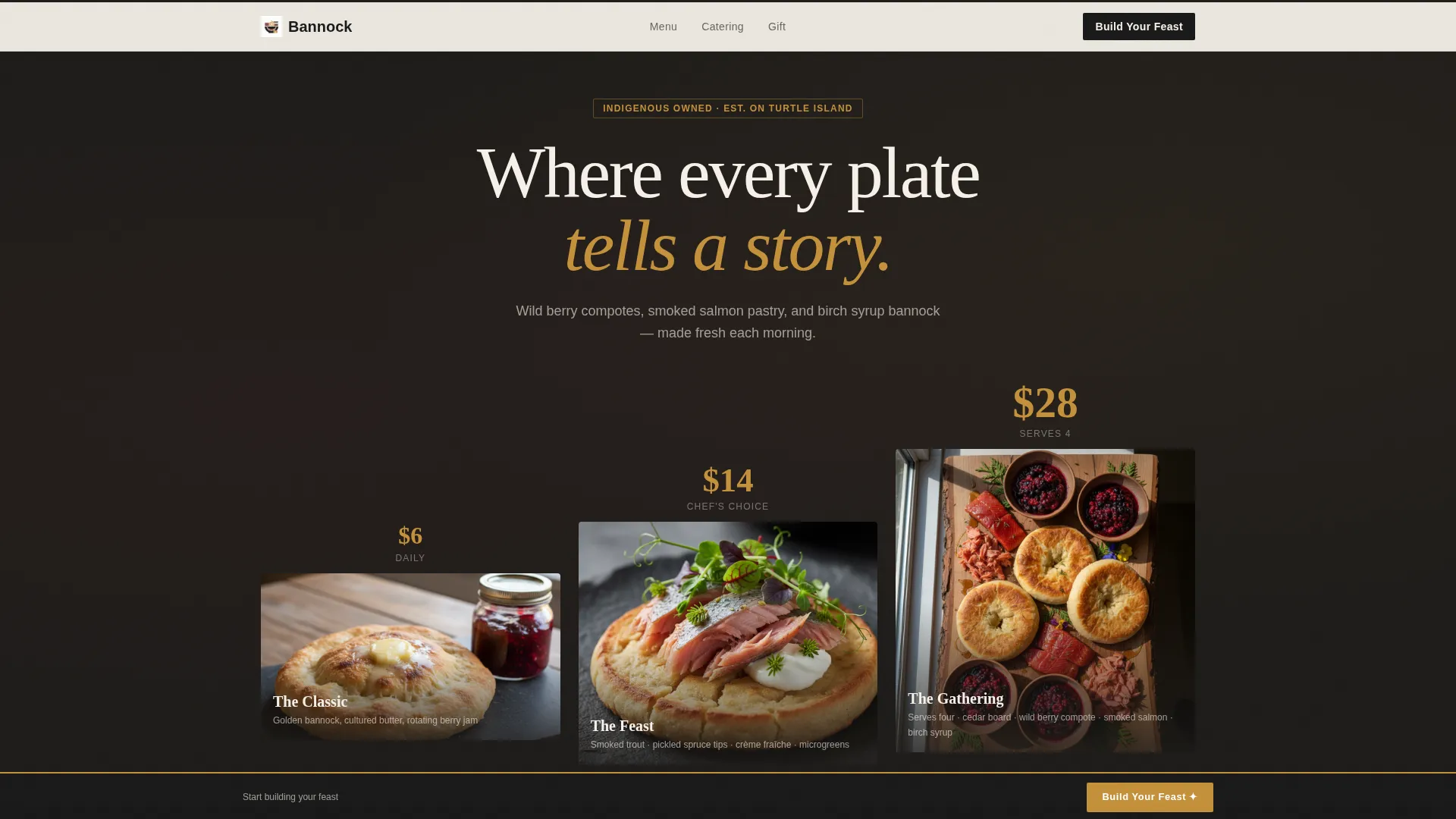
- A full-width price-anchored header showing three tiered bannock plates shot from above
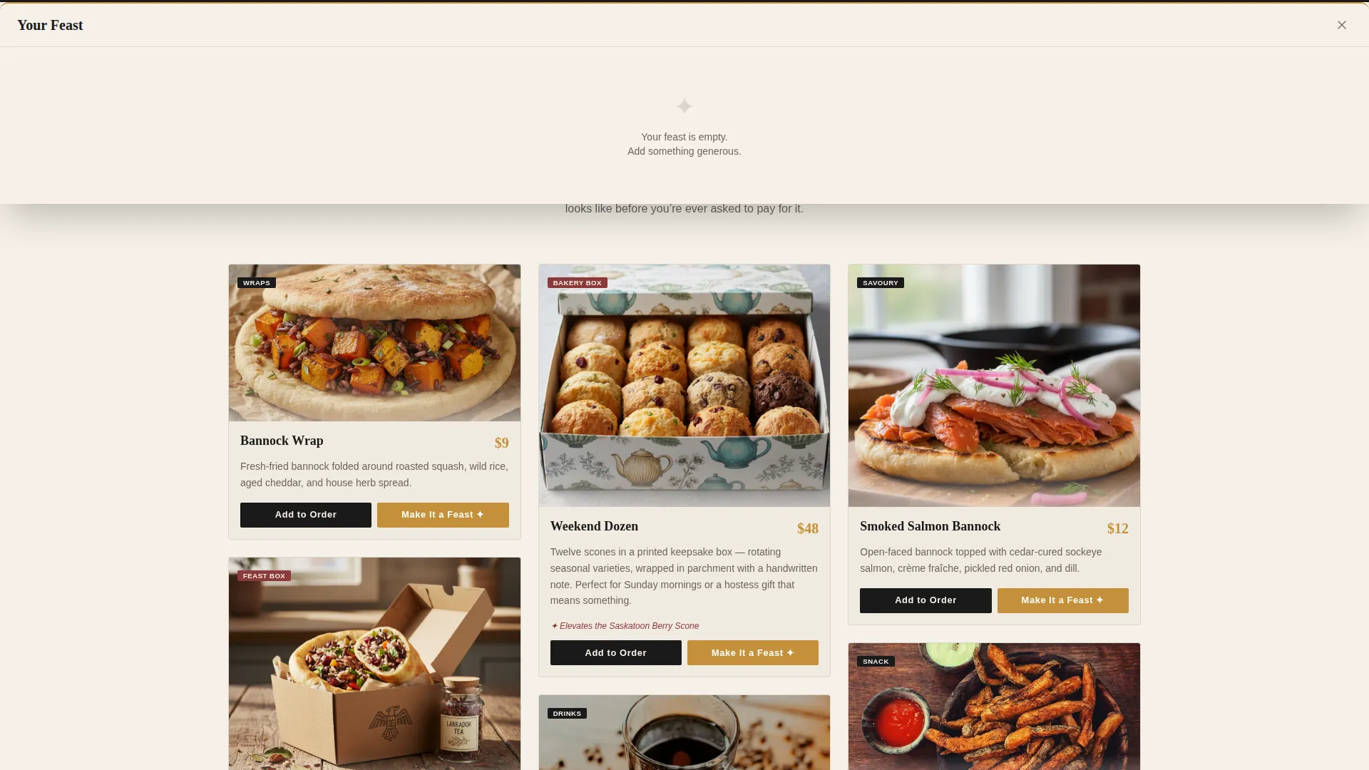
- A masonry card grid with dual-button upsell logic and chokecherry "UPGRADE" ribbons
- A persistent "Build Your Feast" call-to-action drawer, a free-delivery threshold banner, and a "Gift a Feast Box" secondary conversion path
Feature list
Price-Anchored Hero Header
The header spans the full width and displays three plated items arranged left to right on a dark soapstone surface. Prices are typeset in birch-sap amber, large enough to read before the food registers. The Classic, the Feast, and the Gathering grow in size and abundance across the frame.
Masonry Comparison Card Grid
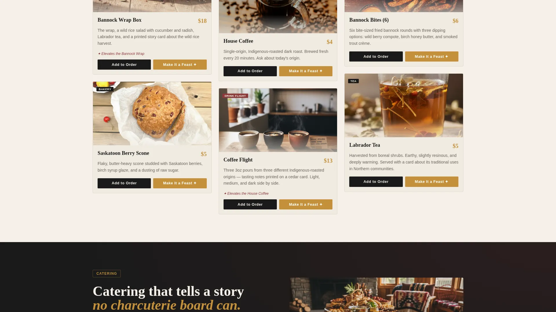
Cards are staggered in masonry rhythm, alternating between solo menu items and their upgraded counterparts. Each upgraded card carries a chokecherry "UPGRADE" ribbon. The rhythm makes discovery feel natural rather than commercial.
Dual-Button Upsell Card Logic
Every masonry card includes two buttons: "Add to Order" in letterpress black and "Make It a Feast" in birch-sap amber. The amber button always pulls the eye toward the richer option without hiding the entry-level choice.
Persistent Build Your Feast Drawer
A "Build Your Feast" button stays pinned to the bottom of the viewport as the visitor scrolls. Tapping it opens a sliding drawer where selected items stack visually like a growing plate, giving the order a physical presence before checkout.
Free-Delivery Threshold Banner
A soft threshold triggers at $30. A banner reading "You're $6 from free delivery, add bannock bites?" appears with a one-tap add option. The nudge is specific, friendly, and tied to a real reward.
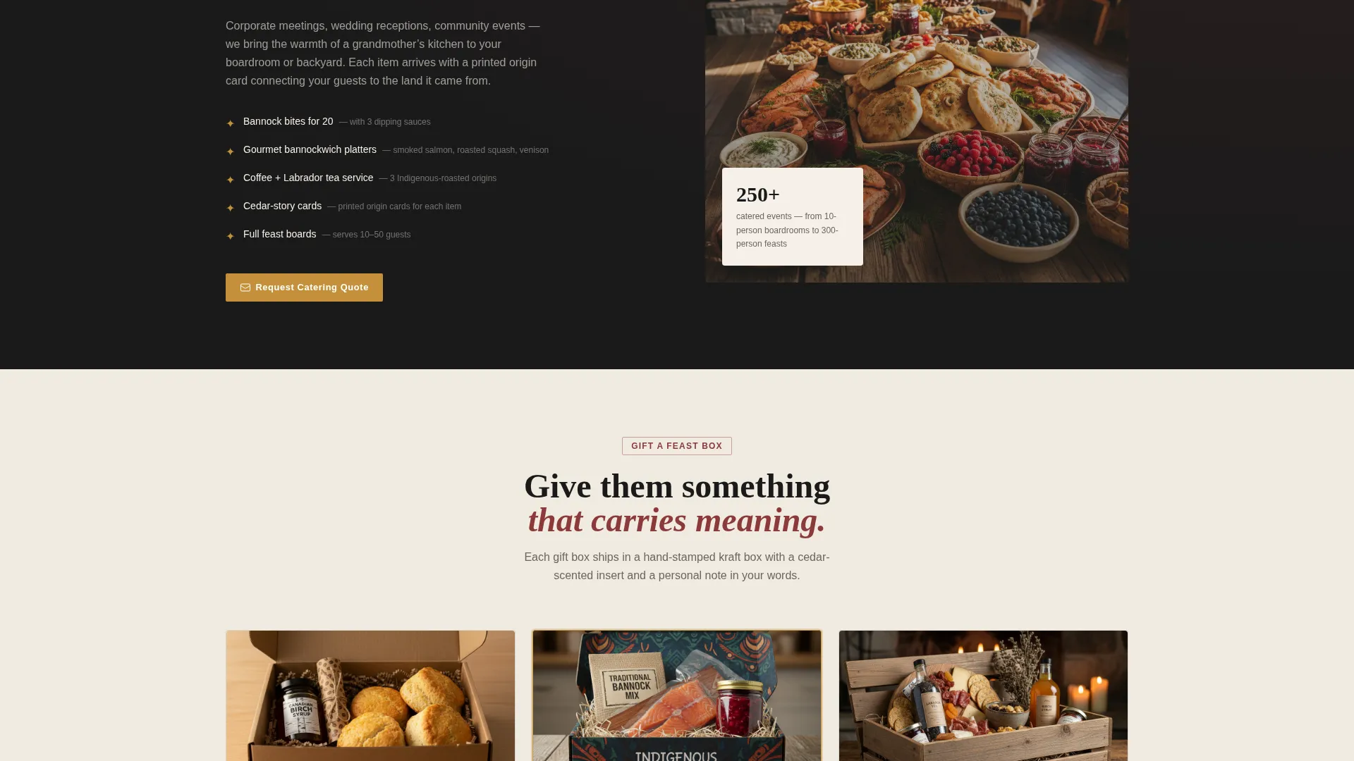
Gift a Feast Box Path
Visitors browsing without immediate hunger have a dedicated "Gift a Feast Box" route. It leads to a curated gift bundle page with a personal note field and a delivery date picker, converting non-hungry browsers into gift purchasers.
Page sections overview
| Section | Purpose |
|---|---|
| Full-Width Hero | Anchor price and appetite with three tiered plates |
| Masonry Card Grid | Show solo and upgraded menu items in staggered rhythm |
| Upgrade Ribbon Cards | Signal abundance and tier difference visually |
| Dual-Button Cards | Drive add-to-order and upsell actions per item |
| Build Your Feast Drawer | Collect and visualize the growing order in real time |
| Free-Delivery Banner | Nudge visitors past the $30 threshold with a one-tap add |
| Gift a Feast Box | Route gift browsers to a bundled purchase with a note field |
Design & branding system
The visual identity follows a Neo-Retro theme using an Ink and Paper color system. Parchment dominates the background, heavy slab serif headlines anchor in letterpress black, and every price or action element glows in birch-sap amber.
- Palette: unbleached parchment (#F5F0E8), letterpress black (#1A1A1A), dried chokecherry (#8B3A3A), smudged pencil gray (#6B6560), birch-sap amber (#C4913B)
- Typography: heavy slab serif for headlines, sharp secondary type for descriptions and prices
- Amber is reserved strictly for prices, badges, and hover states to keep its visual weight meaningful
Mobile & speed optimization
The masonry grid and pinned drawer are structured to adapt to smaller screens without losing the comparison rhythm. The layout keeps the upsell logic intact at every viewport size.
- Masonry columns reflow to a single-column stack on mobile while preserving card hierarchy
- The pinned "Build Your Feast" drawer remains accessible at the bottom of the viewport on all screen sizes
- Amber price type and chokecherry ribbons retain contrast and readability across device widths
How this template helps you convert
The page is designed so every scroll action moves a visitor closer to a decision. Abundance is shown before any ask is made, and the upgrade always looks like an offer rather than a pitch.
- The price-anchored header sets expectations immediately, removing sticker shock before visitors reach the menu cards
- The masonry comparison journey reveals upgraded items naturally, making the "Make It a Feast" button feel like a logical next step rather than an upsell
- The free-delivery threshold banner and the "Gift a Feast Box" path capture both hungry buyers and gift-givers before they leave the page
Other information about this template
This template was designed specifically for the Retail and E-Commerce category under the Indigenous-Owned Business subcategory. It fits food businesses that carry cultural identity as a core brand asset, not a footnote.
- The Neo-Retro theme and Ink and Paper palette are built to honor heritage while feeling current and designed
- The template supports catering and event inquiry use cases through the story-led card copy structure
- It is suitable for businesses using platforms like Framer, Webflow, or similar visual-first builders where masonry layouts and drawer components are natively supported
Theme
Neo-Retro
Creative direction
Comparison Journey
Color system
Dopamine Pop
Style
Bento Grid
Direction
Click-Through
Page Sections
Price-anchored Hero Header
Masonry Comparison Card Grid
Dual-button Upsell Logic
Persistent Order Drawer
Free-delivery Threshold Banner
Gift a Feast Box Section
Related questions
Can I change the menu items and prices in this template?
Does the Build Your Feast drawer work out of the box?
Is this template only suitable for Indigenous or bannock-focused food businesses?
How does the free-delivery threshold banner work?
Can the Gift a Feast Box section be used for a different type of bundle?



