Military Finance Portfolio Website Template
Barracks is a military investment account landing page template built for active-duty service members and military spouses. It features a live stats dashboard, an eight-row comparison table, scenario projection cards, and a three-step portfolio analysis form. The Data Command design uses a Monochrome Steel palette to keep every data point readable and every call to action impossible to miss.
by Rocket studio
Quick summary
Barracks is a single-page landing page template designed for a military financial platform. It combines a live metrics header, a feature comparison table, and scenario projection cards to show service members the exact cost of suboptimal Thrift Savings Plan (TSP) allocation. The page closes with a three-step form driving a free personalized portfolio analysis.
Who this template is for
This template is built for military fintech founders and financial platform teams targeting active-duty service members. It speaks directly to users who understand deployment tax exclusions, Blended Retirement System (BRS) math, and Permanent Change of Station (PCS) rebalancing cycles.
- Active-duty service members from pay grade E-5 through O-4 who are managing TSP contributions and deployment portfolios
- Military spouses tracking household investments across DEROS (Date Eligible to Return from Overseas) rotation cycles
- Fintech teams and financial advisors building a freemium or trial conversion funnel for a military investment account platform
What problem this template solves
Standard financial landing pages are built around civilian assumptions. They ignore combat zone tax exclusions, do not account for PCS-triggered rebalancing, and never address SGLI (Servicemembers' Group Life Insurance) integration. Service members comparing their options need a format that earns trust through data, not lifestyle imagery.
- There is no clear visual tool that shows the dollar gap between a standard TSP allocation and an optimized military strategy
- Generic robo-advisor pages cannot address BRS matching strategy or deployment contribution limits in a way that resonates with active-duty audiences
- Conversion funnels aimed at military users often lack the low-friction secondary path needed to capture visitors who are not yet ready to share financial data
What you get with this template
You get a fully structured, single-page conversion layout that moves visitors from awareness to action using real data. Every section is designed to build an undeniable case before asking for any input.
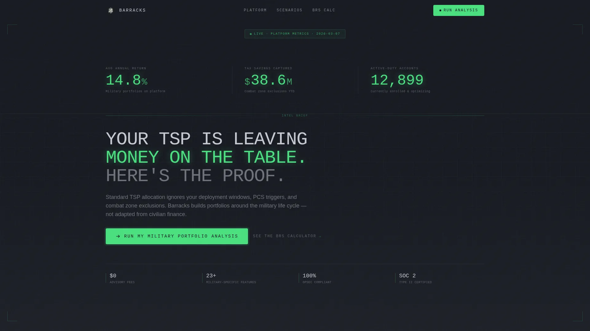
- A live stats dashboard header with three ticking counters showing average annual return, total tax savings captured in deployment zones, and active-duty accounts enrolled
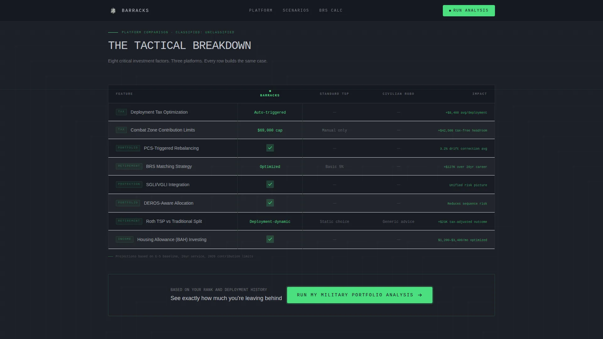
- An eight-row comparison table benchmarking the platform against standard TSP allocation and a typical civilian robo-advisor across deployment tax optimization, PCS rebalancing, SGLI integration, combat zone contribution limits, and BRS matching strategy
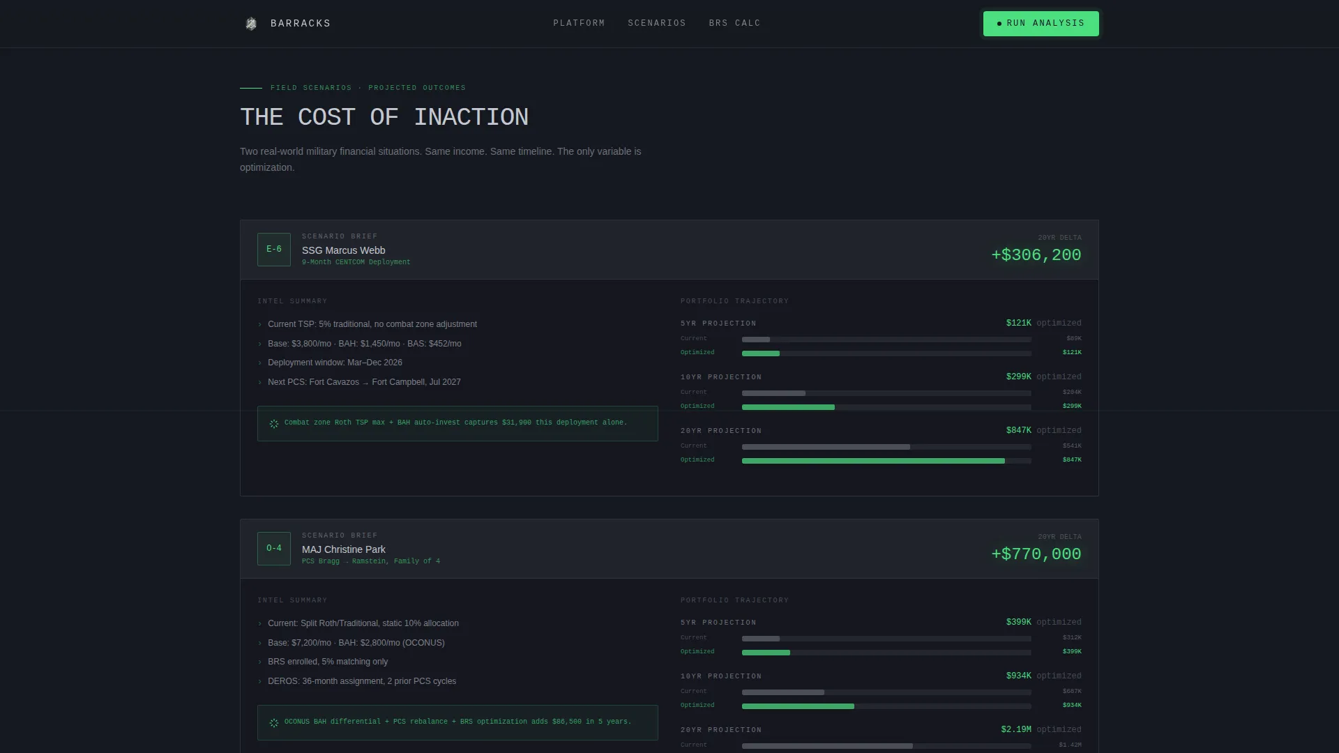
- Two named scenario projection cards showing a five, ten, and twenty-year portfolio difference for an E-6 deploying to CENTCOM and an O-4 family PCSing between duty stations
Feature list
This template includes purpose-built components that serve a military finance audience. Each one is grounded in the tactical, data-forward design brief.
Live Ticking Metrics Dashboard
Three real-time counters sit at the top of the page. They display average annual return for military portfolios, total deployment-zone tax savings captured, and the number of active-duty accounts enrolled. Numbers render in monospaced type, ticking upward in signal-green against a gunmetal background.
Eight-Row Comparison Table
The core of the page is a structured feature matrix. It compares the platform against standard TSP allocation and a civilian robo-advisor across eight rows including deployment tax optimization, PCS-triggered rebalancing, SGLI integration, combat zone contribution limits, and BRS matching strategy. Each cell shows a checkmark, a dash, or a specific dollar figure.
Scenario Projection Cards
Two named scenario breakdowns translate platform advantages into personal dollar terms. One card profiles an E-6 deploying to CENTCOM for nine months. The other profiles an O-4 family PCSing from one duty station to another. Both cards show projected portfolio differences at the five, ten, and twenty-year marks.
Three-Step Portfolio Analysis Form
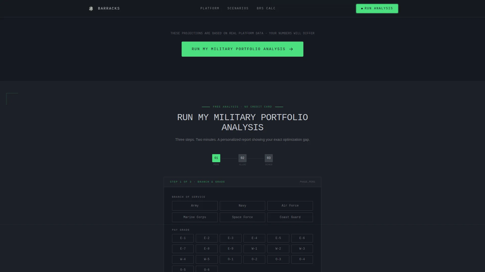
The primary call to action opens a multi-step form. Step one collects branch and pay grade. Step two captures current TSP allocation percentages. Step three asks for the next PCS or deployment window. The form generates a free personalized report comparing the user's current trajectory against an optimized military strategy.
BRS Calculator Secondary Path
A secondary conversion entry point sits below the main call to action. A "See the BRS Calculator" link offers a low-friction option for visitors not ready to share financial data. It still captures an email while giving the visitor an immediately useful tool.
Scroll-Reveal Table Row Stagger
The comparison table rows animate in on scroll, one row at a time. This pacing mirrors an intelligence estimate being read line by line, reinforcing the Industry Report creative direction and keeping visitors engaged through the full table.
Page sections overview
| Section | Purpose |
|---|---|
| Live Stats Header | Display ticking counters and tagline to anchor trust immediately |
| Comparison Table | Benchmark platform versus TSP and robo-advisor row by row |
| Scenario Projection Cards | Show dollar-specific portfolio outcomes for named service member profiles |
| Portfolio Analysis call to action | Drive primary conversion through a three-step personalized form |
| BRS Calculator Path | Capture lower-intent visitors via a low-friction email entry point |
| Footer | Deliver a single-row linear footer closing the page cleanly |
Design & branding system
The template follows a Data Command visual theme using a Monochrome Steel color system. Every design decision prioritizes data legibility over decoration. The result feels like the interior display of an armored vehicle's digital console.
- Color palette: gunmetal dark (#1C1F26) for backgrounds, armor plate mid-gray (#3A3F47) for alternating table rows, brushed aluminum (#C5C9D1) for body text, and signal-green (#4ADE80) reserved exclusively for positive return indicators, active toggles, and call-to-action elements
- Typography: DM Mono is used for all numbers and data fields to maintain monospaced precision; Manrope handles headings and body copy for clean readability
- Visual tone: no warmth, no decorative elements, and zero ornamental styling; every pixel is assigned a functional role aligned with the tactical operations brief aesthetic
Mobile & speed optimization
The template is designed desktop-first to support the complexity of the comparison table layout. Full mobile responsiveness is built in so the experience holds across all screen sizes.
- Desktop-first layout ensures the eight-row comparison table renders with full column clarity on larger screens
- Static sections use server-side rendering (SSR) for fast initial page loads, while interactive components such as counters and the multi-step form run as client-side elements
- Scroll-reveal animations and table row stagger effects are scoped to avoid blocking the critical rendering path
How this template helps you convert
The page is structured to show the cost of inaction in exact dollar terms before it ever asks a visitor for input. Each section adds one more layer of evidence until the call to action feels like a logical next step.
- The live metrics header establishes credibility immediately with real numbers ticking upward, making the tagline "Your TSP is leaving money on the table" feel like a documented fact rather than a claim
- The comparison table builds a row-by-row case using checkmarks, dashes, and specific dollar figures, so visitors see precisely where standard TSP allocation falls short before reaching the call-to-action button
- The scenario projection cards personalize the data by showing named, rank-specific outcomes at five, ten, and twenty years, giving visitors a direct reason to click "Run My Military Portfolio Analysis" or take the lower-friction BRS Calculator path
Other information about this template
This template is categorized under Finance and Insurance with a Military Finance subcategory, specifically targeting the military investment account niche. It is built as a freemium or trial conversion landing page using an Industry Report creative direction.
- The template uses a Stats/Metrics header concept with high-animation ticking counters powered by client-side components
- Interactivity is rated high across three areas: the comparison table with toggle behavior, the multi-step portfolio analysis form, and the scenario calculator cards
- Localization is set for United States audiences using USD, standard military rank terminology, and unambiguous date formatting
- The footer follows a linear single-row pattern, keeping the close of the page clean and uncluttered
Theme
Data Command
Creative direction
Industry Report
Color system
Monochrome Steel
Style
Comparison Table
Direction
Freemium/Trial
Page Sections
Live Ticking Metrics Dashboard
Eight-row Comparison Table
Scenario Projection Cards
Three-step Portfolio Analysis Form
BRS Calculator Secondary Path
Scroll-reveal Row Stagger Animation
Related questions
Who is this landing page template built for?
Can I customize the comparison table rows?
How does the three-step portfolio analysis form work?
What is the secondary conversion path in this template?
Does this template work on mobile devices?



