Specialist Local Brick & Mortar Business Provider Directory Website Template
Haggle is a vibrant flea market landing page template built for local markets, weekend vendors, and thrift-obsessed communities. It combines a full-bleed photo header, interactive before/after reveal sliders, a filterable vendor directory, and a dual-conversion layout, pulling in both shoppers ready to browse and vendors eager to apply for a booth.
by Rocket studio
Quick summary
Haggle is a single-page flea market landing page template that captures the energy of a real weekend market. It leads with a bold aerial photo header, escalates through before/after object transformation reveals, and lands on a filterable vendor directory. Two clear conversion paths serve both shoppers and prospective vendors without either audience feeling like an afterthought.
Who this template is for
This template is designed for anyone running or promoting a recurring flea market, vintage fair, or outdoor marketplace. It speaks directly to the people behind these events and the communities they attract.
- Weekend flea market and vintage market organizers who need a polished online presence
- Local market vendors looking to join an event and submit a booth application
- Thrift and antique market promoters wanting to showcase their vendor lineup before each event
What problem this template solves
Most flea market and local market websites feel flat. They list dates and directions, but they never capture the feeling of being there. Shoppers scroll past without a reason to show up. Vendors have no easy way to apply. This template fixes both problems at once.
- Shops and markets lose potential visitors because their pages fail to convey the discovery and excitement of the real experience
- Vendors have no obvious application path, so booth inquiries pile up in an email inbox
- Without a vendor directory, shoppers cannot preview who will be there or what categories to expect
What you get with this template
You get a fully designed, section-rich landing page built around the look and feel of a real market morning. Every section has a clear purpose, and the layout escalates naturally from storytelling to conversion.
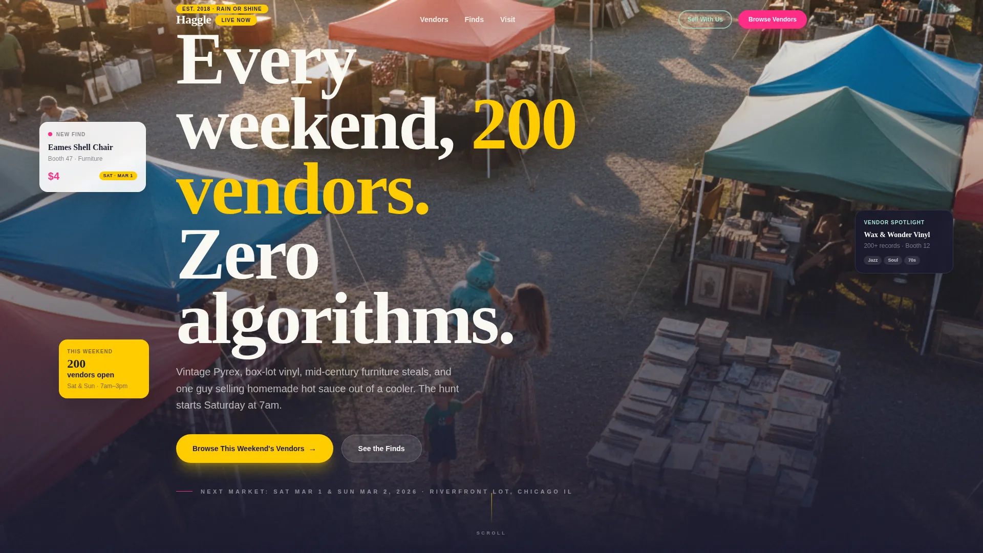
- A full-bleed aerial photo header with a punchy headline and immediate visual impact
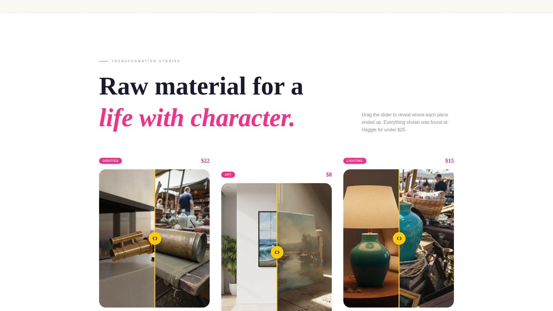
- Interactive before/after reveal sliders showing vendor finds transformed into styled living spaces
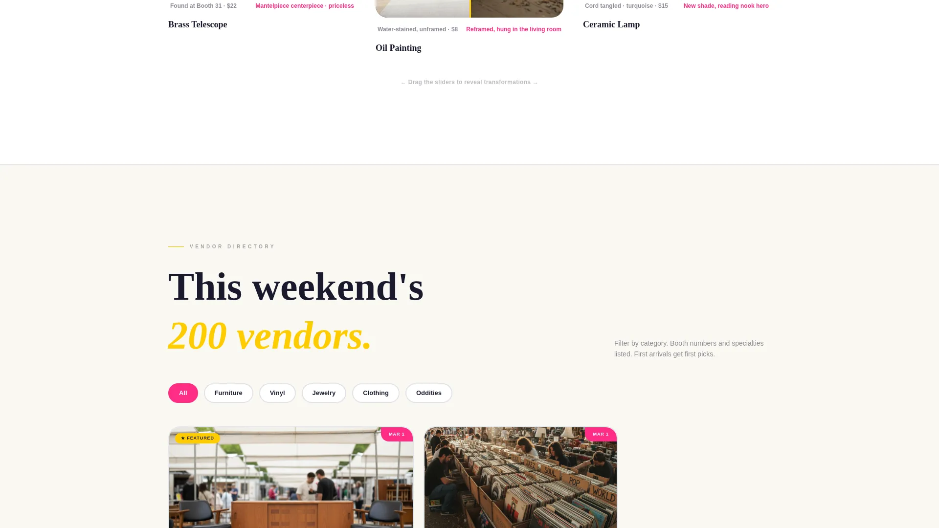
- A filterable vendor directory grid with category tags, booth numbers, specialty labels, and preview photos
- A fixed goldenrod "Browse This Weekend's Vendors" call-to-action button anchored to the viewport bottom
- A secondary vendor application path with a short form covering name, product category, photo upload, and preferred market dates
Feature list
This section breaks down the core built-in components that make the Haggle template work.
Full-Bleed Aerial Photo Header
The header opens with a sun-drenched overhead market shot. Long morning shadows, mismatched canopy tents, and a bold sans-serif headline create an immediate scene. The headline "Every weekend, 200 vendors. Zero algorithms." punches in from below on scroll, setting the tone for the entire page.
Before/After Reveal Sliders
Each vendor spotlight section splits into a raw "found" state and a styled "after" state. Visitors drag an interactive slider between the two views. The sequence escalates from single objects to full room transformations to complete vendor booth walkthroughs, building a compelling case for the market's value.
Filterable Vendor Directory Grid
The vendor directory tiles are organized by category, including furniture, vinyl, jewelry, vintage clothing, and oddities. Each tile carries a magenta corner tag showing the next market date. Shoppers can filter by interest before they ever leave home.
Dual Conversion Path Layout
The page serves two audiences in parallel. A fixed goldenrod button drives shoppers toward the vendor grid. A quieter mint-colored "Sell With Us" link in the navigation leads vendors to a short booth application form, keeping both flows visible without competing for attention.
Dopamine Pop Color System
The visual palette uses electric magenta for hover states and price callouts, sun-bleached goldenrod for featured vendor highlights, deep asphalt for grid frames and typography, and chalky mint for negative space. The result feels like a hand-silkscreened yard sale poster: loud, joyful, and hard to scroll past.
Vendor Application Form
The vendor application section includes fields for vendor name, product category, a photo upload of booth or goods, and preferred market dates. It is designed to be short enough to complete in under two minutes while capturing everything an organizer needs to review a submission.
Page sections overview
| Section | Purpose |
|---|---|
| Aerial Photo Header | Opens the page with full-bleed market atmosphere and headline |
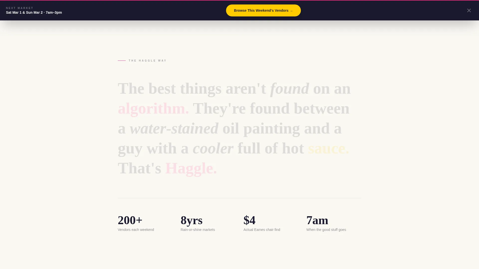
| Headline Punch-In | Delivers the "200 vendors, zero algorithms" brand statement |
| Object Reveal Sliders | Shows single-item before/after transformations interactively |
| Room Transformation Reveals | Escalates the story from objects to fully styled living spaces |
| Booth Walkthrough Reveals | Completes the transformation arc with full vendor booth previews |
| Vendor Directory Grid | Filterable tiles with categories, booth numbers, and market dates |
| Vendor Category Filters | Lets shoppers sort by furniture, vinyl, jewelry, clothing, or oddities |
| Fixed Shopper call to action | Goldenrod button anchored to viewport bottom for persistent visibility |
| Vendor Application Form | Short form for booth applicants with photo upload capability |
| Navigation Vendor Link | Mint-colored "Sell With Us" link providing a secondary entry point |
Design & branding system
The visual identity follows a Dopamine Pop color system paired with a Marketplace Grid layout theme. Every color has a specific role, and nothing is decorative without purpose.
- Electric magenta (#FF2D87) fires on hover states and price callouts; sun-bleached goldenrod (#FFCC00) highlights featured vendors; deep asphalt (#1A1A2E) anchors grid frames and body typography
- Chalky mint (#A8E6CF) covers secondary surfaces and negative space, giving the eye room to breathe between high-energy sections
- Typography uses bold sans-serif headline treatment throughout, consistent with the hand-lettered, silkscreened yard sale poster aesthetic described in the creative brief
Mobile & speed optimization
The layout is structured for practical use across screen sizes. The grid system and interactive sliders are built to translate from desktop to mobile without losing the visual impact that makes the template work.
- The fixed viewport call to action button and filterable vendor grid are designed to remain functional and tappable on smaller screens
- The before/after slider interaction is touch-compatible, so mobile visitors can drag between states just as easily as desktop users
How this template helps you convert
The page earns both clicks by front-loading proof. Visitors see transformation evidence before they ever reach a button, which means they arrive at the call to action already convinced.
- The before/after reveal sequence builds desire progressively, moving from a single grimy object to a fully transformed room, so by the time the vendor grid appears, the value of the market feels real and tangible
- The fixed goldenrod call to action button stays visible throughout the entire scroll journey, reducing the chance that a motivated shopper exits without clicking
- The mint-colored vendor application link sits in the navigation rather than competing with the shopper call to action, giving vendors a clear path without splitting the primary conversion focus
Other information about this template
This template sits at the intersection of retail promotion and local community marketing. It is designed for a specific kind of event: recurring, vendor-driven, and deeply tied to the experience of physical discovery. A few additional details worth knowing:
- The template is categorized under Retail & Commerce and Local Brick & Mortar Business, making it well-suited for antique malls, vintage fairs, and recurring outdoor markets
- The creative direction follows a Before/After Reveal approach, which is an intentional storytelling structure rather than a standard product display format
- The Marketplace Grid layout theme organizes vendor content into a scannable, browsable structure that mirrors how shoppers actually navigate a real market aisle
- The Neo-Retro theme and hand-silkscreened aesthetic give the page a distinctive personality that generic event templates cannot replicate
- This is a single landing page structure, not a multi-page website, so all content and conversion flows live within one scrollable experience
Theme
Neo-Retro
Creative direction
Unboxing Experience
Color system
Citrus Burst
Style
Masonry/Pinterest
Direction
Marketplace/Multi
Page Sections
Full-bleed Aerial Photo Header
Interactive Before/after Reveal Sliders
Filterable Vendor Directory Grid
Fixed Viewport Shopper Call to Action
Vendor Booth Application Form
Dual-path Conversion Layout
Related questions
Can I update the vendor directory with new listings each weekend?
Does the before/after slider work on mobile devices?
Can I use this template for an antique mall rather than an outdoor flea market?
Is the vendor application form connected to a payment or booking system?
Can I replace the default color palette with my own market's brand colors?



