Camping Cookware & Gear Store Pricing Website Template
Basecamp is a masonry-style B2B wholesale landing page built for camping cookware suppliers. It opens with a three-tier price-anchored header, flows through an unboxing-style masonry grid, and closes buyers with a two-step "Unlock Expedition Pricing" form. The Citrus Burst color system and Luxe Minimal design make every product feel catalog-ready before a single unit ships.
by Rocket studio
Quick summary
Basecamp is a single-page B2B wholesale landing page template for camping cookware and outdoor gear suppliers. It leads with a three-column tier pricing header, pulls buyers through an unboxing-style masonry grid, and converts them with a two-step modal form. Every section is built to move regional retailers, glamping procurement managers, and private-label aggregators from browsing to ordering.
Who this template is for
This template is built for wholesale and B2B camping cookware suppliers who need to communicate pricing tiers, product quality, and order minimums in one persuasive scroll. It fits operators who sell cast-iron, titanium, or enameled camp cookware by the pallet and need buyers to feel confident before picking up the phone.
- Regional outdoor retailers curating a camp kitchen aisle with 50 to 1,000-plus unit orders
- Glamping resort procurement managers outfitting multiple sites before peak season
- Amazon aggregators sourcing private-label cookware that photographs and performs at catalog standard
What problem this template solves
Wholesale buyers browse fast and decide faster. Most supplier pages bury pricing, hide minimums, and offer no proof of operational capability. A buyer who cannot find a per-unit cost in ten seconds will leave. This template puts pricing front and center, builds trust through product proof, and captures intent before it cools.
- No clear tier pricing means buyers compare you against whoever shows numbers first
- No operational proof means procurement managers hesitate before committing to pallet quantities
- No low-friction entry path means smaller buyers leave without starting the upgrade conversation
What you get with this template
You get a fully structured, single-page wholesale landing page with layered conversion paths. The layout moves from pricing clarity to product discovery to account capture, giving both high-volume buyers and sample-first prospects a clear next step.
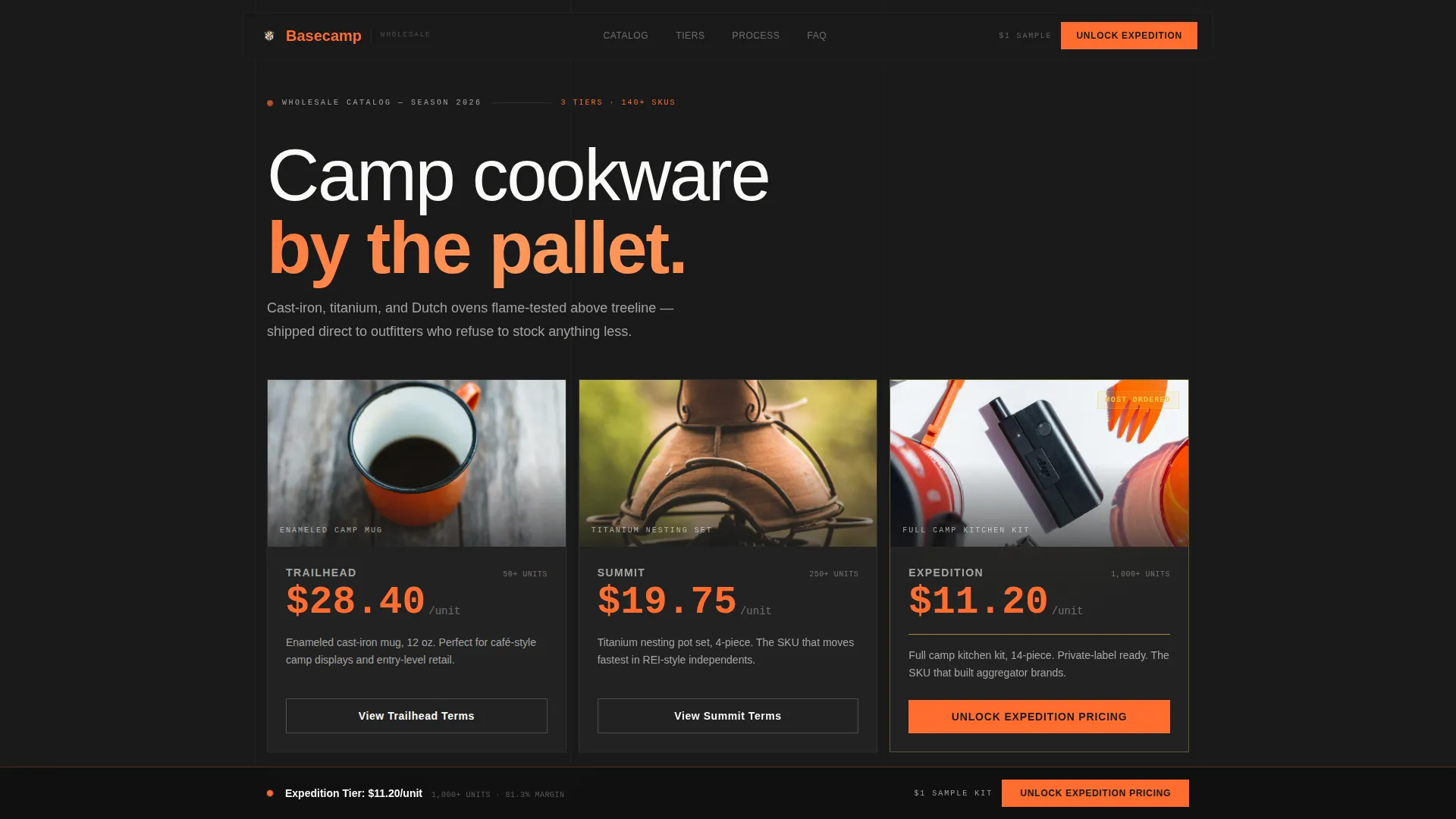
- A price-anchored hero header with three wholesale tier cards: Trailhead at 50-plus units, Summit at 250-plus, and Expedition at 1,000-plus
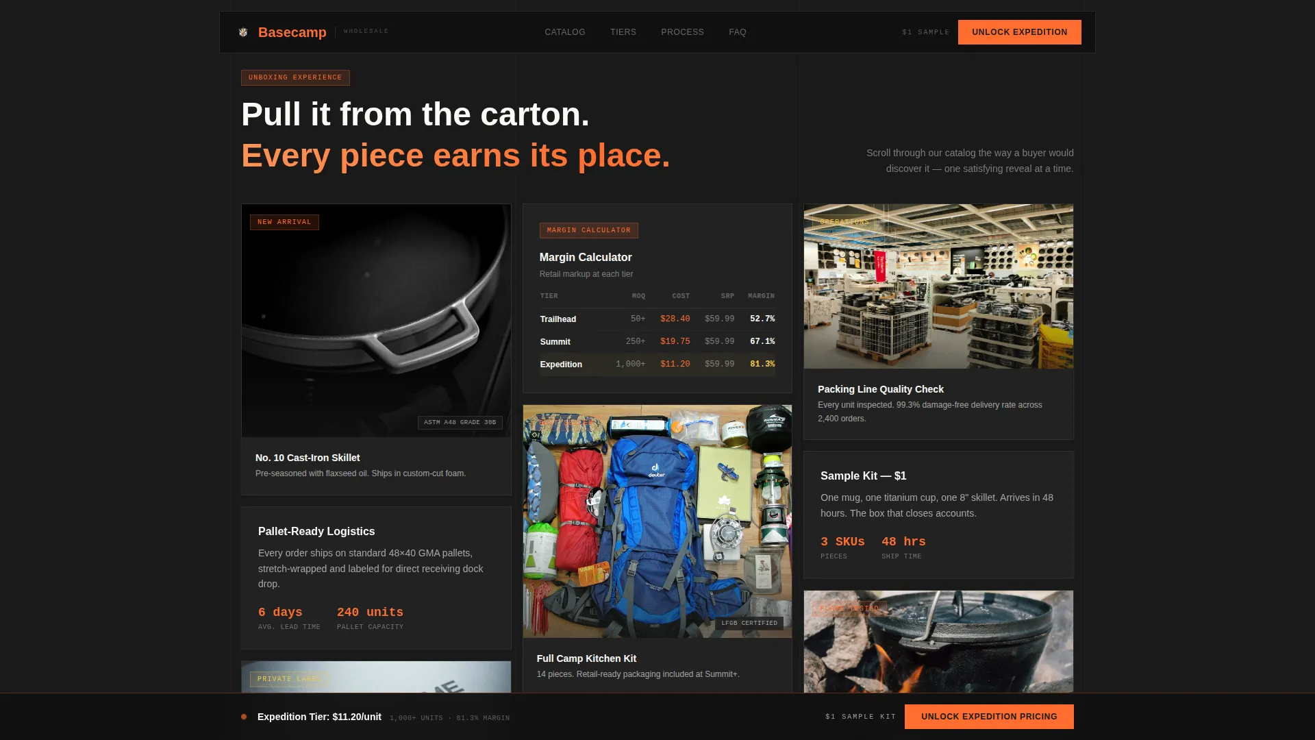
- A masonry grid alternating product beauty shots with operational proof cards: minimum order quantity charts, margin calculators, and specification sheets with ratings
- A sticky upgrade bar, a two-step modal form with toggleable add-ons, and a secondary "Start with a Sample Kit" path for smaller prospects
Feature list
This template packages every element a B2B cookware supplier needs to convert wholesale buyers through one well-paced page.
Price-Anchored Tier Header
Three wholesale tier cards sit side by side against a charred black viewport. Per-unit costs display in oversized tangerine numerals, descending left to right so volume feels inevitable. The Expedition column carries a smoked lemon rule and a "Most Ordered" label in small caps.
Masonry Unboxing Grid
The scrollable masonry grid reveals products the way a buyer discovers them unpacking a sample box. Cards alternate between product beauty shots and operational proof, including packing line footage, minimum order quantity charts, margin calculators, and spec sheets. The staggered reveal keeps buyers engaged through the full scroll.
Two-Step Conversion Modal
The primary call to action, "Unlock Expedition Pricing," opens a two-step form. Step one collects company name, estimated annual units, and an optional current supplier field. Step two presents three default-on add-ons: custom logo engraving, retail-ready packaging, and a 48-hour sample kit for one dollar.
Sticky Upgrade Bar
After three scroll depths, a sticky tier bar appears at the top of the viewport. It keeps the Expedition pricing call to action visible throughout the page without interrupting the product discovery flow below.
Sample Kit Entry Path
A secondary call to action, "Start with a Sample Kit," gives smaller buyers a low-commitment entry point. It routes them to a one-dollar trial box that seeds the account upgrade conversation naturally over time.
Proof and Specs Strip
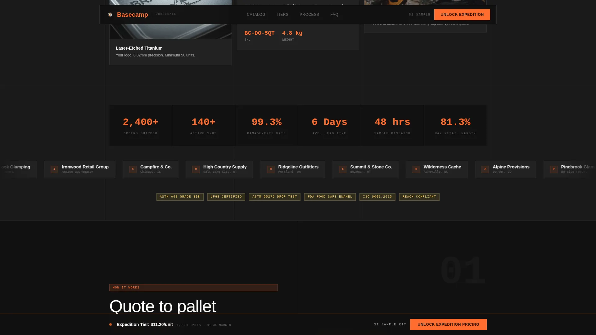
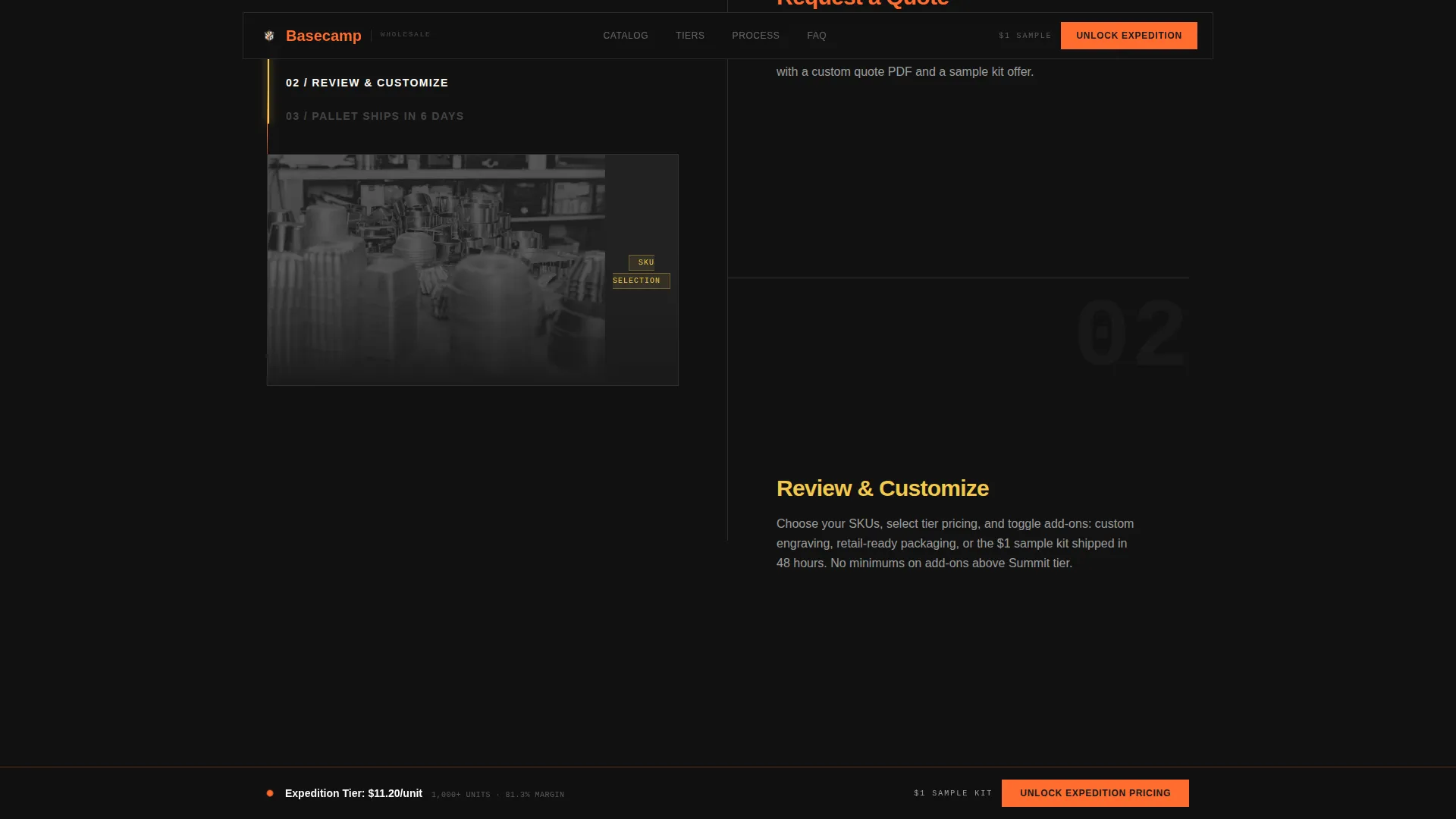
A dedicated section displays minimum order quantity charts, a margin calculator showing retail markup at each tier, and ratings badges. A process section shows how an order moves from quote to pallet, reducing buyer hesitation before large commitments.
Page sections overview
| Section | Purpose |
|---|---|
| Tier Pricing Header | Anchor buyer expectations with three side-by-side wholesale tier cards and per-unit pricing |
| Masonry Product Grid | Build product confidence through alternating beauty shots and operational proof cards |
| Proof and Specs | Display minimum order quantities, margin calculators, and product ratings in one scannable strip |
| Order Process Split | Show how a quote becomes a pallet shipment to reduce procurement hesitation |
| Expedition Pricing call to action | Capture high-volume leads through a two-step modal with default-on add-on toggles |
| Linear Footer Row | Close the page with a single-row footer carrying essential supplier links |
Design & branding system
The visual identity follows a Luxe Minimal theme built around a Citrus Burst color system. Charred black dominates every surface, and citrus tones are deployed only where the buyer's eye needs to land, like a single ember glowing inside a matte-black fire ring.
- Charred black (#1A1A1A) as the dominant background, alpine white (#FAFAF8) for card surfaces and body text, zested tangerine (#FF6D2E) on pricing badges and hover states, and smoked lemon (#F2C94C) for tier highlights and quantity break indicators
- Plus Jakarta Sans for headers and JetBrains Mono for prices, specs, and badges, keeping the page feeling both premium and technically precise
- High-motion animations including load-in reveals, masonry stagger effects, sticky tier bar transitions, and beam effects, all powered by CSS animations and Intersection Observer with no heavy libraries
Mobile & speed optimization
The template is built desktop-first to match how B2B buyers actually browse supplier pages, but it is fully responsive for mobile review. Performance is prioritized through lightweight animation techniques that do not rely on heavy JavaScript libraries.
- CSS animations and Intersection Observer handle all motion and stagger reveals, keeping the page fast without external dependencies
- Masonry grid and tier cards reflow cleanly for tablet and mobile viewports so procurement managers can review specs on any device
How this template helps you convert
Every layout decision in Basecamp pushes a wholesale buyer toward account commitment. The page is engineered to remove hesitation at each stage of the buyer journey.
- The price-anchored header makes per-unit cost the first thing a buyer sees, eliminating the pricing friction that causes most wholesale page exits before the scroll begins.
- The masonry unboxing grid builds product trust progressively, alternating catalog-quality imagery with operational proof so buyers feel confident at pallet scale before they ever open the form.
- The two-step modal with default-on add-ons and the one-dollar sample kit create two parallel conversion paths, capturing both high-volume accounts and smaller buyers who need a low-risk first order to start.
Other information about this template
This template is category-matched for the camping cookware and outdoor gear wholesale market. It is designed to present a supplier as a serious operational partner, not just a product listing. The included social proof elements, such as client logo placement, pallet shipment counts, and SKU catalog size indicators, reinforce scale and reliability for procurement-minded buyers.
- The template supports English-language content, USD pricing, and US date format out of the box
- Typography, color values, and component sizing are all defined in the design system so the template can be adapted to a specific brand identity without rebuilding structure
- The masonry layout and Citrus Burst palette make the page feel distinct from generic trade supplier pages, helping the supplier stand out when buyers are comparing multiple wholesale sources side by side
Theme
Luxe Minimal
Creative direction
Unboxing Experience
Color system
Citrus Burst
Style
Masonry/Pinterest
Direction
Upsell/Upgrade
Page Sections
Price-anchored Tier Header
Masonry Unboxing Grid
Two-step Conversion Modal
Sticky Upgrade Bar
Sample Kit Entry Path
Proof and Process Sections
Related questions
Who is this landing page template designed for?
What are the three wholesale pricing tiers shown in the header?
How does the two-step conversion form work?
Can smaller buyers use this page if they are not ready for pallet orders?
What visual style does this template use?



