RV Park Franchise Landing Page Template
Basecamp is a scroll-reveal landing page template built for turnkey RV park franchise sales. It guides three distinct buyer types through a progressive comparison journey, from franchise model versus independent ownership, to asset class comparisons, to tiered investment options. Each section ends with a targeted call to action that lets visitors self-select the path that fits them.
by Rocket studio
Quick summary
Basecamp is a single-page franchise sales template designed for an RV park business that offers fully built-out park locations along high-traffic American travel corridors. The page uses a scroll-driven comparison structure to walk investors, landowners, and curious browsers toward three distinct conversion points, each matched to their level of readiness.
Who this template is for
This template is built for franchise operators and development teams who need to attract serious investment inquiries without relying on a generic pitch deck. It speaks directly to buyers who want a real asset, not just an idea.
- Retired couples looking to convert retirement savings into a cash-flowing, tangible asset
- Mid-career investors who want alternatives to stock market exposure and are evaluating cash-flow properties
- Small-town landowners and local developers who already hold acreage and need a proven operational playbook
What problem this template solves
Most franchise landing pages either overwhelm visitors with jargon or undersell the opportunity by burying the numbers. Basecamp fixes both problems by structuring the page as a progressive comparison journey that earns trust before it asks for commitment.
- Buyers arrive with different questions; the page answers each one in sequence before presenting the relevant offer
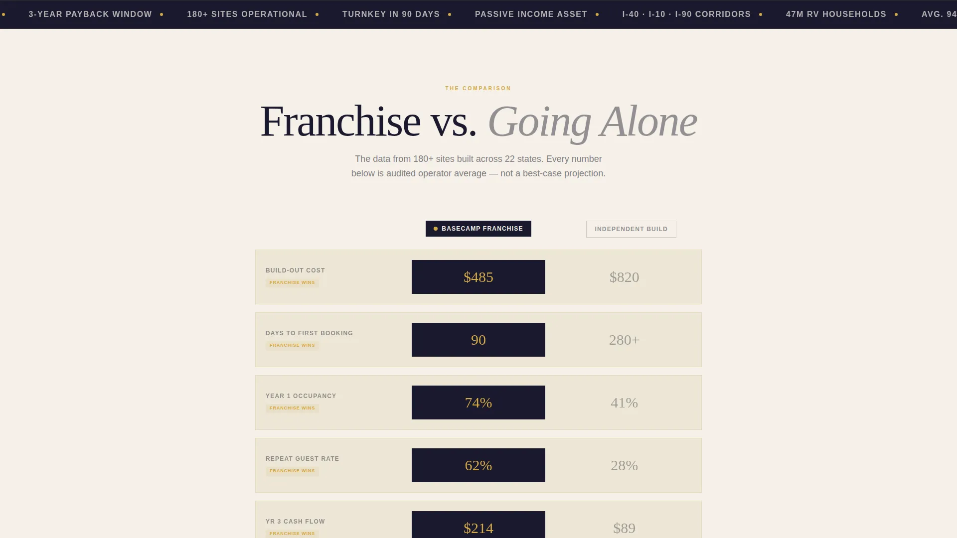
- The side-by-side comparison format removes guesswork from the franchise versus independent ownership decision
- Three separate conversion paths prevent one-size-fits-all friction that causes qualified leads to bounce
What you get with this template
You get a fully structured, scroll-reveal landing page that mirrors the visual energy of the brand it represents: authoritative, adventurous, and built to move money. Every section is designed with a specific role in the buyer journey.
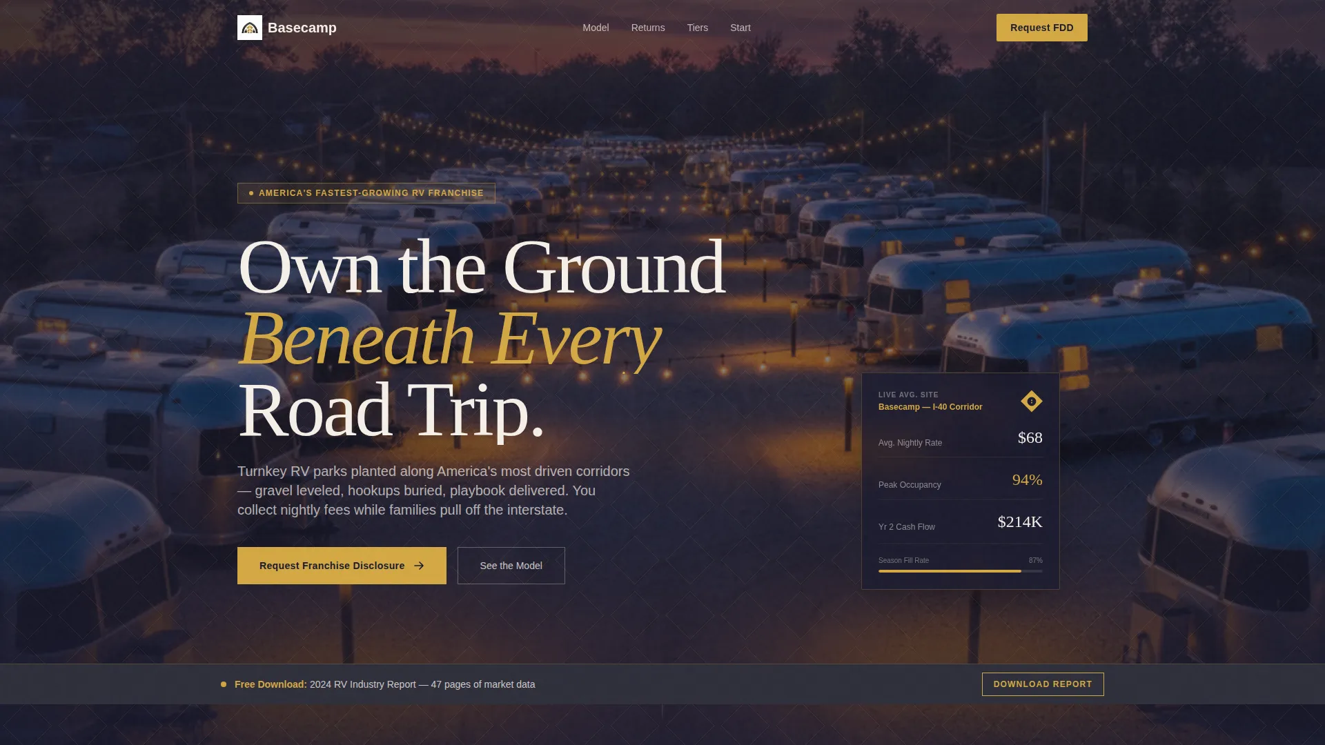
- A full-bleed dusk drone photo header with a geometric diamond overlay and a high-impact opening headline
- Three progressive comparison sections covering the franchise model, asset class benchmarks, and tiered investment options
- Three distinct call-to-action entry points, each matched to a specific buyer type with appropriate form fields
Feature list
A single paragraph introduces the feature set: every component in this template exists to serve a specific moment in the buyer's decision process. Nothing is decorative without purpose.
Scroll-Reveal Comparison Architecture
The page is built around a progressive reveal structure. Each section animates into view on scroll, guiding the visitor through a logical decision sequence. The franchise-versus-independent comparison slides in first, followed by asset class comparisons, then franchise tier breakdowns.
Animated Data Callouts
Key numbers animate on entry. Build-out costs, time-to-first-booking benchmarks, occupancy rates, and projected cash flow figures count up or grow as the visitor reaches each section. This keeps data feeling live rather than static.
Playful Geometric Card Containers
Data points and comparisons are housed inside geometric shapes: hexagons, diamonds, and angled cards. Each container tilts and shadows on hover, creating a tactile sense of interaction that holds attention through the denser comparison panels.
Three-Path Conversion System
Three distinct calls to action serve three buyer types. The primary path targets investors and requests franchise disclosure documents. The secondary path serves landowners with a shorter acreage form. The tertiary sticky-bar path offers a gated industry report download to warm earlier-stage leads.
Tiered Franchise Reveal Section
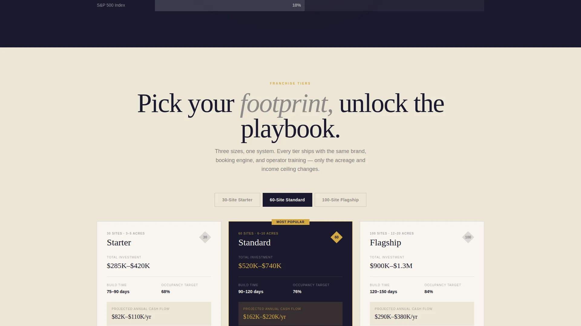
The three franchise tiers (30-site starter, 60-site standard, and 100-site flagship) are revealed progressively, each unlocking amenities, build timelines, and projected cash flow figures as the visitor scrolls deeper. This creates a sense of escalating stakes and reward.
Full-Bleed Drone Photo Header
The header opens with a low-drone dusk photograph of thirty RV sites in geometric rows, amber post lighting, and a violet-to-gold sky. A diamond pattern overlay at fifteen percent opacity connects the photo to the franchise's geometric brand motif before the headline appears.
Page sections overview
| Section | Purpose |
|---|---|
| Full-Bleed Header | Opens with a drone photo, geometric overlay, and the primary brand headline |
| Franchise versus. Independent | Side-by-side cards compare build cost, booking timeline, and occupancy benchmarks |
| Asset Class Comparison | Gold ROI bars compare RV parks against rental properties and laundromats |
| Franchise Tier Reveal | Progressive reveal of 30-, 60-, and 100-site tiers with amenities and cash flow projections |
| Investor call to action Section | Primary form for franchise disclosure document requests from capital-ready investors |
| Landowner Entry Path | Secondary shorter form for visitors who already hold acreage |
| Sticky Download Bar | Tertiary call to action offering a gated industry report to capture early-stage leads |
Design & branding system
The visual identity is built around a Playful Geometric theme. The palette reads like a minted franchise brochure left on the dashboard of a brand-new truck: serious enough to earn trust, warm enough to spark desire.
- Deep campfire black (#1A1A2E) anchors headers and navigation with authority; polished brass (#D4A843) highlights every interactive element, data callout, and animated figure
- Warm asphalt charcoal (#2E2E3A) defines card backgrounds and section dividers; clean cotton canvas (#F5F0E8) opens up comparison panels so numbers have room to breathe
- Geometric shapes (hexagons, diamonds, angled cards) carry the brand motif throughout every section, reinforcing the franchise's visual identity at each scroll point
Mobile & speed optimization
The scroll-reveal animations and geometric card layouts are designed to translate cleanly to smaller screens. The page structure prioritizes readability and tap-friendly interaction at every breakpoint.
- The sticky tertiary call to action bar remains accessible across screen sizes, keeping the gated download offer visible without blocking primary content
- Animated data callouts are triggered by scroll position, ensuring they fire at the right moment whether a visitor is on desktop or mobile
How this template helps you convert
The page is engineered around self-selection. Rather than sending every visitor to the same form, the structure lets buyers identify themselves through the content they engage with.
- The progressive comparison journey does the qualification work: by the time a visitor reaches a call to action, they have already seen the numbers that apply to their situation and are primed to take the next step.
- Three entry points reduce drop-off by matching form length and ask to the visitor's readiness level, keeping friction low for landowners and early-stage leads while capturing full details from capital-ready investors.
Other information about this template
This template is categorized under Franchise Business within the broader Retail and E-Commerce space. It carries an intersection match score of 9, reflecting a high degree of alignment between the franchise sales use case and the comparison-driven page structure.
- The creative direction follows a Comparison Journey format, meaning the persuasion logic is built into the scroll sequence rather than relying on a single hero section
- The template style uses an overlap and layered approach, with geometric card containers stacking and offsetting to create visual depth across comparison sections
- The header concept is a full-bleed photo execution, grounding the emotional pull of the brand in a real, physical location before any sales language appears
- The landing page direction is designed for multi-path conversion, making it well suited to franchise concepts that serve more than one buyer profile simultaneously

Theme
Neo-Retro
Creative direction
Comparison Journey
Color system
Ink & Paper
Style
Overlap/Layered
Direction
Click-Through
Page Sections
Scroll-reveal Comparison Architecture
Animated Data Callouts
Geometric Card Containers
Three-path Conversion System
Tiered Franchise Reveal Section
Full-bleed Drone Photo Header
Related questions
Can I edit the franchise tier details and projected figures?
How do the three conversion forms work?
Do I need to replace the header photo?
Is this template suitable for a single franchise location or a multi-location network?



