Epilepsy Care Professional Website Template
Beacon is a split-screen landing page template built for epilepsy clinical trial matching. It walks visitors through a three-step interactive demo, from seizure-type selection to medication filtering to a mapped list of nearby trials, then moves them toward a portal with a single clear call to action. The design is clean, precise, and built to earn trust fast.
by Rocket studio
Quick summary
Beacon is a single-page, click-through landing page template for an epilepsy clinical trial finder. It uses a 50/50 split-screen layout, a trust-badge hero, and a three-step guided walkthrough to show visitors how the matching system works before asking them to act. The goal is a confident click to the full intake portal.
Who this template is for
This template is designed for teams building patient-facing tools in the epilepsy care and clinical research space. It serves both direct-to-patient channels and clinical professional audiences.
- Parents of children with drug-resistant focal epilepsy who need structured guidance through trial options
- Adults who have cycled through multiple anticonvulsant medications and are exploring new clinical pathways
- Neurologists searching for adjunctive therapy trials for patients who have exhausted standard treatment protocols
What problem this template solves
Finding an appropriate epilepsy clinical trial on a government database is genuinely difficult. The raw data is dense, filter logic is non-intuitive, and most families arrive without the clinical vocabulary to navigate it confidently.
- Visitors arrive overwhelmed by trial registries and leave without a clear next step
- Trust is hard to establish quickly when the stakes are a child's seizure control or an adult's remaining treatment options
- The gap between "I found a trial" and "I understand if I qualify" often stops families from acting at all
What you get with this template
You get a complete, ready-to-customize landing page built around a transparent matching demonstration. Every section is structured to reduce friction and build credibility before the call to action appears.
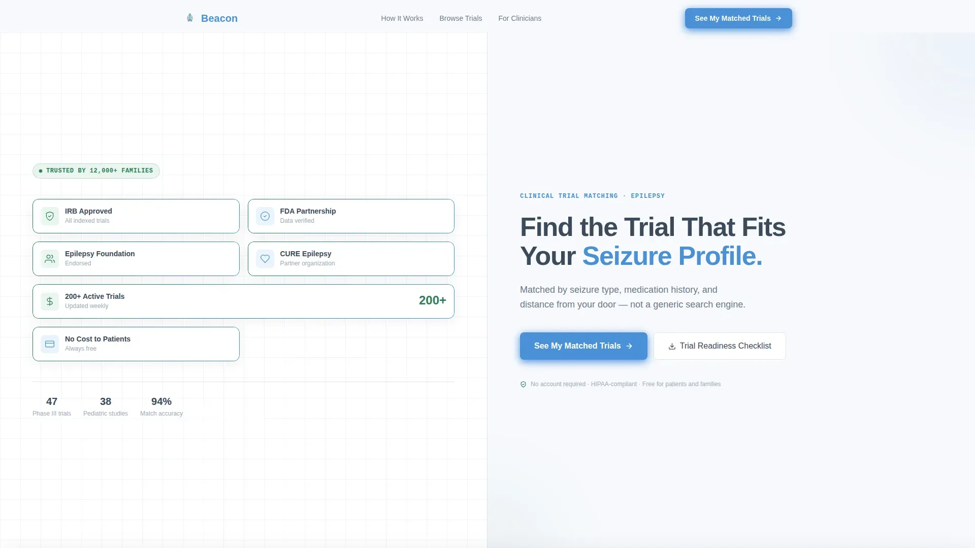
- A 50/50 split-screen hero featuring a trust-badge panel and a headline-plus-subhead panel
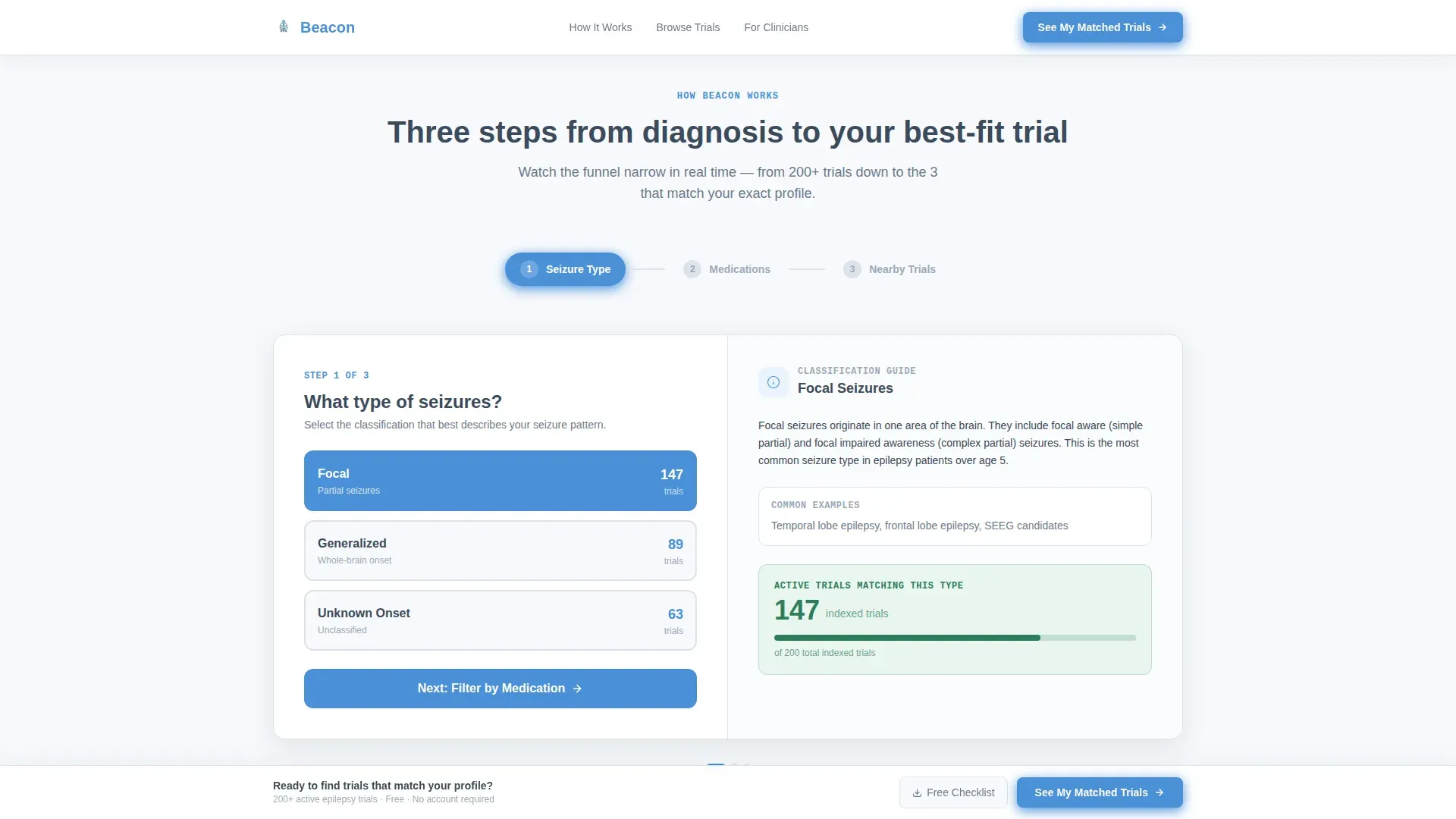
- A three-step interactive walkthrough showing seizure selection, medication filtering, and a mapped trial results view
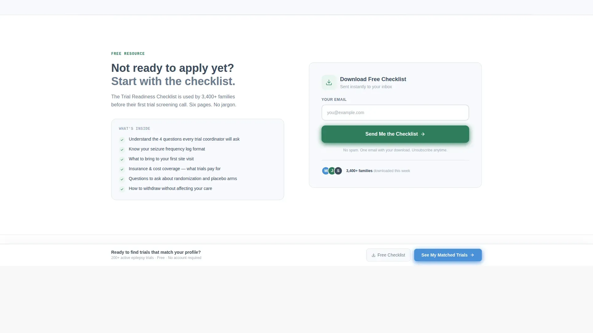
- A persistent bottom call-to-action bar and a secondary email-capture path for a downloadable trial readiness checklist
Feature list
This template ships with a focused set of components, each designed to move a specific type of visitor one step closer to the matching portal.
Split-Screen Trust Badge Hero
The hero opens with two equal panels. The left panel displays a deliberate grid of credential markers including approval seals, patient advocacy endorsements, and a trial count indicator. The right panel holds the primary headline and a one-line supporting subhead. Trust is established visually before the visitor reads a single word.
Three-Step Interactive Walkthrough
A numbered, scroll-driven pathway guides visitors through the matching logic using sample data. Step one presents a seizure-type selector with plain-language definitions. Step two shows a medication checkbox filter with a live trial-count response. Step three displays a map of nearby trial sites alongside the top three matched studies, each showing phase, sponsor, and enrollment status.
Persistent Click-Through Call to Action
The primary call-to-action button, labeled "See My Matched Trials," appears at the base of the three-step section and again as a fixed bottom bar after the midpoint of the page. No form fields are required on this page. The click transfers the visitor to the full intake questionnaire on the matching portal.
Trial Readiness Checklist Capture
A secondary conversion path offers visitors a downloadable trial readiness checklist. This path captures an email address and serves visitors who need more time before committing to the portal flow. It keeps a warm lead in reach without pressuring an immediate decision.
Scroll-Reveal Step Transitions
Each walkthrough step uses scroll-triggered reveal animations and count-up number effects to create a sense of forward momentum. The visual narrowing of trial counts from hundreds down to a handful communicates the power of the matching system without requiring any explanation.
Page sections overview
| Section | Purpose |
|---|---|
| Hero Badge Panel | Display trust credentials and headline on a 50/50 split |
| Step One: Seizure Selector | Let visitors classify seizure type with plain-language guidance |
| Step Two: Medication Filter | Show medication checkboxes and a live narrowing trial count |
| Step Three: Trial Map | Map nearby sites and surface the top three matched trials |
| Primary call to action Block | Drive clicks to the matching portal with the main action button |
| Checklist Capture | Capture emails via a secondary downloadable checklist offer |
| Persistent Bottom Bar | Repeat the primary call to action as a fixed bar after midpoint scroll |
| Footer Row | Deliver a clean single-row footer with essential links |
Design & branding system
The visual identity follows a Corporate Precision style using an Alpine Fresh color system. The palette is intentionally clinical without feeling institutional, designed to reduce anxiety and signal authority at the same time.
- Glacier white (#F7F9FC) as the dominant background, alpine slate (#3B4A5C) for body text and structural elements, evergreen (#2E7D5B) for trust indicators and progress markers, and summit blue (#4A90D9) on all interactive elements and calls to action
- Plus Jakarta Sans for headlines, DM Sans for body text, and JetBrains Mono for data labels and filter output values
- Interactivity is set to high, with tab-switching seizure selectors, clickable medication checkboxes, and step-transition animations at medium intensity
Mobile & speed optimization
The template is desktop-first in layout priority, reflecting the neurologist audience working at a clinical workstation. It is fully responsive for mobile, where parents are more likely to be searching between appointments.
- Static content sections are structured for fast initial rendering, with interactive step components handled as client-side elements
- Scroll-reveal animations and count-up effects are scoped to the walkthrough section to avoid slowing the hero load
- The 50/50 split-screen layout stacks cleanly on smaller viewports without losing the visual hierarchy of the trust badge panel
How this template helps you convert
Every design and copy decision on this page is aimed at one outcome: a confident click to the matching portal. The template earns that click by making the matching logic visible before asking for any commitment.
- The trust badge hero establishes third-party credibility in the first three seconds, so the visitor arrives at the walkthrough already oriented rather than skeptical.
- The three-step demo shows the system working on sample data, giving visitors direct evidence that the tool can narrow hundreds of trials to a meaningful shortlist before they enter their own information.
- The secondary checklist capture holds warm leads who are not ready to click through, ensuring that visitors who need more time still convert in a useful way.
Other information about this template
This template is built specifically for the epilepsy care niche within the broader health and medical category. It is designed for a US geography and English-language audience, with trial proximity measured by drive-time radius from the visitor's location.
- The layout and copy structure support both a business-to-consumer path for patients and caregivers and a business-to-professional path for neurologists
- The footer follows a linear single-row pattern, keeping the page exit clean and uncluttered
- The template assumes a connected matching portal exists as the destination for the primary call to action; the landing page itself carries no intake form
- Color and typography choices are fully customizable to match your organization's existing visual identity

Theme
Corporate Precision
Creative direction
Step-by-Step Guide
Color system
Alpine Fresh
Style
Split Screen (50/50)
Direction
Click-Through
Page Sections
Split-screen Trust Badge Hero
Three-step Matching Walkthrough
Persistent Click-through Call to Action Bar
Trial Readiness Checklist Capture
Scroll-reveal Step Animations
Related questions
Does this landing page include the actual trial matching system?
Can neurologists use this template as well as patients?
What happens to visitors who are not ready to click through to the portal?
How customizable are the colors and typography in this template?
Is the three-step walkthrough interactive or just a visual illustration?



