Elegant Brutalist Jewelry Landing Page Template
Forge is a bold brutalist jeweler portfolio landing page template built for independent studio makers who sell direct. It combines a scroll-jacked hero, an asymmetric bento grid archive, a studio process panel, and a minimal waitlist form. The Obsidian and Gold color system, JetBrains Mono stamps, and Fraunces editorial headings create a high contrast, collector-grade presence.
by Rocket studio
Quick summary
Forge is a single-page jeweler portfolio template built around brutalist design principles. It opens with a scroll-controlled ring rotation, then assembles an asymmetric bento grid of curated pieces. A dark studio process panel and a minimal waitlist form complete the flow. Every section is built to convey craft, confidence, and a direct-to-collector brand position without gallery interference.
Who this template is for
This template is an excellent choice for independent jewelers who work by hand and sell directly to collectors. It suits makers whose audience values structure, weight, and material honesty over polished conventional luxury styling.
- Independent studio jewelers building a direct-to-collector portfolio site
- Emerging makers seeking editorial discovery by design press and curators
- Handcraft artists who want to establish a strong brand presence without hiring a developer
What problem this template solves
Most jeweler portfolio pages either look like e-commerce catalogues or generic agency sites. Neither conveys the weight and intention behind handmade work. This template solves the mismatch between the object and the page that presents it.
- Collectors and editors arrive on pages that feel mass-produced and leave immediately, raising bounce rate and losing the sale
- Studio makers lack a layout that communicates process, scarcity, and direct access in a single scroll
- Building this visual style from scratch requires skilled developers and weeks of custom code
What you get with this template
You get a fully structured, single-page portfolio layout designed around the Forge studio identity. The template ships with all five planned sections, animation structure, typography pairings, and color tokens ready to customize.
- Scroll-jacked hero section with ring rotation and letter-stamp brand reveal
- Asymmetric bento grid archive with per-cell hover micro-animations
- Dark split-panel studio section, minimal waitlist form, and Superhuman-style footer
Feature list
This template brings together five tightly integrated sections. Each feature below reflects what is explicitly built into the layout.
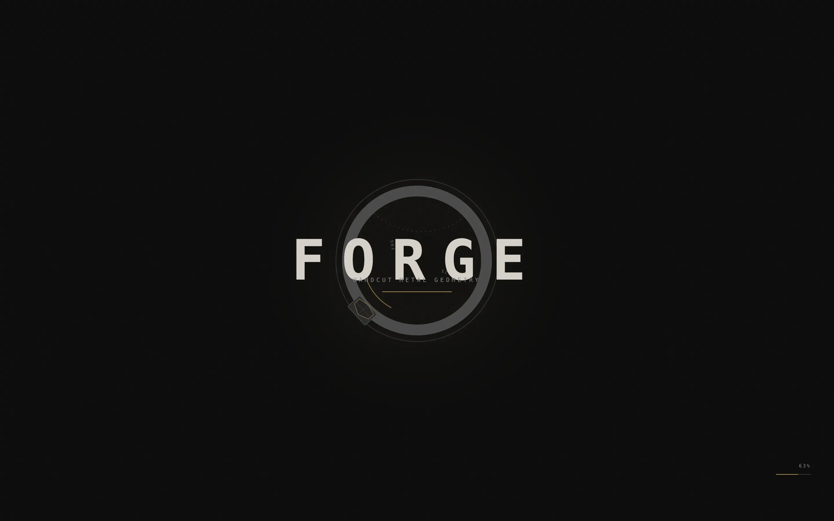
Scroll-Jacked Hero with Ring Rotation
The viewport locks on load. A sculptural ring rotates slowly against a void black background, with the visitor's scroll wheel controlling both rotation speed and angle. No body text appears until the piece completes one full revolution. Then the brand name stamps onto the screen in uppercase mono, letter by letter, like hallmarks being punched into metal. This sequence creates a striking first impression that collectors and editors remember long after they leave the site.
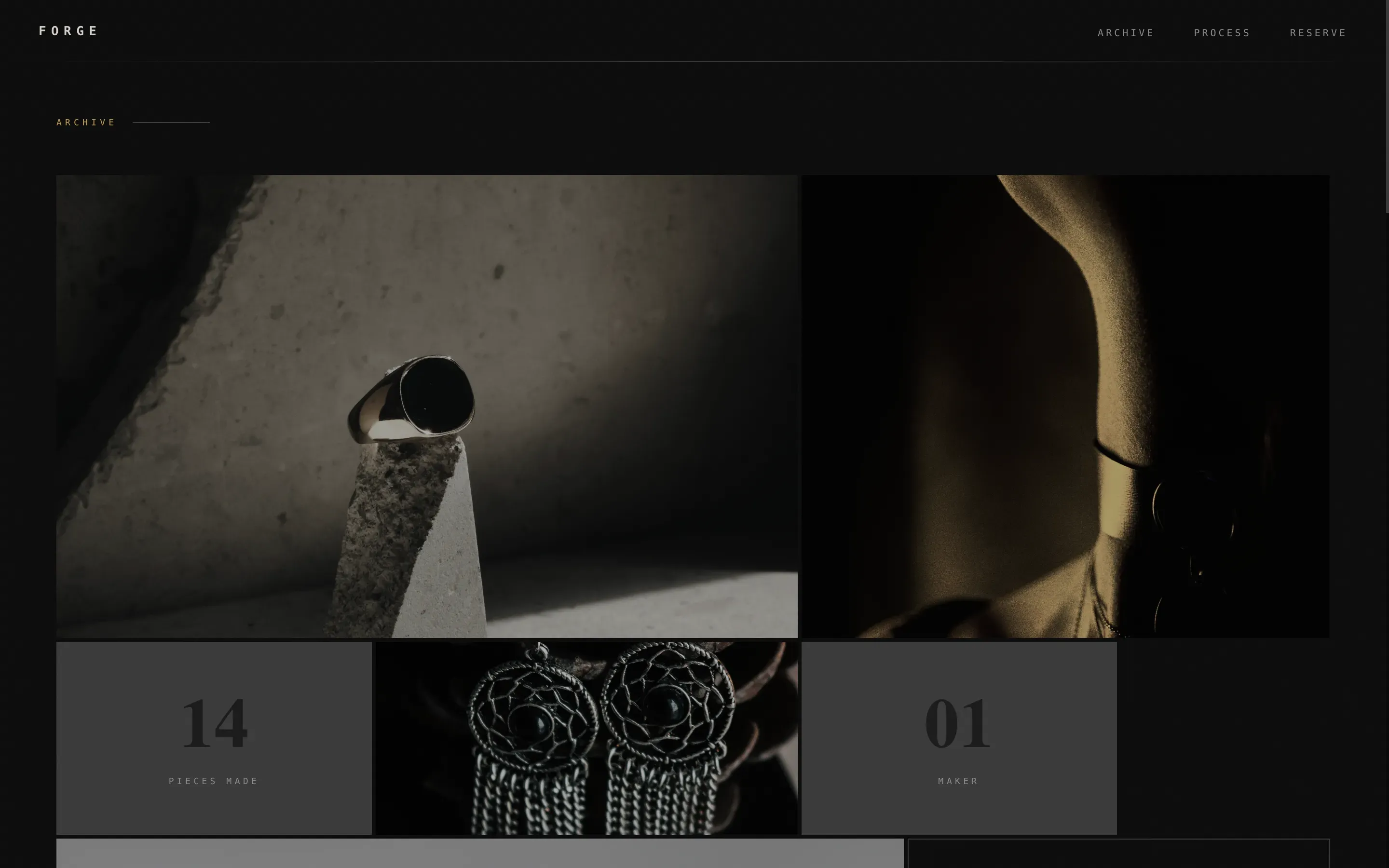
Asymmetric Bento Grid Archive
The portfolio archive uses a bento grid layout where cells are deliberately unequal in size and proportion. Each cell reveals a different piece through hover-triggered micro-animations: a bracelet that unfolds, earrings that sway, a chain that pools. Some cells display tight texture crops; others show full compositions with shadow play. This unconventional layout lets you showcase projects without forcing them into identical boxes, making the grid feel curated rather than catalogued.
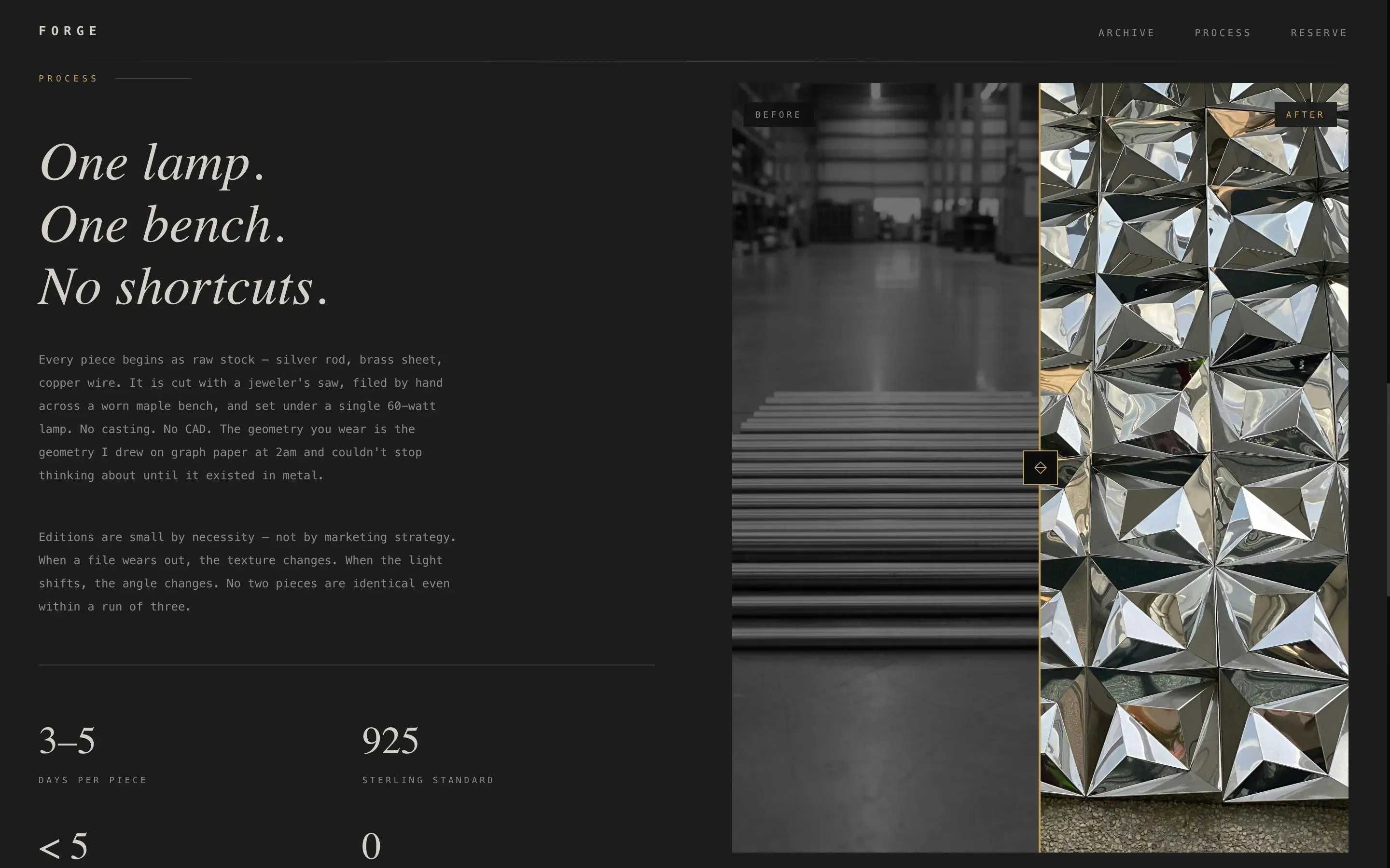
Dark Split-Panel Studio Section
A stark, dark split panel documents the studio process with a before-and-after view of raw material becoming finished object. This section gives visitors the handcraft proof they need to justify a direct purchase or commission inquiry. High resolution images of hammered and matte surfaces demonstrate the physical reality of the work and convey scale, weight, and material intention clearly.
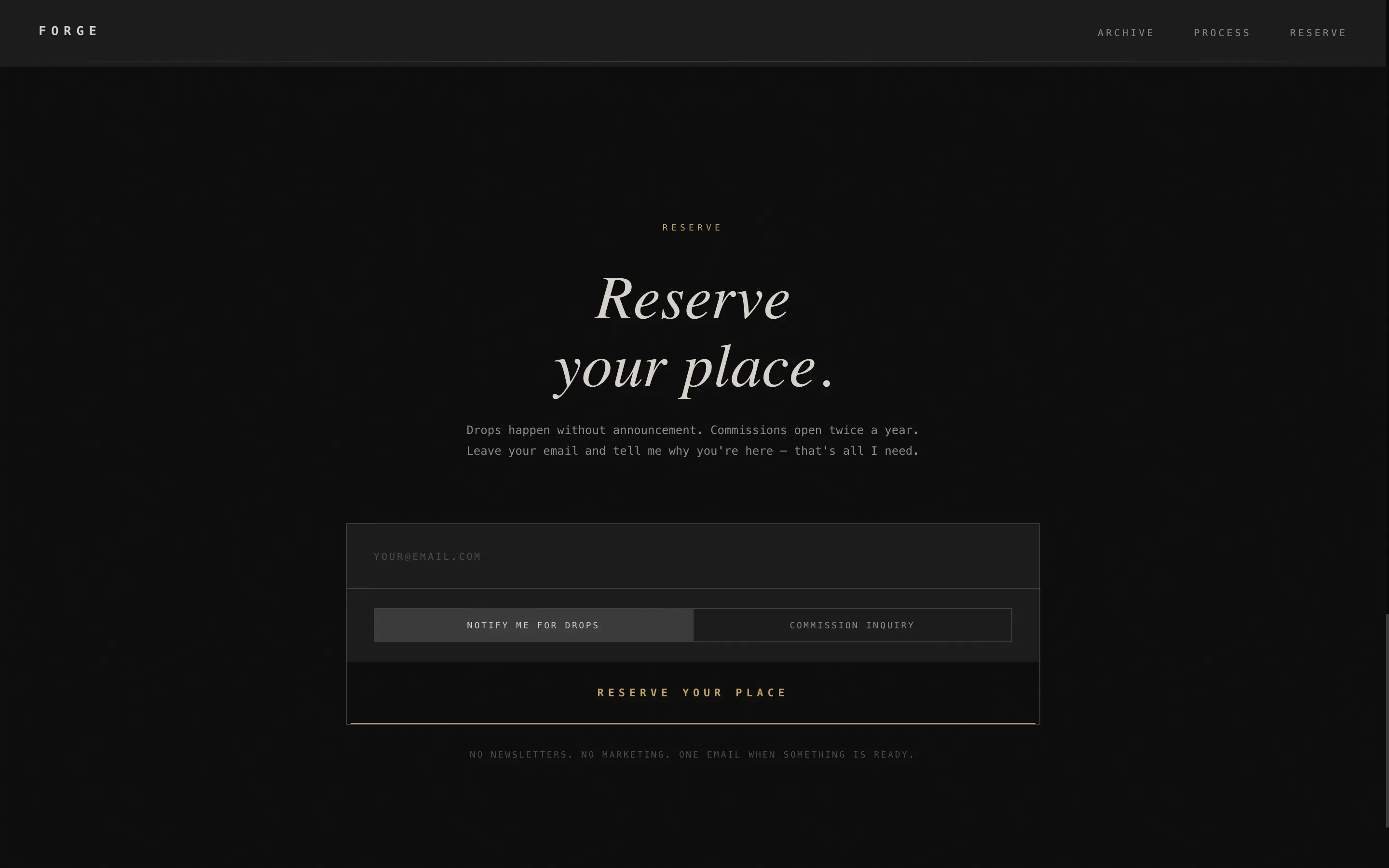
Minimal Waitlist and Commission Form
The Reserve section anchors the page with a purposefully minimal form. It asks only for an email address and a single toggle: "Notify me for drops" or "Commission inquiry." The submit button carries a gentle gold pulse, the only warm element on the entire page. Clear calls-to-action are essential on any jeweler portfolio, and this one earns the click by making visitors feel they have already been let inside something exclusive.
Superhuman Minimal Footer
The footer follows a stripped-down, Superhuman-style pattern. It provides essential links without visual noise and keeps the stark, matte tone consistent to the very end of the page. No decorative elements compete with the work; the footer simply closes the experience with the same confidence and economy that opened it.
Page sections overview
| Section | Purpose |
|---|---|
| Scroll-Jacked Hero | Lock viewport, rotate ring, stamp brand name letter by letter |
| Bento Grid Archive | Display portfolio pieces through hover micro-animations in asymmetric cells |
| Studio Process Panel | Show before-and-after handcraft proof in a dark split layout |
| Reserve Waitlist Form | Capture email and commission intent with a gold-pulse call to action |
| Superhuman Minimal Footer | Close the page with essential links and zero visual clutter |
Design & branding system
The visual identity is built on an Obsidian and Gold color system. Every background, surface, and typographic element draws from a strict four-token palette that prioritizes high contrast and material honesty over vibrant colors or decorative excess. The design should favor functionality and stark authenticity, reflecting principles rooted in brutalist architecture.
- Color tokens: void black (#0B0B0B), polished obsidian (#1A1A1A), raw concrete (#3A3A3A), and molten gold (#C5A258) reserved for interactive states and a single accent line
- Typography: JetBrains Mono for stamps and labels; Fraunces for editorial headings; both fonts reinforce the bold typography system and support high contrast body text legibility
- Style language: brutalist design with matte darkness, concrete texture background, deliberate negative space, and zero decorative ornament
Mobile & speed optimization
The template is built desktop-first, matching how collectors and editors browse portfolio pages. Animation and interactivity are designed to use GPU-accelerated transforms. Reveal timing uses IntersectionObserver so elements load only when they enter the viewport.
- GPU-accelerated transforms keep scroll-jacked animations smooth on capable devices
- IntersectionObserver-driven bento cell reveals reduce unnecessary rendering on load
- Desktop-first layout structure ensures the primary device experience is fully resolved before scaling down
How this template helps you convert
Brutalist portfolio landing pages often reduce bounce rate by holding visitors who came looking for something different. This template converts through atmosphere and restraint rather than aggressive calls to action.
- The scroll-jacked hero forces a moment of attention before any text appears, so visitors who reach the brand stamp have already committed time and focus to the piece, arriving at the form with confidence rather than skepticism.
- The gold pulse on the submit button is the only warm element on the entire page. That strategic contrast makes the call to action feel like an invitation rather than a sales push, which is especially effective when your audience are collectors who favor authenticity.
- The single-toggle form reduces friction to a minimum. Visitors can sign up for drop notifications or signal commission intent in one step, which helps you track two distinct audience segments without complicating the experience.
Other information about this template
The Forge bold brutalist jeweler portfolio landing page template is built on principles drawn from brutalist websites and the broader tradition of brutalist architecture applied to digital design. Brutalist web design is inspired by the architectural movement of the mid-20th century, characterized by raw concrete and functional design. It is a rebellion against decorative excesses, appealing to brands that value authenticity.
- No-code landing page builders allow users to create websites without any coding knowledge, and this template is structured for platforms that embrace that approach. Unicorn Platform is a no-code website builder that offers templates specifically for jewelry brands, making it easy to deploy pages like this quickly after configuration.
- Using templates helps users create professional-looking pages without hiring a developer, and no-code tools let makers focus on content and design rather than technical issues.
- Brutalist websites often feature monochromatic or highly limited color schemes, and this template sticks to exactly that: four tokens, one warm accent, no vibrant colors used structurally.
- Bold typography paired with unconventional layouts is a core principle across effective brutalist examples. The use of JetBrains Mono and Fraunces here follows that logic, using oversized fonts to emphasize key moments without relying on decorative elements.
- Google Analytics and similar tracking tools can be connected to pages built on supported platforms to track visitor behavior, measure sign-up performance, and determine which sections hold attention. Connecting Google Analytics is a standard step when deploying any portfolio site for ongoing performance review.
- Social media platforms can be linked from the footer to extend the brand's reach beyond the landing page itself.
- A compelling brand story can enhance the effectiveness of any landing page. Including style and process description, along with clear studio services information, helps collectors and editors understand the range of work available before they sign up.
- The template is an excellent choice for makers who want a lasting impression on niche, high-intent visitors without the overhead of a multi-page site build.
Theme
Bold Brutalist
Creative direction
Interactive Explorer
Color system
Obsidian & Gold
Direction
Waitlist/Coming Soon
Page Sections
Scroll-jacked Ring Rotation Hero
Asymmetric Bento Grid Portfolio
Dark Studio Process Panel
Gold-pulse Waitlist Form
Superhuman Minimal Footer
Related questions
Can I use this template without writing custom code?
What fonts does this template use?
Is this template suitable for a working jeweler who also takes commissions?
How does the scroll-jacked hero work in practice?
Can I connect this page to tracking tools after launch?


