Oncology Medicine Professional Website Template
A sidebar companion landing page built for oncology private practices. It leads with a five-step interactive care assessment, walks patients through a fear-reframe arc, and resolves into a personalized on-page summary card with a consultation call to action. Every section is designed to replace anxiety with a clear, actionable plan.
by Rocket studio
Quick summary
This template is a single-page sidebar companion layout built for an oncology private practice. A five-step interactive assessment anchors the experience, guiding newly diagnosed patients, survivors, and caregivers from fear-driven research to a booked consultation. The design pairs a warm clinical visual identity with a structured Problem-to-Solution scroll arc.
Who this template is for
This template is built for private oncology practices that treat patients personally and consistently. It speaks directly to patients and caregivers in high-stakes research mode, not medical administrators managing dashboards.
- Oncologists running a private practice who want to demonstrate same-physician continuity
- Newly diagnosed patients researching breast, lung, or colorectal cancer treatment options
- Adult children or caregivers researching on behalf of a parent who has just received a diagnosis
What problem this template solves
Most oncology websites feel institutional. They list credentials, post generic bios, and never address the specific fears a patient carries into their first search. This template is built around those fears directly.
- Patients cannot tell one practice from another when every website sounds the same
- Newly diagnosed individuals want a plan immediately but do not know what questions to ask
- Caregivers researching at 2 a.m. need reassurance and a clear next step, not a contact form
What you get with this template
You get a fully structured sidebar companion landing page with a high-interactivity assessment tool at its center. The layout is desktop-first with a responsive mobile stack.
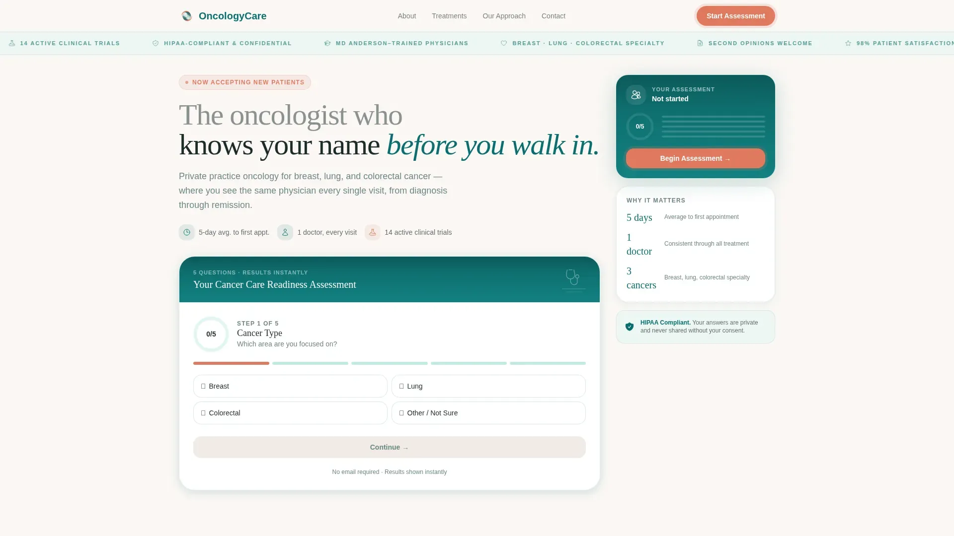
- A five-step progressive disclosure assessment with a live coral progress ring and on-page results
- A contextual sidebar that shifts state across scroll, from assessment tracker to a final personalized summary card
- Five content sections including a hero estimator, fear-reframe blocks, a 30-day visual timeline, testimonial spotlight cards, and a transparent consultation tier section
Feature list
A paragraph introduces this section: each feature below maps directly to a functional component described in the source brief, giving you a clear picture of what is built into this template.
Five-Step Care Readiness Assessment
The assessment uses progressive disclosure across five questions: cancer type via an illustrated body-map selector, known stage with a reassuring "not sure yet" option, care priorities, insurance type, and preferred first-appointment window. A coral progress ring fills visually as each answer is submitted.
On-Page Personalized Summary Card
When the assessment is complete, the template generates a summary card directly on the page. No email gate. The card includes a secondary call to action to schedule a no-obligation consult and displays a direct phone number, so the patient can act immediately.
Contextual Scroll-Synced Sidebar
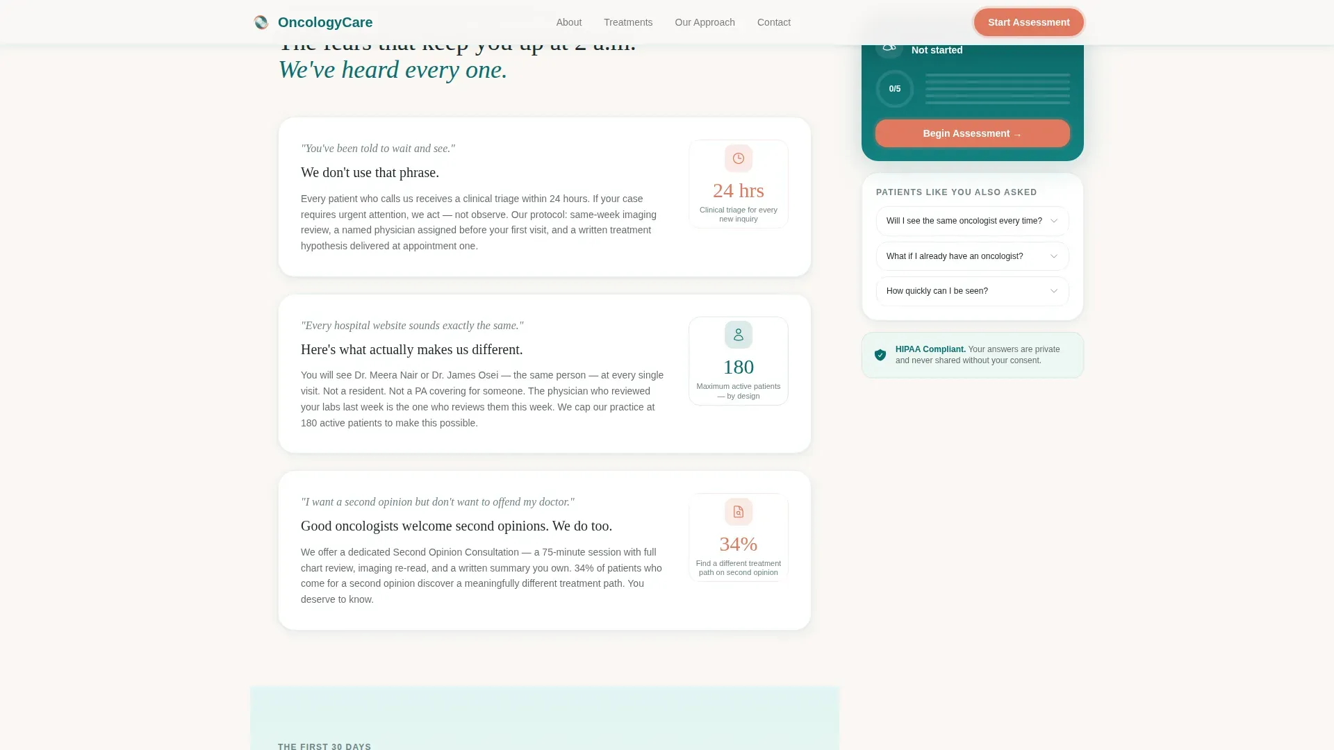
The sidebar travels with the reader as they scroll. It opens as an assessment progress tracker, transitions mid-page to a "Patients Like You Also Asked" module, and resolves near the bottom into a personalized next-step summary card. The sidebar state changes are synchronized with scroll position.
Fear-Reframe Content Blocks
Three distinct sections each name a real patient fear and pair it with a concrete practice response. Examples include addressing the "wait and see" instruction, the difficulty of comparing hospitals, and the hesitation around seeking a second opinion. Each response references named protocols, average days-to-first-appointment data, or similar specifics.
30-Day Visual Timeline
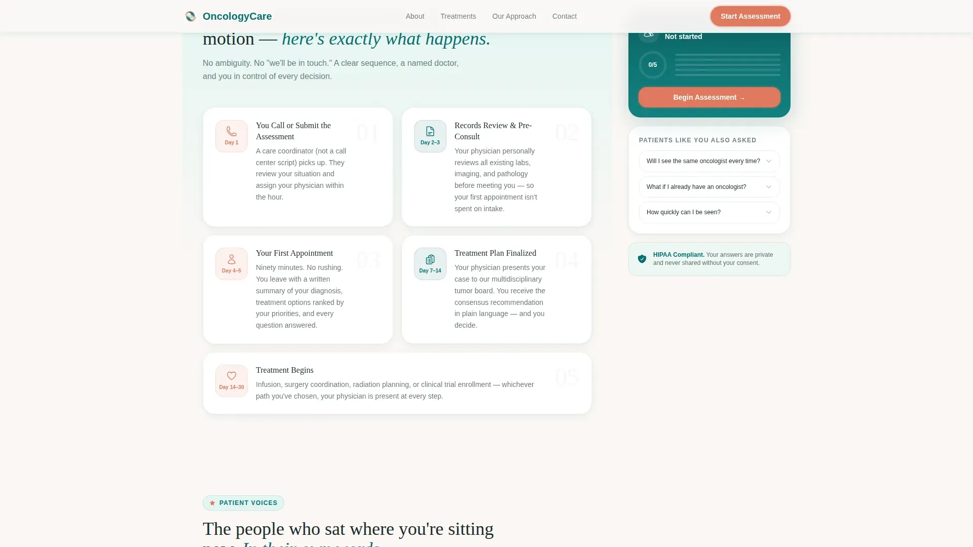
A dedicated section shows exactly what happens after a patient calls. This answers one of the most common caregiver and patient questions: what do the first 30 days look like? The timeline is visual and scannable, not a wall of text.
Testimonial Spotlight Cards
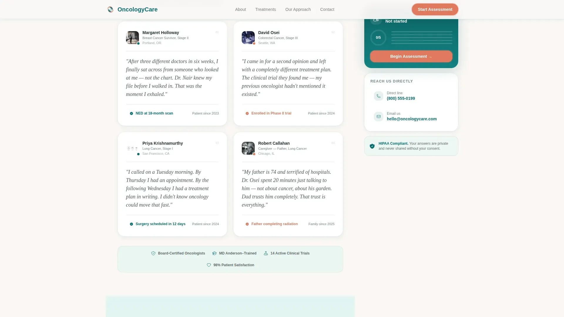
Named patient testimonials include specific cancer types and outcomes. Cards use a grayscale-to-color reveal and respond to mouse-tracking hover interaction, making the social proof feel earned rather than decorative.
Page sections overview
| Section | Purpose |
|---|---|
| Hero Estimator | Introduces assessment, coral progress ring, teal sidebar |
| Fear Reframe Blocks | Names three patient fears with concrete practice answers |
| 30-Day Timeline | Visualizes first month after initial patient call |
| Testimonial Spotlight | Named outcomes with grayscale-to-color card reveal |
| Consult Tiers | Shows consultation options and assessment summary card |
| Footer | Single-row linear footer with practice contact details |
Design & branding system
The visual identity follows a Soft Gradient theme built on the Teal Catalyst color system. The palette is described in the brief as "light filtering through sea glass onto white linen," clinical enough to signal trust and human enough to offer comfort. Gradients move vertically from teal to seafoam, dissolving like watercolor rather than cutting sharply.
- Deep clinical teal (#0B6E6E) anchors the sidebar and primary structural elements; seafoam (#E0F5F2) washes content backgrounds; warm pearl (#FAF7F4) provides visual breathing room
- Quiet coral (#E07A5F) appears exclusively on action states, progress indicators, and call-to-action buttons, never as a decorative color
- Typography pairs DM Sans for body text and interface labels with Fraunces serif for headlines, combining clinical readability with human warmth
Mobile & speed optimization
The template is built desktop-first to support the sidebar companion layout, and it stacks responsively for mobile users. The interactivity budget is intentionally focused.
- The page is static-first; client-side components are used only for the assessment interaction and sidebar state changes
- Scroll-reveal stagger, progress ring fill animation, and spotlight card mouse-tracking are the three animation layers, keeping motion purposeful rather than heavy
- On mobile, the sidebar companion stacks below the main content column, preserving the summary card and call-to-action visibility
How this template helps you convert
Every layout and copy decision is aimed at one outcome: moving a frightened patient from passive reading to an active first step. The assessment does the heavy lifting.
- The assessment gives value before asking for anything. The patient receives a personalized summary card on-page, no email required, which builds trust before the consultation call to action appears.
- The fear-reframe arc reduces the most common objections section by section, so by the time the consult tier appears, the reader already feels understood and has a named plan in mind.
- The fixed sidebar call-to-action button ("See Your Personalized Care Summary") and the on-page phone number remain visible throughout the scroll, removing friction from the moment a patient is ready to act.
Other information about this template
This template was designed for the specific emotional register of oncology care. It is not a generic medical template adapted for cancer. The brief, the copy arc, and the component choices all originate from a single insight: the page should feel like the exhale after weeks of holding your breath.
- The illustrated header interface intentionally replaces stock photography of smiling patients; the estimator itself communicates "this page does something for you right now"
- A small sidebar illustration of a stethoscope resting on an open notebook reinforces the private-practice, human-first identity without clinical coldness
- The template is categorized under Health and Medical, Oncology Medicine, and is suited to a practice treating breast, lung, and colorectal cancer patients in a private setting
- The five-question assessment is designed so that even a patient who selects "not sure yet" for cancer stage receives a relevant, reassuring summary rather than a dead end
Theme
Soft Gradient
Creative direction
Problem→Solution Arc
Color system
Teal Catalyst
Style
Sidebar Companion
Direction
Quiz/Assessment
Page Sections
Five-step Progressive Assessment
On-page Personalized Summary Card
Contextual Scroll-synced Sidebar
Fear-reframe Content Sections
Day Visual Timeline
Testimonial Spotlight Cards
Related questions
Does the assessment require patients to enter an email address?
Can this template support a practice that treats multiple cancer types?
Is the sidebar visible on mobile devices?
What social proof elements are included in this template?
Is this template designed for a solo oncologist or a larger group?



