Epilepsy Care Booking Website Template
A single-page epilepsy telehealth landing page built around a scored care-gap quiz. Visitors answer four quick questions about seizure frequency, current medications, last specialist visit, and seizure action plan status. The template then delivers a personalized care summary and invites them to book a forty-eight-hour consult with a board-certified epileptologist, all without leaving the page.
by Rocket studio
Quick summary
This landing page template is designed for an epilepsy telehealth practice. It opens with a disarming multi-step quiz above the fold, walks visitors through a structured comparison of their current care, and closes with a clear invitation to book a specialist consult. The tone is calm and clinical, built to earn trust before it ever asks for a commitment.
Who this template is for
This template fits telehealth practices that connect epilepsy patients with specialist care. It is built for service providers who need a single, high-converting page rather than a full website.
- Adults managing breakthrough seizures on aging antiepileptic drug regimens who need a medication review
- Parents of newly diagnosed children who need school accommodation letters and a documented rescue medication plan
- Patients in rural neurology deserts where the nearest epilepsy center is a three-hour drive or more
What problem this template solves
Epilepsy patients routinely wait up to six months to see a specialist. That gap leaves breakthrough seizures unmanaged, medication regimens unchanged, and families without a written seizure action plan. This template addresses that frustration before a visitor scrolls past the first screen.
- No clear entry point for patients who need urgent specialist input but cannot access one locally
- No structured way to show visitors the specific gaps in their current care plan
- No low-friction path from "I need help" to "I have an appointment booked"
What you get with this template
The template ships as a fully designed, single-page layout with every section pre-built and ready to customize. The visual hierarchy and interaction flow are already decided, so you spend time on content, not on layout puzzles.
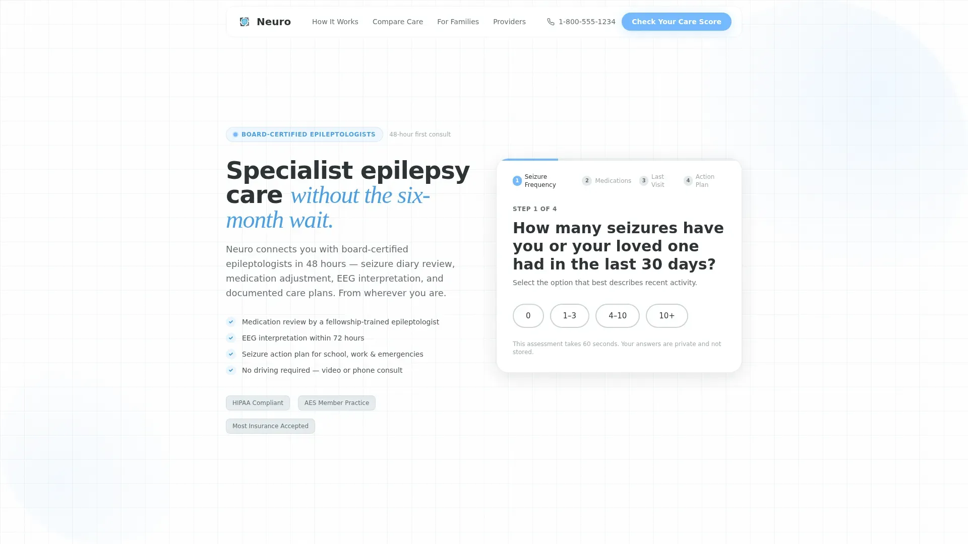
- A multi-step quiz form with pill selectors, a live progress bar, and a personalized care score output
- A seven-row comparison table contrasting current care against specialist telehealth care
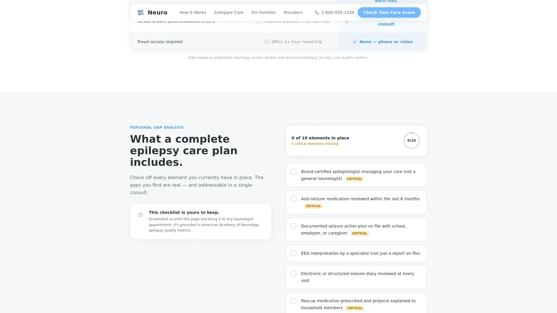
- A complete epilepsy care plan checklist, three patient testimonial blocks, and a dual call-to-action footer
Feature list
This section covers the core interactive and structural components built into the template.
Multi-Step Care Score Quiz
The quiz opens above the fold with a single question about seizure frequency in the last thirty days. Each step collects one piece of information: seizure count, current antiepileptic medications via multi-select, date of last neurologist visit, and whether a documented seizure action plan exists. At the end, visitors receive a personalized care gap summary they can screenshot and bring to any doctor.
Side-by-Side Comparison Table
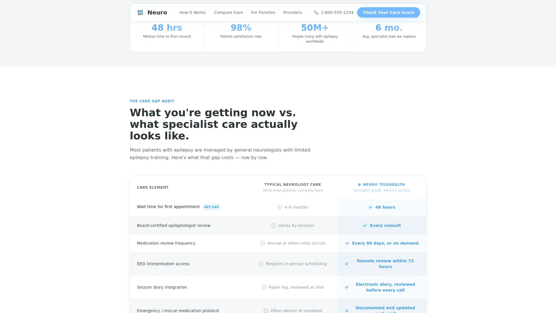
A seven-row audit table sits directly below the quiz preview. It contrasts "Your Current Care" against "Specialist Telehealth Care" across rows including wait time, medication review frequency, access to electroencephalogram (EEG) interpretation, emergency protocol planning, and school or work accommodation letters. Sky blue checkmarks stack on the telehealth side while slate dashes accumulate on the other, making the gap visible without a single fear-based sentence.
Complete Care Plan Checklist
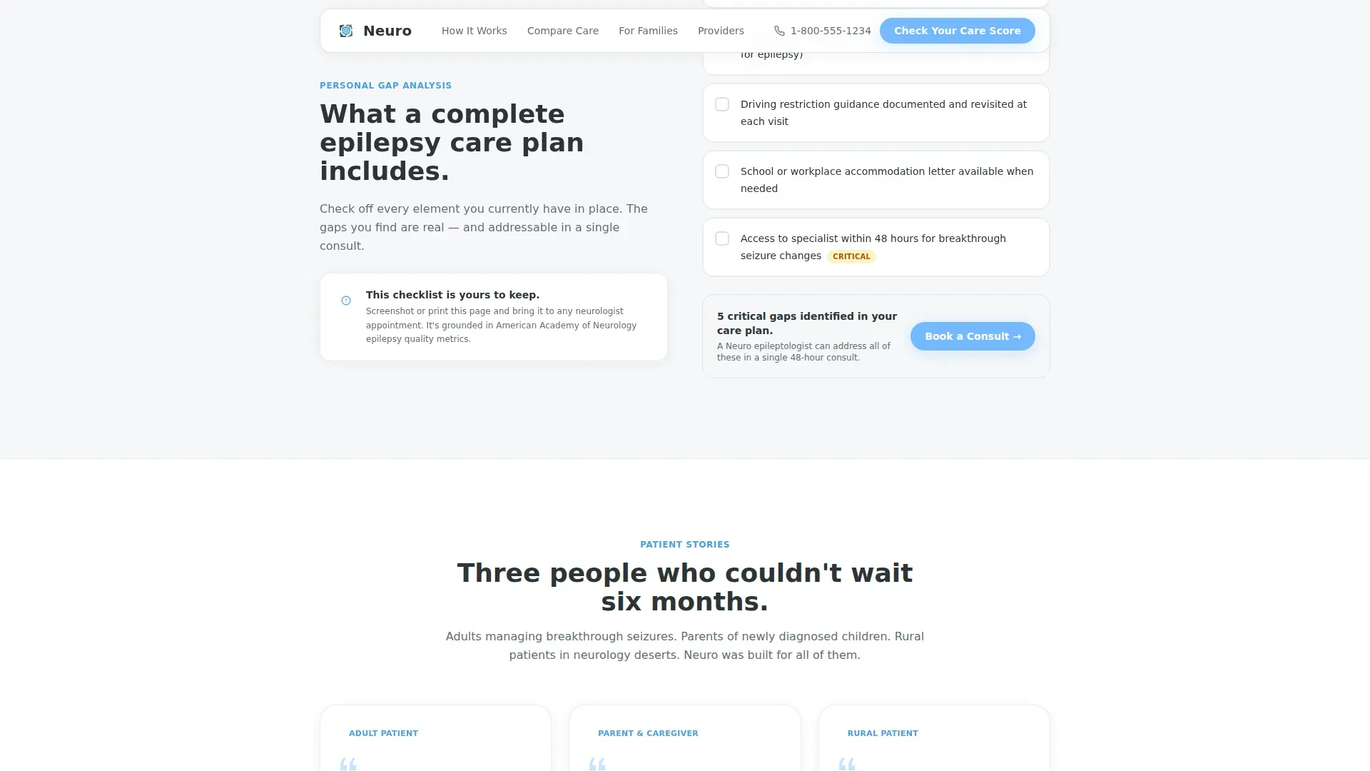
An accordion-style checklist section titled "What a Complete Epilepsy Care Plan Includes" lets visitors mentally audit what they already have. Each item can be expanded for a brief explanation. The section builds quiet urgency by showing what a thorough care plan looks like, not by alarming the reader.
Dual Call-to-Action Footer
The final section presents two paths. The primary call to action, "Check Your Epilepsy Care Score," anchors back to the quiz. The secondary option, a "Talk to Our Care Navigator" click-to-call button, catches visitors who want a human voice before committing. Both options sit in the same visual field so neither path is buried.
Patient Testimonial Blocks
Three pre-built testimonial cards cover the three core audience segments: an adult with breakthrough seizures, a parent of a newly diagnosed child, and a rural patient who could not access a nearby epilepsy center. Each card is designed to carry a specific outcome detail, grounding social proof in real situations rather than generic praise.
Page sections overview
| Section | Purpose |
|---|---|
| Multi-Step Quiz Hero | Collect seizure data and generate a care score above the fold |
| Comparison Audit Table | Visualize gaps between current care and specialist telehealth care |
| Care Plan Checklist | Let visitors self-audit against a complete epilepsy care plan |
| Patient Testimonials | Build trust with three audience-specific outcome stories |
| Final Call to Action | Offer two conversion paths: book a consult or call a care navigator |
| Single-Row Footer | Provide essential practice links in a compact linear layout |
Design & branding system
The template uses a Medical Clarity visual theme. Every color choice is intentional: the palette reads sterile enough to trust and bright enough to breathe, like a hospital window on a clear morning.
- Deep medical charcoal (#2D3436) for primary headings and body text, giving clinical content the visual weight it deserves
- Open-sky blue (#74B9FF) on every interactive element including buttons, progress bar fills, pill selectors, and checkmarks so the eye always knows where to click next
- Clinical slate (#636E72) for secondary copy and table borders, with cloud white (#DFE6E9) backgrounds keeping sections airy and easy to read
Mobile & speed optimization
The template is built mobile-first because many of its target users cannot drive and rely on a phone. Rural patients on mobile data are a named priority in the design brief.
- The multi-step form uses large pill-shaped tap targets and a visible progress bar that works cleanly on small screens
- Static page sections use server-side rendering while the interactive quiz form is isolated as a client component, keeping the initial page load light
- GSAP scroll reveals and form step transitions are set to a medium animation intensity, providing engagement without heavy resource demands on slower mobile connections
How this template helps you convert
The page is engineered to earn the click before it asks for one. Every section moves the visitor one step closer to booking by first delivering genuine value.
- The quiz gives visitors a free, scored care assessment before asking for any contact details, making the page useful even if they never book a consult.
- The comparison table makes the six-month specialist wait tangible by placing it next to the forty-eight-hour telehealth alternative in the same row, turning an abstract frustration into a visible, quantified gap.
- The dual call-to-action footer removes the all-or-nothing pressure by offering a softer human-voice path alongside the primary booking route, reducing drop-off from visitors who are close but not yet ready to schedule.
Other information about this template
This template was designed for the United States market, using English copy, USD pricing references, and MM/DD/YYYY date formatting throughout. It reflects a telehealth context where approximately 6.38 out of every 1,000 people in the population live with epilepsy, grounding the service in real-world prevalence.
- Typography uses DM Sans for all body text and user interface elements, with Fraunces as a serif display face for emotionally resonant moments such as testimonial pull quotes
- The reported patient satisfaction benchmark embedded in the social proof section is 98 percent, and the core service metric is a forty-eight-hour consult turnaround
- Animation is handled by GSAP with scroll-triggered reveals on table rows and a smooth step transition inside the quiz form; interactivity is classified as high throughout the template
Theme
Medical Clarity
Creative direction
Checklist & Audit
Color system
Slate & Sky
Style
Comparison Table
Direction
Quiz/Assessment
Page Sections
Multi-step Care Score Quiz
Seven-row Comparison Table
Accordion Care Plan Checklist
Dual Call-to-action Footer
Audience-specific Testimonial Cards
Related questions
Can I customize the quiz steps and care score output?
Does the comparison table support more or fewer than seven rows?
Is this template suitable for a pediatric epilepsy audience?
What does the click-to-call button require to set up?
Can visitors save or print their care score summary?



