DEI Consulting Landing Page Template | Corporate Precision
Belong is a Corporate Precision DEI consulting landing page template built for firms that turn inclusion ambiguity into boardroom-ready strategy. It pairs a live organization counter, escalating before-and-after case study panels, a 12-question Inclusion Readiness Assessment, and a three-phase methodology strip into one focused, data-forward single-page experience designed to convert CHROs, General Counsel, and Chief People Officers into qualified leads.
by Rocket studio
Quick summary
Belong is a single-page DEI consulting template that leads with data and earns trust fast. A live-updating ticker counts organizations that have completed the Inclusion Readiness Assessment. Four zigzag case study panels show real before-and-after metrics. A 12-question progressive quiz scores each visitor and delivers a tiered PDF report. Every layout decision supports one goal: turning a skeptical HR leader into a booked conversation.
Who this template is for
This template is built for DEI consulting firms that sell to senior decision-makers inside mid-market and enterprise organizations. The language, structure, and conversion flow all speak directly to the people sitting across the table in a pay equity review or a compliance briefing.
- Chief Human Resources Officers facing a first pay equity audit or EU pay transparency directive
- Newly appointed Chief People Officers who inherited a diversity report full of stock photos and no data infrastructure
- General Counsel and senior HR leaders who need to demonstrate an organization's commitment to equity in measurable, defensible terms
What problem this template solves
Most DEI consulting pages feel like brochures. They list values, show smiling stock photography, and ask visitors to "reach out." That approach does not build confidence with a CHRO under time pressures or a CPO staring at a gap-filled representation report. Belong solves the credibility problem at the first scroll.
- Vague aspirational language gets replaced with stark before-and-after metrics that show real change in hiring pipelines and promotion practices
- The absence of a qualifying tool means visitors leave without understanding where their organization stands, so the assessment captures intent before it evaporates
- Generic page layouts scatter attention, while this focused single-conversion structure guides every visitor toward one clear action: measuring their readiness
What you get with this template
You get a complete, structured landing page layout purpose-built for a DEI consulting firm. Every section is pre-architected for the narrative arc described in the brief, from social proof at the top to a scored assessment at the bottom.
- Hero section with a live organization counter ticker, a bold social proof headline, and the primary "Measure Your Readiness" call to action
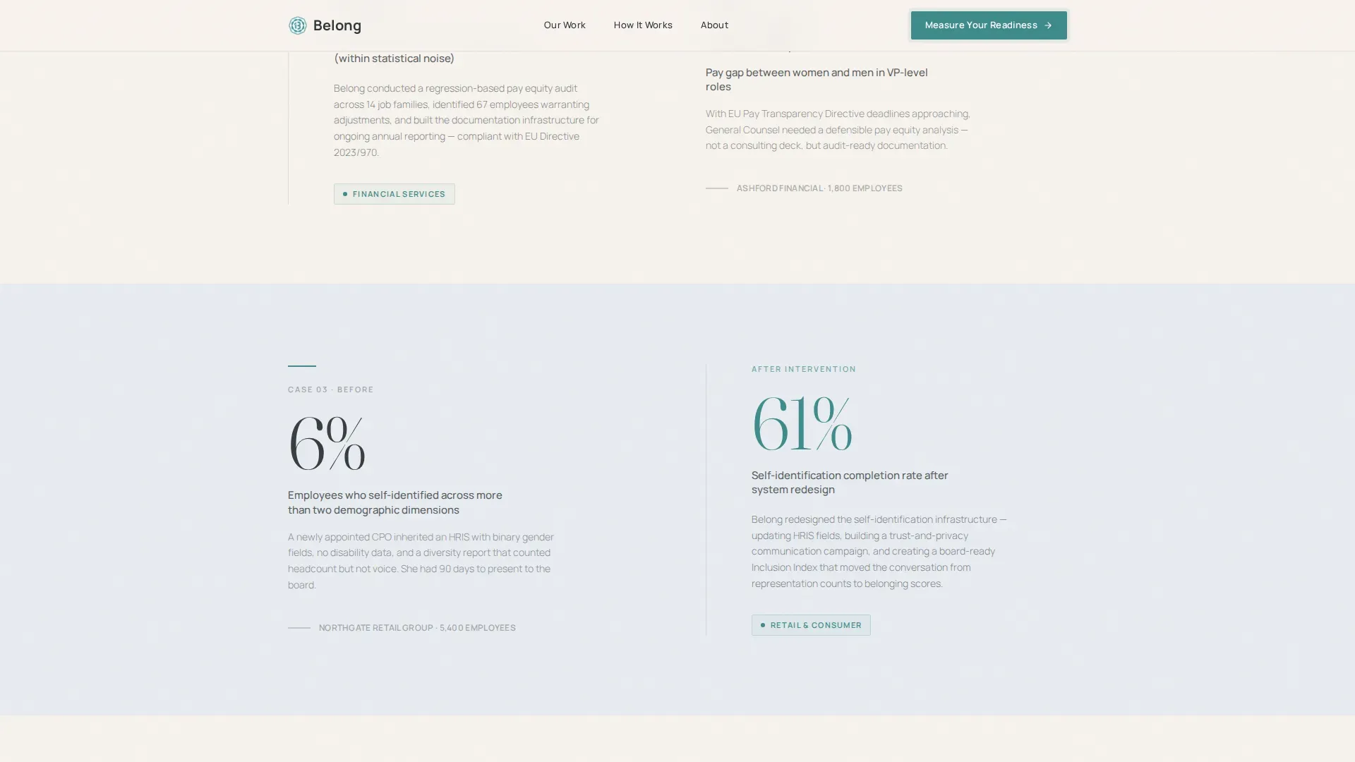
- Four alternating zigzag case study panels that escalate from a 200-person tech startup to a 14,000-employee healthcare system, each split between a before metric and an after narrative
- A 12-question progressive assessment modal with a radial teal progress ring, three scored Inclusion Readiness Tiers (Foundation, Developing, Embedded), and a work-email capture tied to a benchmarked PDF report
Feature list
This section describes the built-in functional and design components included in the Belong template.
Live Organization Counter Ticker
The hero opens with a live-updating counter displaying the number of organizations that have completed the Inclusion Readiness Assessment. The count climbs in real time against a warm parchment field, making social proof the very first thing the eye touches. The number is large enough to feel like a scoreboard; the typography is restrained enough to feel like a research report.
Zigzag Case Study Panels
Four alternating left-right panels tell escalating client stories. The left side holds a stark before metric in large charcoal type: an attrition rate, an engagement score, or a representation gap. The right side reveals the after result alongside one tight paragraph describing the intervention. As the visitor scrolls, the teal accent deepens subtly section by section, mirroring the growing weight of the evidence. The scroll feels like reading a dossier, and each case builds the argument that measurement precedes real change.
12-Question Progressive Assessment Modal
The assessment is the conversion engine of this template. It opens as a modal and begins with low-friction demographic selections before moving into diagnostic territory. Questions cover pay equity analysis frequency, demographic self-identification options, and promotion practices audit cadence. Each answer subtly rotates a radial SVG progress ring in teal. On completion, the visitor receives a scored Inclusion Readiness Tier and is invited to enter a work email to unlock a benchmarked PDF report. The email capture feels like a reward because the quiz has already delivered value.
Three-Phase Methodology Strip
A horizontal strip below the second mid-page call to action lays out how the firm works across three phases. This section gives skeptical decision-makers a process view before they commit to a conversation. It turns abstract consulting expertise into a legible sequence of steps, supporting the sense of structure and accountability that CHROs and legal teams require.
Mid-Page Assessment Call to Action Break
A full-width break section appears after the third case study panel and repeats the "Measure Your Readiness" call to action. This placement catches visitors who scrolled past the hero call to action and reintroduces the assessment at the exact moment case study evidence has peaked. It is a quiet, confident nudge, not a hard sell.
Linear Single-Row Footer
The footer follows a clean, single-row linear pattern. It holds essential links and keeps the page visually closed without adding navigation distractions that pull visitors away from the conversion path.
Page sections overview
| Section | Purpose |
|---|---|
| Hero ticker | Display live org count and primary call to action |
| Case study one | Before versus. after, 200-person tech startup |
| Case study two | Before versus. after, mid-market scenario |
| Case study three | Before versus. after, escalating complexity |
| Case study four | Before versus. after, 14,000-employee healthcare |
| Mid-page call to action | Repeat assessment prompt after case evidence |
| Methodology strip | Show three-phase consulting process |
| Assessment modal | 12-question quiz, radial ring, tier result, email |
| Single-row footer | Essential links, closed page structure |
Design & branding system
The visual identity follows a Corporate Precision theme built on a Soft Mist color palette. The aesthetic feels like a freshly printed strategy deck on heavy matte stock: restrained, unhurried, and quietly authoritative. Every color choice earns its place, and teal appears only where something is actionable or measurable.
- Backgrounds alternate between morning fog gray (#E8ECF1) and warm parchment (#F7F3EE), with all body copy set in boardroom charcoal (#2D3406); a single decisive teal (#3D8B8B) is reserved exclusively for interactive elements, data highlights, and the radial progress ring
- Typography pairs Fraunces (a serif display face) for headlines and large numbers with Manrope (a clean sans-serif) for body text, creating a tension between editorial authority and functional clarity
- Animations are medium-weight: staggered fade-ups on scroll, a live counter increment on page load, scroll-triggered section reveals, and a radial SVG ring animation inside the assessment modal
Mobile & speed optimization
The template is designed desktop-first, reflecting the reality that CHROs and CPOs typically review materials on a laptop in a boardroom or home office context. A solid mobile fallback ensures the experience holds up when a visitor switches devices between sessions.
- Touch-friendly button sizing and form fields on the assessment modal allow thumb-friendly interaction on smartphones without breaking the quiz flow
- Server Components power the static sections of the page, while the quiz modal and live counter run as Client Components, separating rendering concerns for a cleaner build structure
How this template helps you convert
Belonging to this template's conversion architecture means every design and content decision points toward one outcome: a work email tied to a scored readiness report.
- The live org counter and "11,400+ leadership teams have measured what they couldn't see" headline answer the buyer's first question ("Is this firm credible?") before a single paragraph is read, using social proof as the opening visual
- The four escalating case study panels move the visitor from curiosity to conviction by showing that embracing diversity and building an inclusive workplace culture produces specific, measurable outcomes across different industries and organization sizes
- The 12-question assessment delivers immediate personal value by scoring the visitor's own organization, making the email capture feel like unlocking a report they have already earned rather than paying a toll to talk to a salesperson
Other information about this template
This section covers additional context that helps buyers understand the full scope of what the Belong template supports and how it reflects sound DEI consulting practice.
The belong corporate precision dei consulting landing page template is designed around the principle that a DEI statement is not just words. It is a promise and an action plan that must be carried out. A meaningful DEI statement embodies the fundamental principles of creating a culture in which everyone can belong, contribute, and flourish. An effective and authentic statement speaks to an organization's commitment to diversity, equity, and inclusion in a way that resonates authentically with the people who make up that workplace.
Research consistently shows that diverse and inclusive teams outperform their counterparts in terms of innovation, decision making, and financial performance. More than half of all employees and job seekers consider a diverse workforce an important factor when evaluating companies and job offers, making the case studies in this template commercially relevant rather than purely ethical. Diversity in markets, customers, and talent influences business strategies and is essential for innovation, and organizations that embrace a diverse talent pool are better positioned to attract and retain top talent over time.
Building an inclusive culture takes time and effort. Tokenism can undermine the credibility of DEI initiatives by creating superficial attempts to increase diversity without genuine commitment. Overcoming challenges in DEI requires strategic planning, comprehensive education and training, and dedication from leadership at different levels of the organization. A lack of awareness and education among employees regarding the importance of DEI can impede meaningful progress, while resistance to change from employees and leadership can hinder progress in implementing DEI initiatives altogether.
The template's case study narrative creative direction reflects best practice in DEI consulting communication. Each section helps the client understand your expertise, process, and the impact of your work. The design avoids generic stock photos and corporate filler, relying instead on data as the visual. The page is structured to focus attention on a single conversion goal, stripping out navigation menus and sidebars that lead visitors away from the primary offer.
- The assessment modal's email capture form is intentionally limited to essential fields, reducing friction for corporate buyers who are wary of long data-entry requirements
- The template supports continual learning by framing each case study as a lesson in measurement methodology, not just a win story
- Consultants who use this template can customize the case study panels, methodology phases, and quiz questions to reflect their organization's unique culture and subject matter expertise
- The radial progress ring and tier scoring system (Foundation, Developing, Embedded) give diverse groups of visitors a personalized output, making the assessment reusable across industries and organization sizes
- The teal accent color appears on every interactive element and data highlight, creating a visual language where color signals action and measurable progress throughout the inclusive environment of the page


Theme
Corporate Precision
Creative direction
Case Study Narrative
Color system
Soft Mist
Style
Zigzag/Alternating
Direction
Quiz/Assessment
Page Sections
Live Organization Counter Ticker
Zigzag Before-and-after Case Study Panels
Question Progressive Assessment Modal
Three-phase Methodology Strip
Mid-page Assessment Call to Action Break
Soft Mist Color System and Typography Pairing
Related questions
Who is the primary audience for this template?
Can I customize the case study content and assessment questions?
What happens after a visitor completes the assessment?
Does the template include the PDF report or just the email capture flow?
How does the live organization counter work?


