Recruiting & Staffing Agency Professional Website Template
The Belong diversity recruiting discovery landing page template is a modular, card-grid landing page built for HR tech platforms that surface underrepresented talent. It features a persona-selector hero, animated pain-dashboard stats, persona-reactive solution cards, and a staged call-to-action flow. The design uses a calm Cloud Canvas color system to keep the focus on people, not decoration.
by Rocket studio
Quick summary
Belong is a single-page, card-grid landing page template designed for diversity recruiting platforms. It opens with a persona selector that immediately tailors the experience for talent leaders, hiring managers, or recruiters. From there, the page walks each visitor through a data-driven problem-and-solution arc, ending in a confident call to action. The entire layout is calm, spacious, and built around the candidates it helps surface.
Who this template is for
This template speaks directly to B2B teams operating in the HR tech and talent acquisition space. It is built for platforms and products that help organizations build a diverse workforce by surfacing candidates from talent pools that standard applicant-tracking filters miss entirely. If your product reaches people from diverse backgrounds, including historically Black colleges and universities (HBCUs), tribal colleges, disability employment networks, or veteran transition programs, this template gives you the right stage.
- Heads of diversity, equity, inclusion, and belonging (DEIB) who carry board-level mandates and face empty pipelines
- Talent acquisition leads at growth-stage companies filing their first Equal Employment Opportunity (EEO-1) report and under real pressure to show progress
- Agency recruiters who keep losing requests for proposals (RFPs) because their candidate slates look identical every time
What problem this template solves
Most diversity recruiting platforms describe their value in terms that are too broadly defined to be convincing. Vague claims about "inclusive hiring" rarely move a skeptical DEIB leader or a time-pressed talent acquisition manager. The challenge is not just messaging. It is sequencing: showing the visitor their blind spot before offering the solution. This template is designed to solve that exact problem by turning page structure into persuasion.
- Buyers arrive with skepticism. The persona selector immediately signals that this page understands their specific role and its specific challenges, removing the friction of irrelevant content.
- Recruiters and hiring managers need data, not slogans. The animated pain-dashboard section quantifies real challenges like EEOC complaint trends, homogeneity indexes, and time-to-fill benchmarks, making the case without a single word of hype.
- Conversion on recruiting and HR tech landing pages is hard to earn. The template stages the primary call to action so it solidifies only after the solution cards have made the case, which is the right order for buyers in this category.
What you get with this template
You get a fully structured, ready-to-customize landing page built around a clear narrative arc. Every section has a defined role in the visitor journey, and the design system keeps everything consistent without requiring any design decisions from you. The template covers the full flow from first impression to conversion, including a gated secondary path for visitors who are not yet ready to book a demo.
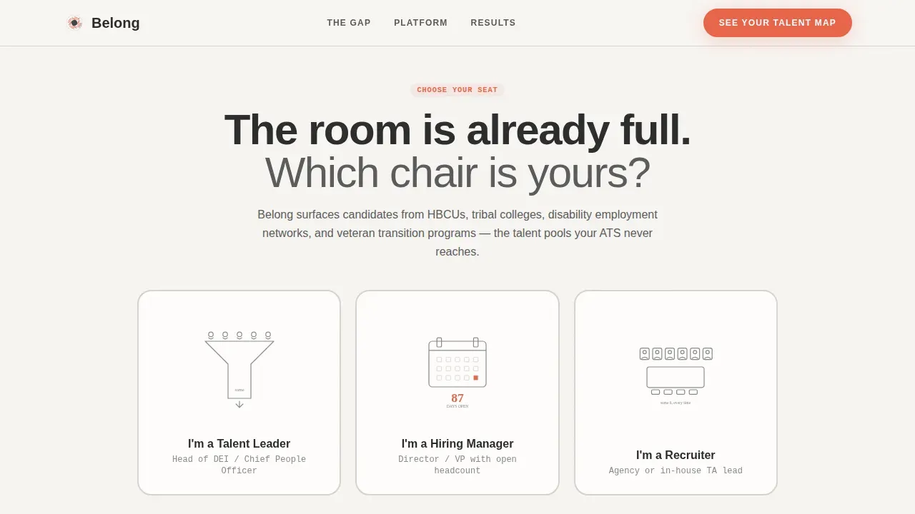
- A persona-selector hero section with three flipping identity cards, each holding a line illustration and a persona-specific one-sentence promise revealed on hover
- An animated pain dashboard with stat cards that count up on scroll, followed by modular solution cards that rearrange based on the selected persona
- A staged call-to-action section with a ghost button that solidifies into the coral accent color, plus a single-field email gate for a downloadable Pipeline Diversity Scorecard
Feature list
This template includes a carefully considered set of interactive and structural features. Each one is grounded in the recruiting and diversity niche it serves, and each one earns its place in the layout.
Persona-Reactive Hero Section
The hero section opens with three large, clickable identity cards centered on a warm white background. Each card represents a distinct visitor type: talent leader, hiring manager, or recruiter. Hovering a card triggers a CSS 3D flip that reveals a one-sentence promise tailored to that persona's daily frustration. A ghost call-to-action button sits beneath the cards, ready to guide visitors forward. This approach replaces generic stock photography with purposeful restraint, letting the structure do the storytelling. The hero section sets the entire tone of the page from the first scroll.
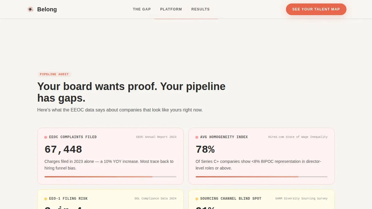
Animated Pain Dashboard
The second major section functions like a dashboard audit the visitor did not ask for but cannot ignore. Stat cards animate into view using an Intersection Observer, counting up to real figures tied to the selected persona. Examples include EEOC complaint trend data, homogeneity index scores, and time-to-fill benchmarks. The section uses JetBrains Mono typography for all data figures, giving each number a precise, credible weight. This section is where the template earns trust before making any ask.
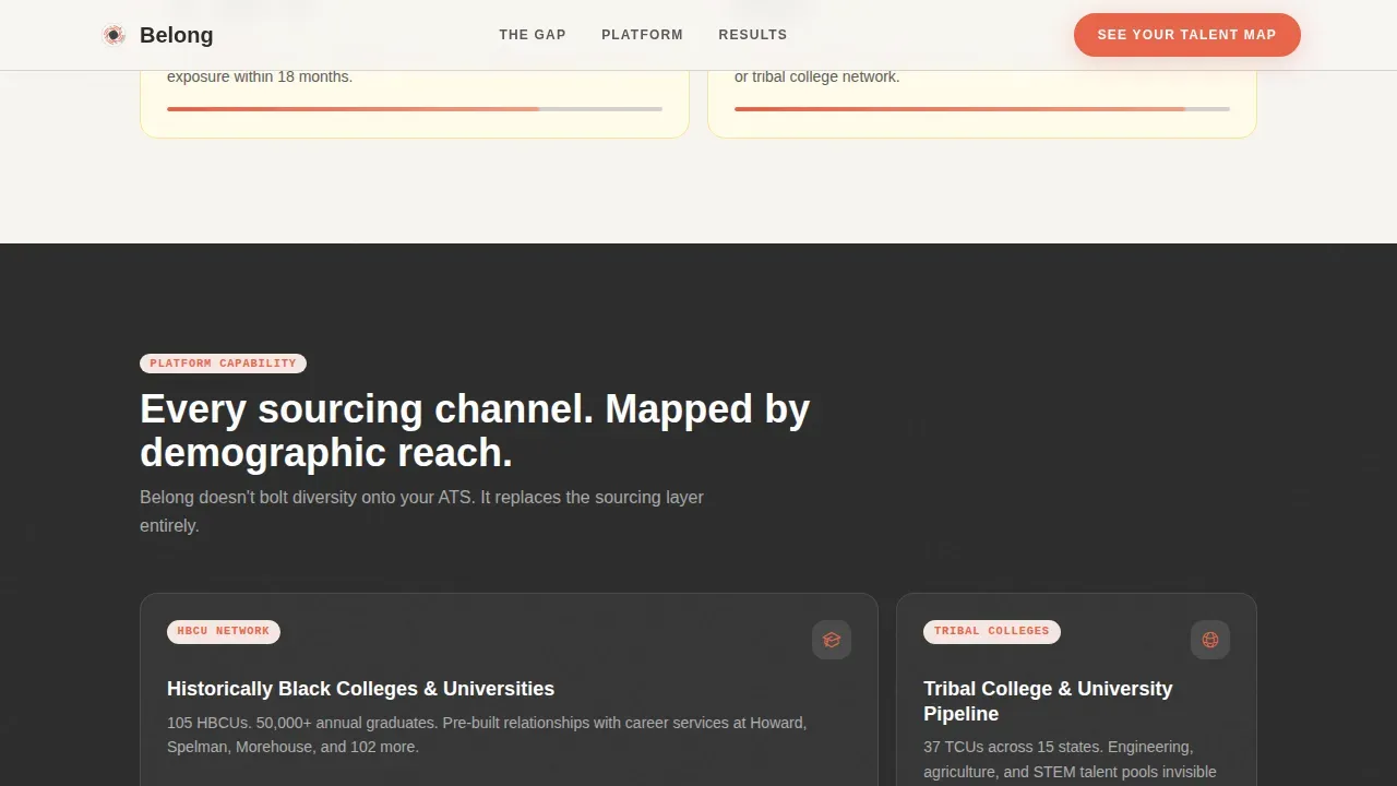
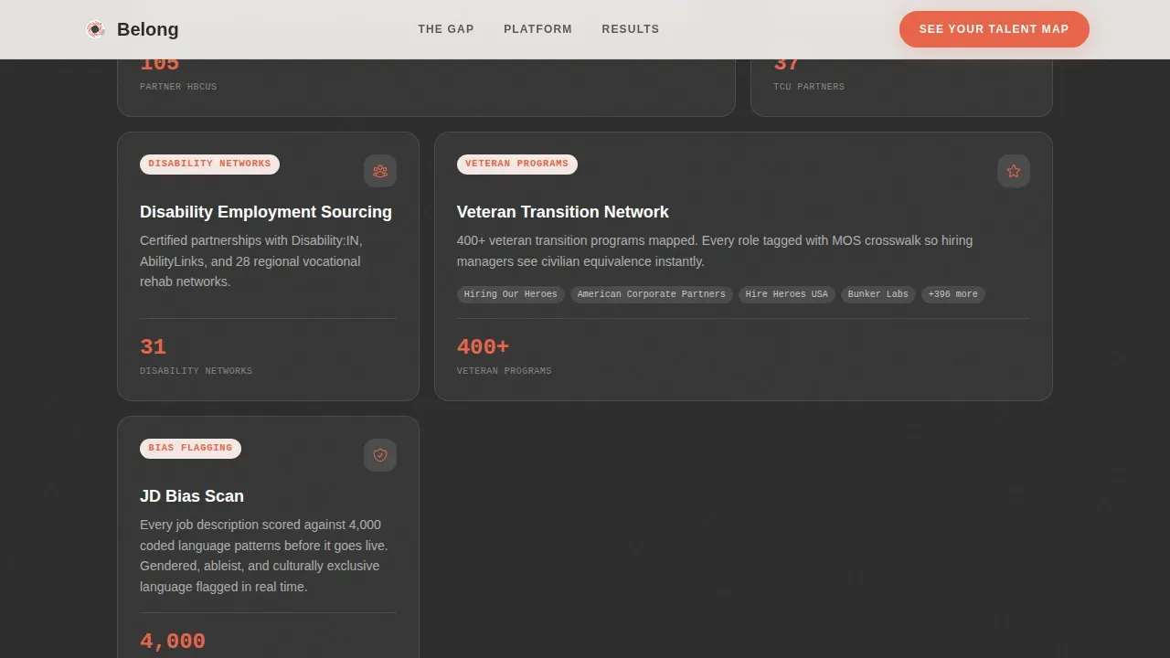
Modular Persona-Reactive Solution Cards
Immediately after the pain dashboard, a grid of solution cards dissolves in. Each card maps a specific capability to the pain point shown above it: sourcing channels organized by demographic reach, bias-flagging integrations, and slate certification workflows. The card grid rearranges itself based on the persona selected in the hero section, so a recruiter sees different cards than a DEIB head. This persona-reactive content swap is driven by client-side component logic, creating a curated scroll rather than a generic catalogue.
Staged Call-to-Action Progression
The primary call to action, labeled "See Your Talent Map," appears first as a ghost button beneath the persona selector. It solidifies into the vivid coral accent color only after the solution cards have loaded and made the case. This progression is intentional: the click is earned by the content that comes before it. A secondary conversion path offers a downloadable Pipeline Diversity Scorecard, gated behind a single work-email input field for visitors who are not yet ready to commit to a live walkthrough.
Social Proof and Trust Section
Between the solution cards and the final call-to-action block, the template includes a dedicated section for metric-led outcomes. Each proof item is structured around a named role, a specific pipeline number, and a concrete result. This format avoids the trap of generic testimonials and instead delivers the kind of measurable results that DEIB leaders and talent acquisition managers actually find credible. Social proof in this format reinforces the data-first tone established in the pain dashboard.
Single-Row Linear Footer
The footer follows a clean, single-row linear pattern. It keeps navigation minimal and on-brand, using the same Cloud Canvas color system and mist gray dividers as the rest of the page. The footer does not compete with the call-to-action section above it. Its job is to close the page without distraction, which fits the overall design philosophy of the template.
Page sections overview
| Section | Purpose |
|---|---|
| Persona Selector Hero | Identify visitor type and set persona-specific expectations |
| Pain Dashboard Stats | Quantify the visitor's specific recruiting challenges with animated data |
| Modular Solution Cards | Match each pain point to a platform capability, rearranged by persona |
| Social Proof Block | Deliver metric-led outcomes with named roles and concrete numbers |
| Call-to-Action Section | Convert visitors via demo request or scorecard download |
| Linear Single-Row Footer | Close the page cleanly without distraction |
Design & branding system
The visual identity follows a Directory and Discovery theme built around calm, deliberate spaciousness. The design philosophy is that the people in the cards should be the color. That means the palette is intentionally restrained so nothing competes with the candidate profiles and data the platform surfaces. The typographic system reinforces this: DM Sans in bold for headings, Manrope for body text, and JetBrains Mono exclusively for stats and data figures, which gives numbers a precise, almost terminal-screen credibility.
- Color system: warm white (#F7F5F2) as the dominant background, mist gray (#D6D2CC) for card borders and dividers, deep graphite (#2B2B2B) for all body text, and vivid coral (#E8654A) reserved exclusively for calls to action, active filters, and progress indicators
- White space is used generously throughout the layout, with the card grid structure providing rhythm without crowding. Cluttered layouts are avoided by design: each section has one clear job, and the page never tries to do two things at once.
- Line illustrations replace photography in the persona cards, and authentic, high-quality visuals are used in the social proof section to help candidates and buyers picture themselves in the environment the platform enables.
Mobile & speed optimization
The template is built desktop-first, reflecting the reality that heads of DEIB and talent acquisition leads do most of their research on desktop. That said, the layout is fully responsive, and the card grid adapts cleanly across screen sizes. Mobile optimization is built into the template structure so that mobile users never encounter broken layouts or awkward zoom behavior. More than 80 percent of job seekers use mobile devices to browse opportunities, so even a desktop-first recruiting page must perform well on smaller screens.
- The responsive design ensures that the persona selector, stat cards, and solution card grid all reflow correctly on mobile devices. The desktop experience remains the primary design target, but no section breaks on smaller viewports.
- Speed matters for any recruiting page. The template uses server components for static sections and client components only for interactive persona logic, which keeps load speed reasonable. Fast loading is supported by avoiding unnecessary scripts and keeping the animation layer lightweight. Slow loading is avoided by design, and the template is structured to load quickly without relying on heavy third-party embeds. Browser caching is compatible with the static-first architecture used for non-interactive sections.
How this template helps you convert
Diversity recruiting landing pages that earn conversions do not just list features. They take the visitor on a journey from recognition to resolution. This template is built around that principle from the first scroll to the final call to action. The conversion rate goal for recruiting landing pages typically falls between 2 and 5 percent, and this template is structured to reach the higher end of that range by removing every unnecessary friction point.
- The persona selector creates immediate relevance. Each visitor self-identifies in the hero section, and the page adapts to show them their specific pain data and matching solutions. Personalized landing pages consistently outperform generic ones because they speak directly to the reader's actual situation, not a broadly defined audience.
- The pain dashboard builds urgency through data. Animated stat cards using data science-style presentation make the cost of inaction visible before the solution is introduced. This sequencing earns the call to action rather than demanding it. Visitors who see their own challenges quantified are far more likely to engage with the solution cards that follow.
- The staged call-to-action progression removes premature pressure. The ghost button becomes solid only after the solution cards have loaded. The secondary scorecard download path captures visitors who need more time, converting a potential bounce into a qualified lead. Both paths track progress toward a demo, just at different speeds.
Other information about this template
This template sits at the intersection of HR tech marketing and DEIB strategy, and it is built to reflect best practices from both fields. The following points cover additional context that recruiters, product teams, and marketing leads will find useful when evaluating or customizing this template.
- The template is designed for the diversity recruiting niche and is particularly well-suited to SaaS companies operating in the talent acquisition community. It supports the full recruitment process from first impression to demo booking.
- Inclusion is treated as a structural principle, not a decorative one. The layout avoids language that is too broadly defined or reliant on vague claims. Every section is built to deliver measurable results and specific data rather than general statements about company culture.
- The page highlights how organizations can track progress toward diversity goals using KPI-driven frameworks. Measurable targets should be set for each objective in a diversity recruiting strategy, and this template gives platforms the visual structure to communicate that accountability clearly.
- Belonging goes beyond inclusion. When employees and job seekers feel that their insights and contributions are genuinely valued, engagement increases and retention improves. This template gives platforms a way to communicate psychological safety and a welcoming environment without resorting to stock photography of diverse handshakes.
- The template is suitable for platforms that serve candidates with veteran status, candidates from underrepresented groups, candidates who identify across a range of sexual orientation identities, and candidates from historically underfunded academic communities. Inclusive teams are built when the recruitment process reaches beyond the usual channels.
- Inclusive language practices are built into the copywriting approach. The template avoids masculine-coded words and jargon-heavy terms that can deter candidates from diverse backgrounds. Removing biased language from recruiting pages is a foundational step toward creating a genuinely welcoming environment.
- The belong diversity recruiting discovery landing page template is optimized to be found by search engines when DEIB buyers are researching platforms. The structure is clean and focused on what matters most for both human readers and search engines.
- Employee Resource Groups (ERGs) and mentorship programs designed for underrepresented groups can be highlighted within the solution cards section. These examples of inclusion in practice give job seekers and candidates a concrete sense of the work environment and company culture they would be entering.
- The page supports user behavior analysis through its modular, persona-reactive structure. Because each persona sees different content, teams can track which persona path drives the highest conversion rate and adapt the strategy accordingly.
- Interactive elements like the card flip animation, animated stat counters, and the ghost-to-solid call-to-action progression are key elements that distinguish this template from static recruiting pages. These interactive elements are intentional and purposeful, not decorative.
- For technical roles in data science and engineering, the template's JetBrains Mono typography for stat displays signals credibility. Candidates and buyers in technical roles respond well to data presented with precision rather than decoration.
Theme
Directory & Discovery
Creative direction
Problem→Solution Arc
Color system
Cloud Canvas
Style
Card Grid (Modular)
Direction
Click-Through
Page Sections
Persona-reactive Hero with Card Flip
Animated Pain Dashboard
Modular Persona-reactive Solution Cards
Staged Call-to-action Progression
Metric-led Social Proof Section
Cloud Canvas Design System
Related questions
Who is the primary audience for this template?
Can the persona selector content be customized for different roles?
How does the staged call-to-action progression work?
Is this template suitable for teams just starting a diversity recruiting strategy?
Does the solution card grid actually change based on the selected persona?


