Family First user experience Mastermind Landing Page Template
The Belong Family First user experience Designers Mastermind landing page template is a masonry-style, movement-driven page built for user experience designer-parents who log off on purpose. It combines a bold hashtag hero, a staggered masonry grid of social proof, a full-width manifesto break, and a two-step identity-commitment form to attract and qualify values-aligned community members.
by Rocket studio
Quick summary
This template gives you a warm, editorial landing page designed specifically for a user experience designer mastermind community where family comes first. The page opens with an oversized #DesignCanWait hashtag, flows through a momentum-building masonry grid of member proof points, and closes with a two-step lead form that feels less like signing up and more like raising your hand. It is free to customize and fast to launch.
Who this template is for
This landing page is built for user experience professionals who are also parents and who want to connect with peers who understand the tension between craft and presence. It speaks to people who have skipped evening meetups, done portfolio reviews during nap time, or billed fewer hours to make school pickup. The page earns trust before it asks for anything, which matters to an audience that is deeply skeptical of hustle-culture marketing.
- Senior product designers at Series B startups who leave the computer by 6 PM and want a community that does the same
- user experience leads at agencies and freelance interaction designers who need async resources and peer support on their own schedule
- Design managers who quietly enforce healthy team boundaries and hope to find others doing the same
What problem this template solves
user experience designers often face high-pressure environments, career plateaus, and the very real cost of choosing work over life. They feel lonely at the top, struggle to talk about burnout openly, and rarely find a community that treats logging off as a value rather than a weakness. Building emotional strength and setting healthy boundaries is essential for navigating these challenges, yet most design communities reward presence over intention. This template solves the specific communication problem of reaching that audience with a page that feels like it was written by someone who understands.
- Standard community landing pages fail to reflect the identity of designer-parents, so visitors bounce before they see the value proposition
- Generic sign-up forms demand too much too soon, which is the wrong approach for a curated, application-based mastermind community
- Most pages talk about benefits without making the visitor feel seen, which is a missed opportunity when your audience is specifically values-driven
What you get with this template
You get a fully structured, single-page masonry landing page ready to launch with your own content. Every section serves a clear conversion purpose, and the layout follows sound user experience principles that your discerning audience will notice and respect. The template is free to use and built to be customized to fit your community's voice and details.
- A hero section, a two-stage masonry grid with a full-width manifesto break, a floating coral call-to-action button, a two-step qualifying form, and a minimal footer
- Pre-built card types for member testimonials, data counters, async screenshot moments, and domestic illustration placeholders
- A movement-and-cause creative direction that makes visitors feel they are joining a stance, not just filling out a form
Feature list
This landing page template packs a set of purposeful, prompt-backed capabilities that work together to create a high-conviction, community-first experience.
Hashtag Hero with Variable-Weight Type
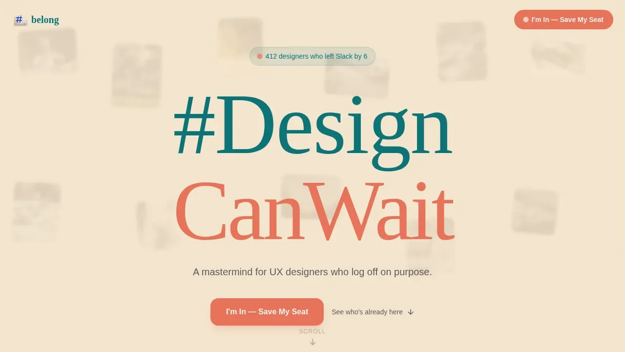
The header opens with a massive #DesignCanWait typographic declaration set in Fraunces serif display type. The letterforms breathe across the full viewport with a subtle variable-weight animation, giving the page an exhale quality from the first scroll. A soft mosaic of blurred artifact photographs sits behind the type to establish tone without showing faces.
Staggered Masonry Grid
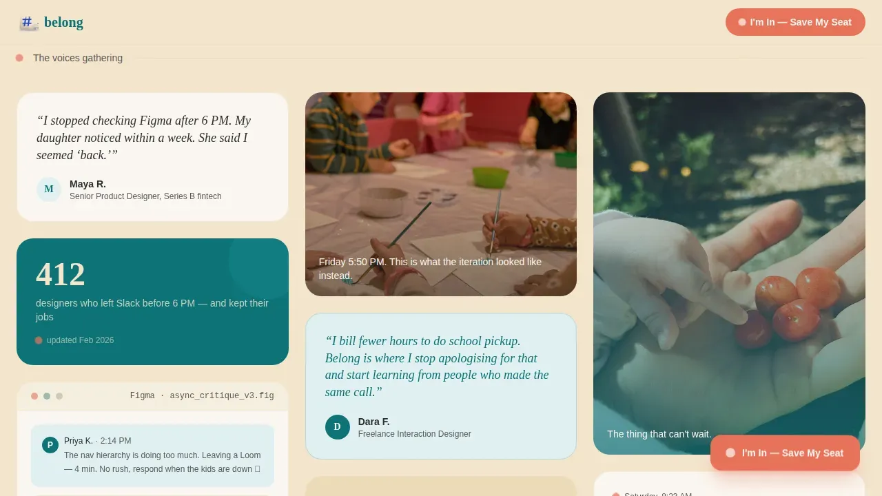
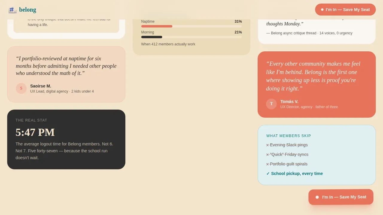
The masonry layout begins sparse and accelerates as the visitor scrolls. Early rows feature one or two cards; later rows cluster into a crowd-like density that signals momentum. Card types vary across the grid: member quote snippets, async Figma critique screenshots timestamped to realistic working hours, a live-style counter showing how many designers have already joined, and small domestic illustrations intercut with wireframe fragments. The rhythm mimics a petition gaining signatures, which is a deliberate movement pattern designed to build confidence before the call to action appears.
Full-Width Manifesto Break
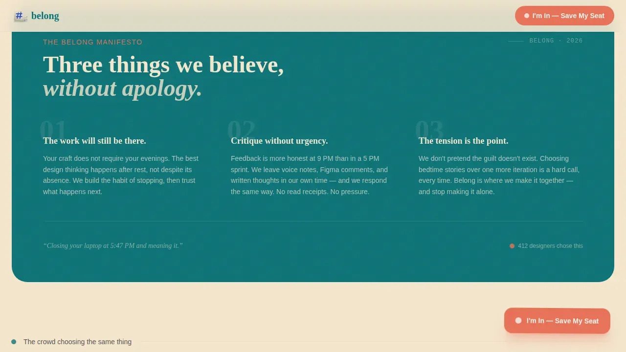
Midway through the grid, a full-width card interrupts the masonry pattern. This manifesto card declares the group's three guiding principles in bold, unhurried type. It is the emotional anchor of the page: the moment a visitor shifts from watching to deciding. The break also creates a visual reset that makes the second half of the grid feel like a fresh wave of support rather than more of the same stuff.
Two-Step Qualifying Form
The primary call to action opens a two-step modal form. Step one asks only for a first name and the question "What did you miss last month because of work?" This is a values-alignment gut-check that filters for the right community fit without demanding business details up front. Step two collects email address, current role, and preferred async window: morning, naptime, or after bedtime. No price is shown at any point. Accepted members receive a personal invite email, which reinforces the curated, invitation-based reality of the community.
Floating Coral Call-to-Action Button
The "I'm In, Save My Seat" button appears first as a floating coral element after the manifesto break and again anchored to the final masonry row. This dual placement means visitors who convert quickly and visitors who need more proof both have a clear, visible path forward without the page ever feeling pushy or demanding.
Teal Catalyst Color System with Warm Typography
The color system pairs deep signal teal (#0D7377) with warm hearthstone (#F4E4CD), soft charcoal (#2E2E2E), and catalyst coral (#E8735A). Fraunces handles display headlines and the hashtag; DM Sans handles body text with the legibility of a handwritten note. Together they create a kitchen-table warmth that is unlike any typical design industry page.
Page sections overview
| Section | Purpose |
|---|---|
| Hero hashtag declaration | Opens the page with #DesignCanWait movement identity and tone |
| Sparse masonry opening | Introduces first proof points, quote cards, and data counters |
| Dense masonry cluster | Builds momentum with testimonials, async screenshots, and illustrations |
| Full-width manifesto | Declares three community principles and anchors visitor commitment |
| Dense proof continuation | Adds more voices and career reality cards to the grid |
| Final call-to-action row | Presents the floating button and two-step form for lead capture |
| Minimal footer | Closes with pattern four superhuman-extreme-minimal footer layout |
Design & branding system
The visual identity follows a Family First theme using the Teal Catalyst color system. Every palette decision reinforces the emotional proposition: warmth, intention, and the quiet confidence of someone who has already decided what matters. The typography pairing of Fraunces and DM Sans supports both editorial impact and everyday readability across the entire page.
- Colors: deep signal teal (#0D7377) for headlines and dividers, warm hearthstone (#F4E4CD) for card backgrounds and the main canvas, soft charcoal (#2E2E2E) for body copy, and catalyst coral (#E8735A) for buttons, badges, and notification details
- Typography: Fraunces serif display for the hashtag hero and section headings; DM Sans for body paragraphs, card text, and form labels
- Tone: warm editorial with movement-and-cause energy, specifically calibrated to feel like a kitchen table after dinner rather than a design portfolio or a typical community website
Mobile & speed optimization
Over half of all web traffic is mobile, and the target audience for this template specifically checks things on their phones during school pickup or after bedtime. The template is built desktop-first with a strong mobile layout so the page delivers full value at any screen size without losing the masonry visual rhythm or the two-step form experience.
- The masonry grid adapts gracefully to narrow viewports, reordering cards so the most valuable proof points stay visible early in the scroll
- The two-step form modal is touch-friendly and keeps each step to a single screen so parents filling it in on a phone can complete the form without frustration
- Server components handle static sections like the hero and manifesto card for faster initial page load, while client-side code manages the animated counters and form interactions
How this template helps you convert
The page converts through identity commitment rather than feature lists. Social proof is the psychological phenomenon where people look to others' behavior to determine the correct course of action in uncertain situations, and this template uses that principle at every scroll depth. Testimonials on sales pages increase conversion by an average of 34%, and products with customer reviews show 270% higher purchase likelihood than those without. Every design choice here earns the click before asking for it.
- The masonry grid delivers different forms of social proof at each stage of the scroll: peer quotes early, timestamped async evidence in the middle, and numerical figures like "412 designers who left Slack by 6" as the grid densifies, matching proof type to the specific uncertainty the visitor faces at each point in their journey
- The manifesto break shifts the visitor's frame from "should I read more?" to "do I agree with this?" and positions the final call-to-action as a values decision rather than a transaction, which dramatically reduces the deal anxiety that causes high-intent visitors to abandon a sign-up form
Other information about this template
The Belong Family First user experience Designers Mastermind landing page template sits inside the Community and Nonprofit category and is built on a Movement and Cause creative direction. It is well-suited for communities, courses, or career-growth programs that value depth over scale and relationships over reach. The template supports a curated application process, including space for an interview-style qualifier, to ensure alignment before onboarding. Each member can also be featured in a Hot Seat card format during async critique weeks, which gives the community a forward-looking sense of mutual investment.
- The two-step form is specifically designed to replace a high-friction application page; it acts as the front door to an invite-based community that never shows pricing publicly
- AI software tools are increasingly part of user experience workflows, and the template supports card slots where members can share resources, techniques, and research around integrating AI into product design practice without losing the human judgment that makes good design matter
- Social proof that is too smooth or too generic gets discounted by discerning user experience audiences; this template avoids that error by using specific, timestamped, role-accurate testimonials that feel like real conversation rather than polished marketing copy
- The page is free to customize and can support product teams at companies of different sizes, from solo freelancers to agency user experience leads, all within the same landing page structure
- Peer proof operates through similarity, and the card grid is built to surface voices that directly mirror the visitor's own career stage, job title, and life situation so the community value lands before the form appears
- The template connects well with broader design career resources, async critique communities, and user experience courses or cohort programs that use application-gated access rather than open enrollment
- Building deep, trusting relationships that foster career growth and work-life harmony is the goal this landing page communicates; every section is a step in that direction
- Impostor syndrome, stakeholder management struggles, and the difficulty of convincing stakeholders to prioritize user experience work are real challenges this community addresses, and the template creates space to surface those realities through card copy and quote testimonials
- Trust signals like privacy policy links and a clear application process help reassure users about data safety and community vetting on the page
Theme
Family First
Creative direction
Movement & Cause
Color system
Teal Catalyst
Style
Masonry/Pinterest
Direction
Lead Generation
Page Sections
Hashtag Hero with Breathing Variable-weight Type
Staggered Masonry Grid with Proof Momentum
Full-width Manifesto Card
Two-step Identity-commitment Form
Floating and Anchored Coral Call-to-action
Teal Catalyst Color System and Editorial Typography
Related questions
Who is this landing page template built for?
Does the template show pricing or membership costs?
How does the two-step form qualify leads?
Can I customize the masonry grid cards and testimonials?
Is this template suitable for user experience courses or career-growth programs?