Powerful Employee Engagement | Free Website Template | Rocket
Belong is a single-column employee engagement landing page template built for HR Tech and SaaS teams. It uses a step-by-step scroll flow, a hero testimonial card, an animated heartbeat visual, a platform demo section, a case study block, and a dual call-to-action to convert both prospective clients and job candidates in one focused page.
by Rocket studio
Quick summary
Belong is a warm, high-impact landing page template designed for tech-focused employee engagement platforms. It guides visitors through a deliberate scroll journey: from diagnosing why senior engineers leave, to seeing the product in action, to reading a specific turnover case study. Two calls to action serve both prospective clients and open job candidates from a single page.
Who this template is for
This template is built for teams that need to prove culture is real, not performative. It speaks directly to the people who own the retention problem in fast-moving tech organizations.
- VP of People Operations at Series B to D startups managing engineering attrition
- Chief Technology Officers at mid-market software-as-a-service companies losing senior developers to larger competitors
- HR Directors at established tech firms looking for culture proof beyond office perks
What problem this template solves
Retention marketing for employee engagement platforms often fails because it feels corporate and cold. A generic landing page cannot carry the emotional weight of the problem it is solving. Belong addresses this directly.
- There is no easy way to communicate "belonging" using a standard feature grid or bullet-point benefits page
- Dual audiences (job candidates and potential clients) rarely share one page without one journey feeling like an afterthought
- Social proof in HR Tech often lacks the specifics that skeptical VP-level buyers need to act
What you get with this template
You get a fully structured, single-column landing page that earns trust at every scroll step. Each section is purposefully sequenced to deepen commitment before asking for a click.
- A hero section with a floating testimonial card, candid employee photo layout, and a heartbeat SVG animation that resolves into the brand logo
- A step-by-step content flow covering attrition diagnosis, a looping platform demo in a family-photo-frame border, and a named case study with specific outcome data
- A dual call-to-action section pairing a careers link with a two-field client form, plus a single-row footer layout
Feature list
This template brings together specific design and interaction decisions that serve the employee engagement platform use case. Each component earns its place in the scroll journey.
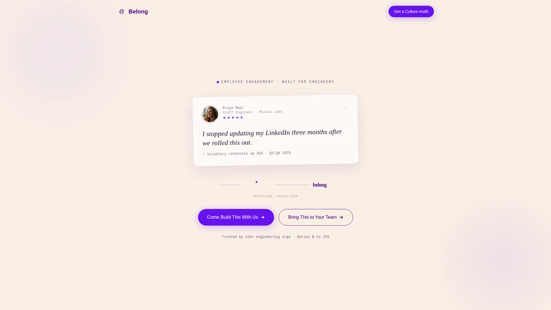
Floating Hero Testimonial Card
The hero opens with a single oversized testimonial card set in generous whitespace. It includes a candid employee photo layout, the person's name, role, and company in monospaced type, and a large serif pull quote. Below the card, an animated SVG heartbeat line pulses once, flatlines into the company logo, and beats again, visualizing retention in under two seconds.
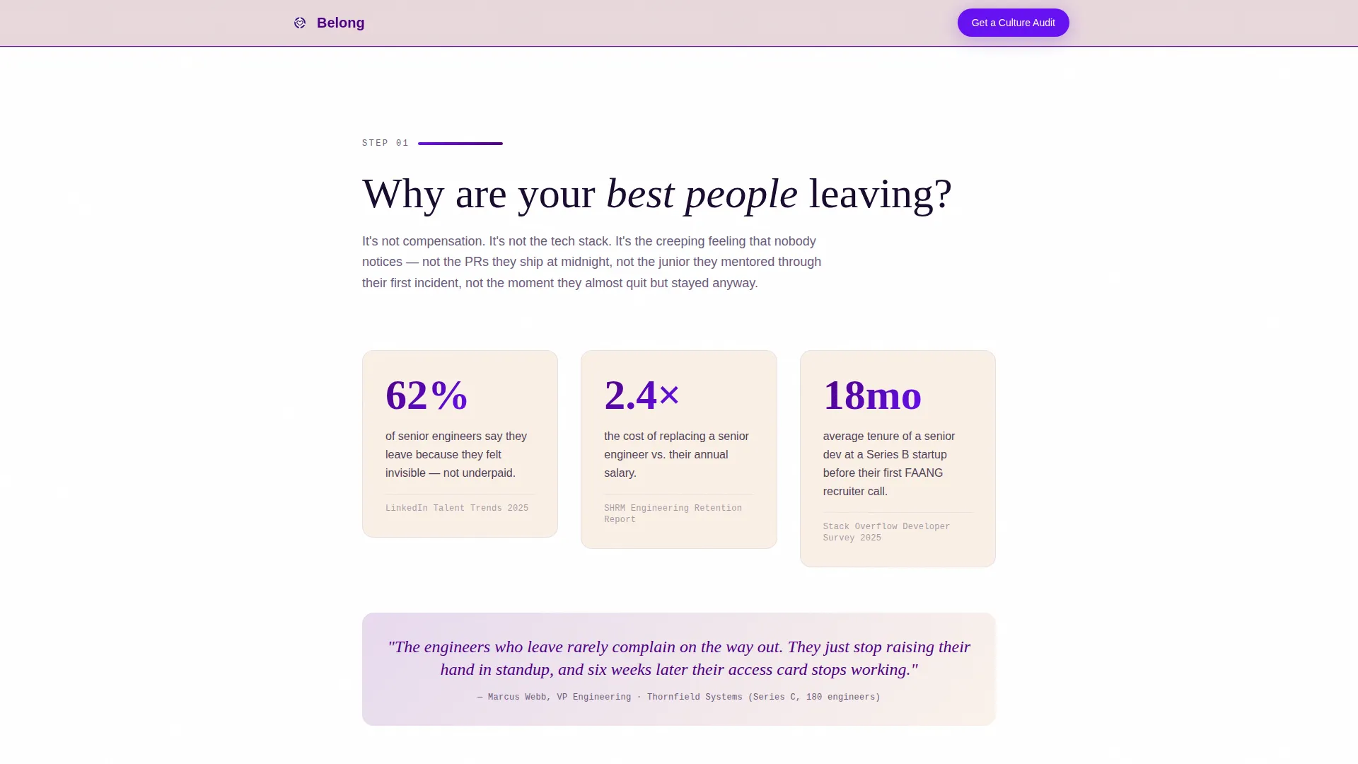
Attrition Diagnosis Section
A dedicated section surfaces an industry attrition statistic alongside the question "Why are your best people leaving?" The stat is styled in JetBrains Mono and built with a subtle shake animation on scroll entry, making the number land with physical weight before the visitor reads further.
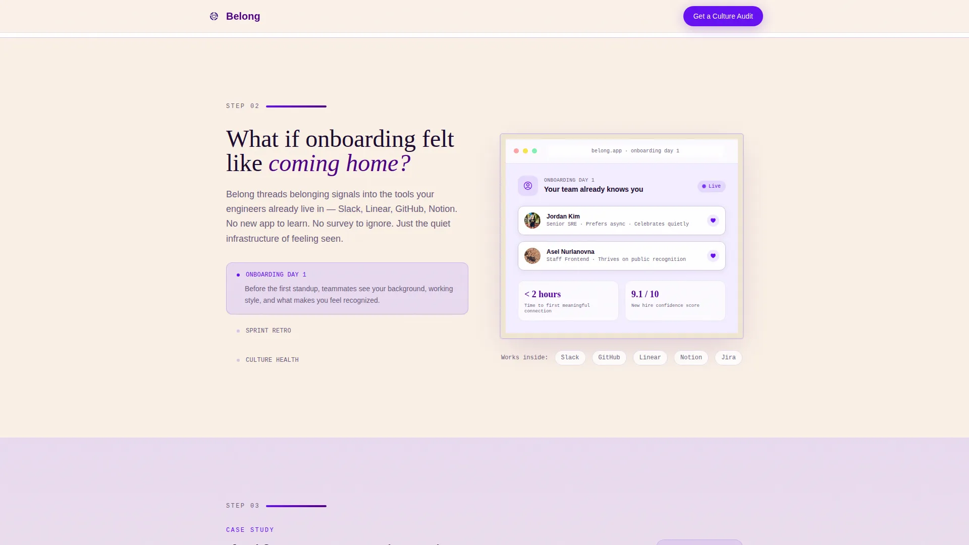
Looping Platform Demo Block
The product's onboarding feature is introduced through a short looping user interface demo. The demo is nested inside a family-photo-frame border treatment, tying the visual language of the platform back to the domestic warmth theme. The section header poses the question "What if onboarding felt like coming home?"
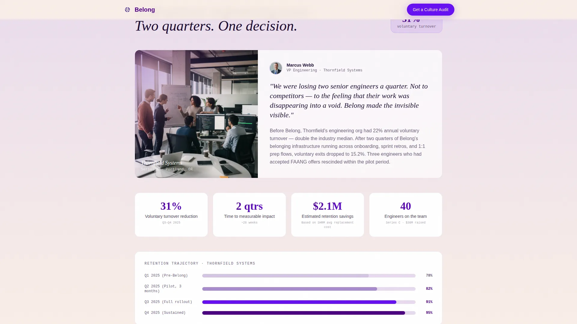
Named Case Study Block
A dedicated case study section presents a 40-person engineering team that reduced voluntary turnover by 31 percent across two quarters. It includes named social proof, company context, and specific timeline and team-size details. This is placed deliberately after the demo, where belief in the product is highest.
Dual Call-to-Action Section
Two conversion paths sit side by side after the case study. The primary call to action, "Come Build This With Us," links to open engineering and customer success roles. The secondary path, "Bring This to Your Team," uses a two-field form capturing work email and team size, with a promise of a personalized culture audit.
Scroll-Linked Animation System
The page uses GSAP-powered scroll reveals, staggered text entry, and parallax depth layers throughout. Mouse-tracking is active on the hero card. Hover states fire on every call-to-action element using the electric indigo accent color. The scroll pace is designed to slow down deliberately, matching a patient, conversational tone.
Page sections overview
| Section | Purpose |
|---|---|
| Hero Testimonial Card | Opens with social proof and retention visualization |
| Attrition Diagnosis | Surfaces the core retention pain with a stat |
| Platform Demo Block | Shows onboarding feature inside branded frame |
| Case Study Section | Delivers specific turnover outcome and timeline |
| Dual Call-to-Action | Converts clients and job candidates separately |
| Single-Row Footer | Closes the page with minimal, clean navigation |
Design & branding system
The visual identity follows a Family First theme built around an Electric Indigo color system. The palette is engineered to feel like high-tech pigment wrapped in domestic warmth, a blacklight poster in a cozy living room.
- Deep digital violet (#4B0082) anchors the primary brand presence across headings and structural elements, electric indigo (#6610F2) fires on buttons, progress indicators, and hover states, lavender mist (#E8DAEF) washes section backgrounds, and warm pearl (#FAF0E6) provides breathing room between content blocks
- Typography pairs Fraunces serif for pull quotes and headlines, DM Sans for body copy and interface labels, and JetBrains Mono for statistics and data callouts
- The candid photo treatment, family-frame border on the demo, and domestic metaphors in copy all reinforce the "belonging" brand position at the visual layer
Mobile & speed optimization
The template is designed desktop-first, reflecting a VP and CTO audience that typically reviews vendor pages on a laptop. Full mobile support is built in so the page functions cleanly on any screen size.
- Server Components handle all static sections to keep the base page lightweight, while animation logic is isolated inside Client Components only
- GSAP scroll reveals, the heartbeat SVG, and the shake animation are all structured to activate only when needed, avoiding unnecessary load on initial render
- The single-column layout naturally adapts to smaller viewports without requiring complex grid restructuring
How this template helps you convert
The page is built on the principle that conversion follows belief. Every scroll step is designed to increase confidence before a call to action appears.
- The hero testimonial card leads with peer-level proof before any product claim is made, establishing credibility in the first three seconds of the visit.
- The attrition stat section creates shared recognition of the problem, making visitors feel understood rather than sold to.
- The case study block, placed after the demo, delivers specific and verifiable outcome data at exactly the moment belief is highest, then immediately presents two clear next steps for two distinct audiences.
Other information about this template
This template is part of a broader HR Tech and Tech and Software HR design direction. It is built for the employee engagement platform category, specifically targeting the intersection of engineering team retention and people operations leadership.
- The template style is Single Column Flow, keeping the visitor focused on one idea per scroll step without sidebar distractions
- The creative direction follows a Step-by-Step Guide structure, answering one diagnostic question per section before moving to the next
- The header concept is a Testimonial Card, a deliberate choice to lead with human voice rather than a product screenshot or headline claim
- The landing page direction is dual-purpose Recruitment and Hiring, serving both a client acquisition funnel and a talent acquisition funnel from a single page
- The Family First theme informs every design decision, from the family-photo-frame border on the demo to the domestic metaphors woven into section copy
- The Electric Indigo color system gives the page a distinctive visual identity that stands apart from typical blue-and-white enterprise HR tools
Theme
Family First
Creative direction
Step-by-Step Guide
Color system
Electric Indigo
Style
Single Column Flow
Direction
Recruitment/Hiring
Page Sections
Floating Hero Testimonial Card
Attrition Diagnosis with Shake Animation
Looping Platform Demo in Frame
Specific Engineering Case Study
Dual Conversion Call-to-action
GSAP Scroll Animation System
Related questions
Who is this landing page template designed for?
Can this template serve both a hiring page and a client acquisition page?
What social proof is built into this template?
Does this template require animation expertise to set up?
What makes this template different from a standard HR software landing page?


