ERG Management Platform Landing Page Template
The Belong Powerful ERG Management Platform Landing Page Template is a single-page, conversion-focused layout built for DEI directors, CHROs, and ERG leads who need to turn scattered group chats into measurable programs. It combines a three-step interactive form, a human-scenario comparison table, and a sticky call-to-action bar inside a sharp Electric Indigo visual system.
by Rocket studio
Quick summary
This template makes the case for structured ERG management in one focused scroll. A three-step form opens the experience, a side-by-side comparison table builds the argument, and a sticky call-to-action bar closes the loop. The design runs on deep indigo and charged violet against midnight black, creating a sharp, forward-leaning look that suits enterprise DEI buying decisions.
Who this template is for
ERG program managers, DEI directors, and senior HR leaders will find this template directly relevant. It speaks to the exact frustrations of people managing employee resource groups without proper tools.
- DEI directors juggling twelve or more ERG leads across spreadsheets and Slack channels
- CHROs who need board-ready participation metrics and measurable outcomes by end of week
- ERG chairs volunteering significant hours each month with little tooling or executive sponsor visibility
What problem this template solves
Managing ERGs without dedicated ERG software is exhausting. ERG leads manually count RSVPs, copy-paste Slack polls into board decks, and struggle to show leadership teams that their programs connect to broader business objectives.
- ERG engagement data stays buried in personal spreadsheets instead of living in a centralized dashboard
- Reporting to the executive sponsor requires hours of manual work with no guarantee of accuracy
- Employees across distributed teams and multiple time zones have no single place to discover, join, or engage with their ERG community
What you get with this template
You get a complete, ready-to-customize landing page built around three core conversion moments. Every section is designed to make a visitor's current pain visible and the platform's value obvious.
- A three-step interactive header form that acts as a product tour before any demo call is booked
- A human-scenario comparison table with five escalating rows contrasting life before and after the platform
- A sticky bottom bar with a repeating primary call-to-action that appears as the visitor scrolls
Feature list
This template includes purpose-built sections and interactive components grounded in the brief below.
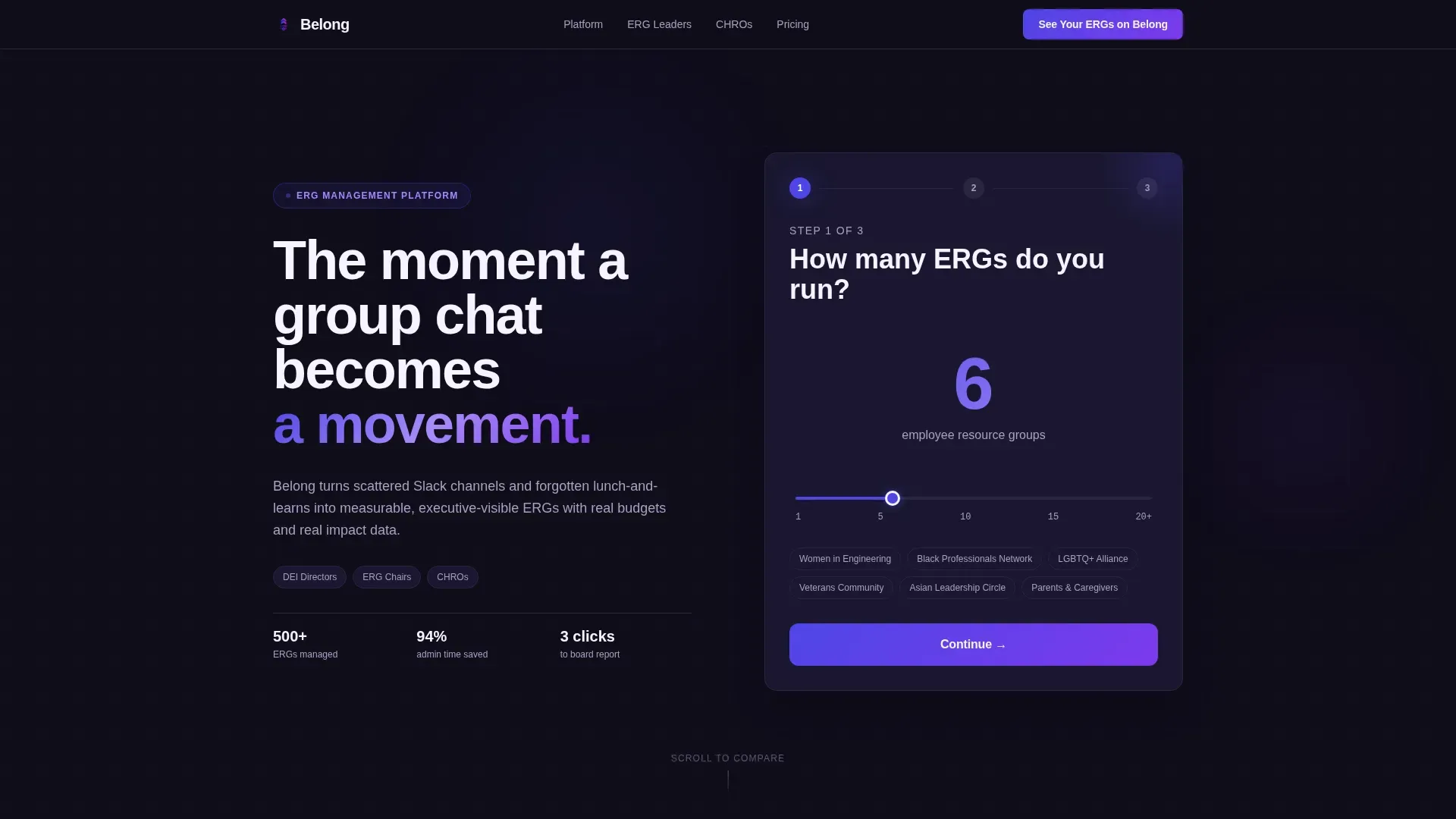
Three-Step Interactive Header Form
The header is a multi-step form that doubles as a live product preview. Step one presents a bold numeric slider asking how many ERG programs the visitor runs. Step two offers three tappable pain-point cards covering tracking engagement, managing budgets, and reporting to leadership. Step three reveals a personalized dashboard preview pre-populated with sample employee resource groups like Women in Engineering and Black Professionals Network. By the final step, the visitor has already experienced the product.
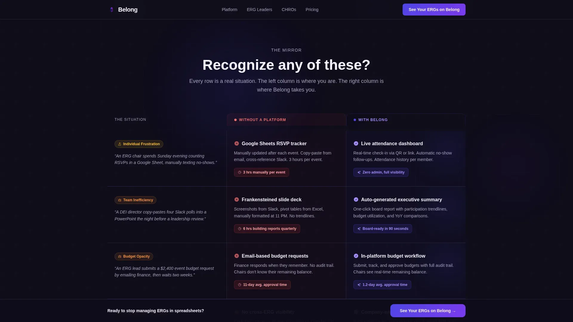
Human-Scenario Comparison Table
The core section of this landing page is a side-by-side table contrasting life without a platform against life with structured ERG management. Each row is anchored by a real human scenario rather than a feature name. Row stakes escalate from individual ERG lead frustration to team-level inefficiency to company-wide inclusion blind spots. The structure helps erg leads, DEI directors, and CHROs see themselves clearly on both sides.
Sticky Call-to-Action Bar
A scroll-triggered sticky bar appears at the bottom of the viewport after the visitor moves past the header. It carries the primary call to action throughout the entire page experience, creating multiple conversion opportunities without adding form fields or friction below the header.
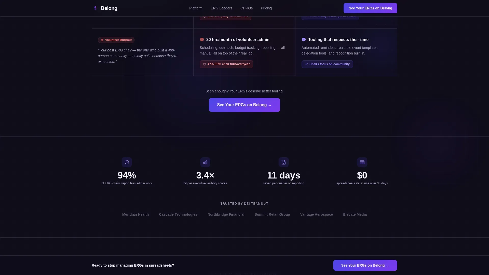
Social Proof Strip
A dedicated strip displays client logos and a participation statistic to build immediate credibility. Displaying recognizable logos of existing clients and concrete engagement numbers gives the platform authority before the visitor reaches the final conversion section.
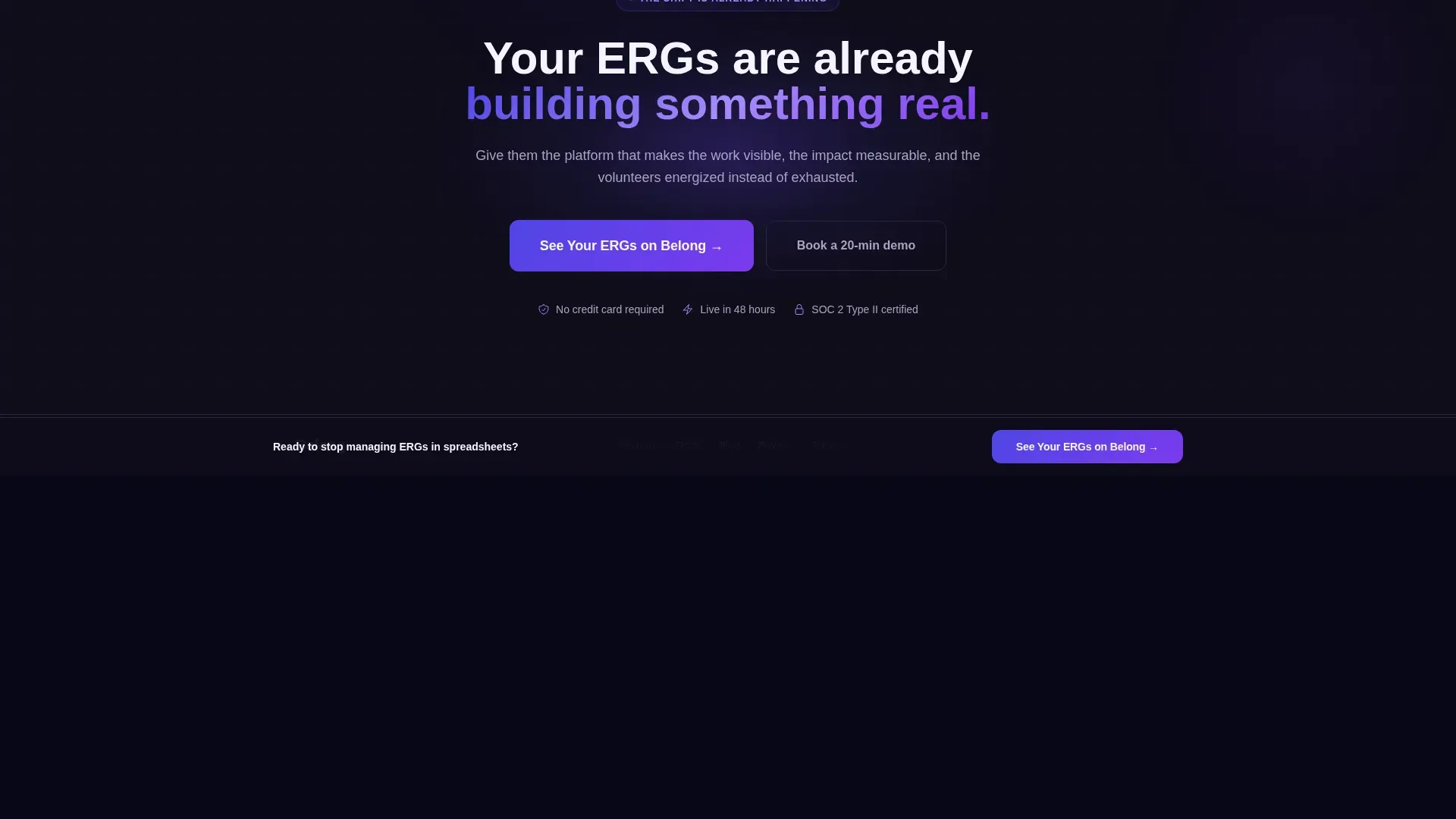
Stakes Escalation Section
The final content section before the footer raises the organizational cost of inaction. It reframes scattered ERG initiatives not as an inconvenience but as a company-wide blind spot, making the call-to-action feel like the overdue, obvious answer rather than a sales pitch.
Linear Single-Row Footer
The footer uses a clean single-row pattern that keeps the page focused. It avoids visual clutter so the last thing a visitor sees before leaving is the brand and the primary call to action.
Page sections overview
| Section | Purpose |
|---|---|
| Multi-Step Header Form | Introduces the platform through a three-step interactive product preview |
| Human Scenario Comparison Table | Contrasts unmanaged ERG life with platform-supported ERG management across five rows |
| Social Proof Strip | Displays client logos and a key participation metric to build trust |
| Stakes Escalation call to action | Raises the organizational cost of inaction and drives the final conversion click |
| Linear Single-Row Footer | Closes the page cleanly with brand identity and a final call-to-action anchor |
Design & branding system
The visual system follows a Startup Velocity theme built to feel like a pitch deck in motion. It is sharp, dark, and purposefully high-energy.
- Primary brand surface uses deep product indigo (#4F46E5), with charged violet (#7C3AED) activating on hover states and tappable elements
- Midnight user interface black (#0F0D1A) anchors navigation chrome and body text, while reactive white (#F5F3FF) with a faint lilac undertone handles backgrounds and heading contrast
- Typography pairs Plus Jakarta Sans for headings with DM Sans for body copy, keeping the interface readable and premium without feeling corporate
Mobile & speed optimization
The template is built desktop-first, matching how CHROs and DEI directors typically evaluate tools, with full mobile support included.
- The multi-step form, comparison table, and sticky bar all adapt cleanly to smaller viewports so ERG program managers reviewing on mobile get the same conversion flow
- Component architecture separates interactive client-side elements, such as the form state and slider, from static server-rendered sections, keeping build structure intentional and organized
How this template helps you convert
Every design decision in this landing page is aimed at reducing hesitation and accelerating the click to the product demo or free trial.
- The three-step form creates investment before the visitor even reaches the comparison table. By the time they see the platform dashboard preview, they have already self-identified their ERG count and biggest pain, making the product feel personally relevant.
- The comparison table builds the argument row by row, escalating from personal frustration to executive-level organizational risk. Each row makes inaction feel increasingly costly, so the call-to-action arrives at exactly the right psychological moment.
- The sticky call-to-action bar ensures the primary action is always one tap away, whether the visitor is reading the comparison table mid-page or finishing the stakes section at the bottom.
Other information about this template
This template is ideal for teams evaluating ERG platforms alongside other specialized tools in the market. The belong powerful erg management platform landing page template is designed to sit confidently in a competitive landscape.
- Several ERG software options exist in this space. Chronus is known for mentoring software that extends to ERG management. Teleskope provides an all-in-one platform for managing DEI programs and ERGs at scale. Chezie focuses on ERG engagement and visibility. Diverst allows ERG leaders to expand membership, organize events, and allocate budget efficiently. Qooper suits organizations looking for a straightforward, easy-to-use platform.
- Research from MentorcliQ shows that employees involved in ERGs or a mentorship program are 50 percent more likely to stay with their organization, making the retention argument central to any ERG platform pitch.
- ERGs provide a safe space for employees across backgrounds including race, gender, sexual orientation, and shared interests. Groups like BIPOC employees networks and Pride Month communities rely on consistent tooling to sustain momentum year-round.
- This template supports use cases that introduce ergs to new employees, help new ergs get off the ground with program templates and structured event management, and allow HR and DEI leaders to collect feedback through surveys and recognize ERG leaders' contributions in performance reviews.
- Affinity groups covering skill development, community building, leadership roles, and mentoring benefit from a clear structure that connects ERG initiatives to the organization's broader goals.
Theme
Startup Velocity
Creative direction
Team & People
Color system
Electric Indigo
Style
Comparison Table
Direction
Click-Through
Page Sections
Three-step Interactive Product Tour Form
Human-scenario Comparison Table
Scroll-triggered Sticky Call to Action Bar
Social Proof and Participation Strip
Stakes Escalation Conversion Section
Electric Indigo Visual Design System
Related questions
Who is this landing page template designed for?
What makes the header form different from a standard sign-up form?
Can this template support large enterprises with many ERG programs?
Does the template require form fields beyond the header interaction?
How does the comparison table encourage participation and drive clicks?


