Complete Recruiting & Staffing Agency Professional Website Template
Bench is a dual-sided staffing agency landing page built for temp and contract placement firms that move fast. It pairs real case study narratives with two clear conversion paths: one for employers who need workers now, and one for candidates ready to start. The zigzag layout stacks proof section by section, earning the click before asking for anything.
by Rocket studio
Quick summary
Bench is a single-page staffing agency landing page designed around speed and trust. It uses a zigzag case study layout to walk employers through three real placement stories, from a single-day fill to a full contract-to-hire transformation. Two conversion paths run throughout: one for employers, one for candidates.
Who this template is for
This template is built for temp and contract staffing agencies that serve industrial and operational clients. It works equally well for firms placing skilled trades workers and those filling administrative or warehouse roles.
- Operations managers and HR directors who need to hire workers fast
- Welders, warehouse leads, forklift operators, and admin temps looking for their next placement
- Staffing agency owners who want a landing page that converts on both sides of the desk
What problem this template solves
Finding the right staffing agency landing page design is harder than it sounds. Most templates feel generic, cold, or built for only one audience. Bench solves that by speaking directly to two groups at once without confusing either.
- Employers get immediate proof of speed and reliability through stacked case study sections
- Candidates get a clear, low-friction path to apply without wading through employer-focused content
- The agency gets a page that builds trust progressively, so visitors are already convinced before they see a form
What you get with this template
Bench delivers a fully structured, single-page layout with every section mapped to a specific conversion goal. The design is editable and built for a staffing firm's actual workflow.
- A hero section with dual call-to-action buttons and space for a real team photo
- Three zigzag case study sections, each telling a distinct placement story with quote and outcome blocks
- A stats trust bar, a final dual-call-to-action section, and a linear single-row footer
Feature list
This section covers the core built-in capabilities of the Bench template as specified in the source brief.
Zigzag Case Study Layout
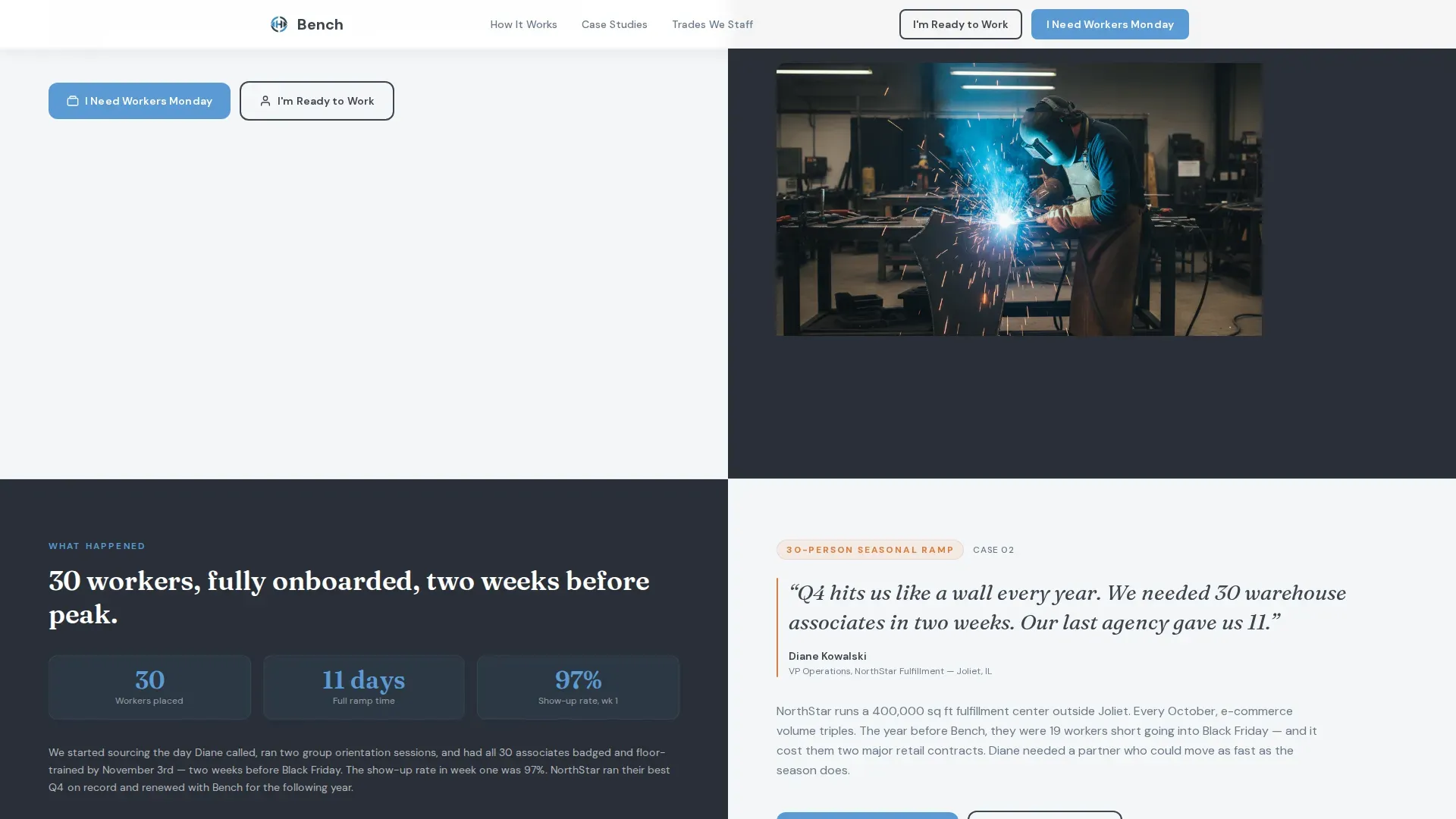
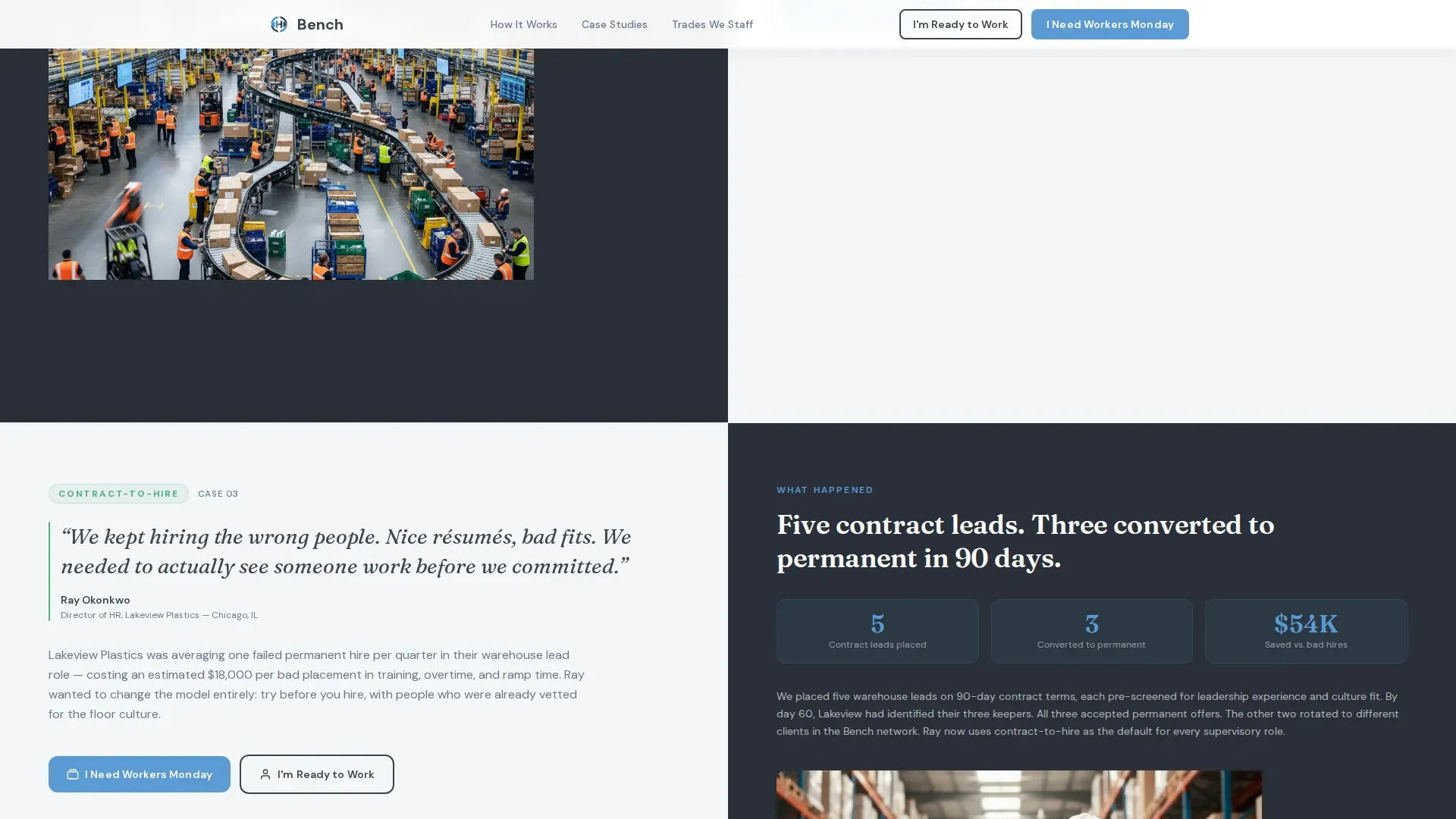
Each alternating section pairs a raw client quote on one side with a measurable placement outcome on the other. The three stories escalate in complexity, from a single-day welder fill to a 30-person seasonal ramp to a contract-to-hire transformation. The scroll builds credibility brick by brick.
Dual Call-to-Action System
Two conversion paths run consistently through the page. The primary button reads "I Need Workers Monday" and opens a short employer form asking for role type, headcount, and start date. The secondary button reads "I'm Ready to Work" and links to a quick-apply form with name, trade or skill, and zip code.
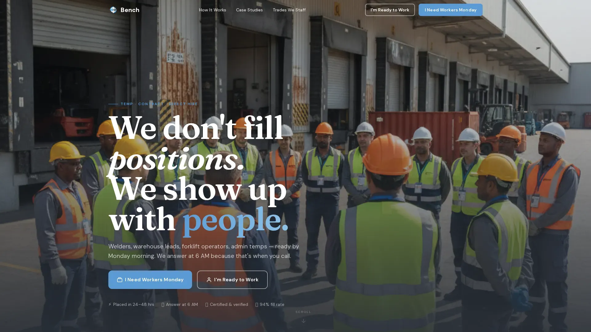
Cinematic Hero Section
The header is designed around a wide-angle real team photo: placed workers and internal recruiters together outside a job site, hard hats and lanyards visible. A headline fades in over the lower third of the image. The visual tone sets editorial warmth over a dependable, industrial feel immediately.
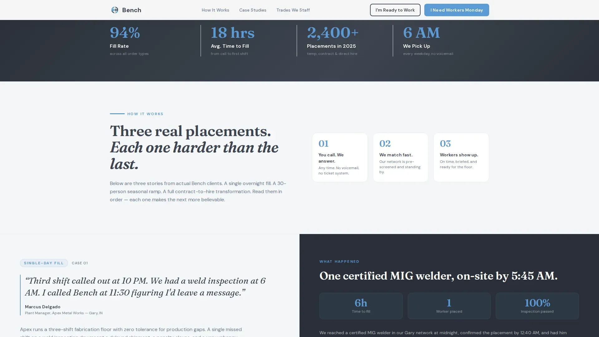
Stats Trust Bar
A dedicated trust bar section displays key placement numbers and timeline metrics. It provides fast, scannable social proof before the final call-to-action section and reinforces the reliability message already built by the case studies.
Dual Modal Forms
Both the employer and candidate conversion paths open as modal overlays rather than navigating away from the page. The employer modal collects role type, headcount, and start date. The candidate modal collects name, trade or skill, and zip code.
Editorial Typography System
Headings use DM Sans for clean, modern readability. Client quotes use Fraunces, an editorial serif that gives raw pull-quotes a distinct visual weight. The contrast between the two typefaces reinforces the page's dual tone: operational clarity paired with human warmth.
Page sections overview
| Section | Purpose |
|---|---|
| Hero with photo | Establish credibility and present dual calls to action |
| Case Study One | Single-day temp fill story with client quote and outcome |
| Case Study Two | 30-person seasonal ramp with warehouse client story |
| Case Study Three | Contract-to-hire transformation narrative |
| Stats Trust Bar | Scannable placement metrics and timeline proof |
| Final Dual call to action | Repeat employer and candidate conversion buttons |
| Linear Footer | Single-row footer with essential links |
Design & branding system
The Bench template uses a Community Hearth visual identity built around a Slate and Sky color system. The palette reads like a clear dawn over an industrial park: dependable and unhurried, with enough warmth to feel approachable.
- Primary text and section anchors use weathered charcoal (#3D4550); secondary elements use hearthstone gray (#6B7B8D)
- Open-morning blue (#5B9BD5) activates buttons, highlights, and trust accents throughout the page
- Warm cloud white (#F4F6F8) fills backgrounds, keeping sections light and easy to scan
Mobile & speed optimization
The page is built desktop-first but carries strong mobile consideration throughout. Operations managers calling at 6 AM are often on a phone, so the layout adapts without losing its core conversion structure.
- Both modal forms are accessible from any section of the page, reducing friction on small screens
- Fade-in reveals, subtle parallax, and staggered scroll animations use medium intensity to keep motion purposeful without slowing the experience
- Static server components handle layout sections; client-side rendering is reserved for the interactive modal forms
How this template helps you convert
Bench earns conversions before it asks for them. Every design decision serves the goal of moving a skeptical operations manager or a job-ready welder toward the right button.
- The case study narrative structure stacks real proof progressively, so by the time a visitor reaches the final call-to-action section, they have already seen three concrete examples of speed and reliability in action.
- Dual calls to action repeat after every case study section, catching visitors at the moment they feel most convinced rather than waiting until the bottom of the page.
Other information about this template
Bench is designed specifically for the American industrial staffing market. All naming conventions, role titles, and form language reflect United States operational contexts with imperial units and domestic industry vocabulary.
- The template style is zigzag alternating, making it well suited for agencies that want to tell layered stories rather than list service features
- The page direction is dual-sided recruitment and hiring, covering both employer acquisition and candidate application in a single cohesive flow
- This template can support a staffing agency serving multiple trades verticals, including skilled trades, warehouse operations, and administrative temp placement
Theme
Community Hearth
Creative direction
Case Study Narrative
Color system
Slate & Sky
Style
Zigzag/Alternating
Direction
Recruitment/Hiring
Page Sections
Zigzag Case Study Layout
Dual Call-to-action System
Cinematic Hero Section
Dual Modal Conversion Forms
Stats Trust Bar
Editorial Typography Pairing
Related questions
Can this template work for both employer and candidate audiences at the same time?
What kind of staffing agency fits this template best?
Do I need professional photography to use this template?
How many case study sections does the template include?


