Surveyor Landing Page Template for Professional Firms
Benchmark is a single-page landing page template built for professional surveying practices. It presents boundary, topographic, ALTA/NSPS, and elevation certificate services through a structured comparison table, an accordion FAQ, and a sticky checklist download bar. The design uses a charcoal and amber field palette that signals precision and credibility to homebuyers, attorneys, and contractors alike.
by Rocket studio
Quick summary
Benchmark is a content-rich landing page template designed for licensed surveying firms. It organizes complex survey types into a scannable comparison table, then layers in accordion FAQs and amber call-out boxes that walk visitors from confusion to confidence. The page closes with a dual-call to action sticky bar that collects leads without asking for trust upfront.
Who this template is for
This template is built for surveying professionals who serve a mixed audience: homebuyers, legal teams, and construction crews. If your practice handles boundary work, topographic data, ALTA/NSPS surveys, or elevation certificates, this page gives each client type exactly the context they need before they call.
- Licensed surveyors who need to explain multiple service types on one page
- Surveying firms fielding questions from first-time homebuyers, real estate attorneys, and general contractors
- Survey practices that want to generate leads through educational content rather than hard-sell copy
What problem this template solves
Most surveying websites bury service details behind vague descriptions. Clients arrive with pressing questions about boundary disputes, mortgage-required surveys, or pre-construction topographic data, and leave without answers. This template solves that gap directly.
- First-time homebuyers have no frame of reference when a lender demands a survey they have never heard of
- Real estate attorneys need clear process detail to advise clients on encroachment claims
- Contractors require specific deliverable information before committing to ground-breaking schedules
What you get with this template
You get a fully structured single-page layout that turns survey expertise into readable, trustworthy content. Every section earns visitor attention before asking for anything in return.
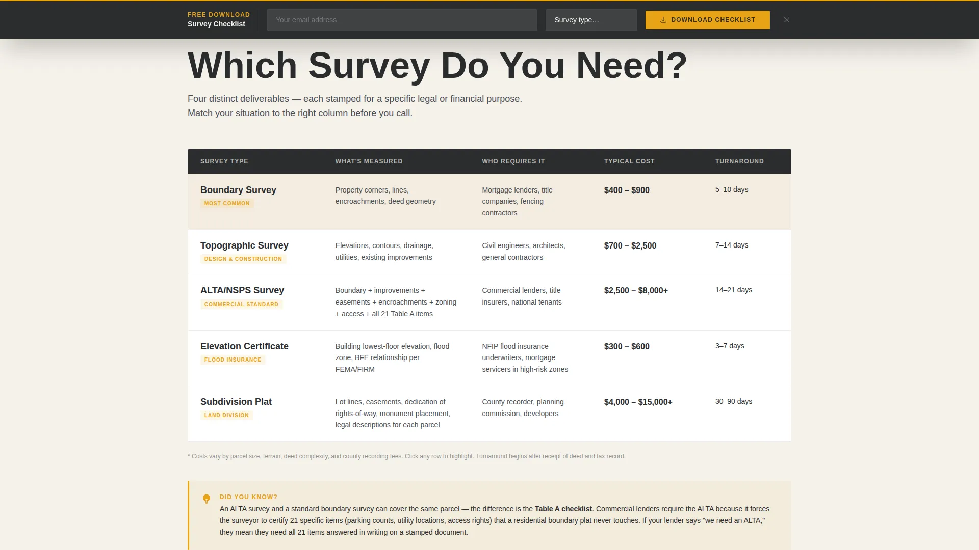
- A four-column comparison table covering boundary, topographic, ALTA/NSPS, and elevation certificate surveys
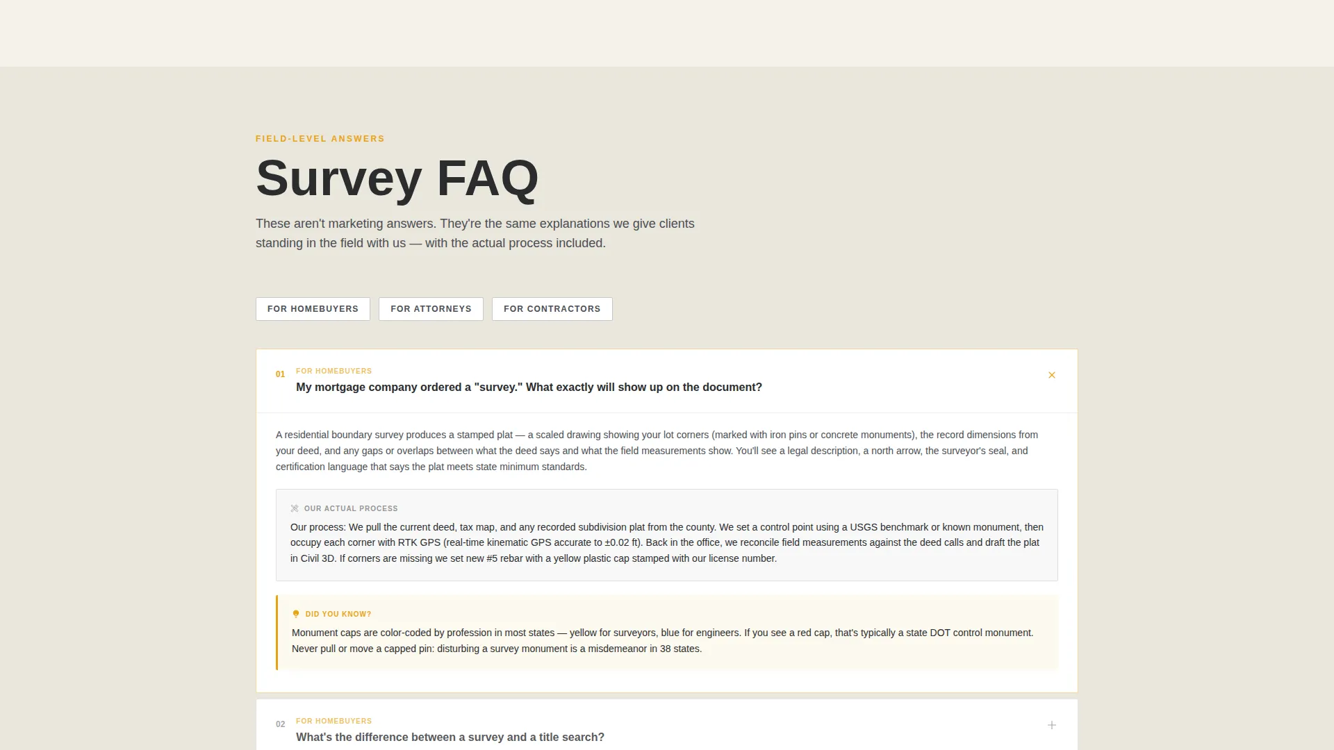
- An accordion FAQ section where each answer describes the surveyor's actual field process in plain language
- A sticky bottom bar with a primary checklist download call to action and a secondary same-week quote path
Feature list
This template packages several purpose-built components that work together to inform, qualify, and convert site visitors.
Survey Comparison Table
The comparison table sets boundary, topographic, ALTA/NSPS, and elevation certificate surveys side by side. Columns cover what is measured, who requires it, typical cost range, and turnaround time. Visitors can immediately identify which survey type applies to their situation without scrolling through unrelated copy.
Accordion FAQ Section
Each FAQ answer opens with the surveyor's real field process, such as setting a control point, occupying corners with RTK GPS (real-time kinematic global positioning system), and drafting the plat in Civil 3D software. The accordion format keeps the page uncluttered while rewarding curious readers with genuine technical detail.
Stats and Metrics Header Bar
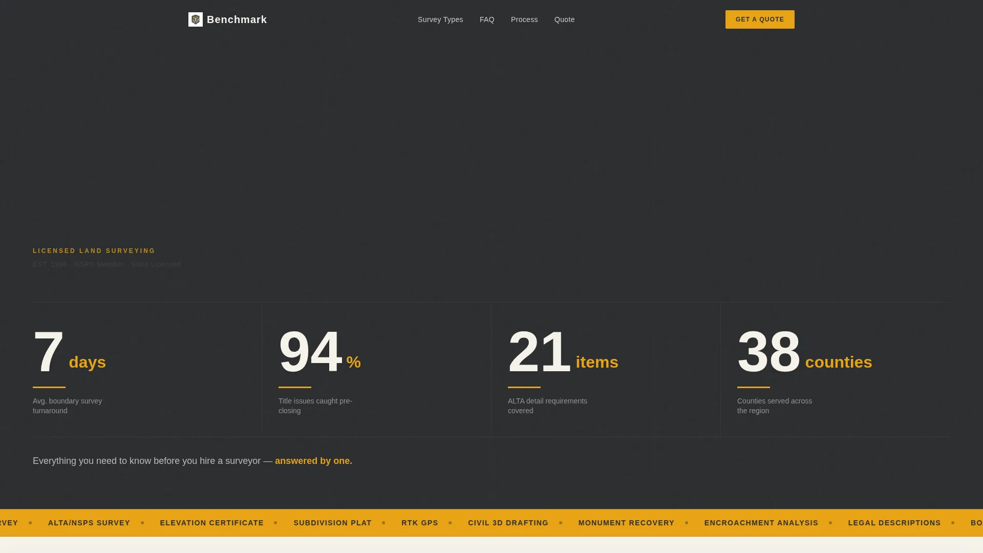
Four oversized figures span the top of the page: average boundary survey turnaround in days, percentage of title issues caught before closing, number of ALTA detail items covered, and counties served. Each figure sits in a heavy condensed typeface with an amber underscore that pulses once on load, anchoring credibility before a visitor reads a single line of body copy.
Amber Call-Out Boxes
Strategically placed "Did You Know?" panels interrupt the scroll with field-level insights that no generic marketing copy would include. These boxes build authority by sharing the kind of specific knowledge that only a practicing surveyor would know, such as the role of monument caps or how to read a legal description.
Sticky Dual-call to action Bottom Bar
A persistent bottom bar stays visible as visitors scroll. The primary button reads "Download the Survey Checklist" and asks only for an email address and survey type from a short dropdown. The secondary link offers "Get a Same-Week Quote" leading to a brief intake form with parcel address, county, and purpose fields.
Progressive Clarity Scroll Structure
The page is architected as escalating clarity. Early sections orient the visitor; mid-page sections explain jargon like monument caps and legal descriptions; the final sections position the practice as the authoritative source. By the time a visitor reaches the call to action bar, they feel informed rather than sold to.
Page sections overview
| Section | Purpose |
|---|---|
| Stats metrics bar | Establish credibility with four key practice figures |
| Tagline intro line | Frame the page as an expert resource for visitors |
| Survey comparison table | Compare four survey types side by side |
| Accordion FAQ section | Answer real process questions in plain language |
| Amber call-out boxes | Share field knowledge that builds practitioner trust |
| Sticky call to action bar | Capture leads via checklist download or quote request |
Design & branding system
The visual identity follows a Service Utility theme built around a charcoal and amber color system. Every color choice reflects the physical environment of field survey work, from matte instrument cases to high-visibility lath stakes.
- Deep field charcoal (#2B2D2F) anchors backgrounds and body text; instrument-case gunmetal (#4A4E54) draws horizontal rules and section dividers; caution-stake amber (#E8A317) activates links, toggle states, and table highlight rows
- Plat-paper off-white (#F5F2EB) fills content panels to mimic the feel of unrolled drafting vellum
- A heavy condensed typeface dominates the stats header, giving numeric figures immediate visual weight against charcoal backgrounds
Mobile & speed optimization
The layout is designed to translate cleanly from a wide desktop viewport to narrower screens. Section structure and hierarchy remain intact at every breakpoint.
- The comparison table is structured to remain readable on smaller screens without losing column context
- The sticky call to action bar stays pinned at the bottom of the viewport on both desktop and mobile, keeping the primary action accessible at all times
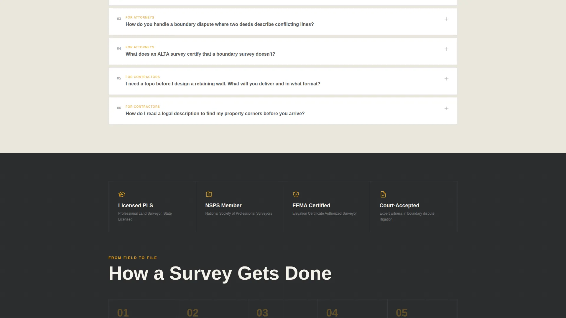
- Accordion FAQ panels collapse by default, reducing visible content load on mobile without hiding useful information
How this template helps you convert
This template earns visitor trust through content before asking for any commitment. The conversion path is designed to feel like a natural next step rather than a sales interruption.
- The stats bar and comparison table immediately demonstrate expertise, qualifying the practice before a visitor reads the FAQ, which reduces friction at the call to action stage
- The dual-call to action model separates high-intent visitors (same-week quote) from research-stage visitors (checklist download), letting the practice nurture both groups through separate follow-up paths
Other information about this template
This template is a strong fit for surveying practices that want a content-first web presence focused on professional services. It is designed as a standalone landing page, not a multi-page site, so it works well as a campaign destination or primary contact page.
- The page category is Professional Services under the Surveyor Online Presence subcategory
- The template uses a comparison table as its structural centerpiece, making it especially useful as a surveyor FAQ and resource hub
- The intake form for the quote path captures parcel address, county, and survey purpose, which are the minimum details a surveyor typically needs to prepare a preliminary estimate
- The checklist download form captures only email and survey type, keeping the barrier to entry low for early-stage visitors
Theme
Editorial Magazine
Creative direction
Case Study Narrative
Color system
Plum Executive
Style
Split Screen (50/50)
Direction
Click-Through
Page Sections
Survey Type Comparison Table
Accordion FAQ with Field Process Detail
Stats and Metrics Header Bar
Amber Did You Know Call-outs
Sticky Dual-cta Bottom Bar
Progressive Clarity Scroll Architecture
Related questions
What survey types does this template cover in the comparison table?
Who is this landing page template designed for?
What does the lead capture form ask visitors to provide?
Can the template be adapted if my practice offers fewer survey types?
What visual style does this template use?



