Compensation Planning | Free Website Template | Rocket
Benchmark is a financial services compensation benchmarking landing page built for RIA firm owners, broker-dealer HR directors, and solo financial planners. It surfaces real pay data across bonus structures, equity splits, and deferred comp schedules using a zigzag Problem-to-Solution layout, a live contributor count ticker, and blur-reveal data panels that drive visitors toward a free benchmarking report preview.
by Rocket studio
Quick summary
Benchmark is a single-page financial services compensation intelligence platform. It shows what advisors, portfolio managers, and compliance officers actually earn, including bonus structures, equity splits, and deferred comp schedules. The page uses a zigzag alternating layout, a live data counter in the hero, and progressive blur-reveal panels to move visitors toward one clear action: previewing their market rate.
Who this template is for
This landing page was built for financial services professionals who need real compensation data, not industry guesses. It speaks directly to the people making high-stakes pay decisions.
- RIA firm owners facing a competing offer for a key advisor and needing hard numbers fast
- HR directors at broker-dealers building or refreshing a compensation grid for the coming year
- Solo financial planners who want to know whether their own payout ratio is competitive
What problem this template solves
Most financial services compensation conversations happen in the dark. Firms rely on outdated surveys, anecdotal ranges, or nothing at all. This landing page is designed to close that gap by making real data feel accessible and trustworthy before a visitor ever clicks.
- No clear way to know whether an offer is competitive across role, region, and firm size
- Team incentive structures and equity models are rarely shared publicly, so most planners are guessing
- Visitors arrive skeptical, so the page must earn trust through proof before asking for anything
What you get with this template
You get a fully structured single-page layout built around a financial services compensation benchmarking use case. Every section has a clear job to do, from hooking skeptical visitors in the hero to qualifying them at the call to action.
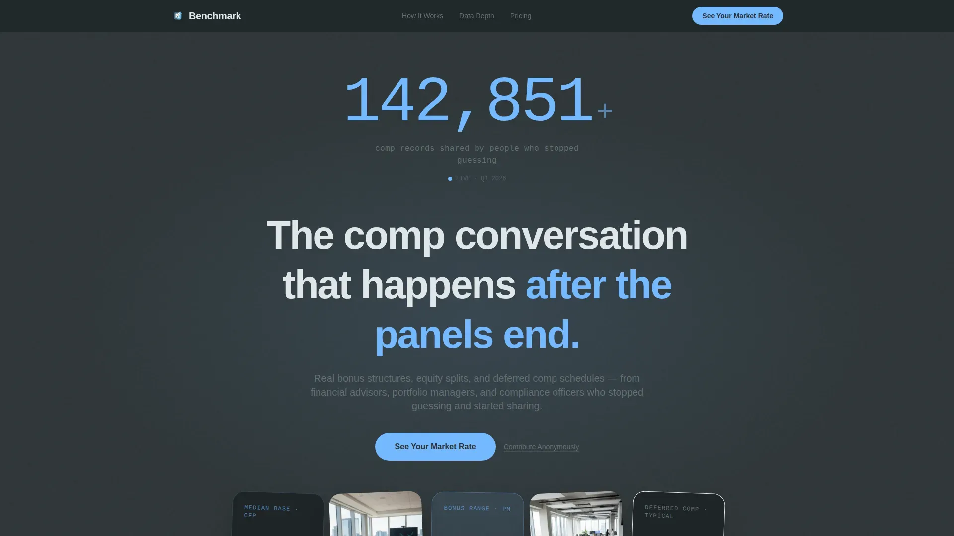
- A hero section with a live animated contributor count ticker, monospaced terminal-style typography, and a deep slate radial-glow background
- Three zigzag alternating panel pairs that escalate from individual advisor pay to team incentives to equity and deferred comp models
- A three-input qualifier modal (role title, firm AUM range, region) and a secondary "Contribute Anonymously" path beneath each primary call to action
Feature list
This template ships with a focused set of purpose-built components. Each one serves the compensation benchmarking narrative.
Live Contributor Count Ticker
The hero displays a large animated number in sky blue, ticking upward in real time like an exchange volume counter. The monospaced DM Mono typeface gives it a terminal-readout feel, and a subtle radial glow behind the counter makes the data itself feel like the light source in the room.
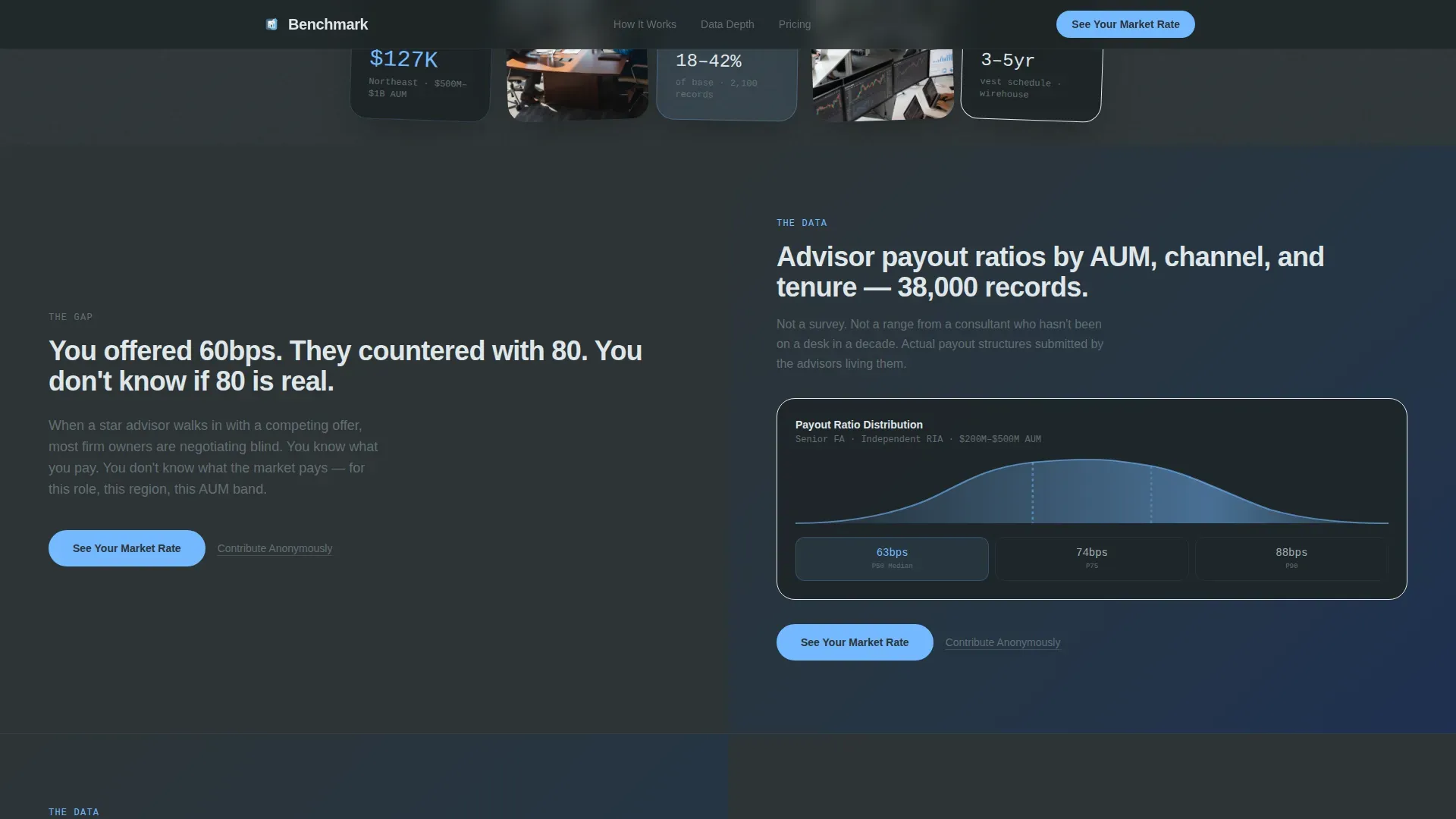
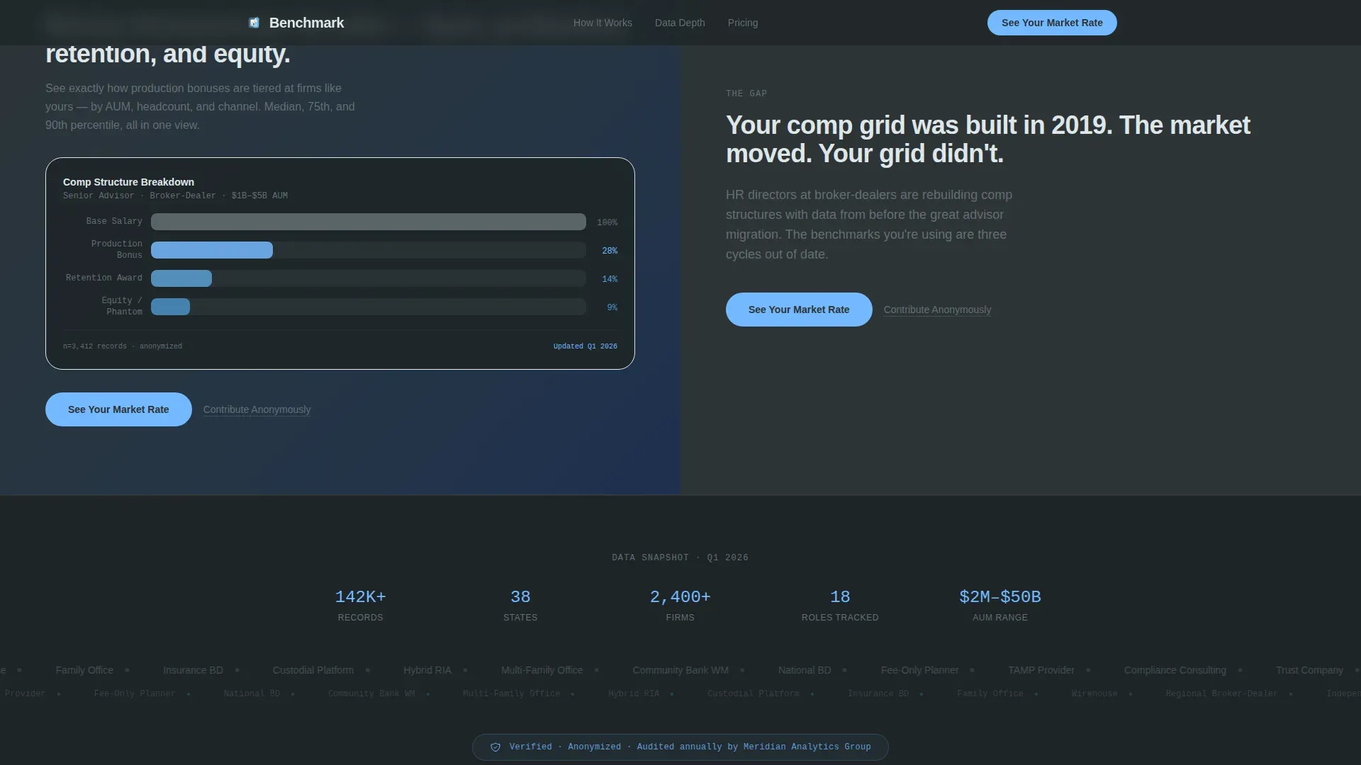
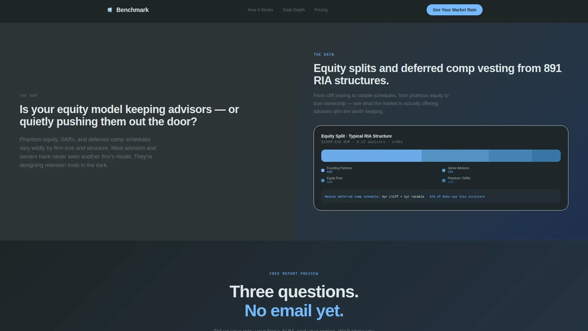
Zigzag Alternating Panel Layout
Three Problem-to-Solution panel pairs alternate left and right as the visitor scrolls. Slate-background panels on the left carry the problem; sky-blue-washed panels on the right carry the solution. The page literally gets lighter as you scroll down, reinforcing the shift from uncertainty to clarity.
Blur-Reveal Data Panels
Each solution panel shows a real compensation distribution chart in a blurred state. As the visitor scrolls into view, the chart sharpens enough to prove depth exists without revealing the specifics. The effect is powered by scroll-linked Intersection Observer reveals.
Qualifier Modal with Three Inputs
Clicking the primary call to action opens a one-screen qualifier. Visitors select a role title from a dropdown, set a firm AUM range on a slider, and choose a region. No email is required at this step, keeping friction low and click-through rates high.
Trust Marquee Strip
A scrolling marquee between zigzag pairs displays the contributor count, firm type diversity, and a methodology credibility badge. It provides social proof at the exact moment a visitor might start to doubt the data's legitimacy.
Repeating Call-to-Action Rhythm
The primary call to action, "See Your Market Rate," appears at the fold line and repeats after every second zigzag pair. A secondary "Contribute Anonymously" path sits in warm stone gray beneath each primary button, giving data-first visitors a way to engage on their own terms.
Page sections overview
| Section | Purpose |
|---|---|
| Hero Ticker | Anchor trust with live data volume and a bold monospaced counter |
| Zigzag Pair 1 | Individual advisor pay problem and blurred solution reveal |
| Zigzag Pair 2 | Team incentive structures problem and solution panel |
| Trust Marquee | Social proof strip with contributor stats and methodology badge |
| Zigzag Pair 3 | Equity and deferred comp problem, solution, and final call to action qualifier |
| Footer | Horizontal footer layout with secondary navigation |
Design & branding system
The visual identity follows a Community Hearth theme. The palette feels like a granite conference table beside a wall of windows on a clear morning: grounded, trustworthy, and quietly optimistic.
- Deep charcoal slate (#2D3436) dominates left-side problem panels; warm stone gray (#636E72) fills secondary surfaces; open sky blue (#74B9FF) highlights data points, interactive elements, and calls to action; cloud white (#DFE6E9) handles text areas and breathing room
- Typography uses DM Mono for all counter and data display elements and DM Sans for body copy, keeping the financial-data aesthetic crisp without feeling cold
Mobile & speed optimization
The template is built desktop-first because RIA owners and HR directors at broker-dealers spend most of their working hours at a desk. Mobile responsiveness is included for visitors who follow up on a phone after seeing a share or referral link.
- Animations use CSS transitions and Intersection Observer triggers, keeping scroll-linked reveals smooth without heavy JavaScript overhead
- The qualifier modal is a single screen with three inputs, keeping the interaction fast and usable on any viewport size
How this template helps you convert
The entire page is structured to earn the click before asking for it. Each section removes a layer of doubt and replaces it with visible evidence.
- The hero counter and "142,000+ comp records" line establish data credibility in the first three seconds, giving skeptical visitors a reason to keep reading.
- The zigzag blur-reveal panels show just enough real compensation data to prove the depth exists, creating a gap in the visitor's knowledge that only the qualifier click can close.
- The low-friction qualifier modal (no email required at entry) removes the biggest barrier to action, so visitors reach the benchmarking report preview without feeling like they gave something away first.
Other information about this template
This template is designed for financial services compensation intelligence platforms operating in the USA with USD-denominated data. A few practical details worth noting before you build.
- The landing page is built for desktop-first display, matching the typical work environment of firm owners and HR directors in financial services
- The live ticker animation, parallax depth effects, and blur-reveal interactions are included in the template and require no external animation library
- The "Contribute Anonymously" secondary call to action path is included as a built-in element beneath each primary button, not a separate page
- The footer follows a horizontal layout pattern suited to financial services brand standards
Theme
Community Hearth
Creative direction
Problem→Solution Arc
Color system
Slate & Sky
Style
Zigzag/Alternating
Direction
Click-Through
Page Sections
Live Contributor Count Ticker
Zigzag Problem-to-solution Panels
Blur-reveal Compensation Charts
Three-input Qualifier Modal
Trust Marquee Strip
Repeating Call to Action with Secondary Path
Related questions
Who is this landing page template built for?
Does the template include the qualifier modal?
How does the blur-reveal effect work?
Can I adjust the colors and typography to match my brand?
Does the page work on mobile devices?


