Legal Compensation | Free Website Template | Rocket
Benchmark is a split-screen legal compensation intelligence landing page built for lateral recruiters, managing partners, and associates who need real salary data. It maps partner, associate, and counsel earnings across practice groups, firm tiers, and markets, down to bonus structures and equity tracks, using a freemium preview model that earns trust before asking for anything.
by Rocket studio
Quick summary
Benchmark is a single-page compensation intelligence platform for the legal profession. It uses a 50/50 split-screen layout, a live user count ticker, and three scroll-driven case study narratives to move visitors from curiosity to conversion. The freemium model shows blurred real data first, then unlocks the full picture after a two-field entry and email registration.
Who this template is for
This landing page is built for teams and individuals who work inside the legal talent market. It serves anyone who needs precise compensation data to make a high-stakes decision.
- Mid-level associates (typically three to seven years of experience) quietly auditing whether their current pay is competitive
- Lateral recruiters placing senior candidates who need live compensation bands to close placements confidently
- Managing partners and firm administrators benchmarking their pay structure against peer firms and Am Law 100 rivals
What problem this template solves
Legal compensation data is notoriously opaque. Associates rarely know what peers at comparable firms earn, and recruiters often negotiate without a reliable reference point. This template addresses that information gap head-on.
- Professionals lack access to verified, practice-group-specific pay data broken down by firm tier and market
- Recruiters and managing partners need comp intelligence that goes beyond base salary to include bonus structures and equity tracks
- Traditional survey reports arrive too late and rarely reflect real-time movement in a competitive lateral market
What you get with this template
You get a fully structured, single-page layout that guides three distinct visitor types through one coherent conversion flow. Every section earns the next click before asking for anything in return.
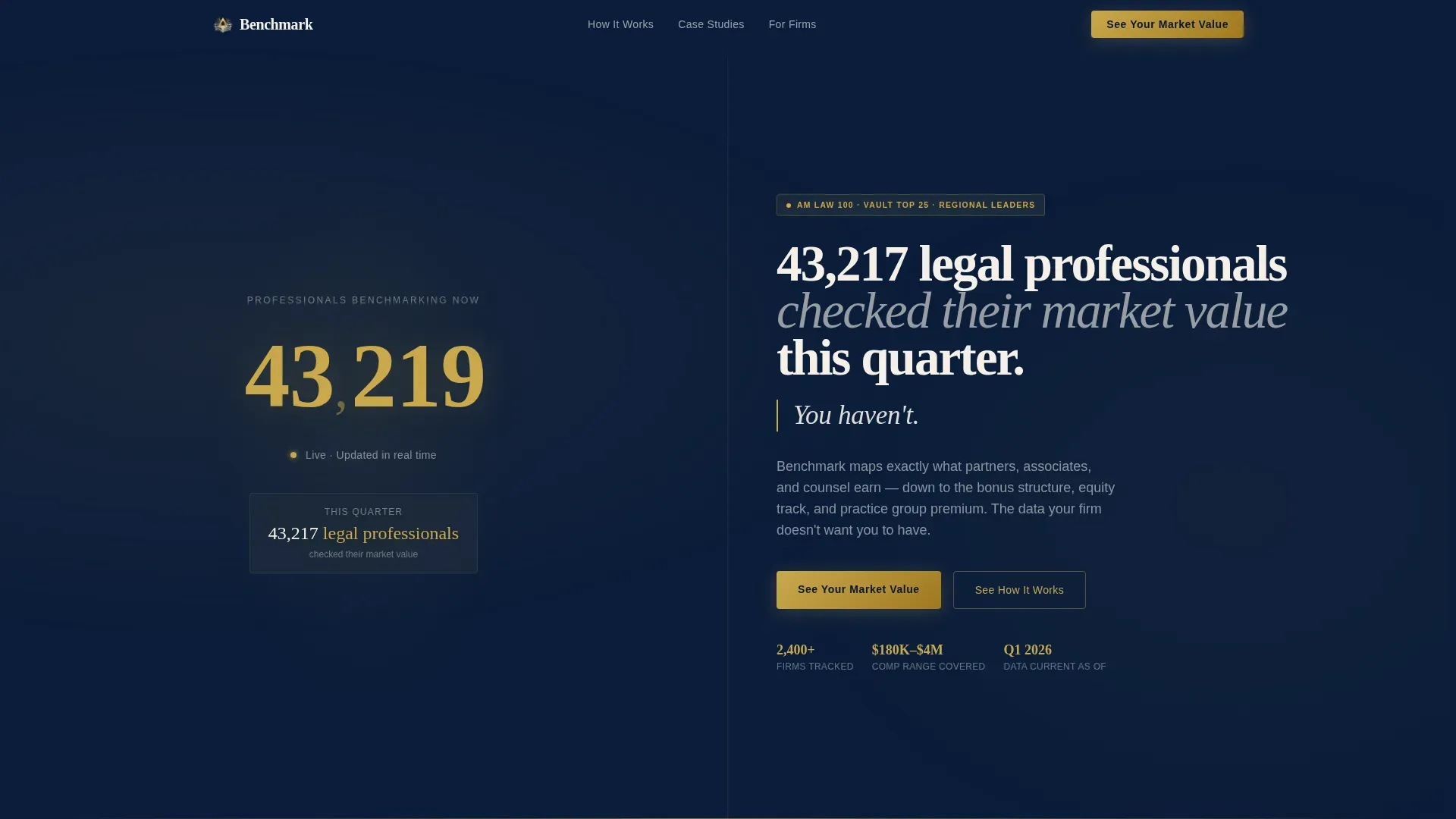
- A live user count ticker header with micro-animations, split against a direct challenge line that creates immediate urgency
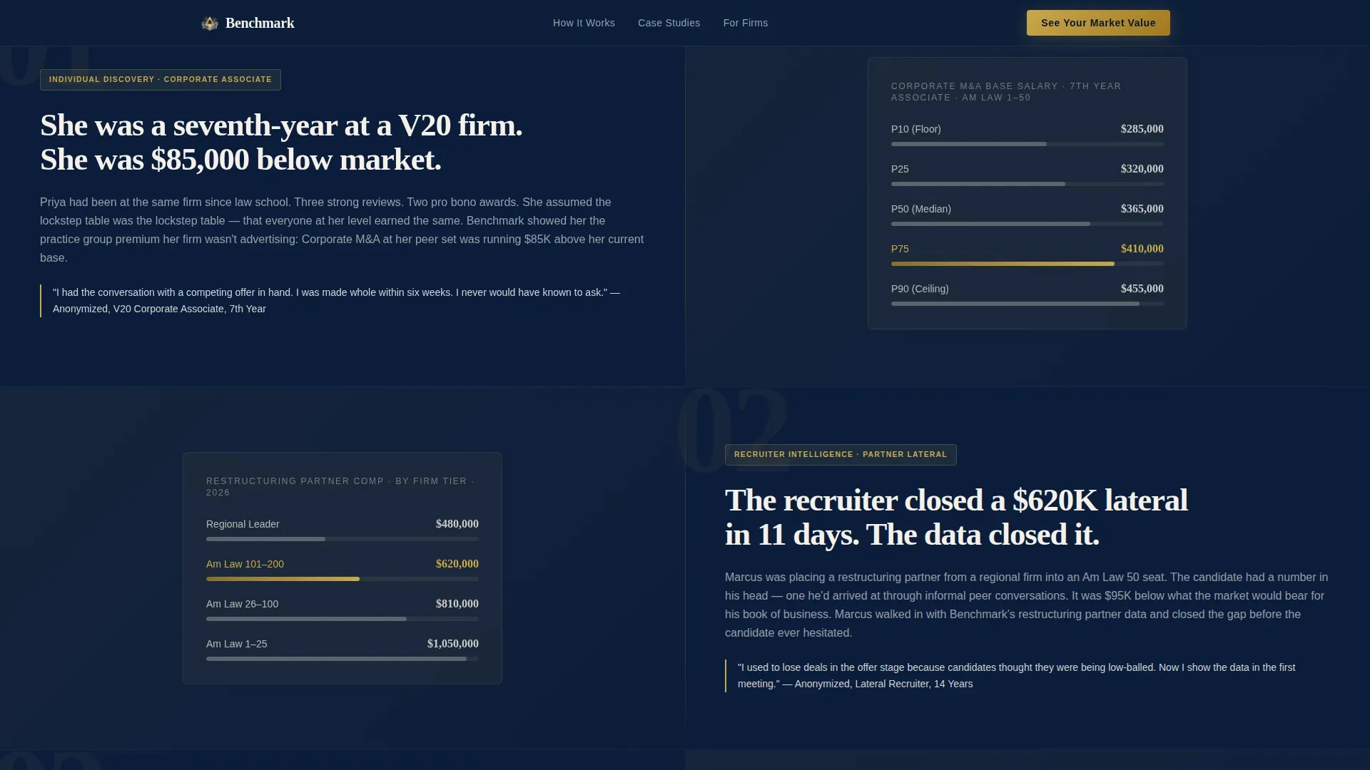
- Three full-screen case study split-screens, each pairing an anonymized compensation narrative with its matching data visualization
- A freemium call-to-action block with a practice area dropdown, a blurred comp range preview, and a two-field email reveal flow
- A separate team access section targeting recruiters and firm administrators, with its own secondary conversion path
- A single-row linear footer rounding out the page structure
Feature list
This section describes the core interactive and structural components built into the Benchmark landing page template.
Live User Count Ticker Header
The left half of the hero displays a real-time counter showing professionals currently benchmarking their compensation. Numbers climb in judicial gold against courtroom navy, with micro-animations on each increment styled after a live stock exchange board. The right half holds a single sharp line of challenge copy designed to make inaction feel costly.
Scroll-Driven Case Study Narratives
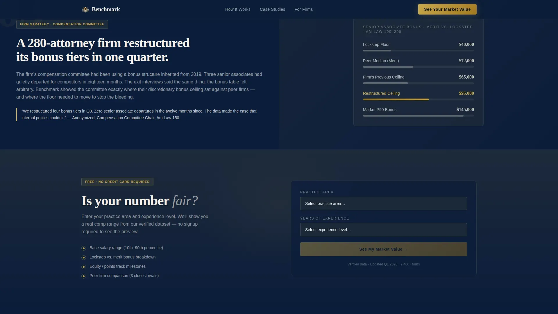
Three full split-screen sections each tell the story of a specific compensation scenario. An anonymized narrative sits on one side; the actual data visualization the person used appears on the other. The scroll sequence escalates from an individual associate discovery to a recruiter placement win to a firm-wide restructuring, building stakes with every section.
Freemium Comp Preview Block
Visitors select their practice area from a dropdown and enter years of experience. Submitting the form reveals a blurred compensation range preview that shows enough real data to validate the source. A follow-up prompt asks for email registration to unlock the full benchmark, making the withheld data feel genuinely valuable rather than artificially gated.
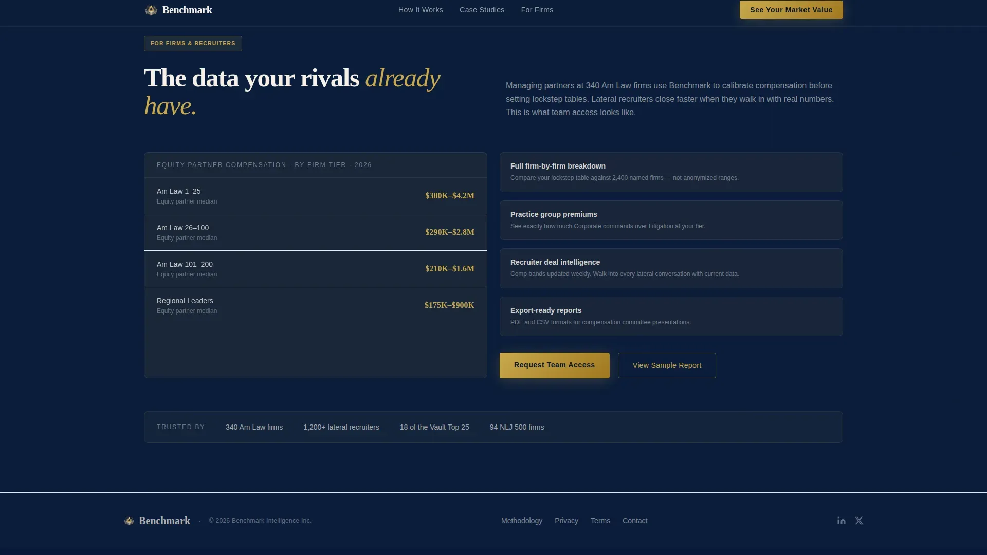
Team Access Conversion Section
A dedicated section below the third case study targets recruiters and firm administrators. It presents a secondary call to action, "Request Team Access", as a distinct conversion path separate from the individual freemium flow. This keeps both audience types moving toward the right entry point.
Directory and Discovery Layout System
The 50/50 split-screen format runs consistently across every major section. It creates a visual rhythm that pairs narrative context with hard data at every scroll step, reinforcing the platform's credibility and making each screen feel like a deliberate reveal rather than a passive scroll.
Navy Authority Color and Typography System
The design uses deep courtroom navy as the primary background, brief-paper ivory for readable body text, and judicial gold reserved exclusively for active states, hover effects, and data highlights. Fraunces serif handles display headlines; DM Sans covers all body and interface text. The result is a palette that reads as credentialed and weighty without feeling dated.
Page sections overview
| Section | Purpose |
|---|---|
| Hero Split Screen | Live ticker left, challenge copy right, immediate social proof and urgency |
| Case Study One | Associate discovery narrative paired with compensation data visualization |
| Case Study Two | Recruiter placement story paired with real-time comp band visualization |
| Case Study Three | Firm restructuring narrative paired with peer benchmarking data visualization |
| Freemium call to action Block | Practice area selector, blurred preview reveal, email registration unlock |
| Team Access Section | Secondary conversion path for recruiters and firm administrators |
| Footer | Single-row linear layout closing the page |
Design & branding system
The visual identity follows a Directory and Discovery theme built on the Navy Authority color system. Every color choice is deliberate: the palette mimics the interior of a white-shoe firm's conference room, understated until something gleams in gold.
- Colors: deep courtroom navy (#0B1D3A) as the primary background, partner-office charcoal (#1E2A3A) for layered surfaces, brief-paper ivory (#F5F0E8) for body text, and judicial gold (#C9A84C) reserved for active states, hover effects, and data highlights
- Typography: Fraunces serif for display headlines and section titles; DM Sans for all body copy, labels, and interface elements
- Animation: high-fidelity micro-animations on the ticker, scroll-linked case study reveals, and a blur-to-reveal interaction on the freemium preview block
Mobile & speed optimization
The template is built desktop-first. Lateral recruiters and managing partners work primarily on wider viewports, and the data density of the compensation visualizations benefits from that extra screen space.
- Desktop-first layout prioritizes data clarity and the split-screen format across wider viewports
- Server Components handle all static sections; Client Components are isolated to the live ticker and interactive call-to-action blocks, keeping non-interactive rendering fast
- The blur-to-reveal interaction and the practice area dropdown are designed for pointer-based navigation on desktop, with the layout remaining readable on tablet viewports
How this template helps you convert
The page is structured to earn each conversion step rather than demand it. Every section adds evidence before asking for a commitment.
- The live ticker and challenge copy in the hero establish social proof and urgency in the first three seconds, framing inaction as a competitive disadvantage before the visitor reads a single case study.
- The three case study narratives build trust progressively, each showing a real-world outcome powered by the platform's data, so the freemium call to action arrives after the visitor already believes the product works.
- The blurred comp preview gives visitors a tangible taste of the data before asking for an email address, making the free tier feel generous enough that withholding registration feels like leaving value behind.
Other information about this template
This template is localized for the United States legal market. All copy, terminology, and data framing reflect Am Law 100 conventions, USD currency, and standard US practice group structures. It is suited for firms and platforms operating in the domestic legal talent space.
- The page uses Fraunces and DM Sans as its type pairing, both available through standard web font delivery
- Animation intensity is high by design; the ticker, scroll reveals, and blur interaction are core to the conversion experience and should be preserved during customization
- The footer follows Pattern 1, a single-row linear layout, keeping the close of the page clean and uncluttered
- This template works well as a standalone acquisition page for a compensation intelligence product or as a gated data preview layer within a broader legal HR platform
Theme
Directory & Discovery
Creative direction
Case Study Narrative
Color system
Navy Authority
Style
Split Screen (50/50)
Direction
Freemium/Trial
Page Sections
Live User Count Ticker with Micro-animations
Three Scroll-driven Case Study Screens
Blurred Comp Range Preview Reveal
Freemium Two-field Entry Form
Dedicated Team Access Section
Navy Authority Visual Identity System
Related questions
Who is this landing page template designed for?
How does the freemium conversion flow work in this template?
Can this template support both individual and team conversion paths?
What makes the header ticker different from a standard hero section?
Is this template specific to the US legal market?


