Fitness Studio Portfolio Website Template
Benchmark is a modular card-grid landing page built for fitness studio case study content. It combines a Bloomberg-terminal-inspired Midnight Blue palette with filterable case study cards, cross-study trend charts, and a persistent app-download call to action. The layout turns dense membership-growth data into a scannable, research-grade reading experience that earns the install before asking for it.
by Rocket studio
Quick summary
Benchmark is a single-page, card-grid landing page template designed for a fitness studio case study archive. It presents real studio growth stories with hard numbers, filterable discovery, and trend-level data visualizations. The page is built to feel like a research dossier, not a blog, and drives visitors toward downloading an app to read every case study in full.
Who this template is for
This template is built for operators and marketers who need proof, not promises. The audience lives in the fitness industry and makes data-driven decisions about studio growth.
- Independent fitness studio owners running boxing gyms, Pilates shops, or CrossFit boxes who want to understand what actually moved the membership needle for peers
- Boutique franchise operators comparing unit economics across multiple locations who need structured benchmarks to make the case internally
- Fitness marketing managers hunting for tactic-level evidence before pitching a spend to leadership
What problem this template solves
Most fitness studio growth content is vague and anecdotal. Studio owners need specific numbers, repeatable tactics, and honest benchmarks to make confident decisions. This template solves the credibility gap between generic advice and real-world proof.
- No central archive exists for case studies sorted by modality, growth lever, or studio size, so discovery is slow and frustrating
- Without visible data density, visitors leave before trusting the content enough to download an app or subscribe to a report
What you get with this template
The template delivers a fully structured, single-page layout built around modular case study cards. Every section has a defined role, from the product screenshot header to the ungated preview cards that prove depth before the download ask.
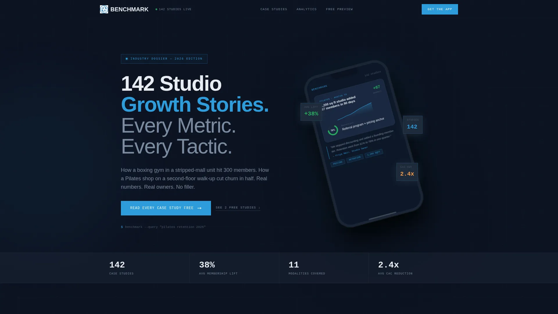
- A hero section featuring a high-fidelity iPhone 15 Pro product screenshot with a real case study card, sparkline, retention chart, and pull-quote on screen
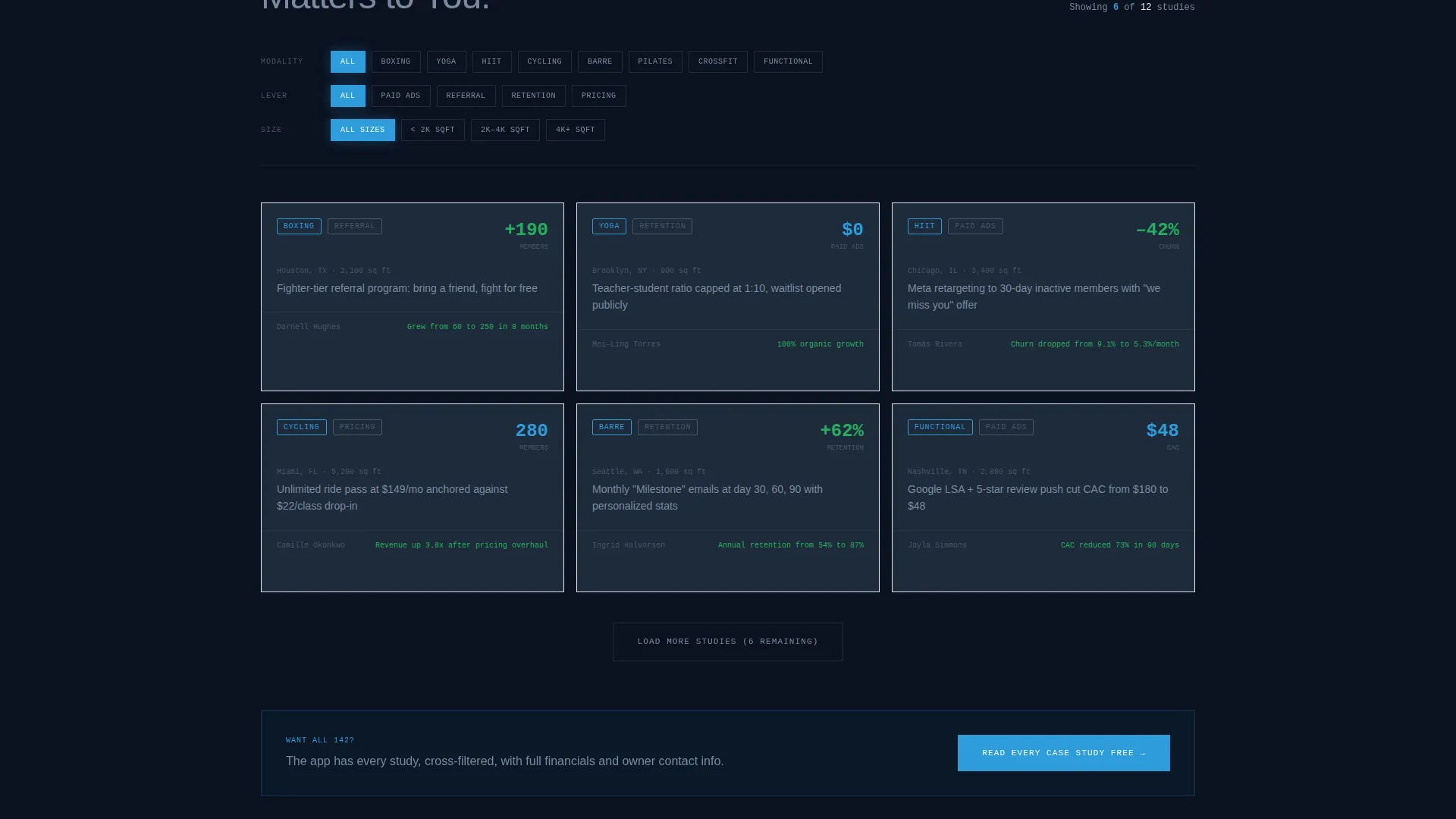
- A filterable card grid where each card shows studio type, market size, hero metric, and a one-sentence tactic summary
- A persistent mobile bottom bar with smart app-download links and a secondary email capture field for a weekly report
Feature list
This template is built around a specific set of components that work together to earn visitor trust and drive the app-download conversion.
Filterable Case Study Card Grid
Each card is a self-contained case study thumbnail. Cards display the studio modality, market size, a hero metric such as "+62% retention," and a one-sentence tactic summary. Visitors can filter by modality (yoga, HIIT, cycling, Pilates), growth lever (paid ads, referral, retention, pricing), and studio size to find exactly the story most relevant to them.
Product Screenshot Hero Header
The header uses a high-fidelity render of the app's case study reader open on an iPhone 15 Pro, tilted fifteen degrees. The on-screen card reads "How a 1,200 sq ft Pilates studio in Austin added 87 members in 90 days." A membership-growth sparkline, a before/after retention donut chart, and an owner pull-quote appear on the device screen, with the headline "142 Studio Growth Stories. Every Metric. Every Tactic." set in cold-white above.
Cross-Study Trend Charts
As the visitor scrolls deeper, individual case study cards give way to aggregated data visualizations. These include average customer acquisition cost by modality, churn benchmarks by city tier, and revenue-per-square-foot distributions. The escalating data density makes the page feel like an analyst's research desk rather than a content feed.
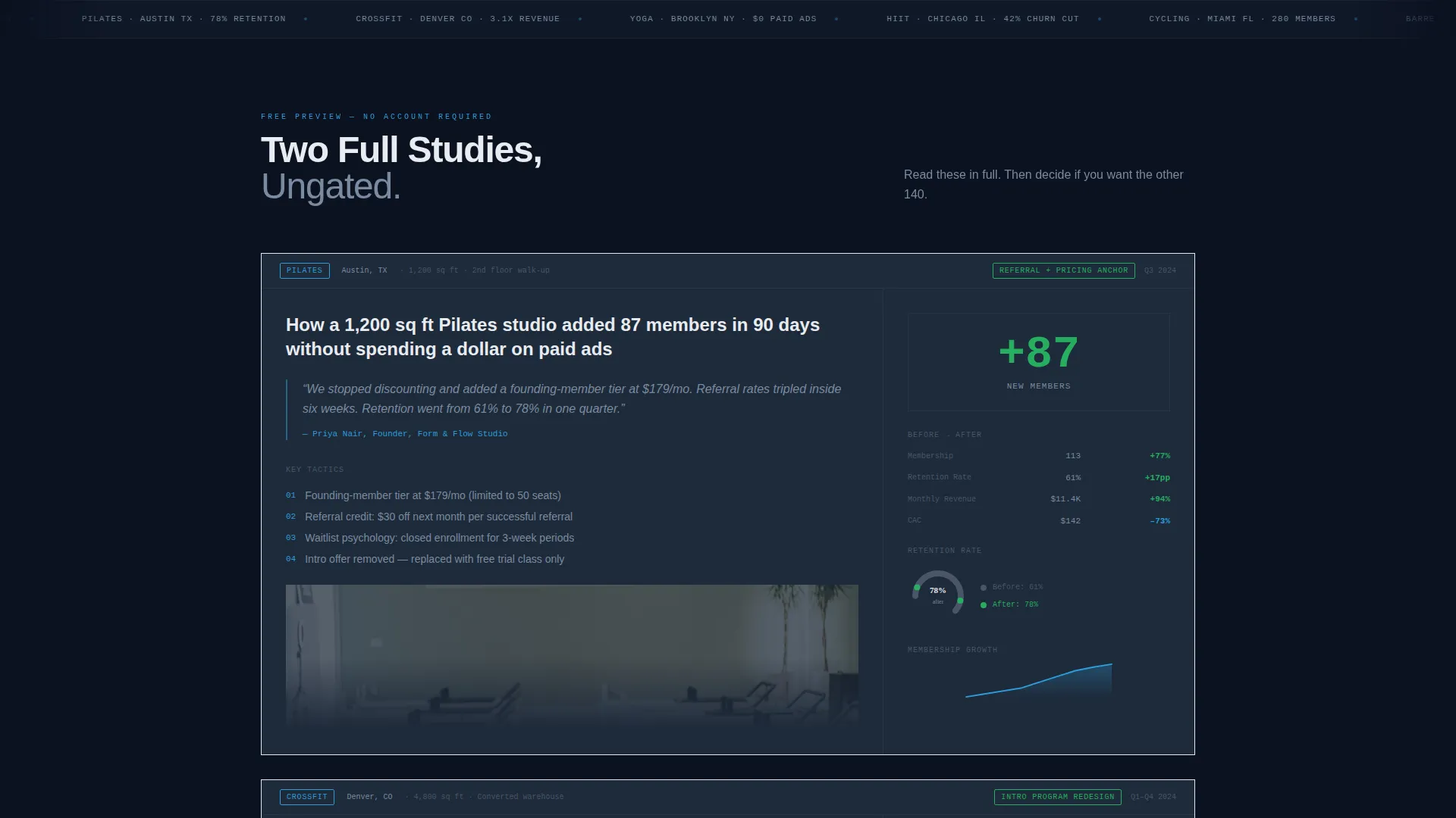
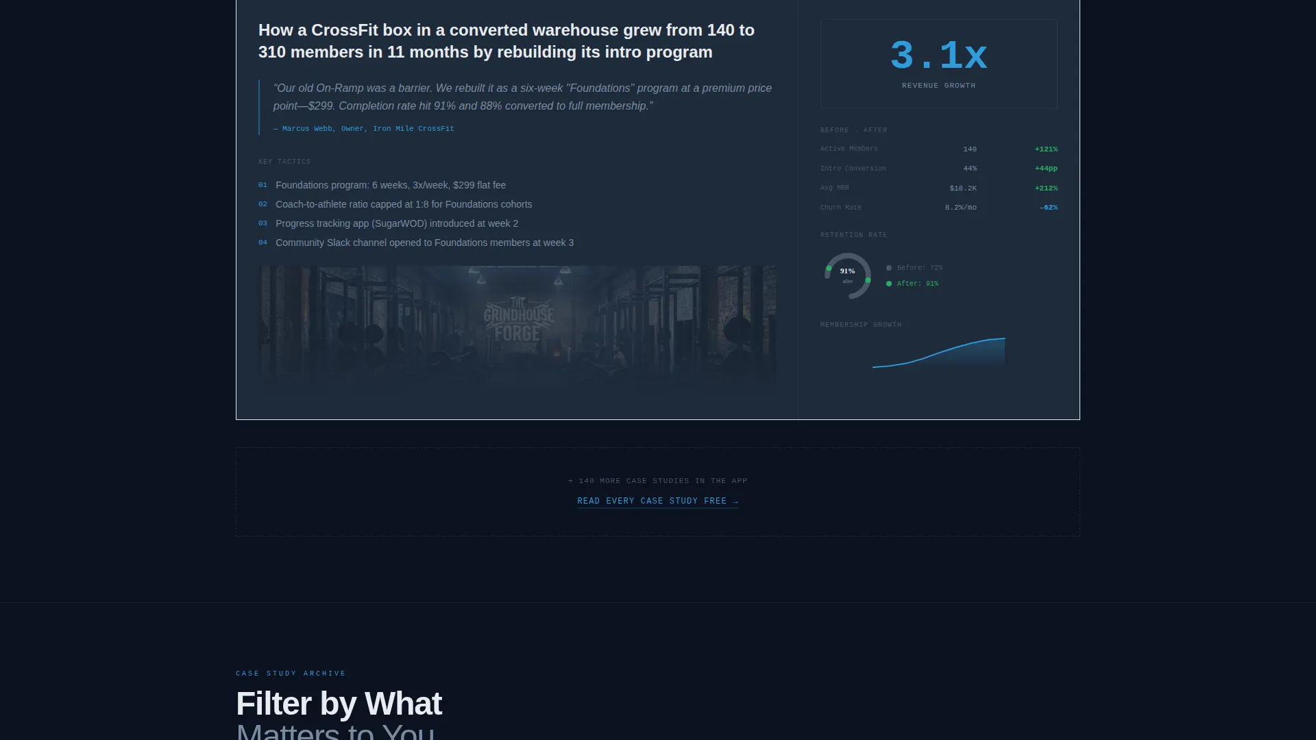
Ungated Preview Case Studies
Two complete case studies appear on the page without any login or email gate. This deliberate proof-of-depth strategy lets readers verify the quality of the content before committing to a download or subscription, which reduces friction and increases install intent.
Persistent App Download Bar
A sticky bottom bar appears on mobile and remains visible as the user scrolls. It carries the primary call to action "Read Every Case Study Free" with device-detected smart links routing visitors directly to the App Store or Google Play. The bar keeps the conversion path accessible at every scroll depth.
Email Capture for Weekly Report
A secondary conversion path offers the "Get the Weekly Benchmark Report" email signup. The field is single-input with studio name auto-suggestion, reducing typing friction. This path captures visitors who are not yet ready to download the app but want ongoing value delivered to their inbox.
Page sections overview
| Section | Purpose |
|---|---|
| Hero Header | Anchors authority with a product screenshot and headline |
| Filter Controls | Lets visitors narrow cards by modality, growth lever, size |
| Case Study Grid | Displays modular thumbnail cards for each studio story |
| Ungated Case Studies | Proves content depth before asking for the app install |
| Trend Chart Block | Aggregates cross-study data into visual benchmarks |
| App Download Bar | Persists on mobile as the primary conversion anchor |
| Email Capture Field | Offers a weekly report as a lower-commitment conversion |
Design & branding system
The visual identity follows a Directory and Discovery theme built on a Midnight Blue color system. The palette is deliberately clinical, referencing the density and authority of financial data terminals applied to the wellness industry.
- Deep terminal navy (#0B1120) on the primary background, steel-slate (#1E2A3A) on card surfaces, and cold data-white (#E8ECF1) for body text keep contrast sharp and legible at every scroll depth
- Electric cerulean (#2D9CDB) is reserved for links, hover states, and metric highlights, giving key numbers and interactive elements a controlled visual emphasis without competing with the data
Mobile & speed optimization
The layout is designed for mobile-first consumption. The primary conversion mechanism is a persistent bottom bar built for thumb reach, and the smart link system routes visitors to the correct app store without extra taps.
- The sticky app-download bar remains fixed at the bottom of the viewport on mobile, keeping the call to action reachable without scrolling back to the top
- Device-detected smart links in the download bar route iOS visitors to the App Store and Android visitors to Google Play automatically, removing the wrong-store friction
How this template helps you convert
The page is structured to build trust progressively and meet visitors at different levels of commitment. Conversion is earned through proof before it is asked for.
- Two ungated case studies appear mid-page to demonstrate content quality, so visitors experience the value of the archive before any download prompt appears
- The persistent mobile bottom bar with smart app-download links keeps the primary call to action visible at every scroll depth, reducing the distance between decision and action
Other information about this template
This template is part of the Technology category and sits within the Fitness Studio Website Templates subcategory. It is specifically designed for the Fitness Studio Case Study Page niche, which requires a balance of data density, scannable layout, and credible visual authority.
- The card grid is modular, meaning individual case study cards can be updated or reordered without restructuring the full page layout
- The Industry Report creative direction was chosen to match the reading behavior of studio owners and marketing managers who already consume research publications and operator newsletters
- The template supports both a primary app-download path and a secondary email-capture path, giving the page two distinct conversion tracks for different audience segments
Theme
Directory & Discovery
Creative direction
Industry Report
Color system
Midnight Blue
Style
Card Grid (Modular)
Direction
App Download
Page Sections
Filterable Case Study Card Grid
Product Screenshot Hero Header
Cross-study Trend Charts
Ungated Preview Case Studies
Persistent App Download Bar
Email Capture for Weekly Report
Related questions
Who is this landing page template best suited for?
Can I change the filter categories on the card grid?
Do visitors need to log in to read the case studies?
Does the template support both iOS and Android app download links?
Is the page layout suitable for a large content archive?