Public Sector | Free Website Template | Rocket
A single-page comparison landing page built for public sector HR professionals who need real salary benchmarking data. The template showcases compensation ranges from municipal payrolls, school districts, and state agencies, and guides visitors toward a free trial with blurred preview tables, testimonial tiles, and a warm, civic-minded visual identity that feels approachable and credible.
by Rocket studio
Quick summary
This landing page template is designed for a government compensation benchmarking platform. It pulls salary data from municipal payrolls, school districts, and state agencies so public HR professionals can make confident pay decisions. The layout combines structured comparison tables with testimonial tiles, a blurred data preview, and a clear free-trial call to action throughout the scroll.
Who this template is for
This template is built for teams and individuals working inside government and public sector organizations who carry real responsibility for compensation decisions. It speaks directly to the people defending budget lines in front of skeptical boards, not just browsing HR software.
- County HR managers who need defensible pay data before a board meeting
- City managers trying to retain essential workers like snowplow drivers and 911 dispatchers
- State agency directors writing classification studies under deadline pressure
What problem this template solves
Public sector HR professionals have long had to guess whether their compensation plans are losing talent to private employers. Salary surveys scattered across PDF reports and outdated classification studies leave too many gaps. This template solves the visibility problem by presenting a platform that puts current, real-world pay data on the table.
- No clear way to compare local government salaries against peer jurisdictions quickly
- Compensation proposals that lack hard data fail to survive board scrutiny
- Talented employees leave when pay lags behind market rates without anyone catching it early
What you get with this template
This template delivers a complete, ready-to-customize landing page for a public sector compensation benchmarking platform. Every section is built to match the workflow and decision-making context of government HR professionals.
- A warm, civic-themed visual layout with a Team Photo header, Testimonial Mosaic scroll sections, and Dopamine Pop color styling
- Interactive comparison tables with blurred-out preview rows that reveal exactly what a free trial unlocks
- A structured lead capture form sequence and a secondary gated PDF download path for visitors not yet ready to trial
Feature list
This template includes purpose-built components that work together to earn trust and drive sign-ups from a highly specific professional audience.
Candid Team Photo Header
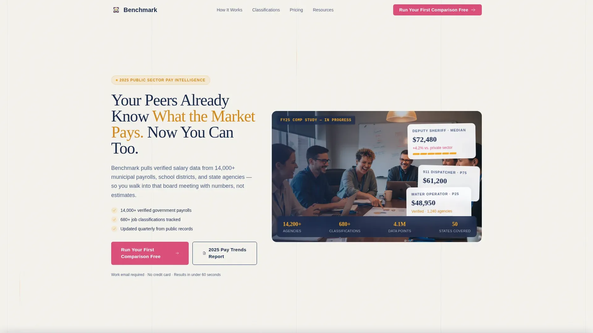
The header uses a warm, documentary-style photograph of six public HR professionals at a conference table. Lanyards on, laptops open, one person mid-laugh over a printed salary report. The headline fades in over the image: "Your Peers Already Know What the Market Pays. Now You Can Too." The image sets an immediately relatable tone before a visitor reads a single data point.
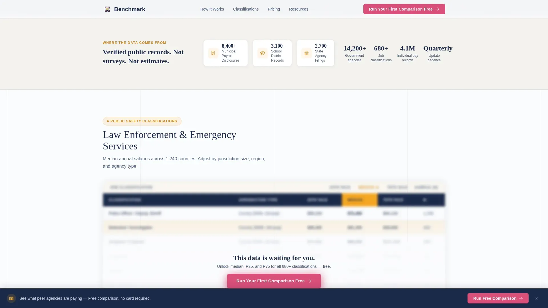
Blurred Comparison Table Preview
Two comparison tables appear with deliberately blurred interior columns. Visitors can see the structure clearly: median salary, 25th percentile, and 75th percentile columns are visible but locked. This preview technique makes the free trial feel like lifting a fog rather than filling out a form to enter a funnel.
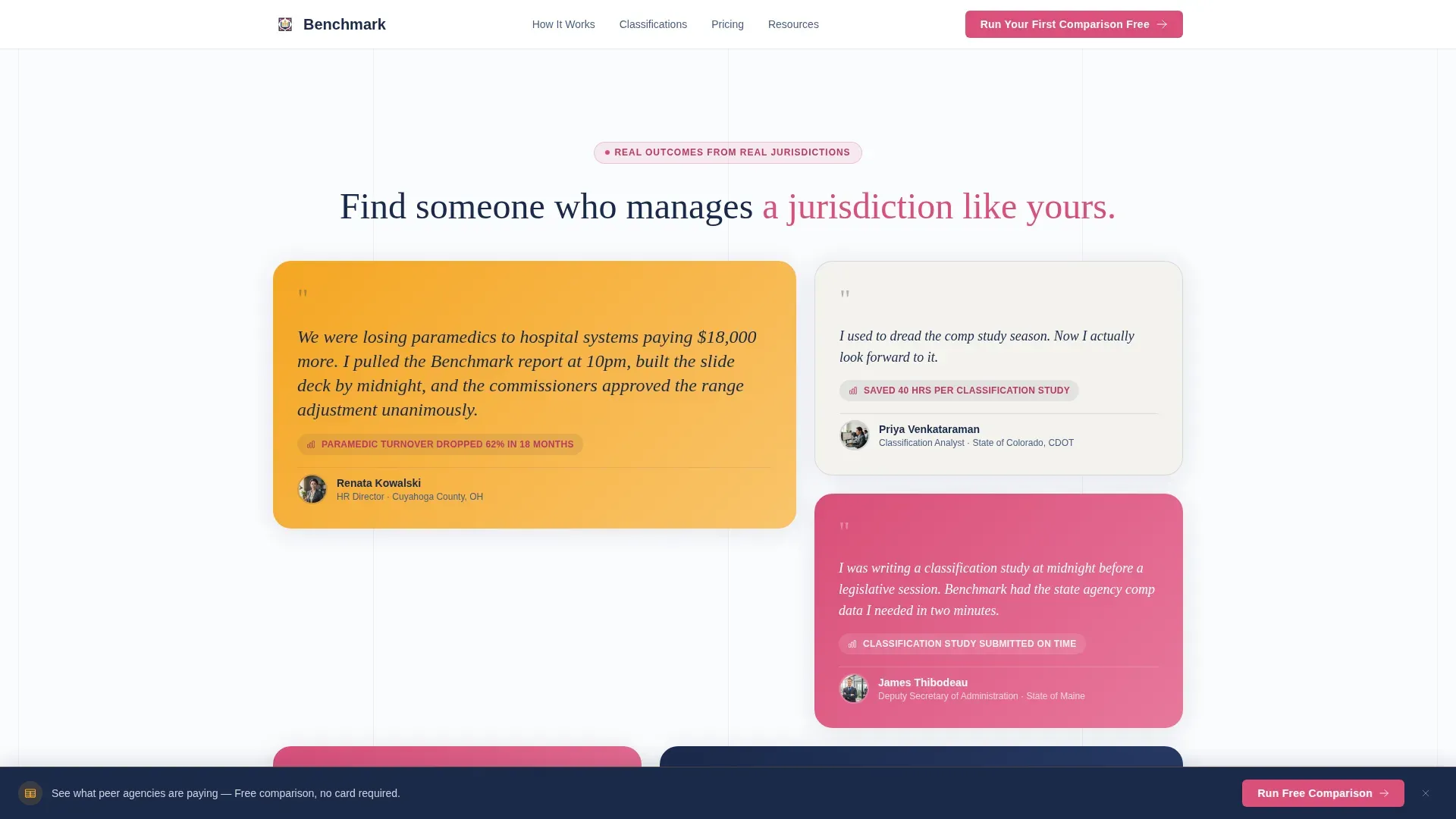
Testimonial Mosaic Section
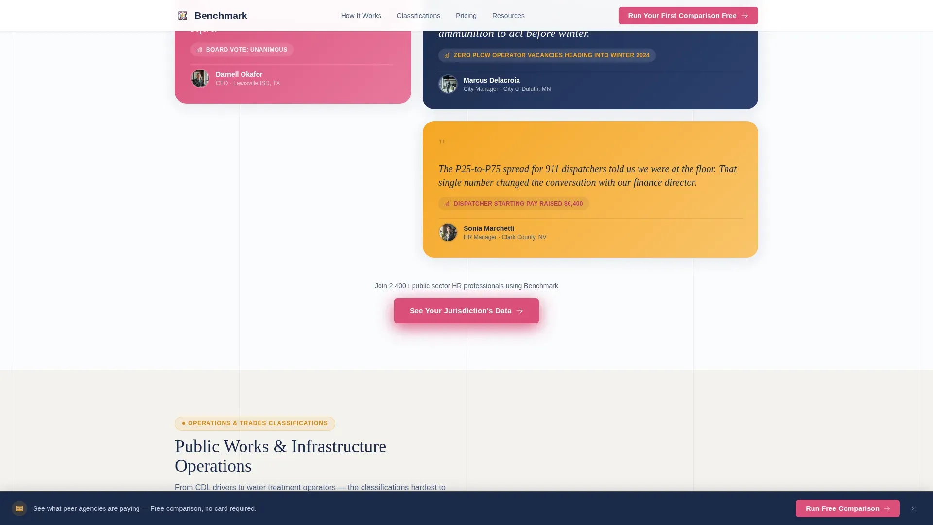
Testimonial tiles are woven between each comparison table rather than grouped at the bottom. Each tile uses a different shape and color from the Dopamine Pop palette and features a specific, named public sector professional. An Ohio county HR director who stopped losing paramedics. A Texas school district CFO whose classified staff raise passed unanimously. The alternating rhythm of hard data and human proof keeps visitors scrolling.
Freemium Trial Lead Capture Form
The primary call-to-action form collects job title first using a dropdown of common public sector classifications such as Deputy Sheriff, Water Treatment Operator, and Assistant City Manager. It then asks for state, agency size by headcount range, and work email. Personal email domains are not accepted, which signals legitimacy and pre-qualifies every lead automatically.
Gated PDF Secondary Path
Visitors who are not ready to start a trial can download the 2025 Public Sector Pay Trends Report. This path captures email address and agency name only, reducing friction for early-stage visitors while still building the contact list.
Sticky Bottom Call-to-Action Bar
The primary call-to-action button is pinned to a bottom bar that stays visible as visitors scroll. The button reads "Run Your First Comparison Free" and uses berry text on a gold hover state. It also appears in the header and after the second comparison table, so no section of the page is far from a conversion point.
Page sections overview
| Section | Purpose |
|---|---|
| Team Photo Header | Sets warm, credible tone with relatable imagery and headline |
| Primary call to action Block | Introduces free trial offer above the fold |
| First Comparison Table | Shows blurred salary data preview to build curiosity |
| Testimonial Tile Cluster | Adds human proof between the first and second data tables |
| Second Comparison Table | Deepens the data preview and reinforces the trial value |
| Secondary call to action Block | Repeats free trial call to action after the second table |
| Testimonial Tile Cluster | Continues the mosaic rhythm with additional peer voices |
| Gated PDF Download | Captures emails from visitors not ready for a full trial |
| Sticky Bottom Bar | Keeps the primary call to action visible throughout the full scroll |
Design & branding system
The visual identity follows a Community Hearth theme expressed through a Dopamine Pop color palette. The overall feeling is a public library that just got renovated: the structure is institutional and trustworthy, but the accent choices have warmth and personality.
- Warm civic gold (#F5A623) carries headers and highlighted data rows; confident berry (#D94F7A) marks interactive elements and calls to action
- Deep municipal navy (#1B2A4A) grounds all body text and table borders to keep the data grids readable and authoritative
- Bright chalk white (#FAFBFD) opens up the dense comparison grids so no column feels crowded, even at the third row of median salaries
Mobile & speed optimization
The template is structured so that dense comparison tables remain readable on smaller screens without horizontal scrolling causing frustration. The sticky bottom bar and simplified form flow are equally usable on a phone as on a desktop browser.
- Comparison table columns are sized and spaced to remain legible on mobile viewports
- The lead capture form uses a logical top-to-bottom field order that works cleanly on touch screens
- Testimonial mosaic tiles restack gracefully in a single column on narrow screens without losing the alternating data-then-narrative rhythm
How this template helps you convert
The page is structured to move a skeptical government HR professional from curiosity to trial sign-up without any single step feeling like a big commitment.
- The blurred table preview creates an immediate, tangible reason to act: visitors see exactly what they will unlock, so clicking "Run Your First Comparison Free" feels like a natural next step rather than a leap of faith.
- The Testimonial Mosaic sections reduce hesitation by showing peers from comparable jurisdictions who have already used the data successfully, making the platform feel proven rather than experimental.
- The gated PDF secondary path captures visitors who are not yet ready to trial, ensuring the page converts even the most cautious browsers into trackable contacts.
Other information about this template
This template is designed as a single-page landing page, not a multi-page site. It is purpose-built for the government and public sector HR niche where compensation benchmarking decisions carry real political and budgetary weight. The Comparison Table layout style keeps the focus on data clarity throughout, which matches how public sector professionals are trained to evaluate information.
- The template style is Comparison Table, making it well-suited for platforms that need to communicate tiered or percentile-based salary data at a glance
- The Freemium/Trial landing page direction means every design decision points toward a low-risk first action, not a hard sales close
- The Community Hearth theme is a deliberate contrast to the cold, clinical look common in government HR software, creating a moment of warmth in a process-heavy environment
- This template can support a compensation benchmarking platform serving municipal governments, school districts, or state agencies of any size
- The form's work-email-only requirement is built into the design to pre-qualify leads and signal professional-grade intent from the first interaction
Theme
Community Hearth
Creative direction
Testimonial Mosaic
Color system
Dopamine Pop
Style
Comparison Table
Direction
Freemium/Trial
Page Sections
Candid Team Photo Header
Blurred Salary Data Preview
Testimonial Mosaic Scroll Design
Freemium Trial Lead Capture Form
Gated PDF Secondary Path
Sticky Bottom Call-to-action Bar
Related questions
Who is this landing page template designed for?
What makes the comparison tables different from a standard pricing grid?
Does the page include more than one conversion path?
Can I customize the job title dropdown in the lead capture form?
Is this template suitable for platforms serving multiple types of government agencies?


