Startup Compensation | Free Website Template | Rocket
Benchmark is a startup and scale-up compensation benchmarking landing page template built for platforms that surface real equity splits, cash bands, and bonus structures. It uses a Stats-First Impact creative direction, a progressive multi-step lead capture form, an interactive blurred data preview, and a Navy Authority color system to turn compensation curiosity into qualified form submissions.
by Rocket studio
Quick summary
Benchmark is a single-column landing page template for compensation intelligence platforms serving startups and scale-ups. It opens with an oversized data-point headline, moves through role-specific benchmark previews, and closes with a three-step lead capture form. Every scroll position leads with a number before a narrative, building trust through data depth before asking for a commitment.
Who this template is for
This template is built for founders and HR leaders at venture-backed companies who need to present compensation data in a way that earns immediate credibility. It suits platforms where the product itself is the data.
- VP People leads at early growth-stage SaaS companies writing a first compensation philosophy
- CFOs at Series B companies modeling equity dilution against market-rate offers
- Talent leads at growth-stage companies who need to counter FAANG-level offers for senior engineering roles
What problem this template solves
Compensation benchmarking platforms often struggle to convert visitors because they describe their dataset rather than demonstrate it. Visitors leave before trusting the numbers. This template solves that by leading with real statistics before a single feature is explained.
- Founders lose senior hires because internal comp ranges are built on survey estimates, not verified offer data
- HR leaders lack a structured page flow that builds data credibility before asking for a form submission
- Talent teams need a conversion experience that turns passive browsing into qualified lead capture
What you get with this template
You get a fully structured, single-column landing page designed around a Stats-First Impact creative direction. The layout alternates between deep navy authority sections and crisp ledger-white data panels, with signal teal driving every interactive and call-to-action element.
- A bold editorial hero section with a half-page photo and text split, oversized stat headline, and a primary call-to-action button
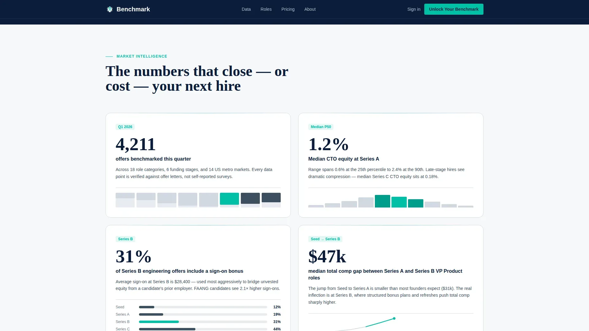
- A scrolling impact band of oversized data points with supporting mini data visualizations including horizontal bars, percentile dot plots, and sparklines
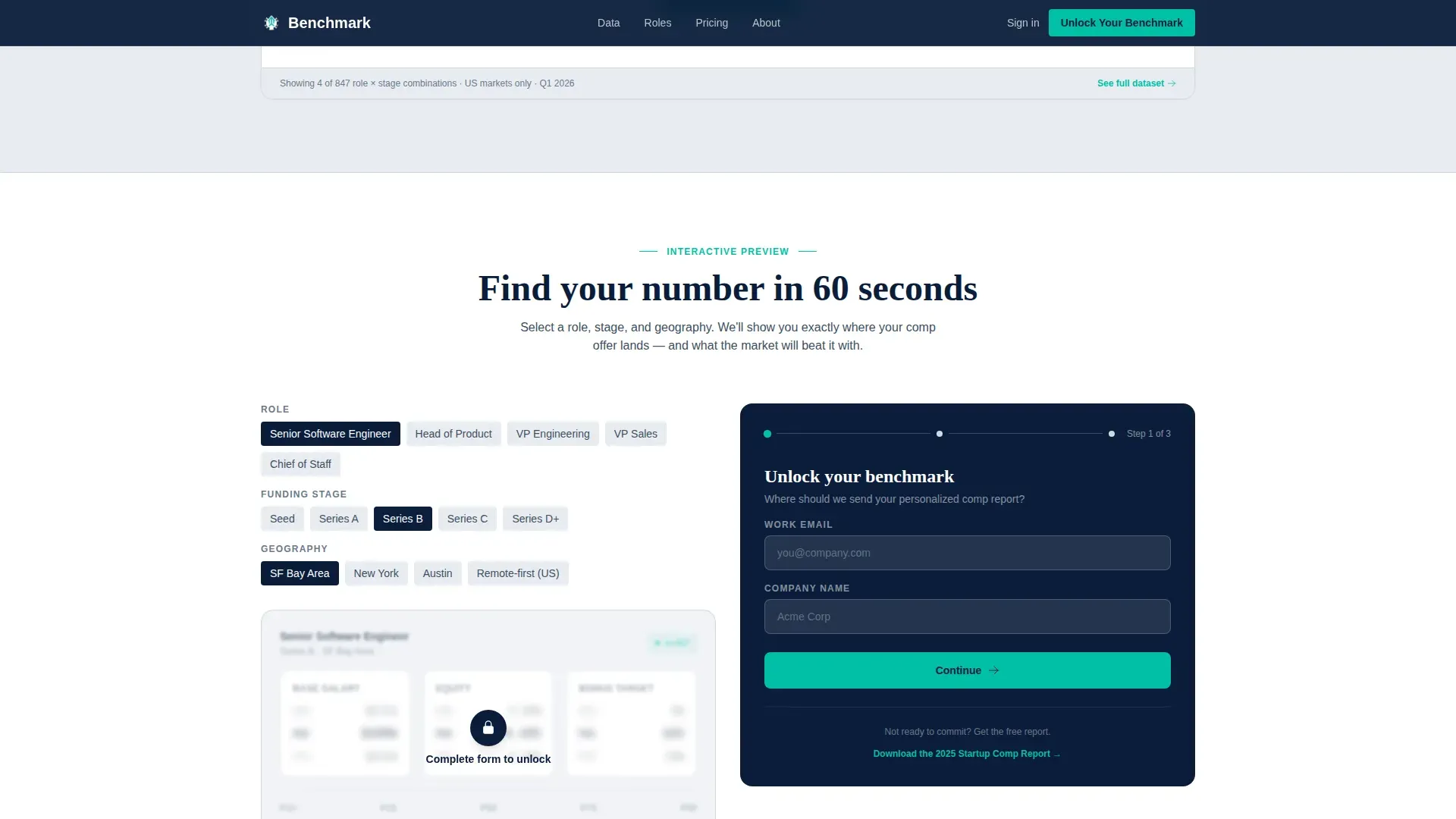
- A three-step progressive disclosure lead capture form and a blurred interactive compensation preview that sharpens on form submission
Feature list
This template includes prompt-backed components designed specifically for compensation data platforms at the startup and scale-up stage.
Stats-First Impact Scroll Band
Each new scroll position opens with a single oversized data point before any supporting text appears. Scroll-triggered number reveals and staggered data row animations reinforce the rhythm of number-then-narrative across the full page.
Blurred Interactive Comp Preview
Visitors select a role, funding stage, and geography to see a blurred compensation range. The range sharpens only after form submission, turning natural curiosity into a direct conversion action.
Three-Step Progressive Disclosure Form
The lead capture form uses progressive disclosure across three steps: work email and company name first, then company stage and headcount range, then role categories being benchmarked. This reduces form friction while collecting richer qualification data.
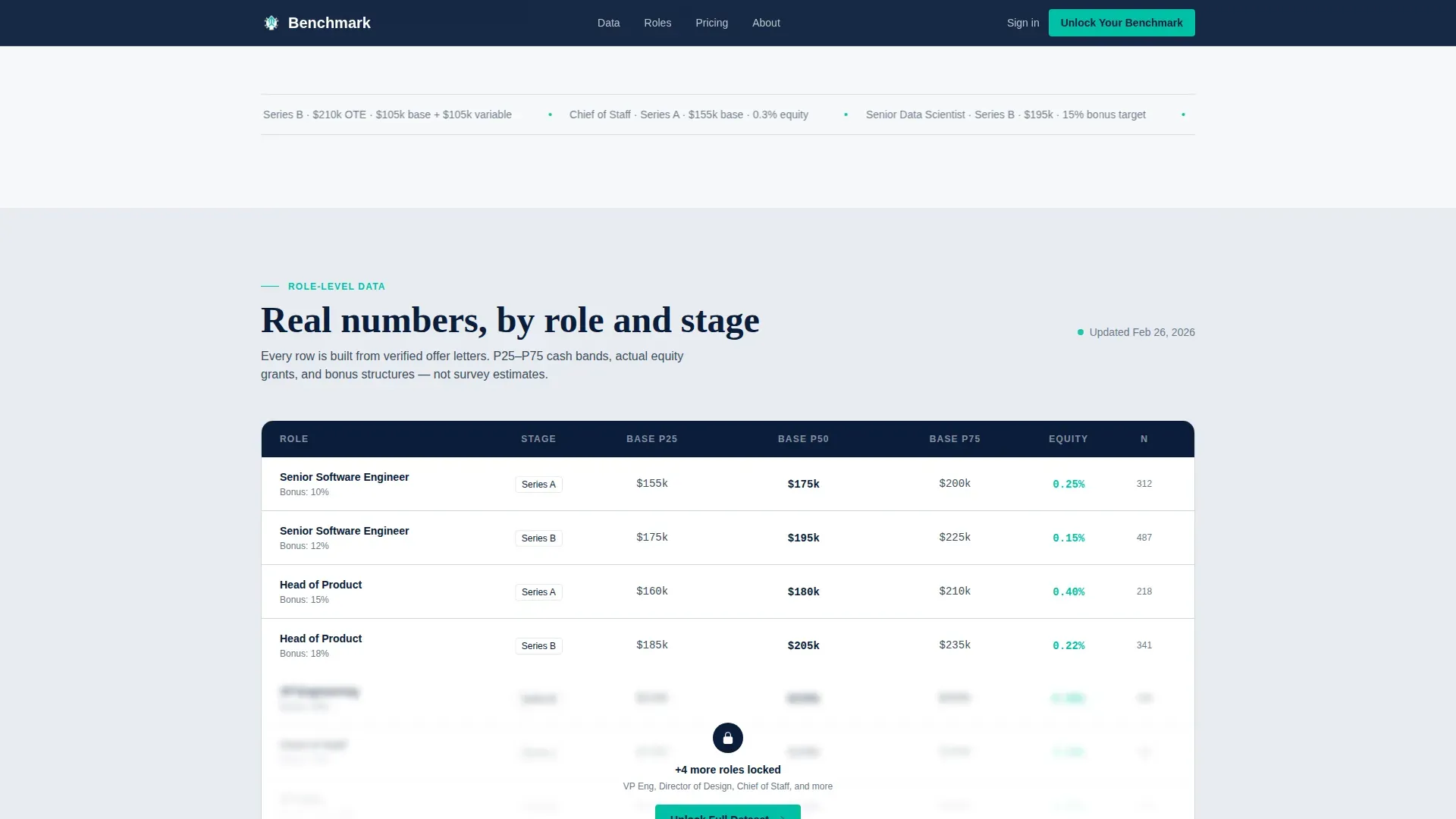
Role-Specific Benchmark Data Table
A data table preview section displays real compensation ranges organized by role and funding stage. The section is designed to feel like a confidential internal spreadsheet, reinforcing platform credibility before the full dataset is unlocked.
Secondary Download Conversion Path
A secondary call to action offers a downloadable startup compensation report. It requires only an email address, capturing visitors who are not yet ready to complete the full multi-step form.
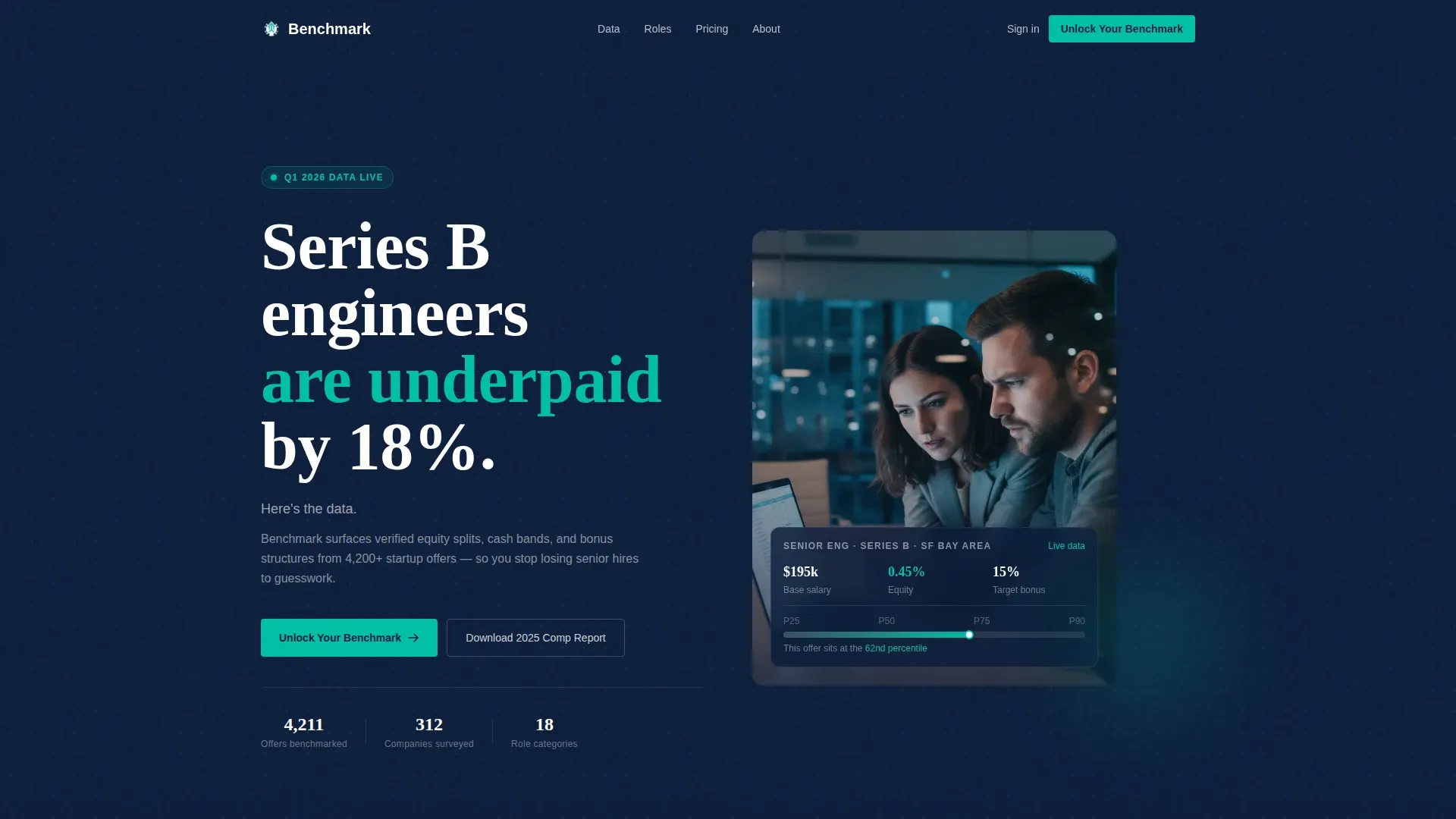
Editorial Hero Section
The hero uses a half-page split layout: bold white stat headline on a deep navy background on the left, and an editorial-grade photograph on the right showing founders reviewing a compensation spreadsheet in a real working environment.
Page sections overview
| Section | Purpose |
|---|---|
| Editorial Hero Split | Opens with stat headline, editorial photo, and primary call to action |
| Stats Impact Band | Delivers oversized data points with mini visualizations on scroll |
| Role Benchmark Table | Shows compensation ranges by role and funding stage as a data preview |
| Interactive Comp Preview | Blurred range selector that sharpens after form submission |
| Testimonials Block | Social proof from VP People, CFO, and Talent Lead personas |
| Closing Navy Block | Final call to action with primary form in a deep navy section |
| Linear Footer | Single-row footer with essential navigation and legal links |
Design & branding system
The visual identity follows a Navy Authority color system that feels like the interior of a Bloomberg terminal built with Scandinavian typographic precision. Navy dominates above the fold and returns for the closing section. Mid-page sections alternate between ledger-white data panels and pale slate divider bands that separate benchmark categories.
- Primary backgrounds use deep command navy (#0B1D3A), with polished gunmetal (#3D4F5F) for secondary text and dividers
- Data cards and content surfaces use crisp ledger white (#F7F8FA), while signal teal (#00BFA6) drives all interactive elements, calls to action, and live data highlights
- Typography pairs DM Sans for data interface and body copy with Fraunces for oversized stat headlines, combining readability with editorial weight
Mobile & speed optimization
The template is designed desktop-first to match the primary use case: compensation modeling at a workstation. The layout is structured so that data-heavy sections remain readable and functional across screen sizes.
- Desktop-first column structure keeps data tables and split-hero layouts intact at larger viewports
- Interactive components including the multi-step form and blur-to-sharp preview are built as client-side components, while static sections use server components to keep initial load lean
- Scroll-triggered animations use medium complexity, appearing only after the relevant section enters the viewport to avoid layout disruption on smaller screens
How this template helps you convert
Every section of this template is sequenced to earn trust before it asks for anything. The page builds cumulative credibility across multiple scroll positions so that by the time the form appears, the visitor already believes the dataset is worth their contact details.
- The hero lands with a bold, specific data point that immediately signals the platform's depth, followed by the primary "Unlock Your Benchmark" call to action in signal teal
- The stats band and role benchmark table demonstrate real data density, so the visitor trusts the numbers before interacting with the blurred preview
- The progressive disclosure form reduces perceived effort by collecting information in three short steps, and the secondary download path captures leads who need more time before committing to the full tool
Other information about this template
This template is localized for United States markets, using USD currency formatting and MM/DD/YYYY date conventions throughout. It is categorized under HR and Hiring, specifically within the startup and scale-up HR and compensation benchmarking niche.
- The template supports a Directory and Discovery theme, making it well suited for platforms that organize and surface structured data sets by category, role, or stage
- Animation complexity is set to medium: scroll-triggered number reveals and staggered data rows add dynamism without overwhelming the information hierarchy
- The closing section repeats the primary "Unlock Your Benchmark" call to action for a third time, ensuring the conversion opportunity is present at the natural stopping point of the page
Theme
Directory & Discovery
Creative direction
Stats-First Impact
Color system
Navy Authority
Style
Single Column Flow
Direction
Lead Generation
Page Sections
Stats-first Impact Scroll Band
Blurred Interactive Comp Preview
Three-step Progressive Disclosure Form
Role-specific Benchmark Data Table
Editorial Hero Split Layout
Secondary Download Conversion Path
Related questions
What types of teams is this landing page template designed for?
How does the interactive compensation preview work?
Can the three-step form be adapted for different qualification needs?
Is there a lighter conversion path for visitors not ready to submit the full form?
What does the Stats-First Impact creative direction mean in practice?


