Bold Brutalist Houseboat Designer Landing Page Template
Berth is a bold brutalist houseboat designer landing page template built for a bespoke floating-home studio. It pairs a cinematic full-bleed scroll experience with an Obsidian and Gold color system, drawing visitors through welded-steel construction, raw concrete interiors, and rooftop terraces before landing them at a clear commission inquiry call to action.
by Rocket studio
Quick summary
Berth is a storybook single-page landing page template for a luxury houseboat design studio. It uses scroll-linked cinematic dissolves, a delayed brass headline reveal, and full-bleed photography to move visitors emotionally through the build process before presenting a dual call to action. The template is grounded in a Bold Brutalist visual identity and targets high-net-worth clients across London and European waterways.
Who this template is for
This template is intended for studios and independent designers who work at the intersection of naval engineering and residential architecture. It speaks directly to the kind of creative practice that builds bespoke floating homes rather than production vessels. Every section is shaped around a client who expects both structural honesty and living-space warmth in a single hull.
- Bespoke houseboat architects and naval-residential design studios seeking a high-impact digital presence that reflects their craft
- Luxury interior design consultancies working on canal or river mooring projects who need a site that communicates lifestyle aspiration alongside technical credibility
- Independent designers and small practices in the residential specialty space who want to attract tech founders, architects, and lifestyle-driven clients already oriented toward waterway living
What problem this template solves
Most architecture and interior design studios working in specialist niches face the same challenge: generic portfolio templates do not communicate the emotional weight of their work. A conventional grid layout cannot carry the feeling of stepping onto a floating brutalist masterpiece at golden hour. The gap between what these designers create and what their websites communicate is often enormous.
- There is no standard template category for naval-meets-residential studios, which forces designers to either overspend on custom development or settle for a generic architecture theme that undersells the concept
- Clients browsing on large desktop screens expect a spatial, immersive experience that mirrors the quality of the built work, and most off-the-shelf options fail to deliver that sense of drama and material depth
- The studio needs to earn emotional commitment before it can ask for an inquiry, and that process requires a narrative structure that unfolds like a short film rather than a brochure site
What you get with this template
You receive a fully structured single-page layout that guides the visitor through five cinematic acts, from the first glimpse of a matte-black hull at water level to a final drone-pullback frame above a glowing vessel on a dark river. Every section is purposefully sequenced to build desire before presenting a call to action. The template ships with a complete design system, scroll animation scaffold, and dual conversion path.
- A five-section storybook page flow covering the hero reveal, dry dock construction narrative, raw concrete and glass interior, rooftop terrace lifestyle scene, and a commission-focused closing frame, plus a structured footer in a horizontal flow pattern
- A complete Obsidian and Gold color system using four precisely defined values, a dual-typeface pairing of DM Sans for body copy and Fraunces for editorial display, and burnished brass reserved exclusively for interactive elements and section dividers
- Scroll-linked cinematic dissolve transitions driven by GSAP ScrollTrigger, cursor parallax layers, a delayed brass headline fade-in on the hero, and brass-colored hover states across all interactive elements, with a persistent "Explore the Fleet" call to action and a secondary outlined "Commission a Hull" button appearing after the fourth section
Feature list
This section covers the core built-in capabilities that define the template and set it apart from standard architecture themes. Each feature is drawn directly from the template brief and reflects real, delivered functionality.
Full-Bleed Hero with Delayed Brass Reveal
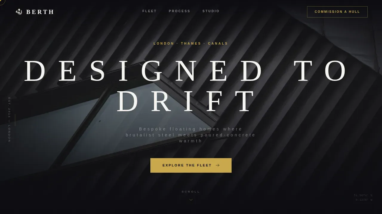
The hero section fills the entire viewport with a water-level golden-hour photograph. The camera sits barely above the river surface, placing water in the bottom third of the frame and the angular brutalist hull against a molten sky. No headline appears for three seconds. Then a single word fades into the center in thin uppercase brass type. This delayed reveal creates a moment of pure visual immersion before language arrives, setting the emotional tone for the whole page.
Cinematic Scroll Sequence with Cross-Dissolve Transitions
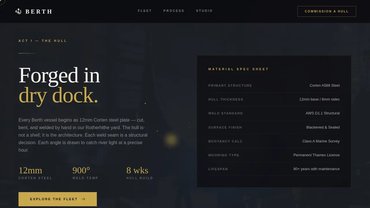
Five full-page sections function as individual dramatic frames. Each one tells the next chapter of the vessel story: hull construction in dry dock, the concrete and glass interior shot from the galley toward the helm, the rooftop terrace at night, and a final drone-pullback closing frame. Transitions between sections are slow cross-dissolves triggered by scroll position using GSAP ScrollTrigger. The effect feels like a short film progressing frame by frame as the user moves down the page, rewarding deliberate scrolling with revelation.
Dual Call-to-Action Conversion Structure
A persistent brass-colored "Explore the Fleet" button appears at the close of every section, linking to the portfolio page where individual boat projects live in full case-study detail. A secondary "Commission a Hull" button in outlined type appears after the fourth frame, linking to the inquiry process. The two-path structure accommodates both browsers who want to explore the range of completed projects and decision-ready clients who are prepared to start the commission process immediately.
Obsidian and Gold Design System
The template ships with a four-value color system: deep black steel for primary backgrounds, raw shuttered-concrete gray for alternating section backgrounds, tidal river dark as a mid-tone field, and burnished brass reserved exclusively for interactive elements, hover states, and section dividers. Body text sits in a muted silver tone that reads like etched metal against dark grounds. The palette is designed to feel like running a hand along a blackened steel hull and catching the glint of a brass porthole.
GSAP ScrollTrigger Animation Scaffold
All scroll-driven animations are built on GSAP ScrollTrigger with GPU-accelerated transforms. This includes the scroll-velocity cross-dissolves between cinematic frames, the cursor parallax layers that give sections a sense of physical depth, and the brass hover states that activate on interactive elements. The animation system is designed to feel deliberate and cinematic rather than decorative, reinforcing the material weight of the brand without overwhelming the content.
Three Client Vignette Social Proof Block
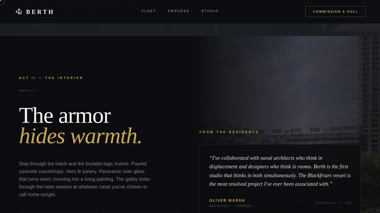
Three short client vignettes are structured into the page: a canal-obsessed architect who needed a naval designer capable of thinking in living spaces, a tech founder who wanted a permanent Thames mooring with the spatial quality of a pavilion, and a retired couple who traded a four-bedroom house for a vessel that rocks them to sleep. These vignettes function as social proof and audience mirrors, helping each visitor type see their own situation reflected in the page before they reach the call to action.
Page sections overview
| Section | Purpose |
|---|---|
| Hero viewport frame | Full-bleed water-level photo, three-second delayed brass headline reveal, scroll cue |
| Hull construction story | Dry dock welding cinematic frame, frozen sparks, build narrative |
| Animated plan drawing | Overhead drawing that animates into a 3D cutaway on scroll |
| Galley interior reveal | Concrete and glass interior shot from galley toward helm windows |
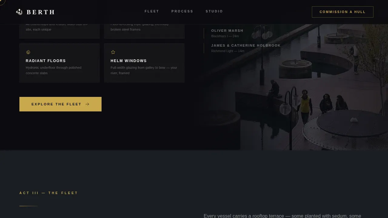
| Rooftop night terrace | City light reflections, lifestyle aspiration, nighttime atmosphere |
| Commission closing frame | Drone pullback, dual call-to-action buttons, final emotional beat |
| Client vignettes block | Three audience-mirror stories, material specs as credibility layer |
| Footer horizontal flow | Vercel horizontal flow pattern, brand links, navigation |
Design & branding system
The visual identity is built around structural honesty and material contrast. The design takes its cues directly from the architecture it represents: raw concrete, blackened steel, and the controlled warmth of burnished brass used only where it counts. The palette is not decorative. Every color value serves a structural function, just as the materials on the boats themselves carry both load and meaning.
- Four-value color system: obsidian black (#0B0B0F) for primary backgrounds, concrete gray (#3A3A3C) for alternating section fields, tidal river dark (#1A1D23) for mid-tone areas, and burnished brass (#C9A84C) reserved strictly for interactive elements, hover states, and dividers, with muted silver (#D0D0D0) body text
- Dual-typeface pairing using DM Sans for all body copy and functional interface text, and Fraunces as the editorial serif display face for headlines and cinematic section titles, with large all-caps sans-serif usage recommended for visual consistency with the brutalist aesthetic
- High-contrast photography approach using water-level golden-hour exteriors, desaturated dry-dock construction imagery, and dusk lighting scenes that highlight raw concrete textures and the interplay of warm interior light against dark industrial exteriors
Mobile & speed optimization
The template is designed desktop-first, reflecting the browsing habits of the target audience: architects, tech founders, and high-net-worth clients who research considered purchases on large screens. The cinematic scroll experience and full-bleed photography are calibrated for widescreen viewports. At the same time, the template is built with mobile excellence as a baseline requirement.
- All scroll animations use GPU-accelerated transforms only, keeping the cinematic dissolve sequence smooth without triggering layout reflows that would degrade the experience on any device
- Image handling is built on Next/Image optimization, ensuring that full-bleed photography loads efficiently across connection speeds without blocking the delayed hero headline reveal
- The layout is structured to reflow cleanly on smaller viewports while preserving the core visual hierarchy, brass accent system, and call-to-action placement that drive conversion on desktop
How this template helps you convert
The conversion strategy built into this template is emotional before it is transactional. The page earns the click by making the visitor fall in love with a lifestyle before ever presenting a button. By the time the final drone-pullback frame appears, the user is not clicking to learn more. They are clicking because they already want to live there. The architecture of persuasion follows a clear sequence.
- The delayed headline reveal on the hero creates a sense of discovery and draws the user into the page without interruption, establishing a high-quality feeling from the very first second that signals the studio's creative standard and sets the tone for every section that follows
- Each cinematic scroll frame peels back another layer of the vessel, moving from brutal exterior to unexpectedly warm interior and building the argument that beauty lives inside the armor, so that by the fourth frame the visitor has experienced a complete emotional arc from curiosity to desire before any call to action appears
- The dual call-to-action structure at the close of the page accommodates two buyer states simultaneously: the browser who needs more detail and wants to explore the full project portfolio, and the decision-ready client who has already decided and is looking for the fastest path to starting a commission conversation
Other information about this template
This section covers additional context, design rationale, and practical usage notes for studios and designers who want to understand the full scope of the template before adapting it to their brand.
The template draws its conceptual roots from the brutalist architecture movement that emerged in the 1950s and gained prominence through the 1960s and 70s. Brutalism is characterized by raw concrete construction, bold geometric forms, and a refusal to conceal structural elements behind decoration. The design emphasizes structural honesty by exposing construction elements without unnecessary ornament. The structure rejects decoration and showcases functional elements through heavy, angular forms. The dominant materials used in the design include exposed concrete (béton brut), steel, and wood. These same qualities translate directly into the template's visual language: every color choice, typographic decision, and layout rule reflects the same philosophy that shapes the physical buildings and boats the studio creates.
The Berth Bold Brutalist houseboat designer landing page template merges the rugged aesthetic of 1950s-70s brutalist architecture with modern maritime design. The houseboat concept features massive, blocky geometric shapes with cantilevered decks and overhanging roofs. The exterior incorporates angular windows to create a secure, fortress-like atmosphere while floor-to-ceiling glass panels connect the interior with water reflections. A section showcasing lighting contrasts at dusk highlights the textures of the raw concrete hull and creates the kind of dramatic photography that the template is designed to display.
Design principles in architecture and product design overlap significantly when the goal is both functional performance and aesthetic authority. Both fields require a deep knowledge of materials and their properties to create designs that are appealing and durable in equal measure. The iterative design process is central to this kind of work, involving prototyping and user testing to refine concepts before final construction. Collaboration between designers, engineers, and manufacturers is essential to ensure that every element of the vessel and the page that represents it meets the highest standard of quality. The integration of technology into both the physical design and the digital presentation enhances functionality and user interaction at every point.
Sustainable design practices are increasingly important in both architecture and product design. The boat design focuses on sustainable durability and utilizes thermal mass to regulate interior temperatures, reducing the energy load of the vessel across daily use. The studio's commitment to responsible material sourcing and long-lifecycle construction is part of the brand story. Sustainable branding emphasizes transparency and ethical sourcing, which can enhance consumer trust and loyalty over time. The use of recycled and responsibly sourced materials in the build process reduces the environmental footprint of each creation and connects the brand to values that matter to its audience.
The landing page is intended to reflect the raw, unrefined philosophy of brutalist web design while balancing architectural appeal with functional web design. The Bold Brutalist identity is not simply a visual style: it is a position on the world that the studio takes and that the page communicates with every frame. The color palette is dominated by grays, black, and a single warm contrasting color in burnished brass. A minimalist typographic approach with large, all-caps sans-serif fonts ensures visual consistency with the architecture. High-contrast imagery in desaturated photography reinforces the material weight of the brand across every screen size.
Designer landing page templates of this kind can save significant time and resources in the web development process by providing a fully considered structure, animation scaffold, and design system that would take months to produce from scratch. Many customizable elements allow users to tailor the design to their own brand: swapping photography, adjusting copy, and adapting the color system while preserving the structural integrity of the brutalist layout. The template can also facilitate A/B testing by providing a stable baseline layout that teams can adapt and test against variations.
The functional product design approach behind this template begins with exploring the anatomy of the page to define its silhouette and presence. User experience is a critical consideration at every stage: each section is designed to be intuitive and easy to move through, with clear visual cues that guide the user forward without instruction. Functional product design requires balancing aesthetic appeal with practical usability, and this template achieves that right balance by making every decorative choice serve a navigational or emotional function. Feedback from user research in luxury residential markets consistently shows that high-net-worth clients respond to immersive, editorial-quality digital experiences over conventional portfolio grids.
The client vignette structure within the page reflects a user-centered design philosophy. Each vignette is written to accommodate a different buyer type: the architect who thinks in living spaces and needs a partner with naval knowledge, the founder who wants a permanent mooring with the spatial quality of a pavilion, and the retired person who is ready to trade a conventional house for something that moves with the water. These three narratives create a range of entry points for different visitors, each of whom should feel that this studio understands their situation. The whole thing is designed so that no visitor feels like a generic user: every person who lands on this page should see their own hope, their own idea of the good life, reflected somewhere in the scroll.
The template's footer uses a horizontal flow pattern intended to accommodate the studio's brand links, contact information, and navigation in a clean, structured layout that maintains the obsidian and brass palette through to the final pixel of the page. The footer is designed to stand as a grounded, composed close to the cinematic experience rather than a functional afterthought. Every element from the hero frame to the footer is maintained at the same level of craft, because the studio it represents holds every weld, every concrete pour, and every piece of leather upholstery to the same standard of creation.
The template is perfectly suited to studios that create work of this quality and need a digital presence that can stand alongside the physical work without diminishing it. It is also a strong foundation for any houseboat designer, floating-home architect, or waterway-focused interior design practice that is building a new presence or refreshing an existing site. The concept is clear, the structure is purposeful, and every section earns its place in the narrative sequence. Studios who use this template begin the client relationship with a page that already speaks their language before the first conversation takes place.
Additional practical notes for studios adapting this template:
- The brass accent color (#C9A84C) is reserved for interactive elements and dividers only; maintaining this rule protects the visual hierarchy and ensures that calls to action remain visually dominant against the dark backgrounds
- The DM Sans and Fraunces typeface pairing is intentional; DM Sans provides clean lines and functional legibility for body copy while Fraunces carries editorial weight in display headings, and both should be maintained to preserve the right balance between industrial utility and refined luxury
- The GSAP ScrollTrigger animation scaffold is structured around GPU-accelerated transforms only; all custom animation additions should follow this constraint to protect the smooth cinematic feel of the scroll sequence
- Photography selection is central to the template's impact; the brief calls for water-level golden-hour exteriors, dry-dock construction shots with frozen sparks, galley-to-helm interior frames, and night rooftop scenes, and swapping these for lower-quality or mismatched imagery will reduce the emotional power of the whole thing
- The three client vignettes are placeholders intended to be replaced with real testimonials or case-study excerpts; they represent the architect, the tech founder, and the retired couple archetypes and should be adapted to reflect the studio's actual project history and client range
- Material specifications presented as credibility markers within the page can include details such as hand blown glass panels, leather upholstery choices, poured concrete countertop mixes, and steel hull grades; these specifics signal craft knowledge and build trust with technically literate clients
- The high court of visual standards that luxury residential clients apply to digital research means every image, every line of copy, and every interactive detail will be scrutinized; the template provides the right structure but the studio's own photography and writing must meet the same level of quality
- The template accommodates a range of studio sizes: a sole practitioner, a small design practice, or a larger studio with multiple ongoing projects can all adapt the page section structure to display an appropriate range of work without breaking the narrative flow
- Sustainable storytelling is a growing expectation among high-net-worth clients in the residential specialty sector; the template's content structure provides natural places to surface the studio's commitment to durable materials, responsible sourcing, and long-lifecycle construction as part of the brand narrative
- The page is designed to display the studio's work at the scale it deserves; the full-bleed photography, the cinematic dissolve sequence, and the editorial typography all work together to create a sense of world-class quality that justifies the studio's position in the luxury market
Theme
Bold Brutalist
Creative direction
Cinematic Sequence
Color system
Obsidian & Gold
Style
Storybook/Full-Page
Direction
Click-Through
Page Sections
Full-bleed Cinematic Hero Reveal
Scroll-driven Five-act Page Narrative
Dual Call-to-action Conversion Path
Obsidian and Gold Four-value Color System
Client Vignette Social Proof Structure
Vercel Horizontal Flow Footer Pattern
Related questions
What kind of studio is this template designed for?
Can I adapt the color system and typography to match my own brand?
What animation technology does this template use?
How does the dual call-to-action structure work?
Is this template only suitable for houseboat designers?