Maritime Crew Manning Agency Website Template
Berth is a precision maritime crew manning landing page built for crewing agencies and shipowners. It presents a zigzag, industry-report-style layout that moves visitors from crisis to confidence. With a split-viewport case study header, real-metric proof sections, a slide-out lead form, and a gated PDF download, it qualifies prospects and captures serious manning inquiries before a vessel misses laycan.
by Rocket studio
Quick summary
Berth is a single-page maritime crew recruitment template designed to convert fleet personnel managers into qualified leads. It opens with a before-and-after manning board, walks through data-backed proof sections in a zigzag layout, and closes with a specific lead capture form. Every section earns trust before asking for commitment.
Who this template is for
This template is built for maritime professionals who operate under real deadline pressure. It speaks their language from the first scroll.
- Crewing superintendents at mid-size shipowners managing vessel pools of roughly fifteen ships
- Fleet personnel managers handling last-minute officer sign-offs and flag-state compliance
- Third-party ship managers who answer to charterers when a chief engineer fails to embark
What problem this template solves
Finding certificated officers and ratings fast enough to meet laycan is one of the hardest operational problems in shipping. Generic agency websites cannot communicate urgency, methodology, or proof with enough precision to earn a crewing manager's trust.
- Open billet boards, flag-state compliance gaps, and departure countdowns create high-pressure decisions
- Crewing managers need evidence of placement speed and database depth before they pick up the phone
- Standard contact forms do not qualify leads by vessel type, rank category, or embarkation port
What you get with this template
The template delivers a complete, single-page lead generation flow built around maritime-specific content and conversion logic. Every layout block has a defined role.
- A split-viewport case study header showing a manning crisis resolved in forty-eight hours
- Zigzag proof sections that alternate data findings with human case study narratives
- A slide-out qualification form and a gated PDF download path for top-of-funnel visitors
Feature list
This template ships with purposeful components matched to how crewing managers actually evaluate a manning agency.
Split-Viewport Case Study Header
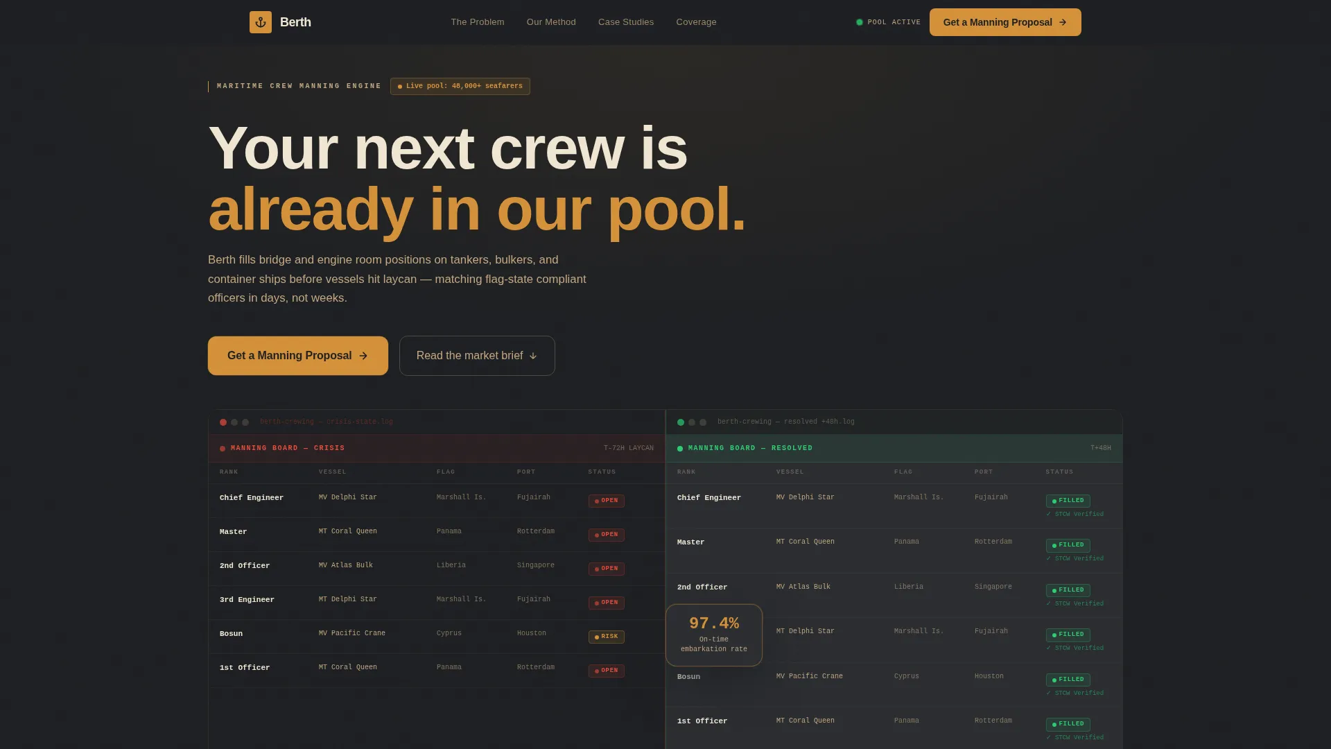
The header divides into two halves. The left side shows a live manning board in crisis: six open positions flagged red, a departure countdown running, and compliance warnings active. The right side shows the same board forty-eight hours later with every billet filled green, certificates verified, and travel confirmed. A floating stat, "97.4% on-time embarkation rate," anchors the transition before the headline resolves.
Zigzag Industry Report Layout
Each alternating section presents a discrete finding. Data panels and human narratives swap sides as the user scrolls. The sequence moves from macro market context through agency methodology and into granular case study proof, building an argument that feels like reading a market intelligence brief.
Slide-Out Lead Qualification Form
The primary call to action, "Get a Manning Proposal," triggers a slide-out panel. The form sequences vessel type first via dropdown, followed by number of positions, rank category, and preferred embarkation port. Name, company, and email come last. This order qualifies each lead by operational specificity before collecting contact details.
Gated PDF Download Path
A secondary conversion path offers a downloadable report titled "2024 Global Seafarer Availability Report." It is gated behind email only. This path captures crewing managers who are still benchmarking suppliers without yet committing to a proposal.
Sticky Bottom Bar call to action
After the second scroll depth, a persistent bottom bar keeps the "Get a Manning Proposal" call to action visible. The bar activates without interrupting reading flow, ensuring the primary conversion path is always within reach.
Warm Stone Dashboard Visual System
The Dashboard Pro theme uses a four-color Warm Stone palette. Signal amber highlights calls to action, status badges, and data points. Deep charcoal dominates section backgrounds. Warm parchment lifts data cards. Weathered sandstone grounds secondary surfaces. The result feels like a well-run crewing office rather than a generic agency site.
Page sections overview
| Section | Purpose |
|---|---|
| Split-viewport header | Shows before-and-after manning crisis resolution with a headline stat |
| Macro market finding | Presents global officer shortage data and aging workforce context |
| Agency methodology panel | Covers database size, average placement speed, and flag-state coverage |
| Case study block | Shares anonymized proof by vessel type, rank, time-to-board, and retention |
| Primary call to action break | Anchors the "Get a Manning Proposal" form trigger after the first zigzag |
| Gated PDF section | Offers the seafarer availability report in exchange for email |
| Sticky bottom bar | Keeps the primary call to action visible after the second scroll depth |
Design & branding system
The Warm Stone color system gives the page a physical weight that generic maritime sites do not have. It suggests a captain's dayroom: teak surfaces, brass fittings, a chart table under a single overhead lamp.
- Weathered sandstone (#C4A882), deep charcoal (#2B2D31), warm parchment (#F0E6D3), and signal amber (#D4913A) form the complete palette
- Charcoal dominates section backgrounds; parchment lifts data cards and text blocks; sandstone grounds secondary surfaces
- Amber is reserved strictly for calls to action, status badges, and data highlights so the eye always finds the decision point
Mobile & speed optimization
The layout is structured to remain readable and functional across screen sizes. Crewing managers reviewing proposals on tablets or phones at port can still navigate the form and download paths without friction.
- The zigzag alternating layout collapses into a stacked single-column flow on smaller screens
- The slide-out form panel and sticky bottom bar are sized for touch interaction
- Data cards and status badge components scale within the parchment card system without losing visual hierarchy
How this template helps you convert
The page is designed to move a skeptical crewing professional from first impression to qualified inquiry in a single scroll session.
- The before-and-after header establishes immediate credibility by showing a real operational outcome, not a marketing claim, before the visitor has read a single paragraph.
- The zigzag industry report structure tightens the argument section by section, so each scroll gives the reader a new reason to trust the agency before the lead form appears.
- The form's vessel-type-first sequence signals operational fluency to the prospect, which reduces hesitation and increases completion rate for high-value manning inquiries.
Other information about this template
This template is built inside the Dashboard Pro theme framework, which provides the structured grid and component hierarchy the Warm Stone palette relies on. The Industry Report creative direction and Case Study Before/After header concept are matched intersection design choices from the Marine and Maritime category.
- The template style is Zigzag/Alternating, a layout pattern well suited to presenting sequential proof in a services context
- The lead generation direction means every design decision from call to action placement to form field order is oriented around inquiry capture
- The Berth template targets the Crew Manning and Recruitment niche within Maritime Services and is ready to be adapted for tanker operators, bulk carrier managers, container shipping groups, and offshore vessel owners


Theme
Dashboard Pro
Creative direction
Industry Report
Color system
Warm Stone
Style
Zigzag/Alternating
Direction
Lead Generation
Page Sections
Split-viewport Before/after Header
Zigzag Industry Report Sections
Slide-out Lead Qualification Form
Gated PDF Download Path
Sticky Bottom Bar Call to Action
Warm Stone Status Badge System
Related questions
Can I change the vessel types listed in the lead form dropdown?
Does the template include both the proposal form and the PDF download path?
Can I replace the headline stat and case study data in the header?
How does the sticky bottom bar appear during the page scroll?
Is this template suitable for a smaller crewing agency with a narrower vessel focus?


