PPC & Paid Media Agency Budget ROI Website Template
Bid is a high-converting landing page template built for pay-per-click and paid media agencies. It pairs a dramatic Before/After Slider header with scroll-driven story panels, an interactive budget waste calculator, and a waitlist form with live slot scarcity. The Tech Glass aesthetic uses deep void black and electric indigo to make every number feel razor-sharp and credible.
by Rocket studio
Quick summary
Bid is a single-page landing page template designed for paid media agencies that need to turn skeptical, data-fluent buyers into booked audit slots. It opens with a full-viewport Before/After Slider, leads visitors through interactive story panels, and closes with a three-field waitlist form backed by live slot-count scarcity. The design runs on a Tech Glass visual identity built around electric indigo and deep void black.
Who this template is for
This template is built for agency founders and strategists who sell paid media management and need their landing page to do serious pre-qualification work. The intended audience is sophisticated and has likely fired at least one agency before, so every design decision earns trust through specificity rather than hype.
- Pay-per-click agencies targeting Series B software-as-a-service founders burning through Google Ads spend
- Paid media consultancies serving direct-to-consumer brand operators watching return on ad spend decay month over month
- Lead generation agencies pitching to chief marketing officers who measure success in incrementality, not impressions
What problem this template solves
Most agency landing pages recycle the same bullet-point promises that burned buyers have already heard. The Bid template solves this by replacing passive copy with interactive proof. Visitors see, drag, toggle, and calculate before they read a single testimonial.
- Agencies lose leads because visitors bounce before trust is established; this template rewards interaction at every scroll step
- Generic templates cannot reflect the analytical credibility a paid media agency needs; Bid is built specifically around auction-level data storytelling
- Standard waitlist pages feel vague; the live slot counter and scarcity framing here feel operational and specific
What you get with this template
You get a complete, full-page landing page structured as a scrollable story. Every section is a chapter that builds urgency from diagnosis to proof to exclusivity. The layout is ready to fill with your own account screenshots, numbers, and case study links.
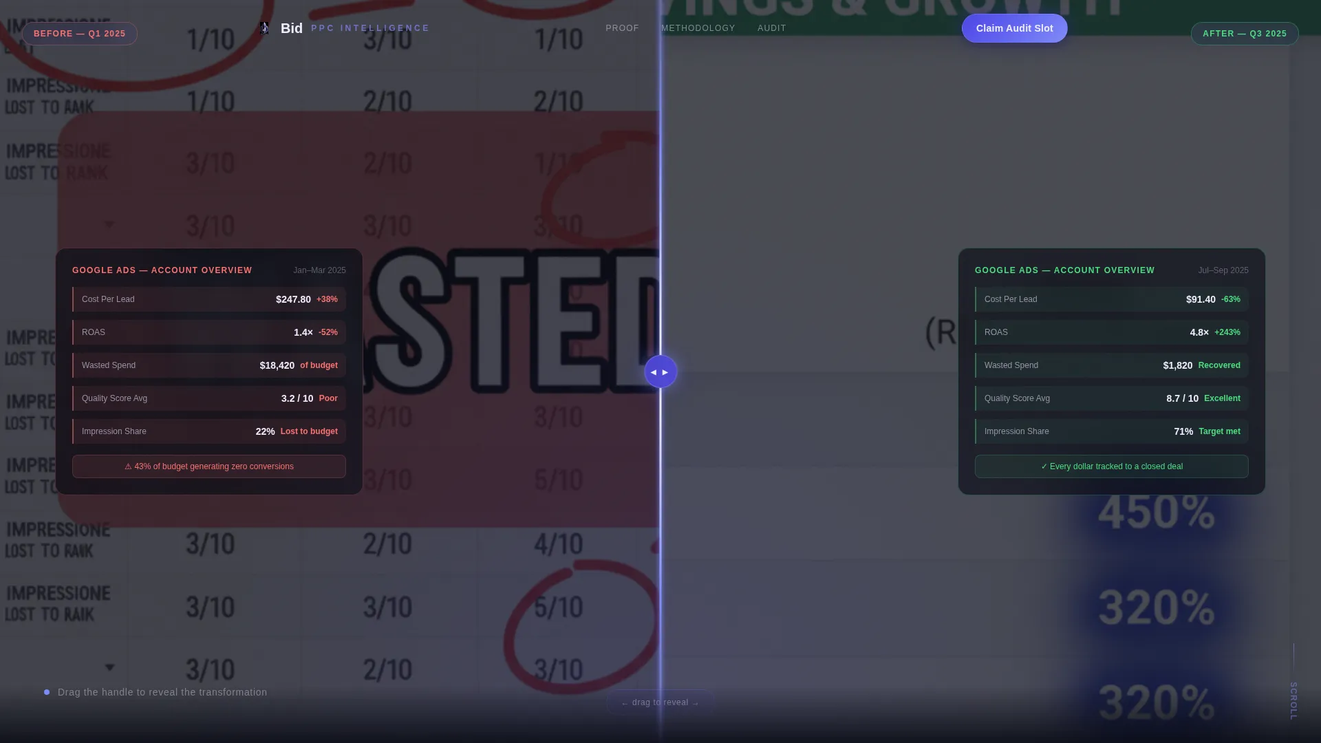
- A full-viewport Before/After Slider header with a frosted-glass drag handle and a self-typing headline that appears on first touch
- Interactive scroll panels including a live budget waste calculator and a toggleable channel allocation chart on a glassmorphic surface
- A three-field waitlist form with a live remaining-slot counter and a secondary email-gated case study download link
Feature list
This template packs several purpose-built components that are rarely found in generic agency page templates.
Before/After Slider Header
The header splits the full viewport into two states: a real-looking Google Ads dashboard drowning in red waste indicators on the left, and the same account recovered on the right with halved cost-per-acquisition and a glowing return on ad spend column. The visitor drags a frosted-glass prism handle to reveal the transformation. The headline types itself in only after the first drag.
Interactive Budget Waste Panel
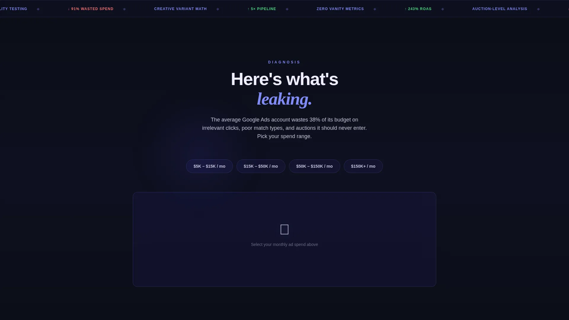
One full-page story panel lets visitors type in their monthly ad spend and watch an animated visualization show how much of that budget is likely being wasted. The interaction makes the agency's diagnostic value tangible before any claim is made in text.
Toggleable Channel Allocation Chart
A second interactive panel lets visitors toggle between channel mixes and watch projected returns shift on a glassmorphic chart surface. This panel communicates strategic depth and positions the agency as a math-first partner rather than a generalist vendor.
Waitlist Form with Live Slot Counter
The primary call to action is a three-field form collecting monthly ad spend range, primary advertising platform, and work email. A live counter below the form displays remaining audit slots for the current quarter, making scarcity feel like an operational reality rather than a marketing tactic.
Email-Gated Case Study Path
Visitors who are not ready to commit can follow a secondary path: a "See the Full Case Study" link that gates a downloadable document behind an email capture field. This catches high-intent readers who need one more proof point before booking.
Tech Glass Visual Identity System
The entire template is built on layered black-to-indigo gradients, glassmorphic floating cards, periwinkle hover states, and a cool-gray body text tone. Every surface, card, and interactive element is styled to feel like a live data dashboard rather than a static marketing page.
Page sections overview
| Section | Purpose |
|---|---|
| Before/After Slider | Opens the page and demonstrates transformation through drag interaction |
| Budget Waste Panel | Lets visitors calculate their own likely wasted spend |
| Channel Allocation Chart | Shows projected returns across different platform mixes |
| Diagnosis Narrative | Escalates the story from problem identification to urgency |
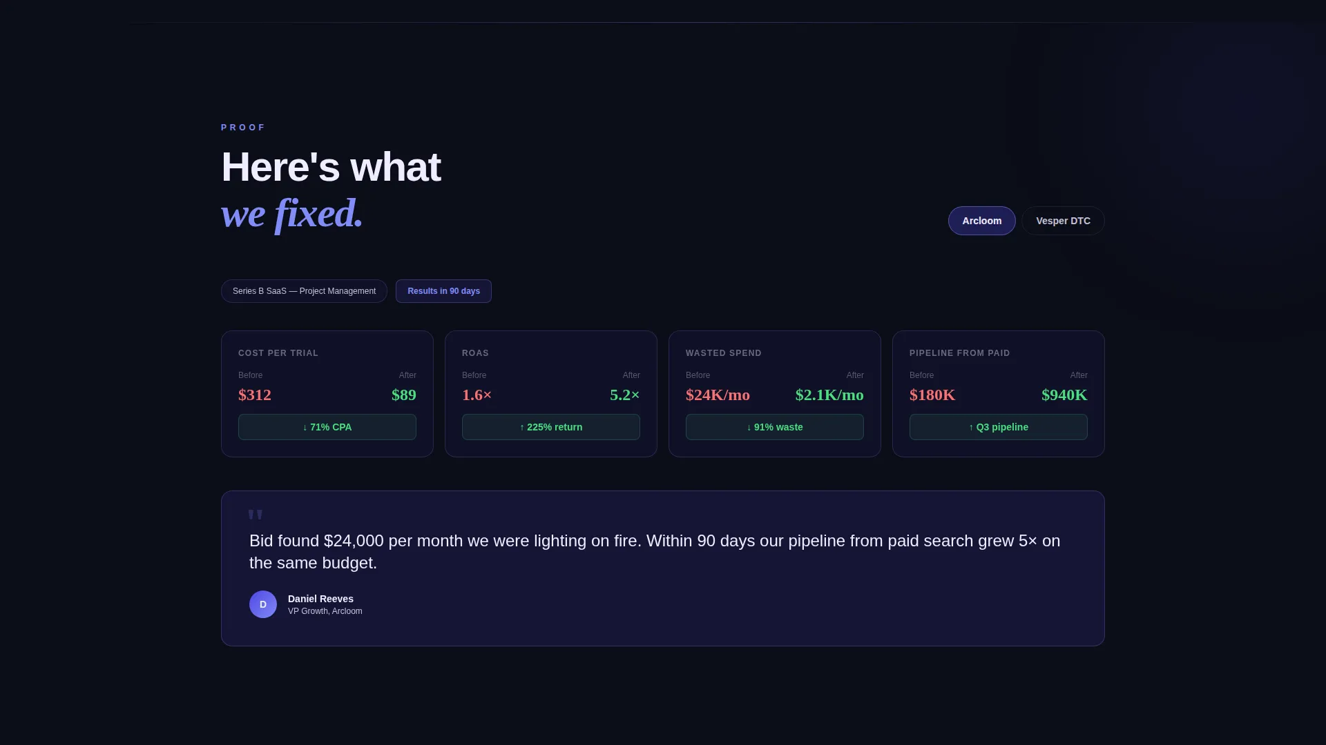
| Proof Panel | Presents fixed account results and case study evidence |
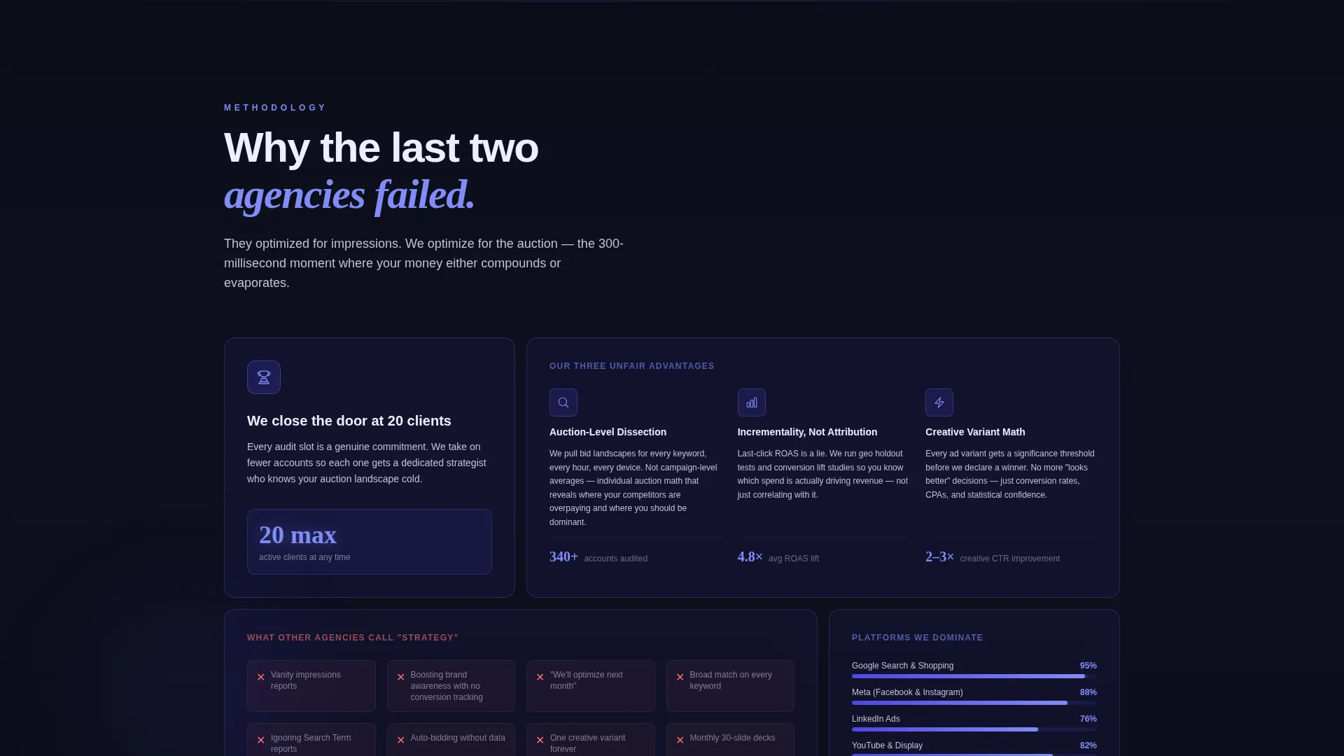
| Exclusivity Panel | Introduces the closing-door scarcity narrative |
| Waitlist call to action Form | Captures high-intent leads with spend range, platform, and email |
| Case Study Gate | Catches mid-funnel visitors behind a secondary email capture |
Design & branding system
The visual identity is built on a Tech Glass theme that uses depth, translucency, and controlled glow to communicate analytical precision. Nothing on the page feels decorative for its own sake. Every color and texture signals that serious numbers live beneath the surface.
- Color palette: deep void black (#0B0D17) as the base, translucent indigo glass (#4F46E5 at 60% opacity) for cards and overlays, electric periwinkle (#818CF8) for interactive highlights and hover states, searing white (#F0EDFF) for key headings, and cool gray (#C4C1D8) for body text
- Surface treatment: layered black-to-indigo gradients form the background, glassmorphic cards float above them, and accent strokes pulse in periwinkle on interaction
- Typography and motion: the self-typing headline and animated coin-evaporation effect reinforce the dashboard-at-midnight aesthetic the template is designed to deliver
Mobile & speed optimization
The template is structured for a single-page, section-led scroll experience, which keeps the layout clean and predictable across screen sizes. Interactive panels and glassmorphic elements are designed to scale without breaking the visual hierarchy.
- The full-viewport Before/After Slider and story panel layout are designed to adapt to narrower viewports while maintaining drag and toggle interaction
- Glassmorphic card surfaces and gradient backgrounds are handled through layered CSS-style treatments that avoid heavy asset dependencies
- The live slot counter and form are placed in a single focused block, keeping the mobile conversion path short and uncluttered
How this template helps you convert
Every structural decision in this template is aimed at moving a skeptical, data-driven buyer from cold visitor to waitlist submission. The interactive story format does pre-qualification work that a static page cannot.
- The Before/After Slider forces engagement before a single word is read, anchoring the agency's value in a visual proof moment that visitors create themselves by dragging the handle
- The budget waste calculator personalizes the pitch in real time, making visitors feel the cost of inaction with their own numbers before the waitlist form appears
- The live slot counter creates honest, operational scarcity that data-fluent buyers find credible, while the secondary case study gate captures leads who need one more reason to trust the offer
Other information about this template
This template is categorized under Portfolio and Agency pages, specifically within the Digital Marketing Agency and pay-per-click paid media niche. It is built as a Storybook full-page layout, meaning every scroll step is a designed story beat rather than a standard content block.
- The template is part of the Electric Indigo color system collection, which pairs well with agencies whose brand identity leans into technology, data, and precision
- The Interactive Explorer creative direction means the page is built around visitor-driven reveals rather than static copy blocks
- The Waitlist and Coming Soon landing page direction makes this template a strong fit for agencies launching a new service tier, a limited cohort program, or a capacity-gated audit offering
Theme
Tech Glass
Creative direction
Interactive Explorer
Color system
Electric Indigo
Style
Storybook/Full-Page
Direction
Waitlist/Coming Soon
Page Sections
Before/after Slider Header
Interactive Budget Waste Calculator
Toggleable Channel Allocation Chart
Waitlist Form with Live Slot Counter
Email-gated Case Study Download
Tech Glass Visual Identity System
Related questions
Can I replace the Google Ads dashboard screenshot in the Before/After Slider?
Does the live slot counter update automatically?
What platforms does the primary platform dropdown include?
Is this template a good fit for a new service launch or capacity-gated offer?
What if I do not have a case study PDF ready yet?



