Tools Auction Landing Page Template | Marketplace Grid
Bid is a scroll-reveal landing page template built for tools and hardware auction platforms. It pairs an Ink & Paper visual identity with a Comparison Journey layout that stacks proof as visitors scroll. From the hero device mockup to the Pro upgrade pricing toggle, every section is designed to turn casual browsers into active bidders.
by Rocket studio
Quick summary
Bid is a single-page auction landing page template purpose-built for tools and hardware resale platforms. It uses a progressive scroll-reveal structure to walk visitors through live lot previews, head-to-head value comparisons, and a clear Pro upgrade offer, all wrapped in a high-contrast Ink & Paper design that feels like a classified-ads page that actually converts.
Who this template is for
This template is built for founders and product teams running timed-lot auction platforms in the tools and hardware space. It suits anyone who needs to communicate live bidding, tiered membership value, and a curated lot catalog in one focused page.
- Auction platform operators selling reconditioned power tools, estate-sale equipment, and surplus hand tools in timed lots
- Independent contractors and reseller-focused platforms that need to convert price-conscious, deal-driven buyers quickly
- Early-stage marketplace teams looking for a credibility-first landing page that doubles as an app store preview driver
What problem this template solves
Most tools auction pages either look like a raw listing feed or a generic SaaS pricing page. Neither builds the specific trust that a first-time bidder needs before placing money on a timed lot. This template closes that gap.
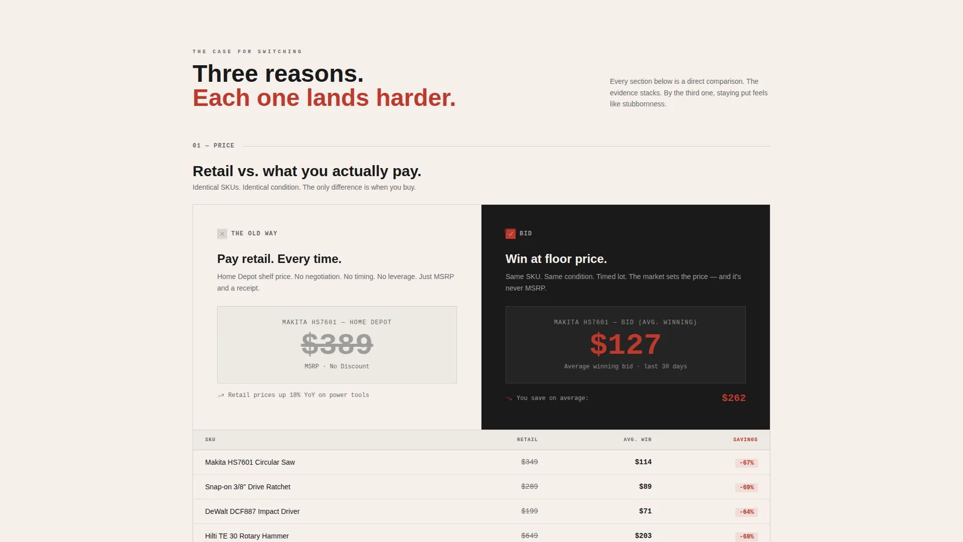
- Buyers arrive skeptical about price fairness; the animated comparison counters show retail price versus average winning bid on identical items, making the value case without a single sales claim
- First-time visitors do not understand how timed-lot bidding works; the progressive reveal sections educate and reassure in sequence before asking for a commitment
- Free-tier users who browse but never upgrade need a concrete reason to unlock Pro features; the toggle pricing section with the highlighted annual plan gives them that reason at exactly the right scroll depth
What you get with this template
You get a fully structured, scroll-reveal landing page with every section pre-designed and logically sequenced. The layout moves from social proof at the top to comparison evidence in the middle to a clear upgrade call to action at the bottom.
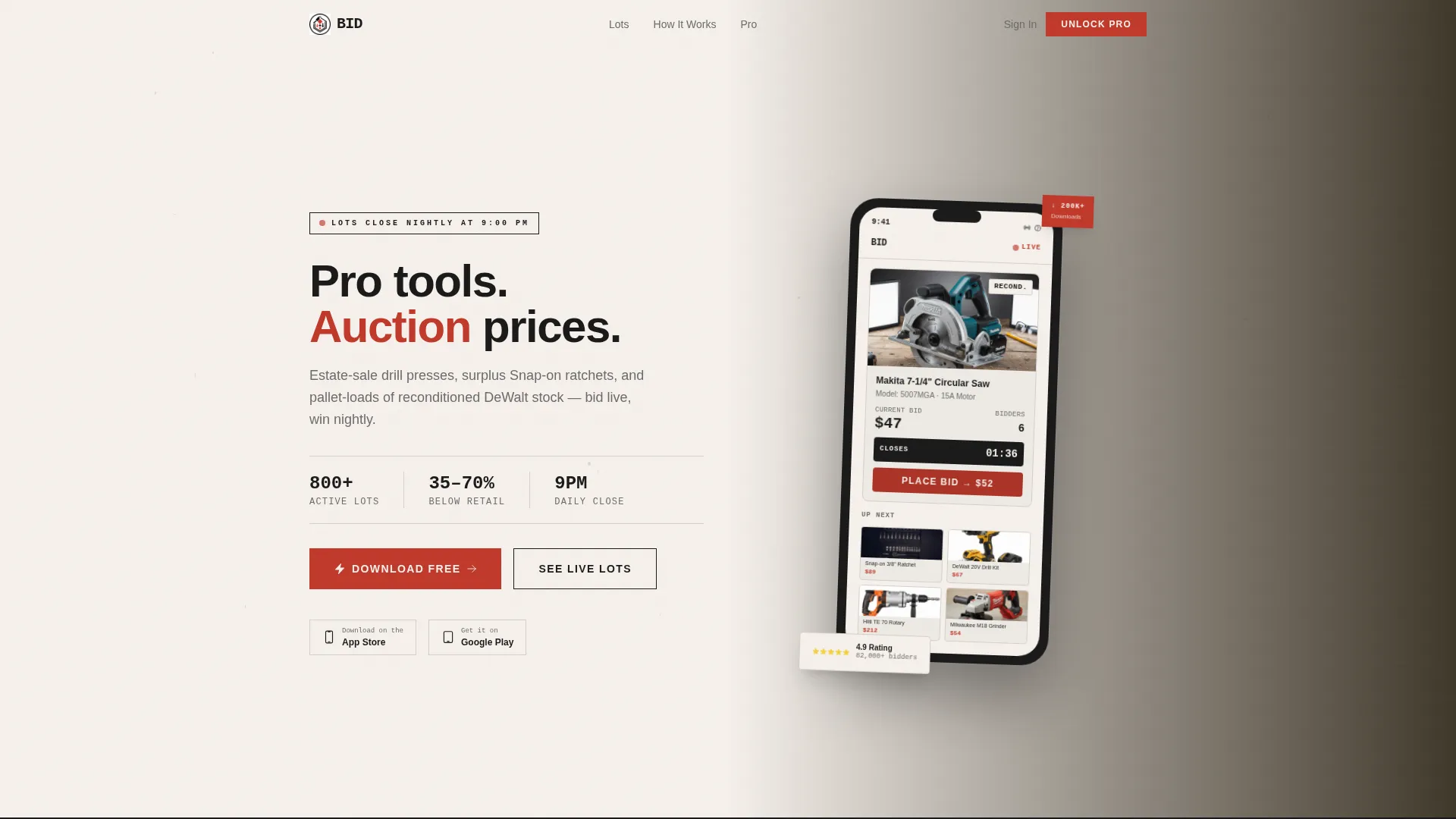
- A hero header with an App Store Preview device mockup showing a live mid-bid interface, a five-star rating badge, and a download count anchor
- Three Comparison Journey sections that contrast old buying habits against the platform experience, each with animated counters and visual evidence
- A Pro upgrade pricing block with a monthly/annual toggle, an annual plan highlighted in auction-paddle red, and a ghost-button secondary call to action for a seven-day free trial
Feature list
This section covers the distinct, prompt-backed capabilities built into this template.
Hero Device Mockup with Live Bid Interface
The header features a phone mockup presented at hero scale. It displays a live auction mid-bid, including a lot thumbnail, a current bid figure, an active bidder count, a ticking countdown timer, and a grid of upcoming lots below. The device floats over a faint workbench and sawdust texture, grounding the digital product in its physical context.
Progressive Scroll-Reveal Layout
Each section animates into view as the visitor scrolls, creating a Comparison Journey that builds momentum. The reveal structure means visitors are never confronted with all information at once, which keeps the page feeling organized rather than overwhelming.
Animated Comparison Counters
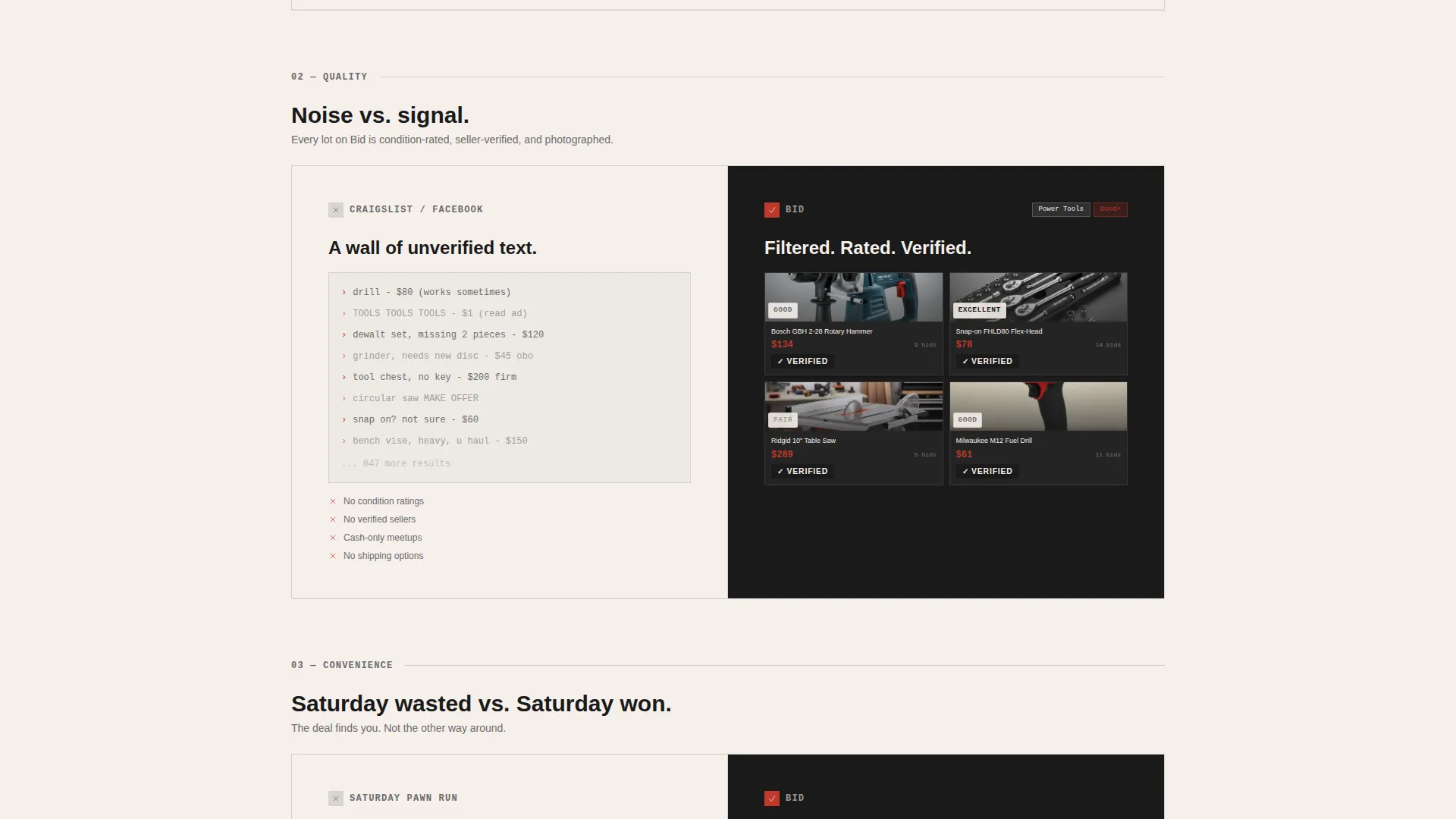
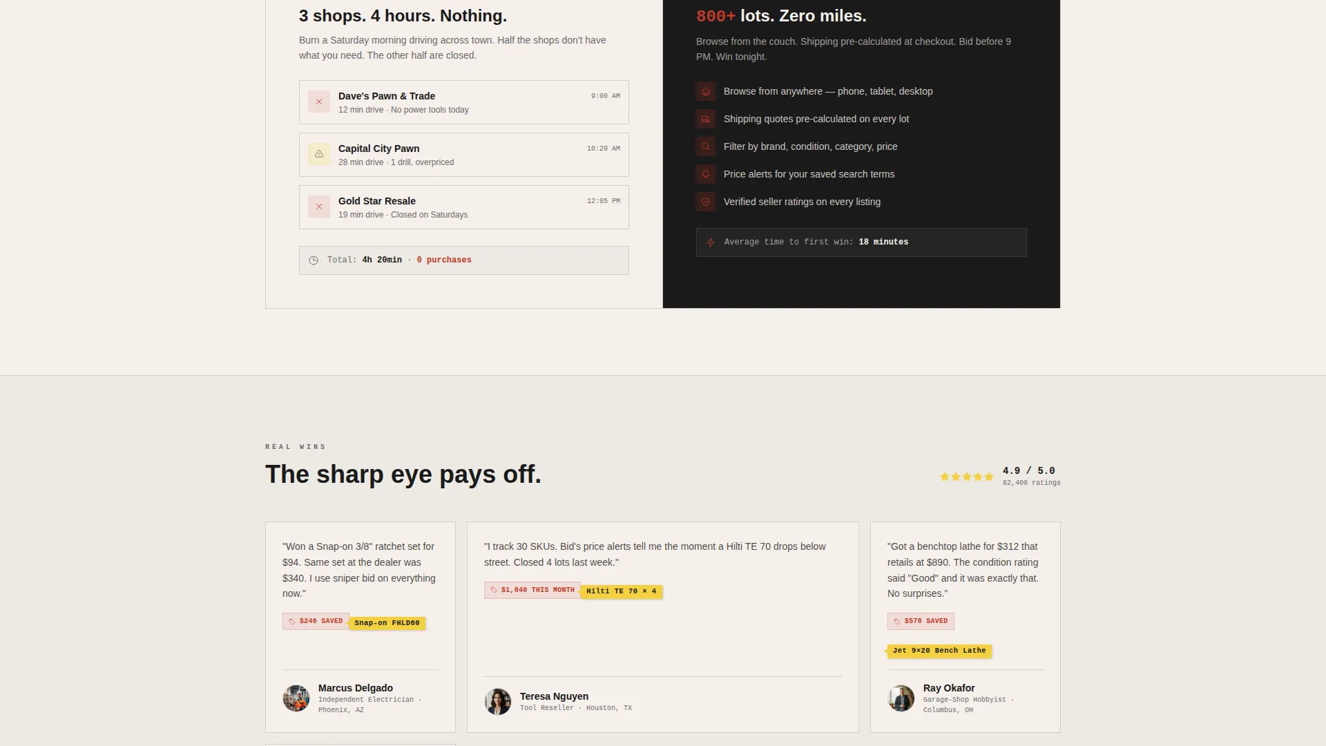
Three dedicated comparison sections stack the value argument progressively. The first contrasts retail prices against average winning bids using animated tallying counters. The second contrasts cluttered listing walls against a filtered grid with verified seller badges and condition ratings. The third contrasts in-person sourcing effort against browsing hundreds of lots with pre-calculated shipping quotes.
Pro Upgrade Pricing Block with Toggle
A dedicated upgrade section presents free-tier and Pro-tier features side by side. A monthly/annual pricing toggle lets visitors switch views. The annual plan is visually highlighted in auction-paddle red with a "Save 2 months" tag. Pro features shown include sniper-bid scheduling, price-alert watchlists, and zero buyer premiums on lots under a defined threshold.
Dual Call-to-Action Structure
The primary call to action, "Unlock Pro Bidding," appears after the comparison sections complete their case. A ghost-button secondary option, "Try Pro Free for 7 Days," sits directly below. This dual structure serves both committed visitors and those who want to test one feature before paying.
Marketplace Grid Theme with Ink & Paper Palette
The visual layout uses a Marketplace Grid structure with deliberate auction-tag density. Every color in the system carries a role: newsprint white for backgrounds, carbon ink black for body text, pencil-lead gray for secondary labels, and auction-paddle red reserved exclusively for bid buttons, countdown timers, and winning-lot badges.
Page sections overview
| Section | Purpose |
|---|---|
| Hero Device Header | Show live auction interface with social proof anchors |
| Retail versus. Bid | Contrast retail pricing with winning bid data using animated counters |
| Listing Quality Comparison | Compare cluttered listings against the platform's verified filtered grid |
| Convenience Comparison | Contrast in-person sourcing against browsing lots with shipping quotes |
| Pro Upgrade Pricing | Present tier differences, toggle pricing, and dual call-to-action buttons |
Design & branding system
The template uses an Ink & Paper color system designed to feel like a high-contrast trade newspaper classified section. Every color has a deliberate, single-purpose role so the eye lands exactly where the design intends.
- Four-color palette: newsprint white (#F5F0EB) for backgrounds, carbon ink black (#1A1A1A) for primary text, pencil-lead gray (#6B6B6B) for secondary labels and metadata, and auction-paddle red (#C0392B) strictly reserved for bid buttons, countdown timers, and winning-lot badges
- Marketplace Grid theme with a workbench texture and sawdust surface visible beneath the hero device mockup, giving the page a physical, warehouse-floor quality
- High-contrast, utilitarian typography that keeps information scannable at a glance, where every red element signals that a financial action is available or in progress
Mobile & speed optimization
The template is built around a hero device mockup, which means the mobile presentation is central to the design rather than an afterthought. The scroll-reveal structure was chosen in part because it delivers content in digestible blocks on smaller screens.
- Progressive section reveals load content in sequence, reducing perceived wait time and keeping mobile visitors engaged through the full Comparison Journey
- The pricing toggle and dual call-to-action buttons are sized and spaced for thumb interaction, so the upgrade decision point is easy to reach on a phone without zooming or misclicking
How this template helps you convert
This template is built around a deliberate conversion sequence. Each scroll depth unlocks the next piece of evidence before presenting the upgrade ask.
- The hero mockup with a five-star rating badge and download count builds credibility before the visitor reads a single line of body copy, so objections about platform trust are addressed passively at the top of the page.
- The three Comparison Journey sections do the persuasion work in the middle of the page, stacking retail savings data, listing quality proof, and convenience evidence so the Pro upgrade feels like a logical conclusion rather than a sales pitch.
- The dual call-to-action block at the bottom serves two visitor types at once: the committed buyer who clicks "Unlock Pro Bidding" and the hesitant contractor who clicks "Try Pro Free for 7 Days," reducing drop-off at the decision moment.
Other information about this template
This template is suited to tools and hardware auction platforms operating in the secondhand and reconditioned equipment space. It is particularly well-matched for platforms where buyers are experienced, price-literate, and motivated by deal discovery rather than brand browsing.
- The template style is Scroll Reveal (Progressive), meaning sections animate into view in sequence rather than loading all at once
- The creative direction is Comparison Journey, a structure where each scroll section presents a before-and-after contrast that makes the platform's advantage concrete
- The header concept is App Store Preview, giving the landing page dual utility as both a conversion page and an app discovery asset
- The landing page direction is Upsell/Upgrade, which means the page assumes some visitors are already familiar with the free tier and targets them with a clear value gap argument for Pro
Theme
Marketplace Grid
Creative direction
Comparison Journey
Color system
Ink & Paper
Style
Scroll Reveal (Progressive)
Direction
Upsell/Upgrade
Page Sections
Hero Device Mockup with Live Bid Interface
Progressive Scroll-reveal Layout
Animated Comparison Counters
Pro Upgrade Pricing Block with Toggle
Dual Call-to-action Structure
Marketplace Grid with Ink & Paper Palette
Related questions
What type of auction platform is this template designed for?
Can I use this template to promote a Pro membership upgrade?
What are the Comparison Journey sections about?
Does the hero section show actual live auction data?
Who are the typical end-users this landing page targets?



