Auction Platforms & Types Pricing Website Template
Bid is a scroll-reveal landing page built for Dutch auction platforms. It captures the falling-price thrill through animated countdowns, seasonal auction sections, and a Before/After slider header. A progressive upsell module guides free visitors toward a premium tier. The Sunset Gradient palette and playful geometric style make every second feel urgent and worth watching.
by Rocket studio
Quick summary
Bid is a single-page, scroll-reveal landing page template designed for Dutch auction platforms. It opens with a dramatic Before/After slider, flows through three time-of-day auction sections, and closes with a low-friction premium upgrade path. The design uses a Sunset Gradient color system and playful geometric shapes to make falling prices feel cinematic and unmissable.
Who this template is for
This template is built for entrepreneurs, marketplace founders, and product teams launching or refreshing a Dutch auction platform. It speaks directly to the people who use these platforms every day.
- Thrift hunters and collectors who browse for deals between meetings or early in the morning
- Resellers who track drop schedules and need a platform page that matches their urgency
- Platform owners who want to convert casual visitors into paying premium subscribers
What problem this template solves
Most auction landing pages feel static. They list features and ask for a sign-up without ever conveying the tension that makes Dutch auctions genuinely addictive. Bid solves that disconnect.
- Visitors leave before they understand the Dutch auction mechanic or why timing matters
- Free-tier users have no clear reason to upgrade until it is too late to act
- The platform's rhythm of morning, midday, and evening drops is invisible without guided storytelling
What you get with this template
You get a fully designed, scroll-reveal landing page that teaches the Dutch auction experience while moving visitors toward conversion. Every section is purposeful and prompt-backed.
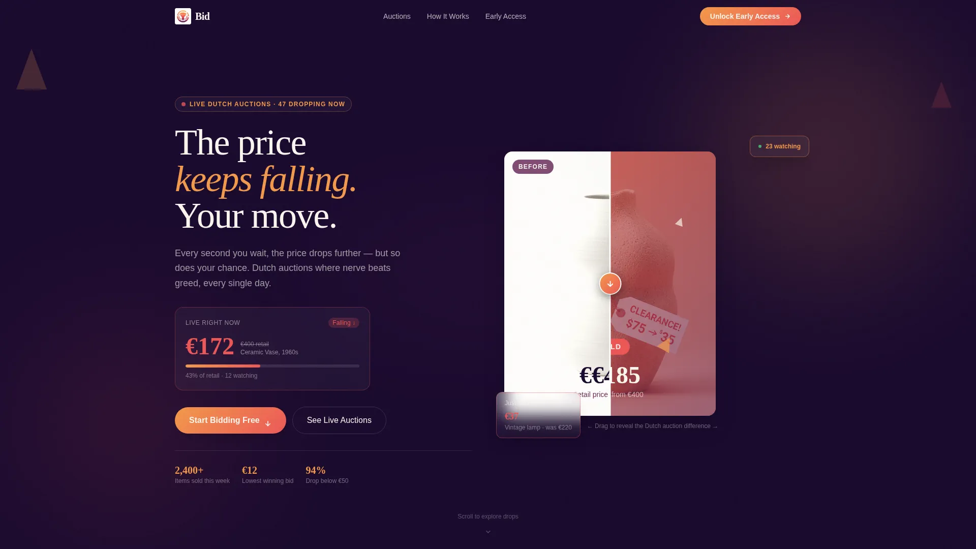
- A Before/After slider header that contrasts full retail price against a mid-fall slashed price with a "SOLD" badge
- Three scroll-revealed auction season sections: Morning Drops, Lunchtime Lightning, and Friday Night Grails, each with distinct visual tones
- A progressive upsell module that reveals free-tier limits, premium benefits, and a real user testimonial before asking for an email
Feature list
This template is built around the specific mechanics and emotions of Dutch auction selling. Each feature below is drawn directly from the design brief.
Before/After Auction Slider
The header splits one auction item into two states. Drag left and the item sits at full retail on a clean white background. Drag right and the price is slashed mid-fall, geometric confetti scatters, the background warms to coral, and a pulsing "SOLD" badge appears. The slider handle is a downward arrow that reinforces the falling-price mechanic at first glance.
Live Horizontal Price Ticker
Below the hero section, a horizontally scrolling ticker displays current live auctions with real-time falling prices. It gives visitors immediate proof that deals are happening right now, building urgency before they read a single headline.
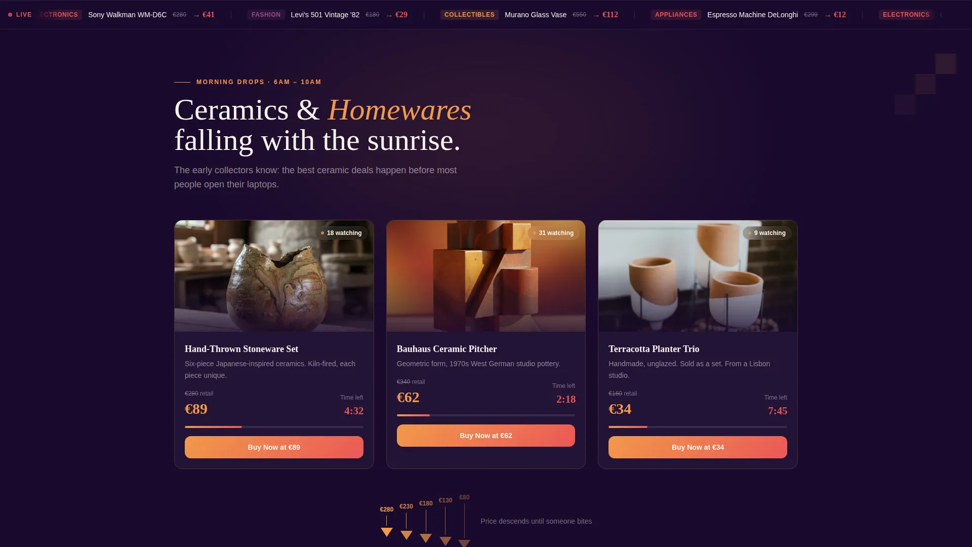
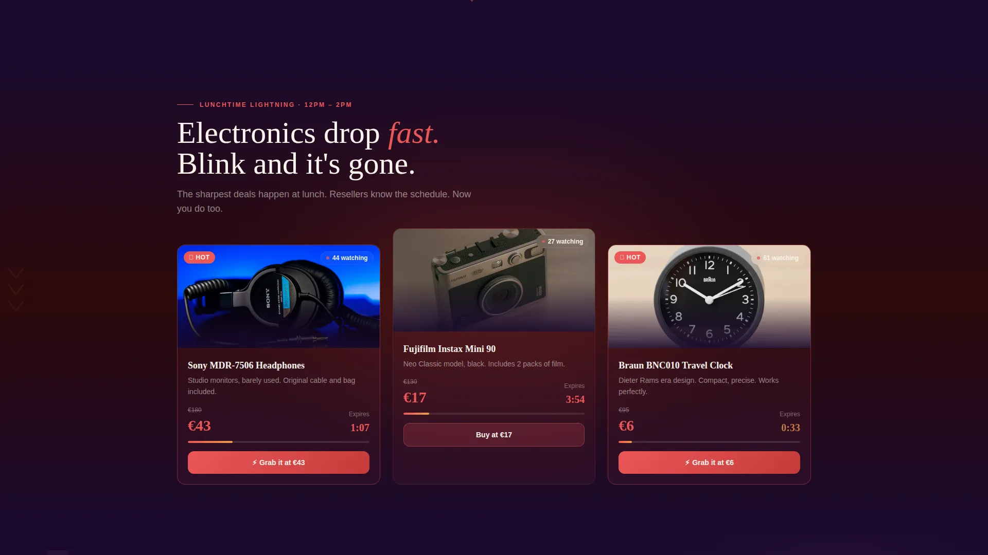
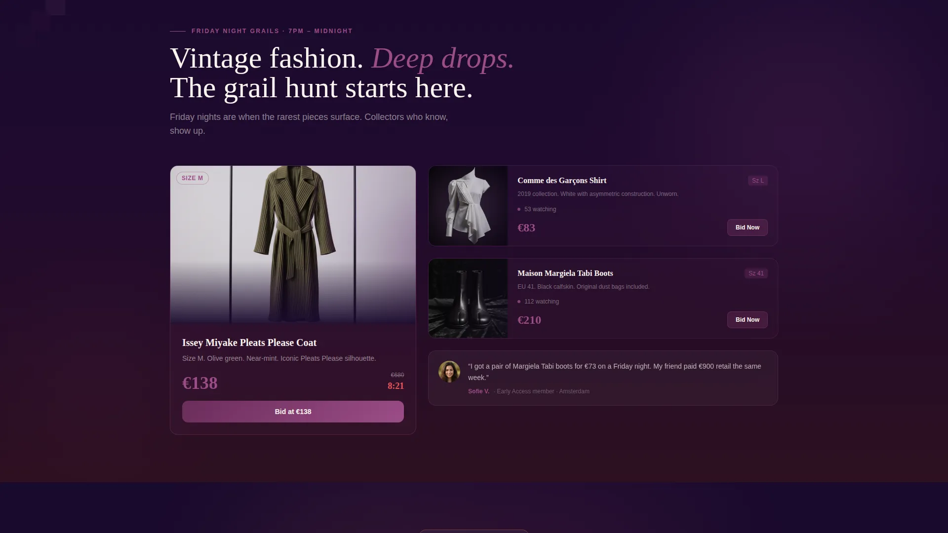
Scroll-Revealed Auction Season Sections
Three distinct sections materialize as the visitor scrolls. Morning Drops uses soft amber tones for ceramics and homewares. Lunchtime Lightning fires in sharp coral for electronics. Friday Night Grails deepens into plum for vintage fashion. Descending geometric animations make prices visually fall down the screen in each section.
Progressive Upsell Comparison Module
The upgrade path reveals itself in three stages. First, the visitor sees what the free tier includes. Next, they see what they are missing. Then a testimonial from a real premium user who bought a twelve-euro espresso machine closes the argument. The upgrade form asks only for email and preferred categories, keeping credit card friction out of the impulse moment.
Countdown Timer Display
Coral-colored countdown timers sit on price tags and auction cards throughout the page. They make the cost of hesitation visible and keep the visitor's attention anchored to the present moment.
Playful Geometric Decorative System
Triangles, descending staircases, and downward-pointing chevrons appear as decorative elements across every section. They are not arbitrary; each shape visually echoes the falling-price mechanic and gives the page a cohesive, thematic identity.
Page sections overview
| Section | Purpose |
|---|---|
| Before/After Slider Header | Dramatizes the Dutch auction price-fall mechanic on first view |
| Live Auction Ticker | Scrolls current auctions with falling prices to build instant urgency |
| Morning Drops Section | Introduces ceramics and homewares in warm amber tones |
| Lunchtime Lightning Section | Showcases electronics in sharp coral with faster energy |
| Friday Night Grails Section | Highlights vintage fashion in deep plum tones |
| Upsell Comparison Module | Progressively reveals free limits, premium benefits, and social proof |
| Premium Upgrade Form | Captures email and category preferences with minimal friction |
| Footer | Grounds the page in aubergine with brand and navigation anchors |
Design & branding system
The visual identity follows a Playful Geometric theme built on a Sunset Gradient color system. The palette evokes a flea-market sky at golden hour: warm, urgent, and fading fast.
- Amber (#F2994A) transitions across section backgrounds; coral (#EB5757) powers countdown timers and price tags; plum (#6B2D5B) anchors headlines; near-black aubergine (#1A0A2E) grounds card containers and the footer
- Geometric shapes including triangles, descending staircases, and downward chevrons reinforce the falling-price theme as decorative and directional elements throughout
- Scroll-reveal animations and descending geometric transitions make prices feel like they are physically dropping as the visitor moves down the page
Mobile & speed optimization
The landing page is designed with a scroll-driven, section-by-section reveal that works naturally on touch devices. The progressive layout keeps interactions simple and thumb-friendly.
- The Before/After slider is designed with a clear drag handle so the interaction reads on both desktop and mobile viewports
- Scroll-reveal sections load content progressively, keeping the visual experience smooth as the visitor moves through each auction season
- The upsell form collects only two inputs, email and preferred categories, reducing load and friction on smaller screens
How this template helps you convert
Bid is built around one core truth: urgency converts. Every design decision moves the visitor from curious to committed.
- The Before/After slider and live ticker create immediate emotional engagement before the visitor reads any marketing copy, shortening the time to interest.
- The three seasonal sections teach the platform's rhythm through storytelling, turning a casual browser into someone who understands there is always a moment worth catching.
- The progressive upsell module removes the biggest barrier to premium sign-up by delaying the credit card ask and leading with a relatable success story instead.
Other information about this template
Bid is part of the Auction and Collectibles category and sits within the Auction Platforms and Types subcategory. It is a strong fit for any team building or marketing a Dutch auction experience online.
- The template supports an overlap and layered layout style, meaning sections visually stack and bleed into each other for a continuous, flowing scroll experience
- The creative direction is rooted in a Seasonal and Moment-based storytelling approach, making it relevant for platforms that run rotating or time-sensitive inventory
- The scroll-reveal structure makes it straightforward to adapt section content for different auction niches, from homewares and electronics to vintage collectibles and fashion
- The Sunset Gradient palette and Playful Geometric theme are pre-built into the template, so visual consistency is maintained from header to footer without extra design work
Theme
Neo-Retro
Creative direction
Unboxing Experience
Color system
Sunset Gradient
Style
Overlap/Layered
Direction
Click-Through
Page Sections
Before/after Auction Slider Header
Live Horizontal Price Ticker
Scroll-revealed Auction Season Sections
Progressive Upsell Comparison Module
Low-friction Premium Upgrade Form
Playful Geometric Decorative System
Related questions
What type of auction platform is this template designed for?
How does the Before/After slider in the header work?
Does the premium upsell module need a payment integration on the landing page?
Can the seasonal auction sections be adapted for different niches?
Is design experience required to use this template?


