Performance Marketing Agency Landing Page Template
Bidstream is a single-column landing page template built for performance marketing agencies that manage serious ad budgets and need to win VP-level and CFO-level trust. The layout follows a FAQ-driven scroll structure, answers hard objections one by one, and guides qualified visitors toward booking a spend audit through an embedded scheduling module.
by Rocket studio
Quick summary
Bidstream is a single-column, FAQ-driven landing page template designed for performance marketing agencies. It mirrors the internal questions a senior marketing or finance leader asks before hiring a new agency, answers each one with data-backed copy, and closes with a frictionless booking module. The result is a page that pre-qualifies visitors before they ever click a button.
Who this template is for
This template is built for performance marketing agencies that manage significant paid media budgets across Google and Meta. It speaks directly to an audience that demands numbers, not narratives.
- Agency founders and strategists pitching VP-level marketing leaders at mid-market software-as-a-service companies
- Teams serving direct-to-consumer brands where paid channels consume a large share of operating runway
- Agencies fielding scrutiny from finance leaders who have started attending marketing budget reviews
What problem this template solves
Most agency landing pages describe capabilities without addressing doubt. Sophisticated buyers arrive with specific objections, and a generic page full of service bullets does nothing to resolve them. Bidstream flips that dynamic.
- Visitors leave before converting because their real questions go unanswered
- Attribution skepticism and past agency failures create friction that a standard hero section cannot overcome
- No structured path from objection to proof to booking keeps high-value prospects from self-qualifying
What you get with this template
Bidstream delivers a complete, publication-ready landing page layout with every structural decision already made. You get a focused, single-column flow that moves from authority to proof to action without detours.
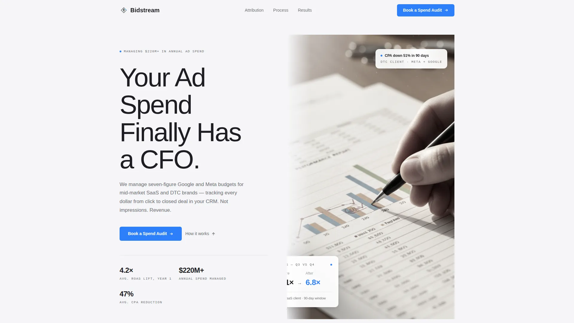
- A half-page editorial header with a headline, supporting text area, and a desaturated, cropped photograph communicating precision and review
- A full FAQ-driven scroll body where each question block is paired with an answer and one supporting data point or anonymized case metric
- An embedded booking module with a spend range dropdown, company URL field, and an optional open-text field, no phone number required
Feature list
A paragraph of context: each feature below maps directly to a structural or visual decision described in the source brief. Nothing here is speculative.
Editorial Header Composition
The header uses a half-page photo and text split. The left side carries an oversized, medium-weight sans-serif headline set against presentation-white. The right side displays a tightly cropped, desaturated photograph of a hand annotating a printed performance report. Shallow depth of field and overhead soft light give it an editorial quality that signals precision without using a stock photo cliche.
FAQ-Driven Scroll Structure
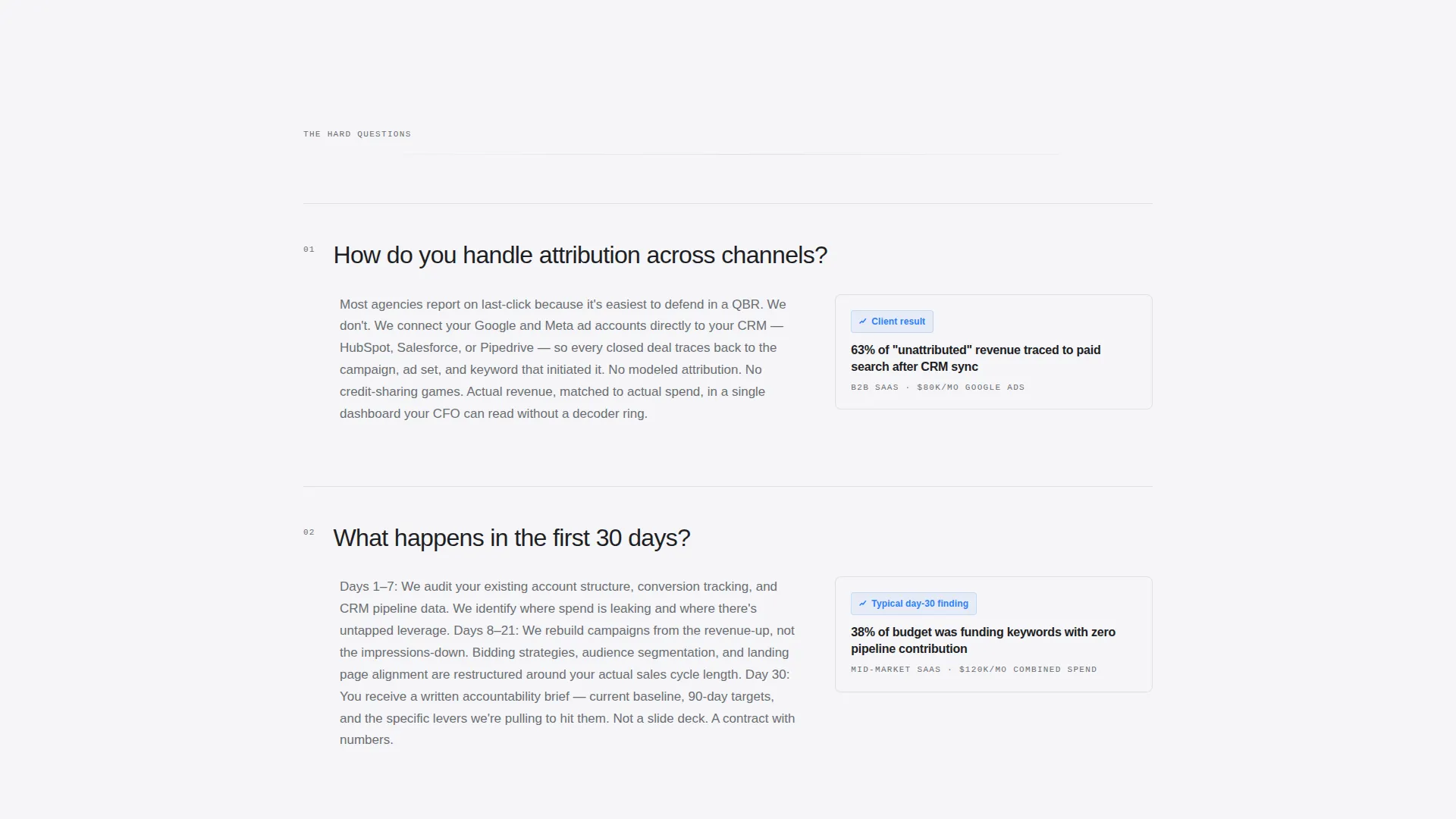
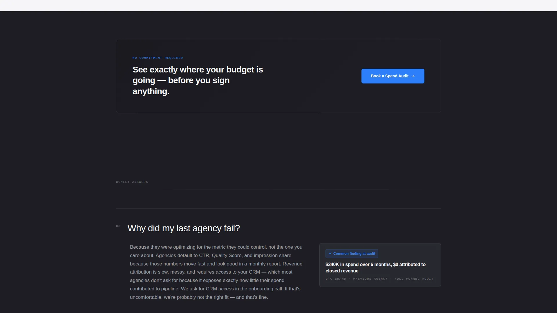
The page body is organized as a progressive sequence of skeptical buyer questions. Each question appears as a bold, full-width typographic break. It is followed by a concise answer block and one data point or anonymized client metric. The questions grow harder and more specific as the visitor scrolls, mirroring real internal objections until the final prompt leads directly to the booking step.
Persistent Booking Call to Action
A signal-blue "Book a Spend Audit" button appears first beneath the header and repeats after every third FAQ block. The button is unobtrusive but consistent, so qualified visitors always have a clear next step without feeling pressured before they are ready.
Embedded Scheduling Module
The final section contains an embedded scheduler styled like a Calendly-format booking form. Fields include name, company URL, monthly ad spend range via dropdown, and one optional open-text line. There is no phone number field. The form is designed to be reached only after every major objection has already been answered.
Monochrome Steel Color System
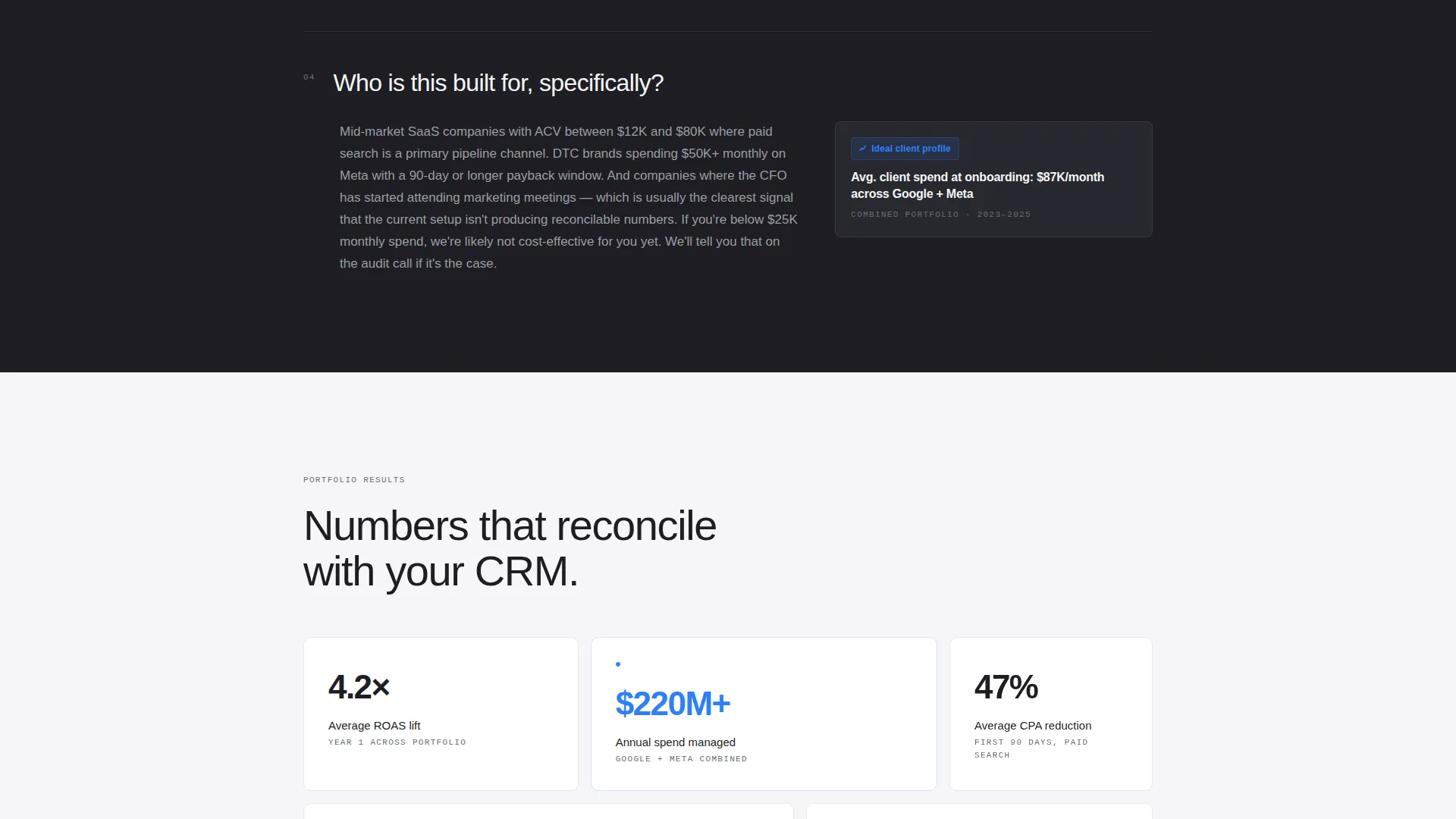
The palette uses boardroom charcoal, brushed steel mid-gray, presentation-white, and a single signal-blue accent reserved for calls to action and live data points. Section backgrounds alternate between charcoal and white. Body text stays in steel gray. The color system communicates authority without decoration.
Alternating Section Backgrounds
Backgrounds alternate between charcoal and presentation-white throughout the scroll. This creates natural breathing room between FAQ blocks and prevents visual fatigue during a long, copy-heavy read. The contrast rhythm also reinforces the sense of a structured, board-deck-quality presentation.
Page sections overview
| Section | Purpose |
|---|---|
| Editorial Header | Establishes authority with headline and annotated-report photograph |
| Primary call to action Block | First "Book a Spend Audit" button placement beneath the header |
| FAQ Block One | Answers attribution and channel tracking objections with proof |
| Repeat call to action Signal | Persistent booking button after the first three FAQ items |
| FAQ Block Two | Addresses onboarding timeline and first-30-days expectations |
| Repeat call to action Signal | Booking button recurrence after the second FAQ cluster |
| FAQ Block Three | Handles past agency failure and accountability objections |
| Final FAQ + Cost | "What does it cost to find out?" leads directly into the scheduler |
| Booking Module | Embedded scheduler with spend range, URL, and optional context field |
Design & branding system
The visual identity follows an Executive Suite theme built entirely around the Monochrome Steel color system. Every design choice prioritizes clarity and calm authority over visual warmth or decoration.
- Four-color palette: boardroom charcoal (#1E1E24), brushed steel mid-gray (#6B6E73), presentation-white (#F5F5F7), and signal blue (#2D7FF9) used exclusively for calls to action and data accents
- Typography uses oversized, medium-weight sans-serif for headlines and steel-gray body text that never competes with numerical proof points
- The photograph in the header is desaturated and editorially framed, reinforcing a tone of review and human judgment applied to data
Mobile & speed optimization
The single-column layout is inherently well-suited for smaller screens. The linear scroll flow requires no complex grid adjustments for mobile viewports.
- Full-width FAQ blocks reflow cleanly without horizontal scroll or content truncation
- The booking module fields stack vertically on mobile, keeping the form usable on any screen size
- The alternating charcoal and white section backgrounds maintain visual rhythm and readability at all viewport widths
How this template helps you convert
Bidstream is structured to convert visitors who arrive skeptical, not just curious. The conversion logic is built into the scroll order itself.
- The FAQ-driven sequence answers every major objection before a call to action appears, so visitors arrive at the booking button already persuaded rather than still evaluating
- The repeated but restrained placement of the "Book a Spend Audit" button after every third FAQ block keeps the next step visible without interrupting the objection-resolution rhythm
- The booking form collects only high-signal information, including monthly spend range and a single optional context field, which means the agency receives pre-qualified leads and the visitor experiences no unnecessary friction
Other information about this template
Bidstream was designed with a specific intersection context in mind: a performance marketing agency operating in the business-to-business marketing space where financial accountability is a primary sales objection. The template style and content direction were informed by an Executive Suite theme, FAQ-driven creative direction, and a single-column layout optimized for booking and scheduling outcomes.
- The template is categorized under Professional Services, specifically the Marketing and Advertising Agency subcategory, with a niche alignment toward B2B marketing agency positioning
- The landing page direction prioritizes booking and scheduling over content downloads or lead magnets, which shapes both the call to action label and the form field selection
- The intersection match score of 9 out of 10 indicates a strong alignment between the template structure and the target audience's expectations for this type of professional services page
Theme
Executive Suite
Creative direction
FAQ-Driven
Color system
Cloud Canvas
Style
Sidebar Companion
Direction
Content/Resource
Page Sections
Editorial Header with Photo Split
Faq-driven Objection Scroll
Persistent Spend Audit Call to Action
Pre-qualifying Booking Module
Monochrome Steel Color System
Alternating Section Backgrounds
Related questions
What type of agency is this landing page template designed for?
Can I change the FAQ questions to match my agency's positioning?
How does the booking module work in this template?
Why does the call-to-action button repeat throughout the page?
Is this template suitable for agencies serving direct-to-consumer brands?



