Health & Wellness Auction Landing Page Template
Bidwell is a Neo-Retro health and wellness auction landing page built for platforms selling premium supplements, fitness gear, and holistic treatment packages through live bidding. With overlapping product cards, before/after scroll reveals, live countdown timers, and a membership upsell flow, it turns browsing into a high-stakes discovery experience that moves visitors toward a paid upgrade.
by Rocket studio
Quick summary
Bidwell is a single-page auction landing page template designed for health and wellness platforms. It blends vintage apothecary aesthetics with live-bidding energy to showcase premium wellness products at compelling bid prices. The template guides visitors through layered before/after reveals, builds social proof section by section, and closes with a frictionless membership upgrade prompt.
Who this template is for
This template fits founders and teams running wellness-focused auction or flash-sale platforms. It speaks directly to audiences who value both quality products and smart savings.
- Health and wellness platform operators who sell supplements, fitness gear, or treatment packages through competitive bidding
- Community builders targeting biohackers, yoga instructors, and budget-conscious wellness shoppers looking for premium products below retail
- Entrepreneurs launching a membership-gated auction experience who need a polished, conversion-ready landing page from day one
What problem this template solves
Wellness shoppers are skeptical. Showing them a discount without context rarely works. This template solves the credibility gap between a low bid price and a high-value product.
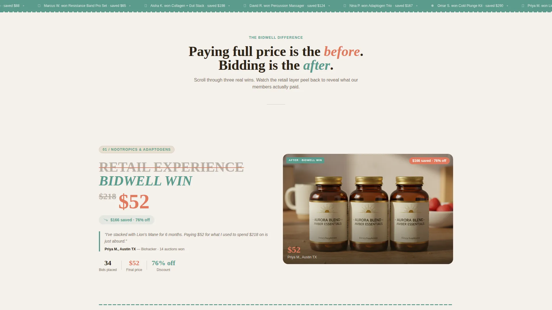
- Visitors do not trust steep discounts without seeing proof, so the before/after reveal structure shows real winner data and unboxing photos side by side with retail pricing
- Free visitors lose access after three auctions, creating urgency without pressure, and the membership upsell appears only after they have already internalized the savings pattern
- Most auction pages feel transactional and cold, while this template wraps competitive bidding in warm, nostalgic design that makes discovery feel exciting rather than risky
What you get with this template
The template delivers a complete single-page auction experience with every visual and structural section already in place.
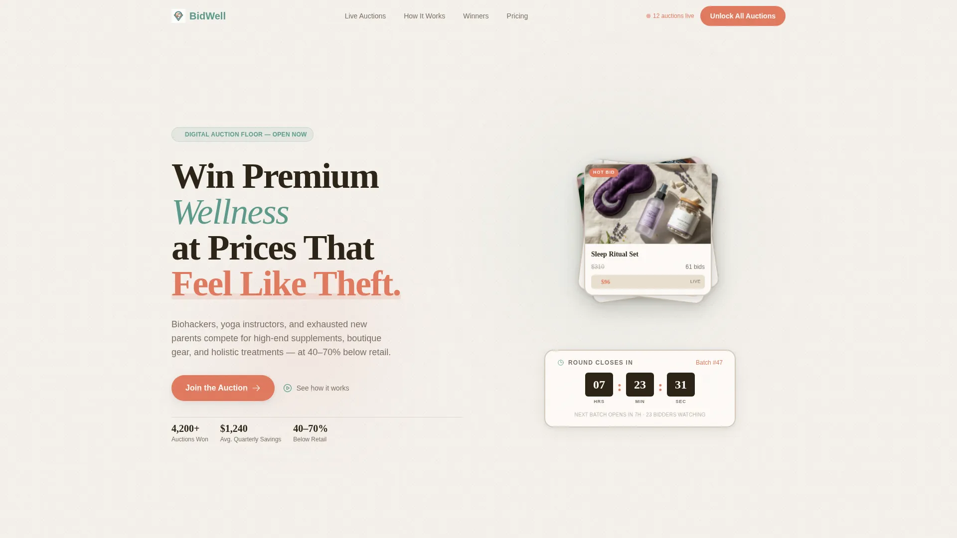
- A layered header with three fanned product bundle cards, struck-through retail prices, live ticking bid figures, and a vintage-style countdown clock
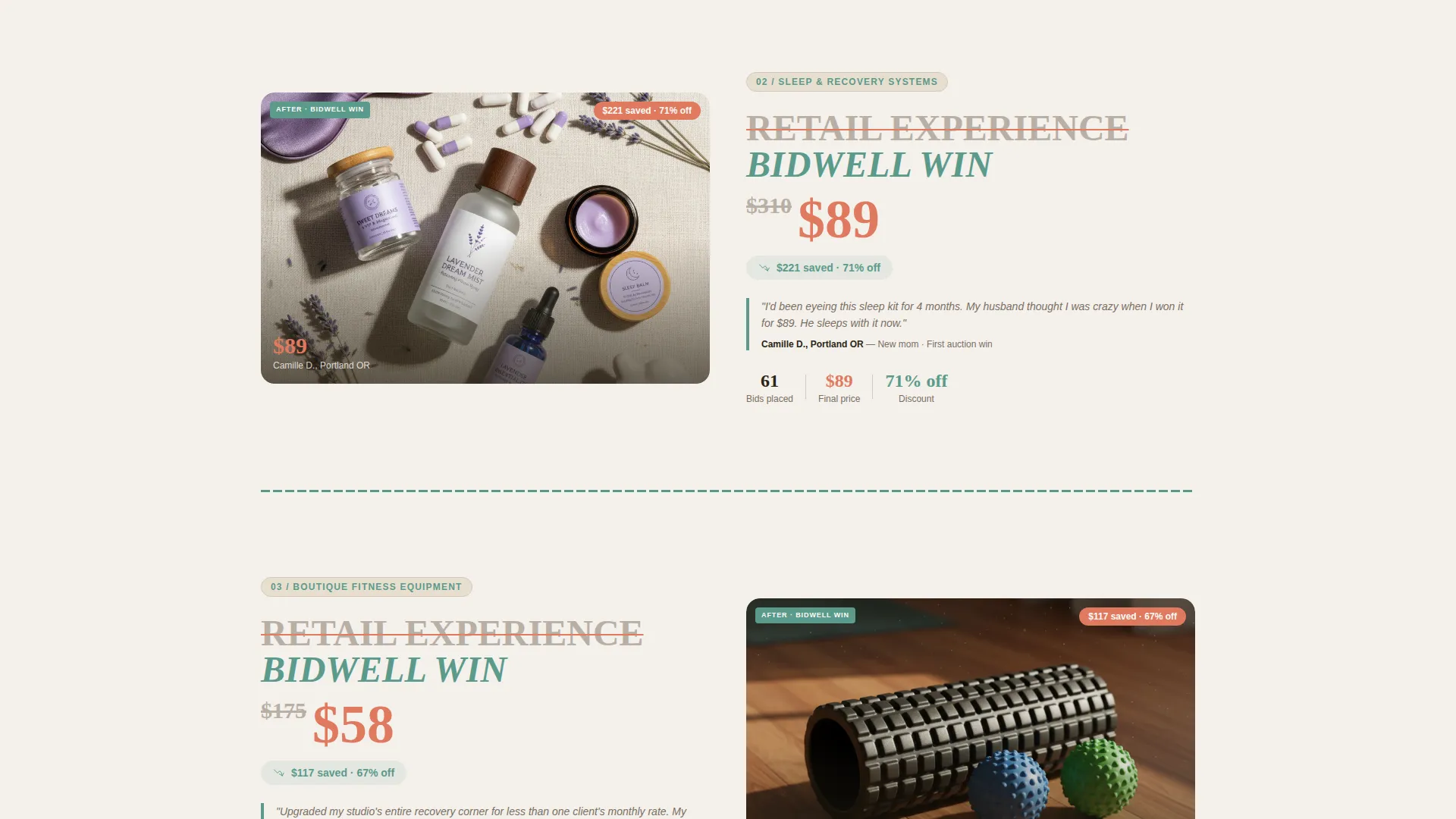
- A scrollable before/after reveal sequence covering multiple wellness categories, each stacked with bid histories, winner testimonials, and authentic unboxing photography
- A membership upsell section with a free versus premium toggle, monthly and annual pricing options, a savings nudge, and a minimal two-field upgrade form
Feature list
This template brings together several purposeful design and layout features grounded directly in the brief.
Overlapping Bundle Card Header
Three product cards are fanned and layered like a winning hand, each displaying a curated wellness bundle. Retail prices appear struck through in coral while current bid prices tick in teal. A vintage flip-style countdown clock sits between the cards to reinforce live auction urgency.
Before/After Scroll Reveal
Each wellness category section opens with the retail experience on a back layer, showing sterile imagery and full prices. As the visitor scrolls, the auction layer slides overtop revealing real bid prices, winner testimonials, and kitchen-counter unboxing photos. The sequence builds a mounting case that bidding is the smarter choice.
Membership Gating with Blurred Preview
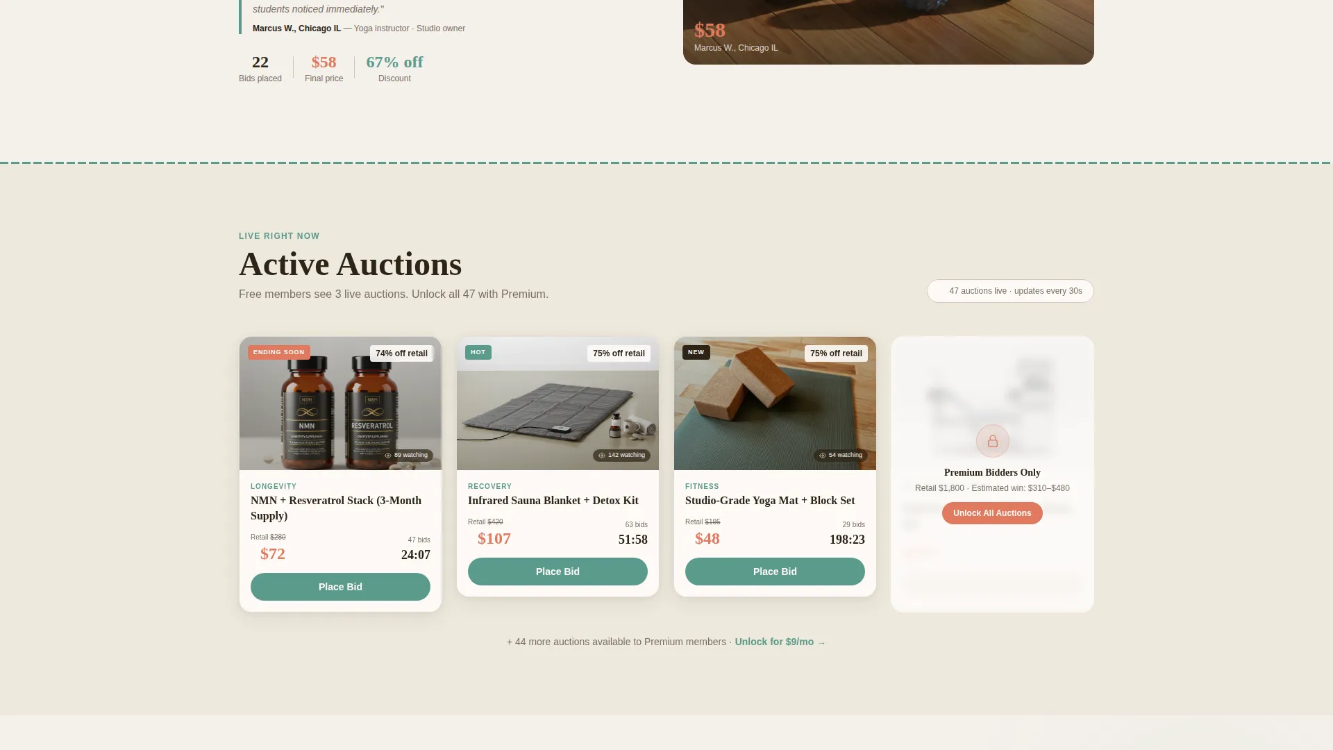
Free visitors see three active auctions clearly. A fourth auction appears blurred and labeled as premium access only. This controlled reveal creates curiosity and positions the upgrade as the natural next step rather than an interruption.
Upsell Toggle with Savings Nudge
A pricing toggle lets visitors switch between monthly and annual plans. The annual option is highlighted as the best value. A secondary nudge states that premium members saved an average of $1,240 last quarter, grounding the upgrade decision in concrete savings.
Minimal Upgrade Form
The membership upgrade form asks only for an email address and payment details. No profile building, no multi-step forms. The low-friction entry point is designed to remove every reason to hesitate at the point of conversion.
Neo-Retro Layered Card Layout
Card elements float on a cream background with soft drop shadows, each overlapping the next like auction paddles on a table. The layout uses teal for navigation and section dividers and coral for live pulses, countdown states, and call-to-action buttons.
Page sections overview
| Section | Purpose |
|---|---|
| Bundle Deal Header | Displays three fanned wellness bundle cards with live bid prices and a countdown timer |
| Before/After Reveal | Scrollable category sections that layer auction results over retail pricing comparisons |
| Bid History Display | Shows real bidding records and winner data alongside each product category |
| Winner Testimonials | Surfaces authentic user wins and unboxing moments to build trust |
| Membership Gate Preview | Blurs the fourth auction and signals premium access to trigger upgrade intent |
| Upsell Pricing Toggle | Presents monthly and annual plans with a savings nudge and plan highlight |
| Upgrade Form | Collects email and payment with no extra fields to minimize drop-off |
Design & branding system
The visual identity follows a Neo-Retro theme built on the Cloud Canvas color system. It feels like a 1960s pharmacy advertisement reprinted on handmade paper, warm and familiar yet unmistakably modern.
- Core palette: soft cumulus white (#F4F0EB), apothecary cream (#E8DFD0), faded tonic-label teal (#5B9A8B), and bidding-war coral (#E07A5F), with coral reserved strictly for live auction pulses, countdown timers, and call-to-action states
- Layout approach: layered card elements with soft drop shadows float over the cream background, overlapping like stacked auction paddles, while teal anchors navigation and section dividers with the visual authority of an old enamel sign
- Photography direction: vintage apothecary aesthetic for product styling alongside genuine, unposed unboxing photos shot on kitchen counters to contrast retail polish with real-life auction wins
Mobile & speed optimization
The overlapping layered layout is structured to translate clearly across screen sizes without losing its stacked depth effect.
- The fanned bundle card header and countdown clock are composed to remain readable and visually balanced on smaller screens
- Each before/after scroll section is designed as a self-contained layer, keeping the reveal mechanic functional even on touch-driven mobile devices
- The two-field upgrade form keeps interaction minimal, reducing the typing burden and drop-off risk on mobile at the point of conversion
How this template helps you convert
Every section of this template is arranged to move visitors through a deliberate journey from discovery to paid membership.
- The before/after reveal sequence stacks social proof progressively across three full category sections, so by the time the primary call-to-action appears, visitors have already seen concrete evidence of savings three times over
- The membership gate and blurred preview create natural curiosity before the upsell is ever shown, making the "Unlock All Auctions" call-to-action feel like a reward rather than a sales pitch
- The two-field upgrade form and the annual plan savings nudge eliminate the two most common friction points at checkout, hesitation about value and hesitation about effort
Other information about this template
This template is part of the Bidwell series and is categorized under Health and Wellness E-Commerce within the broader Retail and E-Commerce design collection.
- The template style is Overlap/Layered, meaning visual depth and stacking are core to the layout rather than decorative additions
- The creative direction is Before/After Reveal, a scroll-driven storytelling approach that reframes the same product twice to make the savings feel earned and real
- The header concept is Bundle Deal, presenting curated multi-product sets rather than individual items to increase perceived value per bid
- The landing page direction is Upsell/Upgrade, with every structural decision oriented toward converting free visitors into paid premium members
Theme
Neo-Retro
Creative direction
Before/After Reveal
Color system
Cloud Canvas
Style
Overlap/Layered
Direction
Upsell/Upgrade
Page Sections
Overlapping Bundle Card Header
Before/after Scroll Reveal Sections
Premium Membership Gate
Pricing Toggle with Savings Nudge
Low-friction Upgrade Form
Neo-retro Layered Card Layout
Related questions
Who is this landing page template designed for?
Can I customize the product bundles and auction categories shown?
How does the membership upsell section work?
Does the template include live bidding functionality?
What makes the before/after reveal different from a standard testimonials section?



