Holistic Dental Portal Landing Page Template
The Biofield holistic dentist patient portal landing page is a single-column flow built for whole-body dental practices. It leads with three trust-building stat pills, then alternates clinical evidence with patient stories as visitors scroll. The warm Soft Mist palette, serif headlines, and a persistent mobile call-to-action bar guide health-conscious patients toward portal login or a new-patient discovery booking.
by Rocket studio
Quick summary
Biofield is a single-column landing page for a holistic dental practice. It opens with a half-page photo and text header, delivers three large stat pills immediately, and builds trust through alternating clinical proof and patient narrative scroll segments. The only asks are two clear clicks: enter the patient portal or book a discovery visit.
Who this template is for
This template is built for holistic and biological dental practices that want to earn patient trust before asking for any action. It speaks directly to an audience that has already moved past conventional dental care and is looking for something more considered.
- Health-conscious parents researching ceramic implants and mercury-free options for their family
- Autoimmune patients and chronic-illness sufferers exploring the link between oral health and systemic wellbeing
- Wellness practitioners such as yoga teachers and functional medicine followers who understand whole-body alignment
What problem this template solves
Conventional dental websites lead with forms and appointment widgets before patients feel safe. For a holistic practice, that order of operations breaks trust. Patients who care about biological dentistry need evidence and story before they are ready to click anything.
- Clinical proof gets buried below generic service lists, so health-researching patients leave before they connect
- New patients have no clear path that separates first-timers from returning portal users
- The sterile, fluorescent feel of most dental sites contradicts the warm, whole-body brand a holistic practice wants to project
What you get with this template
You get a fully structured single-column landing page designed around a trust-first scroll experience. Every section is purposefully sequenced so that evidence arrives before any call to action does.
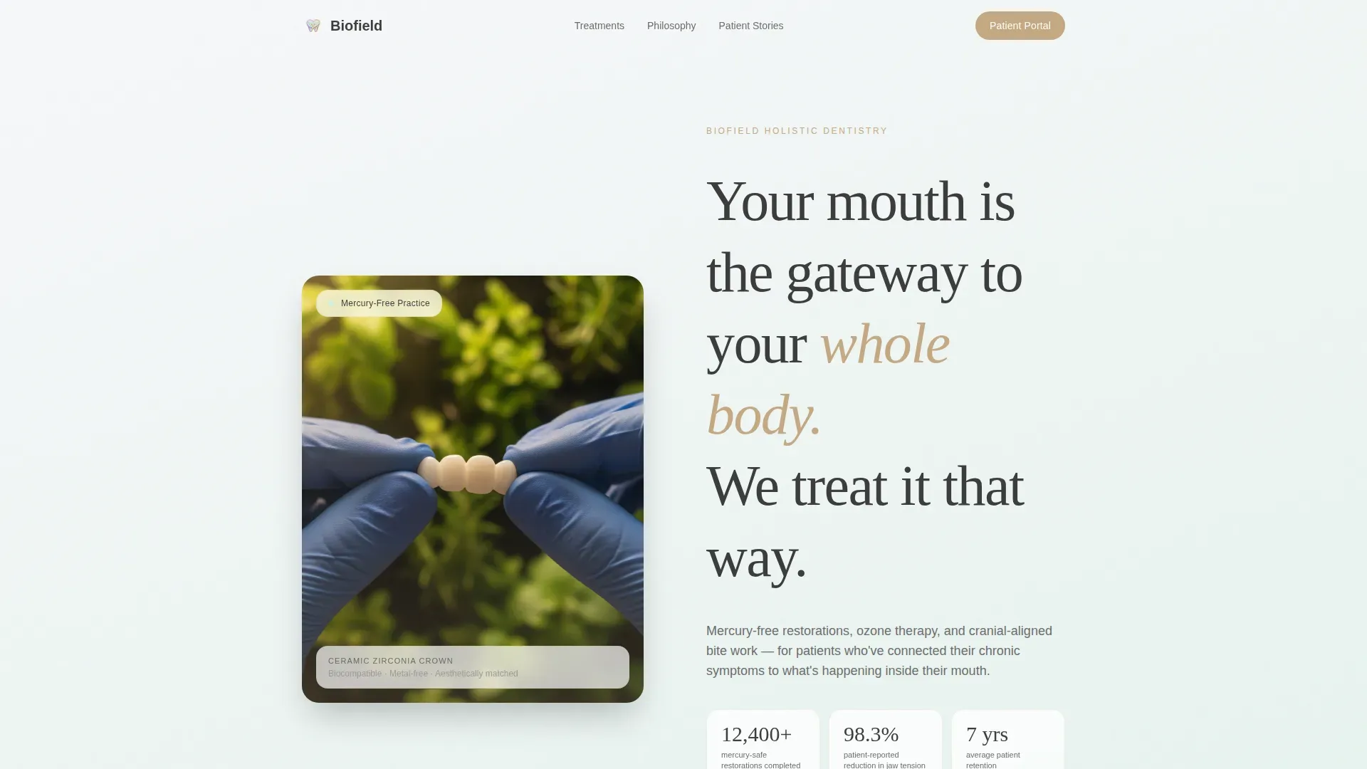
- A half-page hero with a practitioner image, serif headline, and three animated stat pills showing mercury-safe restorations, jaw tension reduction, and patient retention
- An alternating evidence rhythm of clinical data paired with two-sentence patient narratives, with a slow lavender-to-mint gradient shift across the scroll journey
- An asymmetric bento treatment section covering mercury-free fillings, ozone therapy, ceramic implants, and cranial bite work, followed by dual calls to action and a persistent mobile bottom bar
Feature list
This landing page is built around six purposeful components that work together to guide a health-conscious patient from first impression to confident click.
Half-Page Hero with Stat Pills
The header splits into a practitioner close-up on the left and a generous serif headline on the right. Three stat pills render immediately below: 12,400 or more mercury-safe restorations, 98.3 percent patient-reported jaw tension reduction, and a seven-year average patient retention figure. Each number sits inside its own soft-gradient pill with hover states included.
Alternating Evidence and Story Rhythm
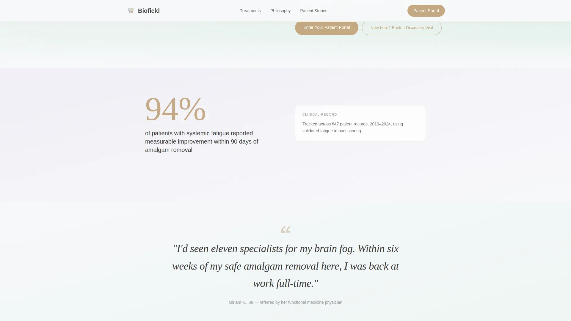
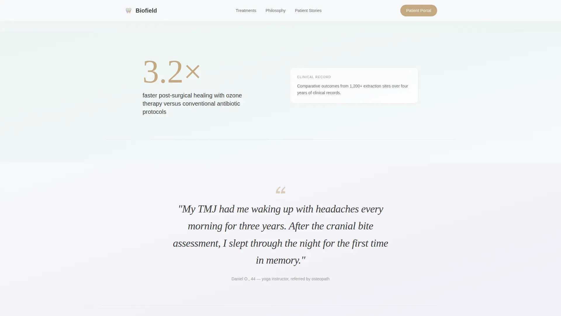
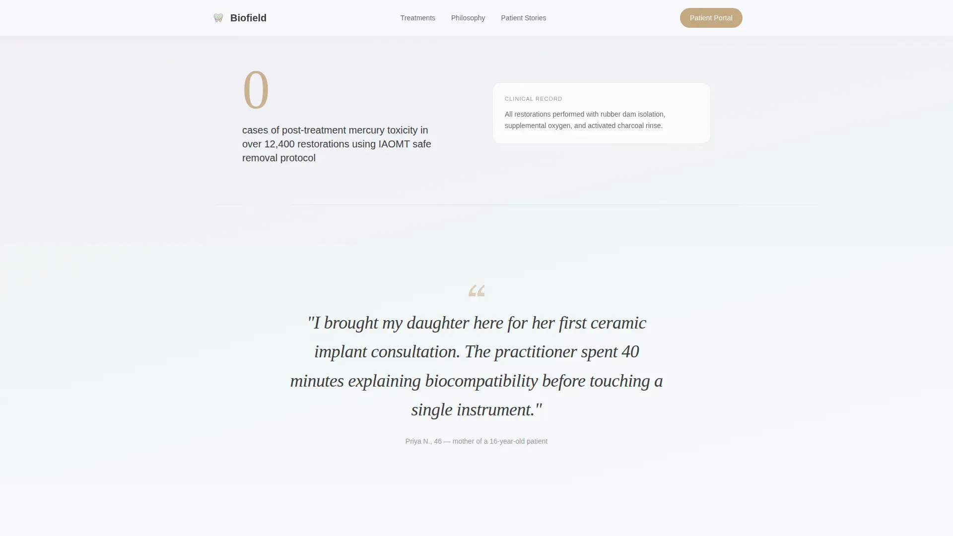
As visitors scroll, the page alternates between a clinical data point on the left and a two-sentence patient narrative on the right. The background gradient shifts imperceptibly from diffused lavender to breath mint across these segments, reinforcing a calm, building sense of credibility.
Asymmetric Bento Treatment Grid
Four core treatment areas appear in an asymmetric bento layout: mercury-free fillings, ozone therapy, ceramic implants, and cranial-aligned bite work. Each card gives the treatment a focused moment without overwhelming the scroll flow.
Dual Call-to-Action Section
After the third stat block, a warm clay primary button reads "Enter Your Patient Portal." Directly below, a secondary line reads "New here? Book a Discovery Visit" and links to a scheduling page. No form appears anywhere on the page.
Persistent Mobile Bottom Bar
On mobile, a fixed bottom bar keeps the primary portal call to action always visible. This supports the mobile-first research behavior of the target audience without interrupting the scroll narrative.
Scroll-Linked Gradient Animation
The background transitions slowly from lavender to mint as the visitor moves deeper into the page. Staggered scroll reveals and a parallax effect on the hero image add a sense of gentle motion that matches the calm, reassuring brand tone.
Page sections overview
| Section | Purpose |
|---|---|
| Hero Header | Introduce practice with image, headline, and three stat pills |
| Evidence Rhythm | Alternate clinical stats with patient stories as scroll deepens |
| Treatment Bento Grid | Present four core treatment areas in an asymmetric card layout |
| Portal Call to Action | Deliver warm clay primary button and secondary booking link |
| Persistent Mobile Bar | Keep portal entry visible at all times on mobile screens |
| Footer | Close with a single linear row of practice links and info |
Design & branding system
The Soft Mist color system defines the entire visual feel of this template. It is built to make a health-conscious patient exhale before they read a single word.
- Backgrounds cycle between morning fog white (#F7F8FA) and diffused lavender (#E8E0F0), with breath mint (#D4EDE1) appearing as the scroll progresses and warm clay (#C4A882) reserved for buttons and interactive accents
- Typography pairs Fraunces serif for headlines with DM Sans for body text, giving the page a grounded warmth that reads as both clinical and calm
- Gradients between lavender and mint move slowly enough to feel like breathing, while charcoal (#3D3D3D) body text ensures readability without visual aggression
Mobile & speed optimization
The template is built mobile-first because health-conscious patients do most of their research on phones. Every layout decision starts from the small screen and scales up.
- The persistent bottom bar keeps the portal call to action reachable without scrolling back, which is especially useful on long mobile sessions
- Static content is handled through server components with minimal JavaScript, keeping the page light even while supporting scroll-linked gradient shifts and staggered reveals
- The single-column flow means content stacks cleanly on any screen width without requiring layout reconfigurations
How this template helps you convert
This template replaces the conventional pressure-first dental website model with a consultation-style scroll. Trust is built in layers before any commitment is requested.
- The stat pills in the hero establish immediate credibility with real practice numbers, so first-time visitors have a reason to keep reading before they have read a single sentence about services.
- The alternating clinical-proof and human-story rhythm mirrors how a good intake consultation actually works, making the visitor feel heard and informed rather than sold to by the time they reach the call-to-action section.
- The split call-to-action path lets returning patients go straight to the portal while new patients have a pressure-free entry point through the discovery visit link, reducing drop-off from both audience types.
Other information about this template
This template is part of a Health and Medical category covering holistic dentist websites and patient portal landing pages. It is designed for practices that position oral health as a gateway to whole-body wellness.
- The template supports a Click-Through landing page direction, meaning conversion happens off the page through portal login or external scheduling, with no on-page form to manage
- The Stats-First Impact creative direction and Half-Page Photo and Text header concept are built into the template structure, not optional add-ons
- The Soft Gradient theme and Soft Mist color system are fully applied across all sections, including the scroll-linked gradient transitions
- The template is built for English-language, US-market practices, with USD context implied throughout the design and copy placeholder structure
Theme
Soft Gradient
Creative direction
Stats-First Impact
Color system
Soft Mist
Style
Single Column Flow
Direction
Click-Through
Page Sections
Half-page Hero with Stat Pills
Alternating Evidence and Story Rhythm
Asymmetric Bento Treatment Grid
Dual Call-to-action Section
Persistent Mobile Bottom Bar
Scroll-linked Gradient and Reveal Animation
Related questions
Does this landing page include a patient intake form?
Can both existing patients and new patients use this page?
What treatments does the template's bento section cover?
How does the scroll gradient animation work?
Is the persistent mobile bottom bar always visible on phones?



