Pathology Medicine Patient Education Website Template
Biopsy is a single-column pathology patient education landing page that translates dense medical report language into plain, calm guidance. Built for recently diagnosed patients and their families, it combines a stepped scrolling guide, a five-question "Decode Your Report" assessment, and a pinned glossary search bar to meet visitors exactly where anxiety peaks.
by Rocket studio
Quick summary
Biopsy is a patient-facing landing page that turns pathology report confusion into clarity. A stacked typographic hero draws visitors in, a numbered scrolling guide walks them through real report language step by step, and a short assessment helps them understand their specific results. The design stays calm, uncluttered, and mobile-ready throughout.
Who this template is for
This template is built for health technology teams, patient education platforms, and medical content publishers who need to reach people at the most vulnerable moment of their health journey. It speaks directly to a non-medical audience that needs trustworthy, approachable guidance fast.
- Recently diagnosed patients reading a pathology or biopsy report for the first time
- Caregivers, spouses, and family members searching late at night on behalf of someone they love
- Patient advocacy organizations or health platforms building self-serve educational tools
What problem this template solves
A pathology report lands in a patient's hands with no translation guide attached. The terminology is dense, the implications feel enormous, and a quick internet search usually makes the anxiety worse, not better. This template fills that gap with a calm, structured page that proves understanding is possible before it ever asks for a click.
- Patients leave medical appointments holding reports filled with words like "poorly differentiated" or "atypical cells" and have nowhere to turn for plain-language answers
- Generic health search results return clinical references that increase confusion rather than reduce it
- There is no guided, step-by-step pathway that mirrors how a pathology report is actually structured
What you get with this template
The template delivers a complete single-column landing page flow, designed from the first heading to the footer with the anxious, first-time report reader in mind. Every section has a clear job, and the visual system never introduces elements that feel alarming or clinical.
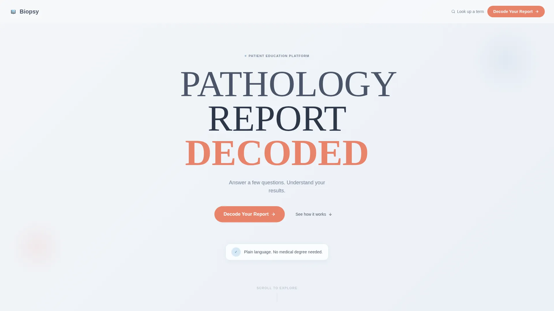
- A Stacked Type Tower hero with the words PATHOLOGY, REPORT, and DECODED, plus a single-line subheading and a primary call-to-action button
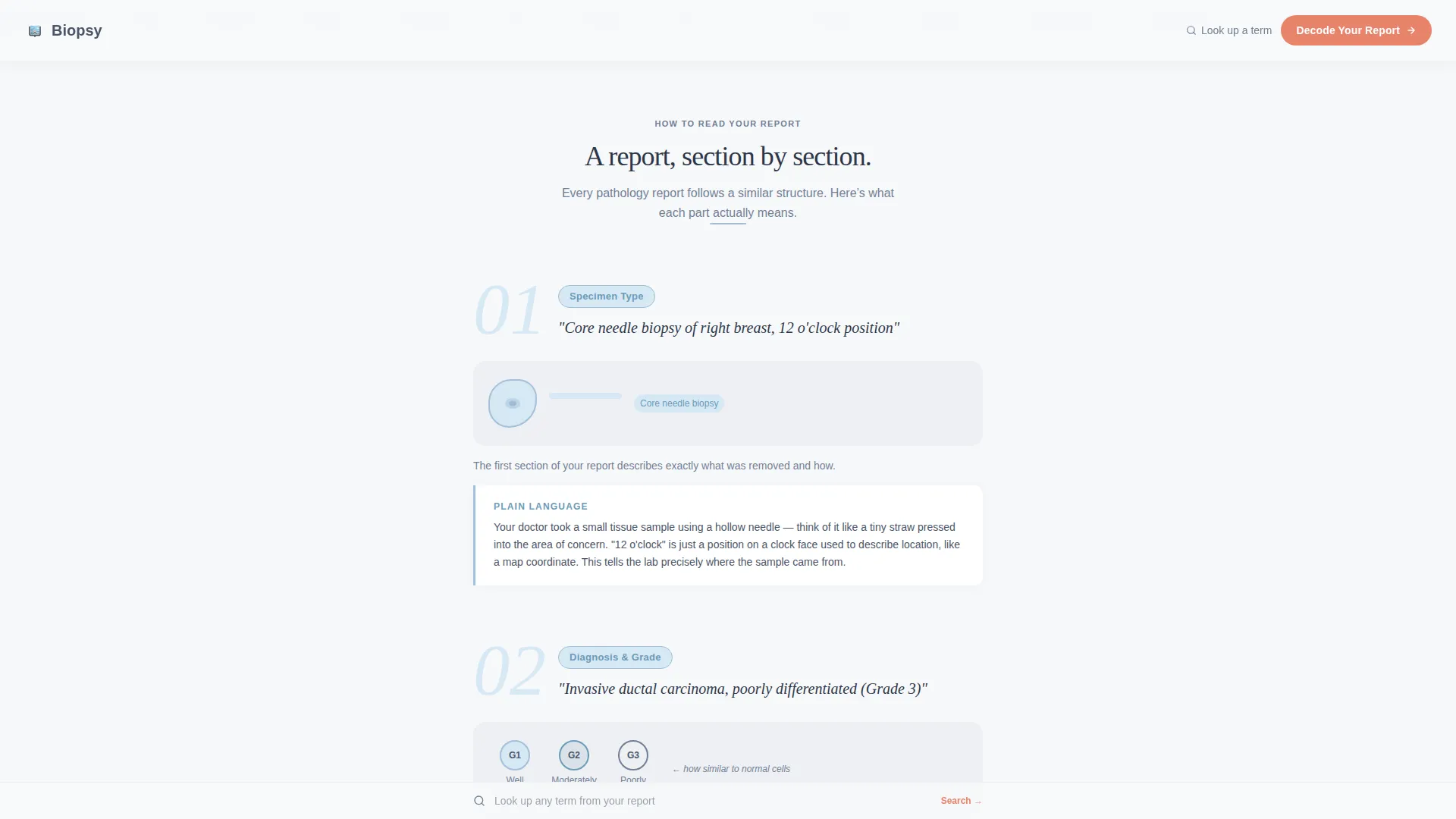
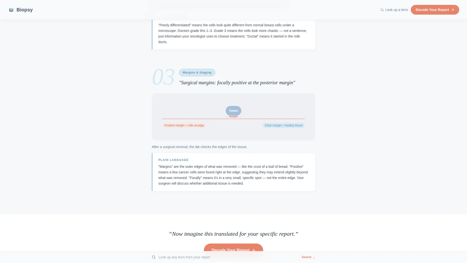
- A three-part scrolling step guide that mirrors actual pathology report structure, with real patient phrases translated into plain language
- A five-question "Decode Your Report" assessment, a pinned glossary search bar, a trust and credibility section, and an ultra-minimal footer
Feature list
This template packages several deliberate, purpose-built components that work together to guide a frightened reader toward understanding.
Stacked Type Tower Hero
The hero displays the words PATHOLOGY, REPORT, and DECODED in a large stacked vertical sequence. Each word grows progressively bolder, creating a visual funnel that draws the eye downward. No imagery competes for attention. White space does the reassuring work instead.
Numbered Scrolling Step Guide
Three numbered sections mirror the actual structure of a pathology report. Each section opens with a real phrase patients encounter, such as "What does 'poorly differentiated' mean?", and closes with a plain-language translation. Scroll reveals and entrance animations make the progression feel like turning booklet pages, not clicking through a database.
Five-Question Decode Assessment
The primary interactive feature walks a visitor through five one-per-screen questions covering report type, body site, staging mention, specific remembered terms, and primary concern. A sky blue progress bar tracks position through the flow. The assessment is driven by a client-side state machine for fast, smooth transitions between steps.
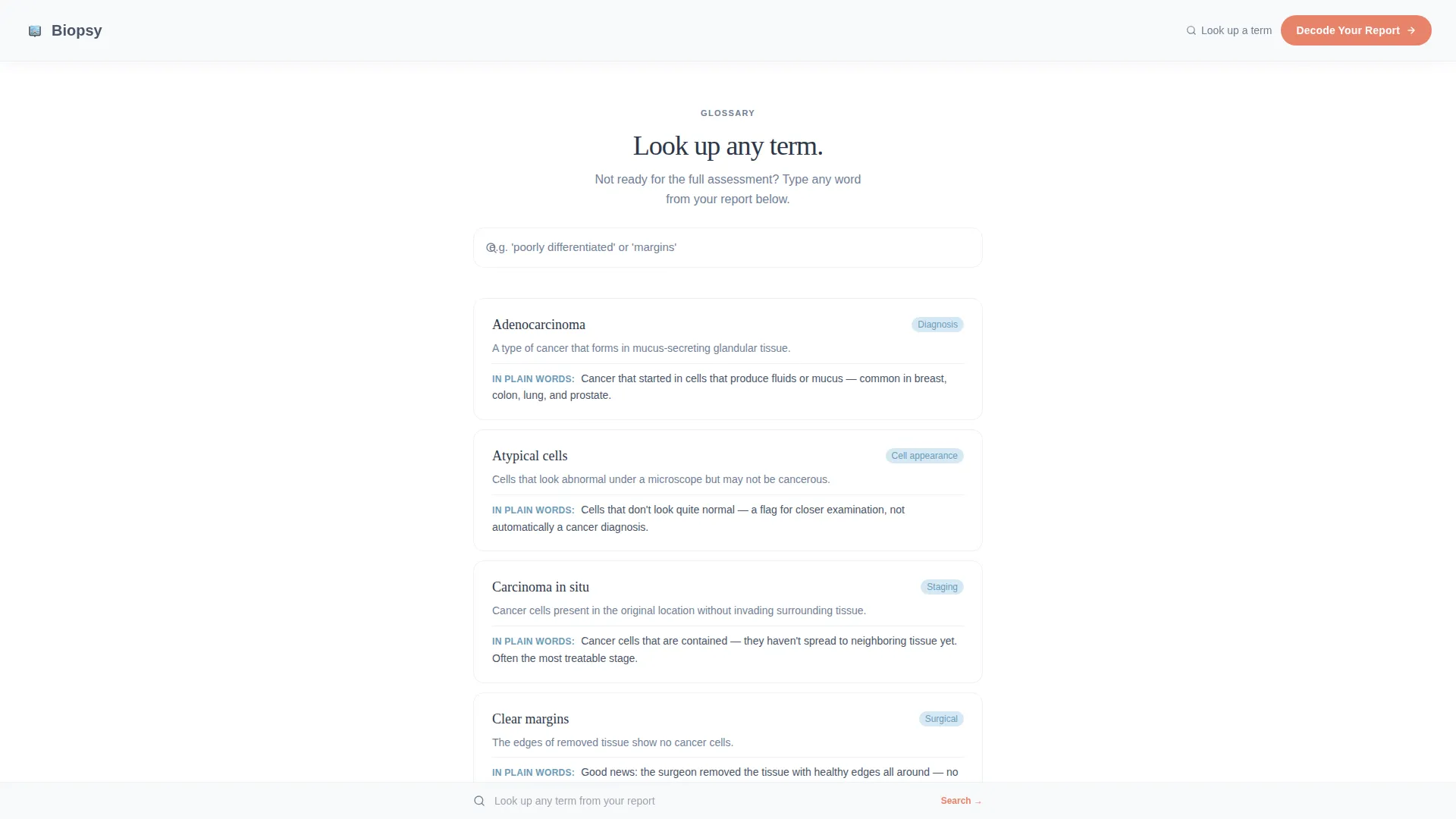
Pinned Glossary Search Bar
A search bar stays fixed at the bottom of the page with the prompt "Look up any term from your report." This gives visitors who are not ready for the full assessment an immediate, low-commitment way to find one answer and build enough confidence to continue.
Patient Scenario Vignettes
In place of testimonials, the template uses brief patient scenario vignettes that describe recognizable situations. These short narrative moments build empathy and credibility without requiring personal data or external social proof systems.
Trust and Credibility Section
A dedicated section explains the methodology behind the content and includes a reviewed-by note. This section anchors the page in professional accountability and reassures visitors that the translations they are reading meet an editorial standard.
Page sections overview
| Section | Purpose |
|---|---|
| Hero Tower | Introduce the page concept and present the primary call to action |
| Scrolling Step Guide | Walk visitors through pathology report structure in plain language |
| Assessment Call to Action | Invite visitors to start the "Decode Your Report" five-question flow |
| Glossary Search | Provide instant term lookup for visitors not ready for the full assessment |
| Trust and Credibility | Establish methodology transparency and include a secondary call to action |
| Minimal Footer | Close the page with essential links in a clean horizontal layout |
Design & branding system
The visual identity follows a Medical Clarity theme using the Cloud Canvas color system. Every color decision is intentional: the palette avoids clinical red and sterile green, choosing instead tones that feel like a clean lab slide held up to diffused natural light.
- Backgrounds stay in the white-to-pale-gray range using Cloud Canvas white (#F7F8FA); body text uses reassuring slate (#4A5568) for sustained reading comfort
- Sky blue (#A3BFDA) marks informational callouts, progress indicators, and the assessment progress bar to signal guidance without urgency
- Warm signal coral (#E8836B) appears exclusively on interactive elements and calls to action, so visitors always know where to act
Mobile & speed optimization
The template is built mobile-first, reflecting the real behavior of its audience. Patients search on phones in parking lots, in waiting rooms, and at two in the morning. Every layout decision prioritizes the small-screen experience first.
- Single-column flow eliminates the need for complex responsive breakpoints and keeps the reading experience consistent across all screen sizes
- The quiz assessment uses a client-side state machine, meaning transitions between questions are handled locally without server round trips, keeping the interaction fast and uninterrupted
- Scroll reveal animations and entrance effects are set to medium intensity, providing a sense of calm progression without sacrificing load responsiveness
How this template helps you convert
The conversion strategy embedded in this template is built on earning trust before asking for anything. The page does not open with a sign-up form. It opens with proof that clarity is possible, then invites action.
- The scrolling step guide delivers immediate value by translating real pathology phrases into plain language, so visitors experience the platform working before any call to action appears
- The primary "Decode Your Report" button appears beneath the hero and again after the third guide section, placed at the two natural moments when a visitor's confidence is highest
- The pinned glossary search bar offers a lower-commitment entry point for hesitant visitors, keeping them on the page and moving toward a fuller interaction at their own pace
Other information about this template
This template sits at the intersection of patient education, health technology, and plain-language medical communication. It is designed as a business-to-consumer product aimed at individual patients and their support networks rather than clinical professionals.
- Typography uses Fraunces for the display tower and DM Sans for all body and interface text, pairing expressive editorial weight with clean functional readability
- Animation intensity is set to medium across the template, covering entrance animations, scroll reveals, and quiz step transitions
- The footer follows a horizontal flow pattern that keeps the page closing feeling clean and unobtrusive
- The template is localized for English (United States) with no currency display and standard date formatting
- This landing page sits in the Health and Medical category under the Pathology Medicine subcategory, making it well suited for patient advocacy groups, health technology startups, and medical content publishers building self-serve education tools
Theme
Medical Clarity
Creative direction
Step-by-Step Guide
Color system
Cloud Canvas
Style
Single Column Flow
Direction
Quiz/Assessment
Page Sections
Stacked Type Tower Hero
Numbered Scrolling Step Guide
Five-question Decode Assessment
Pinned Glossary Search Bar
Patient Scenario Vignettes
Trust and Credibility Section
Related questions
What kind of visitor is this landing page designed for?
What does the Decode Your Report assessment include?
Can visitors use the page without completing the full assessment?
What typography and color system does this template use?
Is this template suitable for mobile users?



