Premium Feeders Landing Page Template
Perch is a bento grid landing page built for bird feeder and nesting house subscription boxes. It combines a warm sunset color palette, a device mockup header, a five-step personalization quiz, and urgency-driven bento cells to turn casual browsers into committed subscribers. Every layout decision is designed around discovery, trust, and a gentle nudge toward "Find Your Flock."
by Rocket studio
Quick summary
Perch is a single-page subscription landing page for a curated bird feeder box service. The design uses a bento grid layout, a soft sunset gradient palette, and a quiz-first conversion flow. Each section earns attention before asking for a commitment, guiding visitors from curiosity to a personalized box recommendation and email sign-up.
Who this template is for
This template suits anyone selling a curated, nature-focused subscription product where personalization is a key selling point. It works especially well when your audience ranges from total beginners to passionate hobbyists.
- Subscription box founders selling bird feeders, seed blends, or nesting supplies
- Direct-to-consumer retailers wanting a story-led landing page instead of a standard product listing
- Side-project creators building a nature or wildlife subscription brand from the ground up
What problem this template solves
Generic subscription pages treat every visitor the same. They show one box, list a price, and hope for the best. Perch fixes this by leading with specificity and warmth rather than a hard sell.
- Visitors leave when a page feels too salesy or too generic for their actual situation
- Subscription products are hard to convey without showing what is actually inside the box
- First-time buyers need reassurance, not just a checkout button
What you get with this template
You get a fully structured, single-page layout ready to be customized for a bird feeder subscription brand. Every section is pre-built and purposeful.
- A bento grid body with large beauty cells and small proof cells arranged for visual rhythm
- A five-step illustrated quiz flow that collects region, yard type, experience level, goals, and email
- A sticky "Find Your Flock" bottom bar that appears after the first scroll, keeping the primary call to action always reachable
Feature list
This template is built around five core design and conversion ideas drawn directly from the brief. Each one serves a specific job on the page.
App Store-Style Device Mockup Header
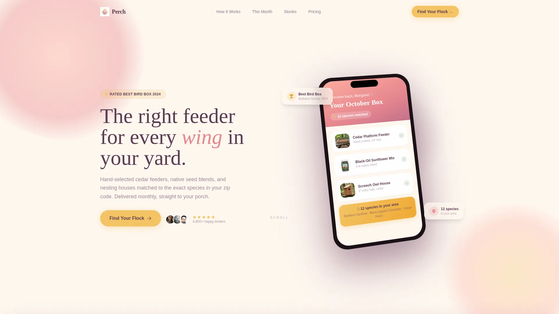
The header floats a stylized phone screen at a slight angle showing a "Your October Box" subscription card. Thumbnail images of a cedar platform feeder, a seed bag, and a screech owl house sit inside the device frame. A five-star review snippet and a "Rated Best Bird Box 2024" badge flank the phone to provide instant social proof.
Bento Grid Layout with Varied Cell Sizes
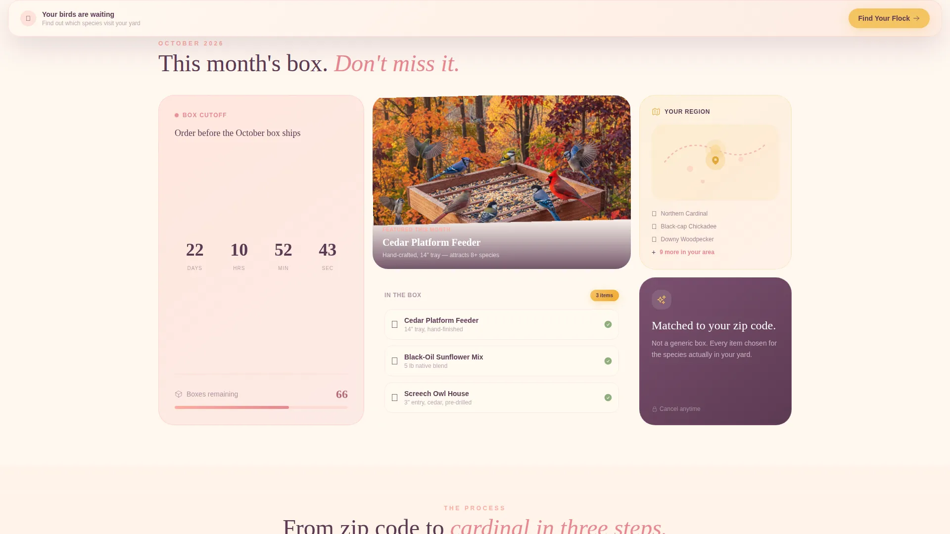
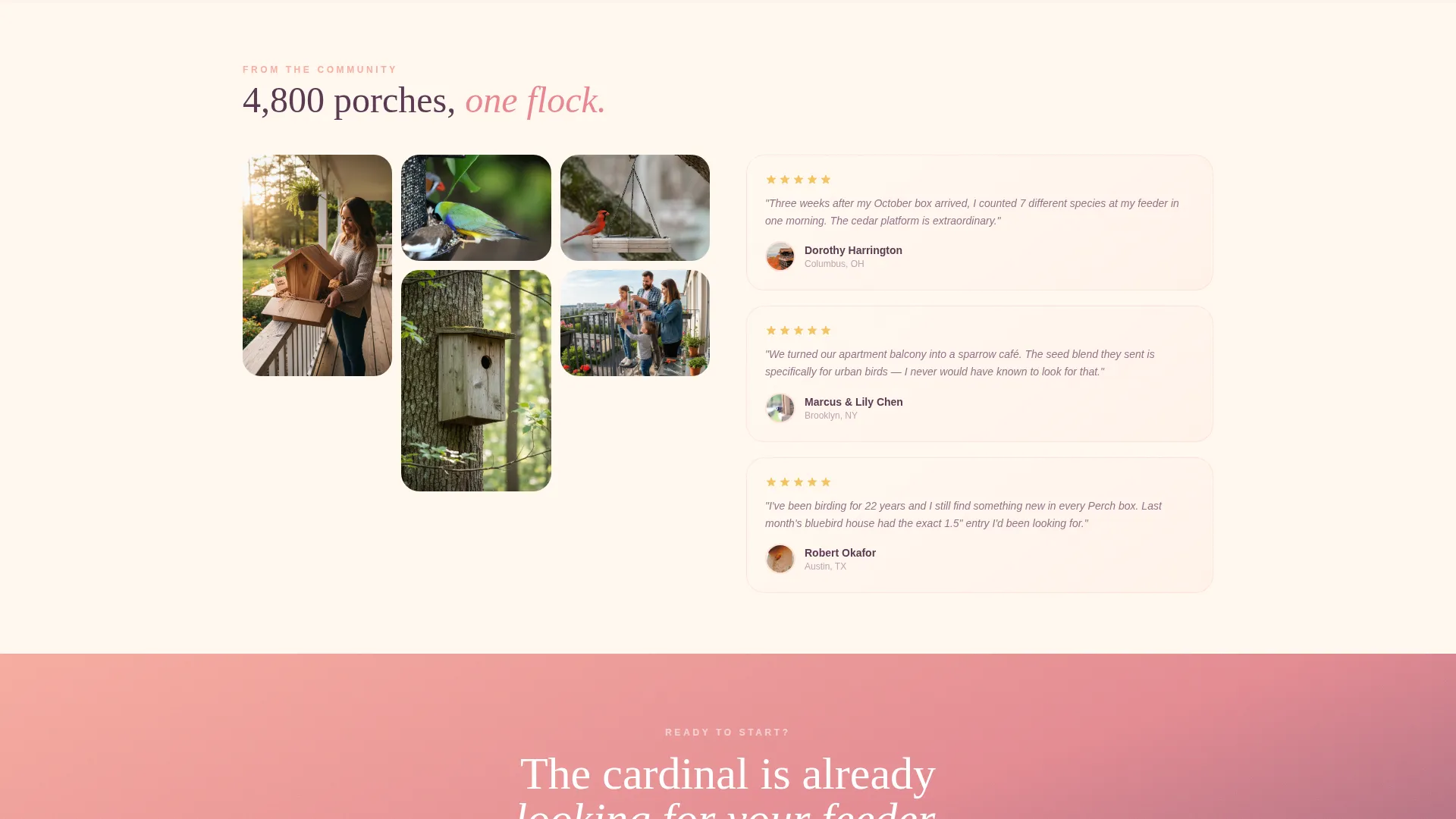
The page body uses a bento grid where large cells carry photography and atmosphere while small cells carry proof and urgency. One cell shows the featured feeder in a subtle rotation loop. Another displays a regional species map. A third stacks subscriber unboxing photos in a mosaic. A smaller cell pulses with a live inventory counter showing remaining boxes.
Five-Step Personalization Quiz
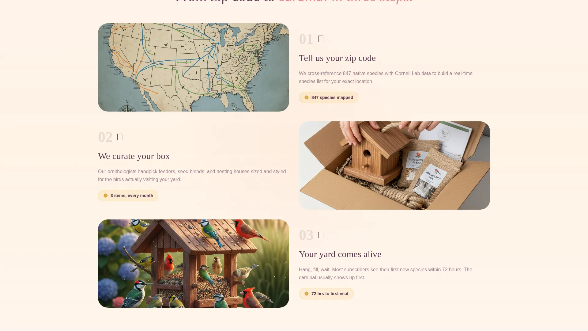
The primary call to action opens a five-step illustrated quiz. Step one captures region via a tap-friendly map. Step two asks yard type. Step three gauges experience level with playful labels. Step four asks about birding goals. Step five collects email and name, then delivers a personalized box recommendation showing exactly which three items would ship and which species might visit.
Flash Deal Urgency Elements
A countdown timer placed immediately below the header ticks toward the current month's box cutoff. A live inventory counter reads "67 boxes left" to create gentle, honest scarcity. These elements work together without resorting to aggressive pressure tactics.
Sticky Call-to-Action Bar
After the visitor scrolls past the header, a goldenrod sticky bar appears at the bottom of the screen. It keeps the "Find Your Flock" quiz entry point visible at all times without interrupting the browsing experience.
Page sections overview
| Section | Purpose |
|---|---|
| Hero Header | Introduce the brand with a device mockup and headline |
| Countdown Timer Strip | Show cutoff urgency immediately below the hero |
| Featured Feeder Cell | Highlight this month's star product visually |
| Regional Species Map | Personalize the page by visitor location |
| Unboxing Photo Mosaic | Build trust with real subscriber photos |
| Live Inventory Counter | Create gentle scarcity with remaining box count |
| Five-Step Quiz | Collect preferences and deliver box recommendation |
| Quiz Result Page | Show personalized items and species illustrations |
| Sticky call to action Bar | Keep quiz entry reachable throughout the scroll |
Design & branding system
The palette is built around a sunset gradient that runs from warm peach through dusty rose into muted plum. Every color choice feels tied to the last twenty minutes of daylight, nothing cold, nothing harsh.
- Core colors: warm peach (#FDAB9E), dusty rose (#E8878F), muted plum (#7B506F), creamy buttermilk (#FFF8F0), and soft goldenrod (#F4C463)
- Gradients wash gently behind bento cells rather than filling them as flat blocks, giving each card its own sense of atmosphere
- Text appears in plum on buttermilk backgrounds; interactive elements glow goldenrod on hover, like a porch light clicking on
Mobile & speed optimization
The bento grid is structured to reflow naturally on smaller screens. Touch-friendly interactions are a primary concern throughout the quiz flow.
- The five-step quiz uses tap-friendly map and button inputs sized for comfortable mobile use
- The sticky call-to-action bar is designed to sit cleanly at the bottom edge of a phone screen without blocking content
- Cell sizing in the bento grid adjusts so large beauty cards and small proof cards remain legible at any viewport width
How this template helps you convert
Perch is structured around a progressive trust-building sequence. Each scroll reveals something new rather than repeating the same pitch.
- The device mockup header establishes product credibility and social proof before the visitor reads a single sentence of copy
- The countdown timer and live inventory counter create soft urgency that motivates a decision without feeling pushy
- The quiz replaces a generic sign-up form with a personalized experience, making the visitor feel that the box was built specifically for them
Other information about this template
This template is categorized under Retail and E-Commerce with a focus on the bird feeders and houses niche. It sits at the intersection of subscription retail and wildlife hobby products, making it a strong fit for dropshipping store operators as well as direct brand builders.
- The template style follows a masonry and Pinterest-influenced bento grid, which keeps visual hierarchy fluid and photo-forward
- The creative direction centers on flash deal mechanics layered over a discovery-first browsing experience
- The header concept is a device mockup, making the subscription app interface the visual anchor of the page
- The landing page direction is built around an upsell and upgrade path, where the quiz result page naturally positions premium or add-on box options
Theme
Soft Gradient
Creative direction
Flash Deal
Color system
Cloud Canvas
Style
Masonry/Pinterest
Direction
Upsell/Upgrade
Page Sections
App Store-style Device Mockup Header
Bento Grid with Urgency Cells
Five-step Personalization Quiz
Regional Species Map Cell
Sticky Call-to-action Bar
Related questions
Can I use this template for a different subscription niche?
How does the five-step quiz convert visitors into subscribers?
What urgency elements are included in this template?
What does the bento grid layout look like on a phone screen?
Who is this landing page template best suited for?



