Editorial Doula Landing Page Template
Birthside is an editorial-style doula landing page built for birth workers who want their online presence to feel as intentional as their practice. It leads with data storytelling, a comparison table, and a trust-building logo wall, then guides visitors toward a focused three-field lead form. The result is a calm, authoritative page that speaks directly to expectant parents.
by Rocket studio
Quick summary
Birthside is a single-page doula and birth coach landing page template. It opens with typeset birth statistics, moves through a hospital logo wall, centers on an editorial comparison table, and closes with a minimal lead form. The design follows an Editorial Magazine theme in Arctic White, making the page feel quiet, credible, and deeply personal.
Who this template is for
This template is built for independent doulas and birth coaches who want a professional online presence that earns trust quickly. It suits practitioners serving a defined geographic area who need to communicate their unique value clearly to emotionally invested visitors.
- Birth doulas and postpartum doulas offering tiered service packages
- Birth coaches who attend hospital, birthing center, or home births across a named service area
- Experienced practitioners with a personal story, attended-birth count, and specific local credentials to share
What problem this template solves
Most doula websites look like wellness blogs or generic service pages. They fail to address the specific fears and decisions that bring a pregnant person to the page in the first place. Birthside closes that gap with structured, data-led content that meets the visitor where she actually is.
- Visitors arrive anxious and undecided; a comparison table helps them understand their real options at a glance
- Generic hero images feel impersonal; data storytelling with local statistics makes the visitor feel seen in her specific geography
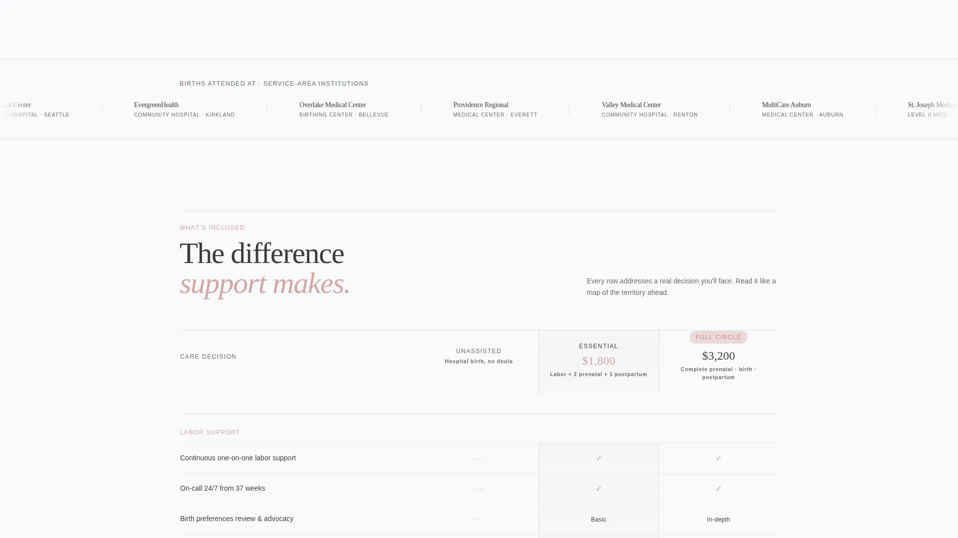
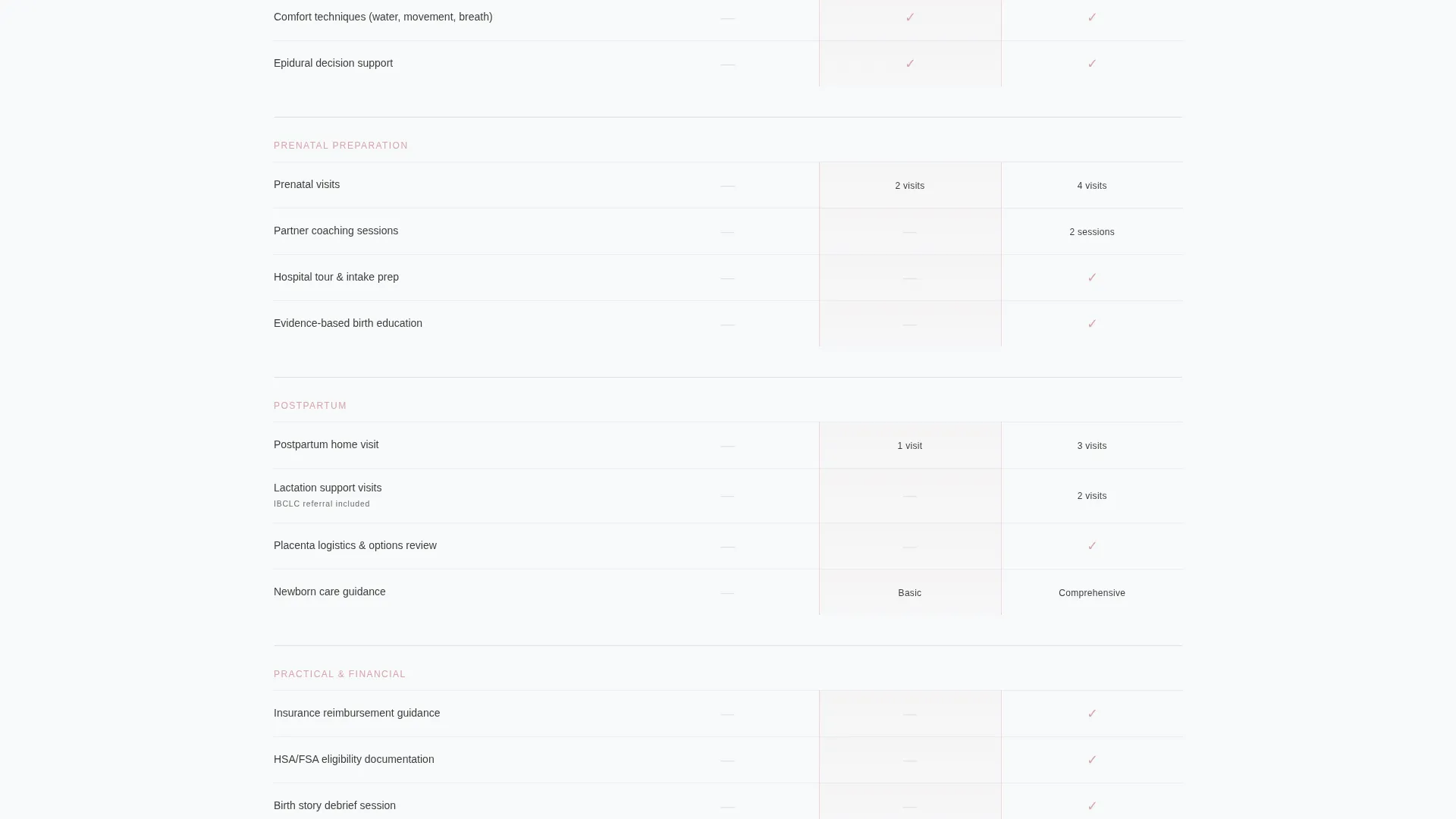
- Unclear service tiers lose potential clients; the three-column table maps every decision point from labor support to insurance guidance
What you get with this template
The template delivers a fully structured, single-page layout with every section pre-built and ready to personalize. Each section has a clear job, and together they create a confident, editorial flow from first impression to form submission.
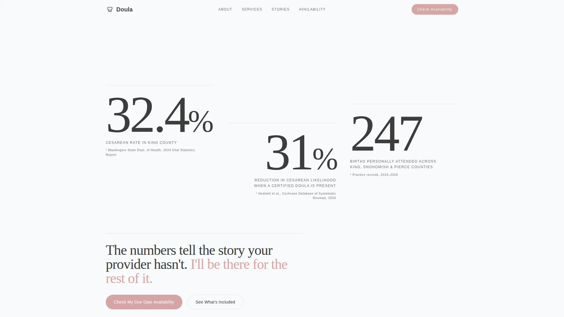
- A data-storytelling header with three oversized typeset statistics and footnote-style sourcing in small caps
- A horizontal logo wall band for hospitals, birthing centers, and local practice insignias from the service area
- An editorial comparison table, birth story pull-quote vignettes with location tags, and a two-instance lead generation form
Feature list
This section walks through the core built-in components that make Birthside work as a lead generation landing page for doula and birth coach services.
Data Storytelling Header
Three key birth statistics are typeset in an oversized editorial serif and staggered across the viewport with generous whitespace. Each figure is sourced and footnoted in small caps directly below it, creating immediate credibility without a single stock photo.
Logo Wall Authority Band
A horizontal strip beneath the header displays hospital logos, birthing center marks, and local OB-GYN practice insignias. It is presented in an editorial colophon style rather than a corporate badge wall, signaling professional familiarity with the institutions visitors already know.
Editorial Comparison Table
The centerpiece three-column table compares unassisted hospital birth, a standard doula package, and the full coaching and postpartum package. Each row targets a real decision point, including continuous labor support, partner coaching sessions, lactation visits, placenta logistics, and insurance reimbursement guidance. Blush checkmarks and small caps headers keep it readable and on-brand.
Birth Story Pull-Quote Vignettes
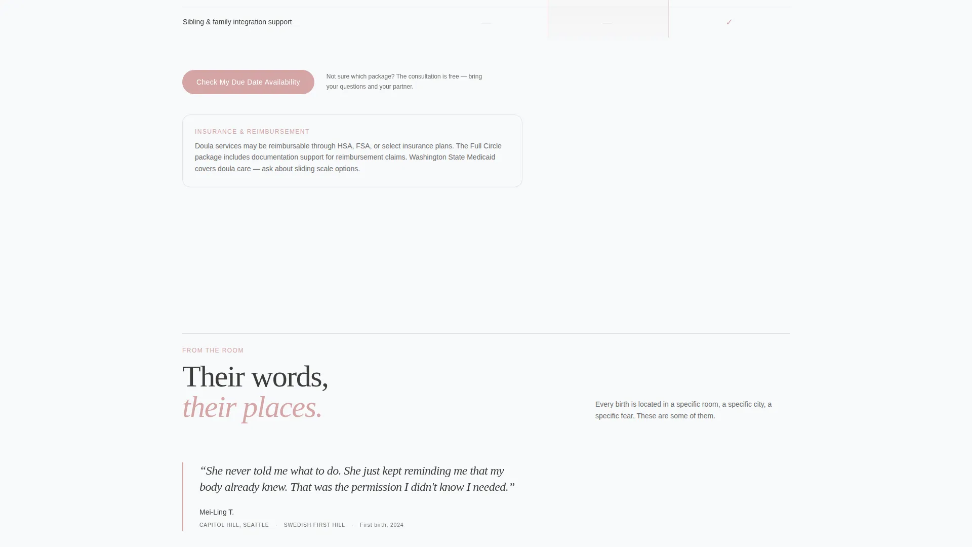
Editorial-style birth story excerpts appear as pull-quote blocks with specific hospital and neighborhood location tags. These make the service area tangible and personal without relying on a map, and they reinforce trust through specificity.
Three-Field Lead Generation Form
The form asks exactly three questions in a deliberate order: estimated due date via a date picker, birth location or hospital preference via a dropdown populated from the logo wall, and a free-text field asking "What does your ideal birth feel like?" This sequence prioritizes the visitor's most urgent information first.
Dual call to action Placement
The primary call to action, "Check My Due Date Availability," appears twice on the page: once floating after the comparison table and once anchoring the final section. This placement catches visitors at two natural decision moments.
Page sections overview
| Section | Purpose |
|---|---|
| Data Statistics Header | Opens with three local birth statistics to establish immediate relevance and credibility |
| Hospital Logo Wall | Displays service-area institution marks to build authority and local familiarity |
| Comparison Table | Helps visitors evaluate three service tiers side by side across real decision points |
| Birth Story Vignettes | Shares location-tagged pull-quote stories to make the service area feel personal |
| Mid-Page call to action | Floats the availability form prompt directly after the comparison table |
| Lead Generation Form | Captures due date, birth location preference, and the visitor's birth vision |
| Final Anchor call to action | Closes the page with a second "Check My Due Date Availability" call to action |
Design & branding system
The visual identity follows an Editorial Magazine theme grounded in an Arctic White color system. Every design choice reinforces calm, trust, and unhurried authority, the same qualities a doula brings into the birth room.
- Color palette: glacial white (#F8F9FA) for open negative space, soft graphite (#3D3D3D) for serif body text, pale silver (#E0E2E6) for thin section dividers, and muted blush (#D4A5A5) for buttons and pull-quote accents
- Typography: oversized editorial serif numerals in the header, small caps for footnotes and table headers, and unhurried body text that gives every element room to breathe
- Overall feel: Scandinavian nursery at dawn, still and clean, with generous whitespace holding the layout together rather than decoration filling it
Mobile & speed optimization
The layout is structured with a clean single-column flow that adapts naturally to smaller screens. Generous whitespace and a limited color palette keep the design legible without needing heavy visual assets.
- The comparison table is designed to reflow on mobile so visitors can scroll through service tiers without horizontal scrolling
- The three-field lead form is minimal by design, reducing friction on touch devices where long forms cause drop-off
How this template helps you convert
Every structural decision in Birthside is oriented toward one outcome: a qualified visitor submitting the lead form. The page earns that action by building trust progressively before asking for anything.
- The data header creates instant personal relevance by referencing the visitor's county-level cesarean rate and the documented reduction in interventions when a doula is present, making the case before the visitor has read a single service description.
- The comparison table removes hesitation by turning a confusing decision into a clear, visual side-by-side, so the visitor understands exactly what she gains by choosing a fuller package.
- The lead form's first question, the estimated due date, signals that the doula's time is limited and that availability is real, creating natural urgency that feels caring rather than salesy.
Other information about this template
Birthside is built specifically for the doula and birth coach service area and location page use case. It is designed for practitioners who serve a named geographic area and want to communicate that specificity visually and structurally.
- The template style is Comparison Table, making it suitable for doulas offering more than one package tier or service level
- The header concept is Data Storytelling, which requires the practitioner to supply real local statistics and a personal attended-birth count for the figures to carry their full weight
- The creative direction is Logo Wall Authority, meaning the logo band works best when the doula has attended births at multiple named local institutions and can display those marks
- This template is categorized under Professional Services, subcategory Doula and Birth Coach Online Presence, and is designed as a lead generation landing page rather than a full multi-page website
Theme
Editorial Magazine
Creative direction
Logo Wall Authority
Color system
Arctic White
Style
Comparison Table
Direction
Lead Generation
Page Sections
Data Storytelling Header
Hospital Logo Wall Band
Editorial Comparison Table
Birth Story Pull-quote Vignettes
Three-field Lead Generation Form
Dual Call to Action Placement
Related questions
Can I use this template if I am new to birth work with fewer attended births?
Do I need to supply my own birth statistics for the header?
Can the comparison table rows be changed to match my actual packages?
Is this template suitable for a doula who focuses only on postpartum support?
What should I include in the birth story vignette sections?



