Editorial Midwife Landing Page Template
Birthwork is a single-column editorial landing page built for independent midwives who need a web presence that carries real weight. It leads with a typographic manifesto, follows with full-viewport statistics, and guides visitors through philosophy sections and birth stories before presenting a gentle, three-question consultation form. The design speaks authority without shouting.
by Rocket studio
Quick summary
Birthwork is a single-column editorial landing page for midwifery practices. It opens with a bold manifesto header, moves through full-viewport impact statistics, and flows into long-form philosophy and birth story sections. A three-question lead form and a secondary PDF download give visitors two clear paths forward, whether they are ready to book or still deciding.
Who this template is for
This template is built for independent midwives and small birth-support practices that want a web presence reflecting real clinical experience. It works especially well for practitioners who feel let down by generic health and wellness templates.
- Midwives with an established practice who want to lead with credibility rather than stock photography
- Birth professionals targeting first-time mothers, experienced mothers seeking different outcomes, and families planning home births
- Solo practitioners who want a refined, editorial look without hiring a custom design agency
What problem this template solves
Most health and wellness templates default to soft pastels, generic bump photography, and feature blocks that could belong to any service provider. For a midwife, that visual language actively undermines trust. Prospective clients need to feel the practitioner's experience before they read a single word.
- Lack of a strong visual authority signal that separates an experienced midwife from a general wellness page
- No clear structure for presenting clinical credibility, personal philosophy, and a low-pressure path to booking together in one flow
- Difficulty converting cautious visitors who are researching but not yet ready to call
What you get with this template
You get a fully structured single-column landing page layout that is editorially paced and conversion-focused. Every section has a clear role, from the opening manifesto to the fixed bottom call-to-action bar.
- A typographic manifesto header, a stats impact section with three full-viewport numbers, philosophy and birth story alternating sections, a lead generation form, and a secondary PDF download gate
- A fixed bottom call-to-action bar that fades in after the visitor has scrolled 40 percent of the page
- A Monochrome Steel color system with warm parchment backgrounds, charcoal editorial type, and muted rose accents reserved strictly for calls to action and pull-quote marks
Feature list
This landing page template includes the following built-in components and structural features.
Typographic Manifesto Header
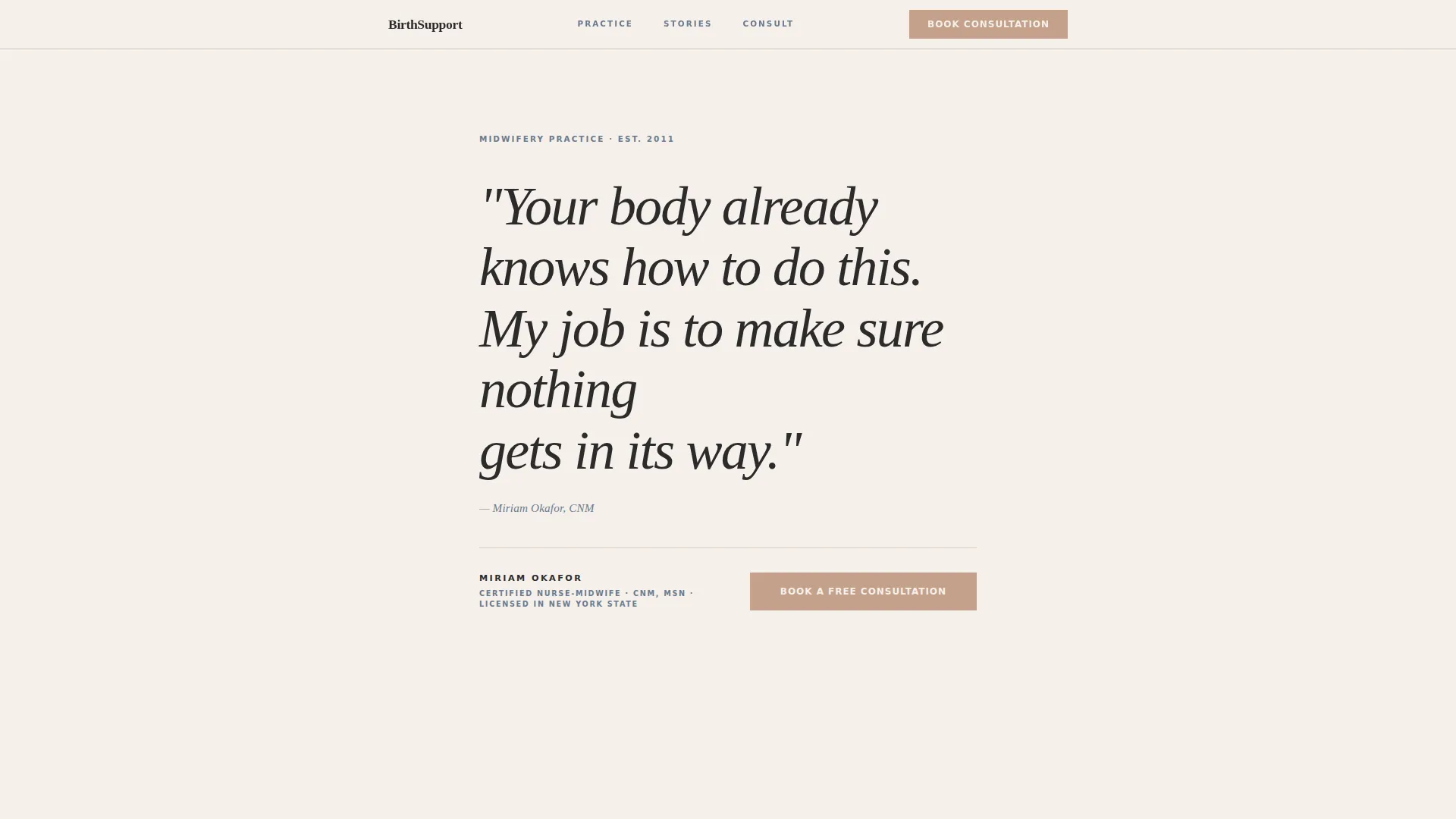
The header opens with a single large editorial serif line on a warm parchment background. No image, no logo at first glance. A steel-rule divider separates the quote from the midwife's name and credentials in understated caps. The simplicity creates an immediate stop-and-read moment.
Full-Viewport Statistics Section
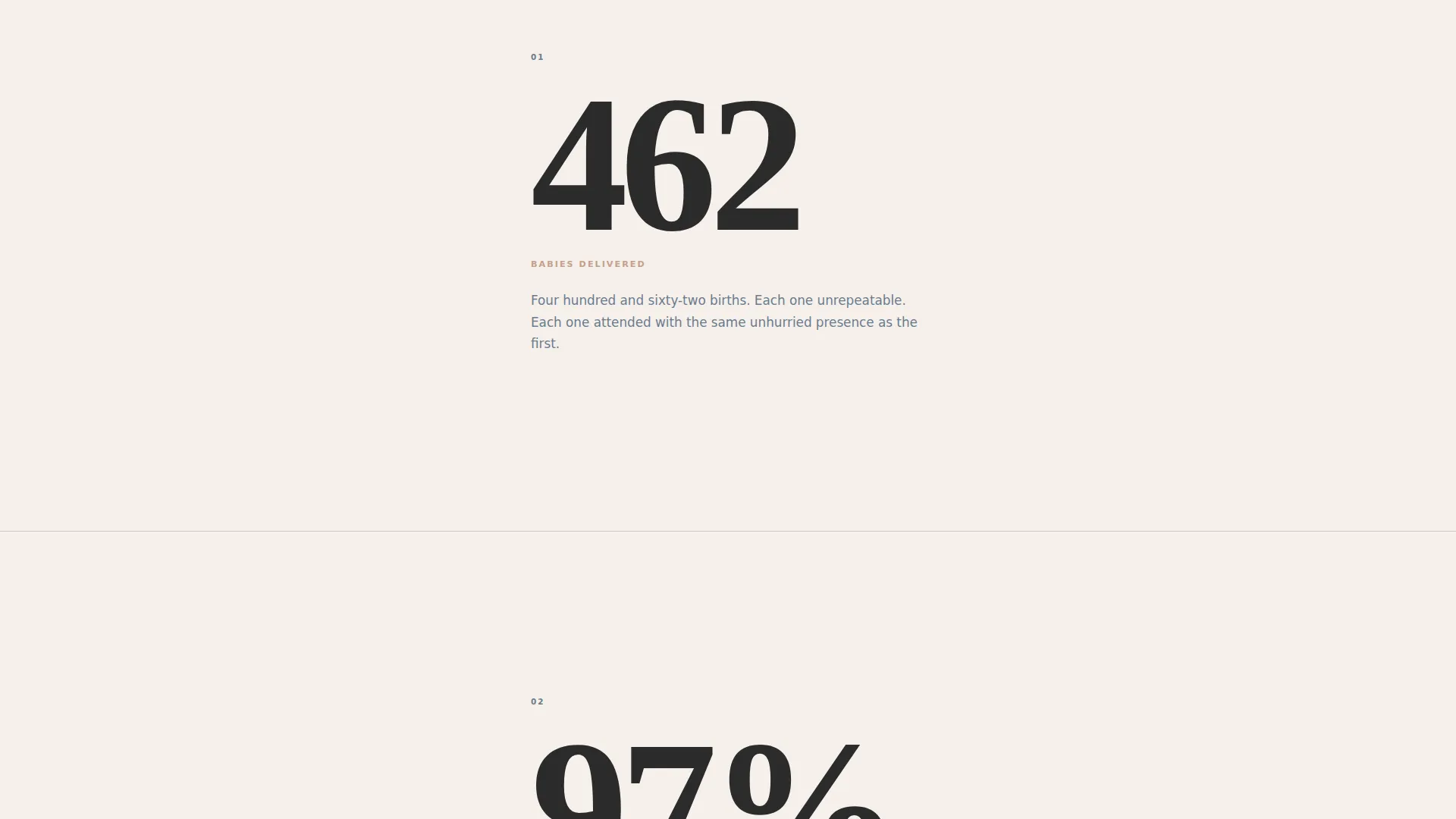
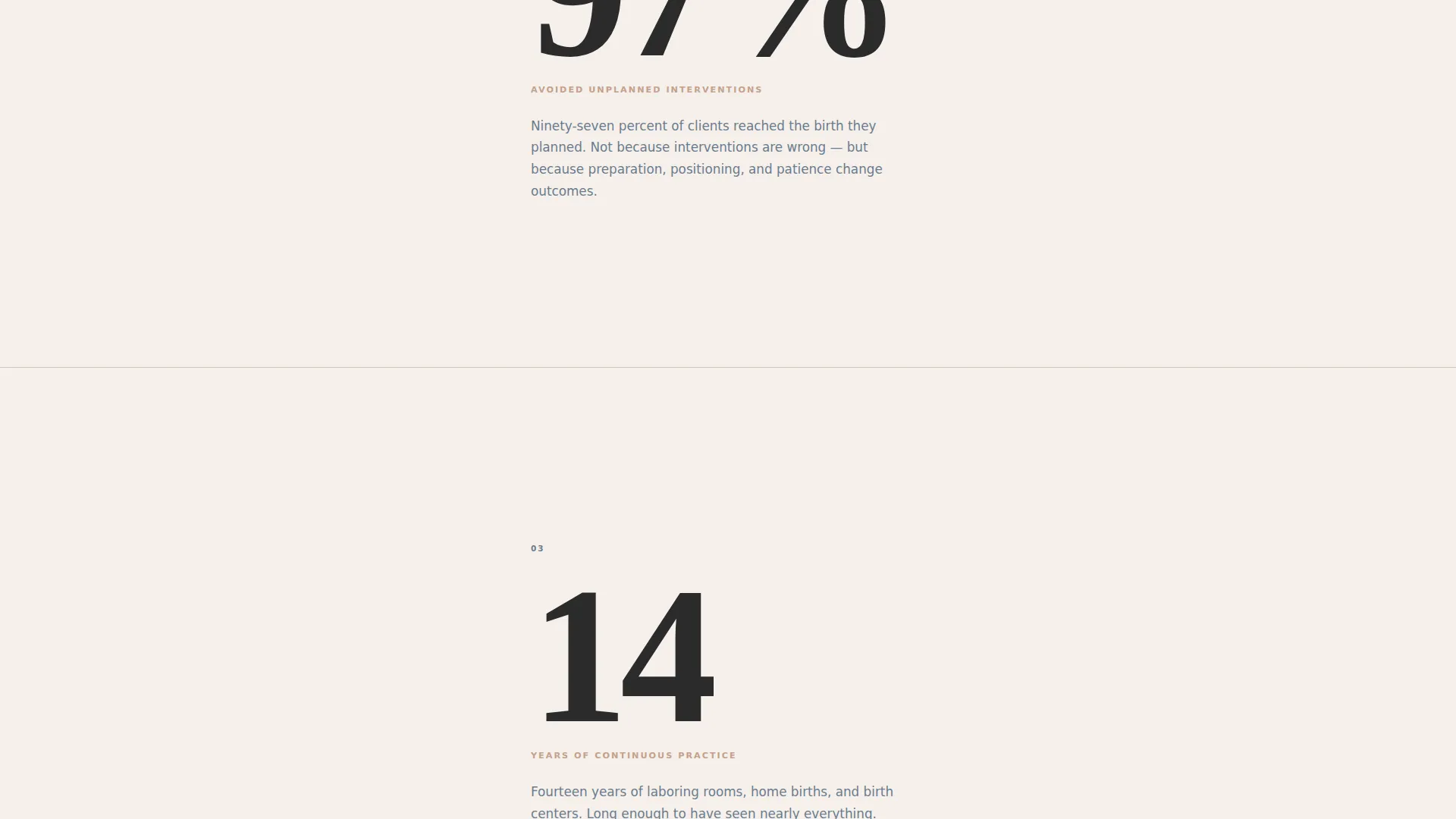
Three oversized numbers render in sequence as the visitor scrolls: total babies delivered, percentage of clients avoiding unplanned interventions, and years of continuous practice. Each number occupies nearly a full viewport height with a single explanatory sentence below in steel-gray type. The numbers carry the emotional weight that testimonials typically provide.
Philosophy and Birth Story Sections
Long-form editorial sections alternate between the midwife's practice philosophy and client birth stories. Philosophy sections use drop caps and pull quotes marked in muted rose. Birth story sections are presented as captioned photo essay layouts in steel tones. The alternating rhythm keeps the scroll feeling like reading, not browsing a service page.
Three-Question Lead Generation Form
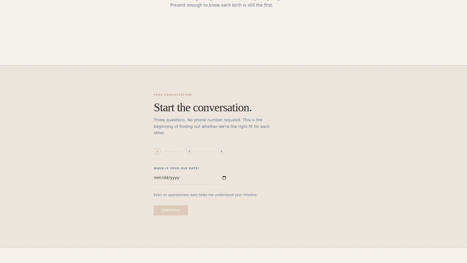
The primary consultation form asks only three questions: due date via a date picker, birth preference via a dropdown, and a short free-text field asking what matters most for this birth. No phone number is required. The form is framed as the start of a conversation rather than a clinical intake process.
Secondary PDF Download Gate
A secondary conversion path offers a downloadable guide gated by email address only. Visitors who are not ready to book can still enter the funnel through this lower-commitment option. It serves researchers and comparison shoppers who need more information before reaching out.
Fixed Bottom Call-to-Action Bar
A persistent bottom bar fades in after 40 percent scroll and carries the primary "Book a Free Consultation" call to action. It stays accessible throughout the remainder of the page without interrupting the editorial reading experience at the start.
Page sections overview
| Section | Purpose |
|---|---|
| Manifesto Header | Open with authority using a single editorial serif quote and credential line |
| Steel Rule Divider | Create a clean visual pause between the quote and identity block |
| Stats Impact Block | Deliver credibility through three full-viewport numbers with brief context lines |
| Primary call to action Block | Present the first "Book a Free Consultation" prompt directly after statistics |
| Philosophy Feature | Share the midwife's practice approach in long-form editorial format with drop caps |
| Birth Story Section | Present client experiences as captioned photo essay layouts in steel tones |
| Philosophy Feature Two | Continue alternating editorial rhythm with a second philosophy section |
| Birth Story Section Two | Second captioned birth story block sustaining the reading-pace scroll |
| Lead Generation Form | Capture due date, birth preference, and a short personal note in three steps |
| PDF Download Gate | Offer a downloadable guide gated by email for visitors not yet ready to book |
| Fixed Bottom Bar | Persistent call to action bar that fades in after 40 percent scroll for late-page conversions |
Design & branding system
The visual identity follows an Editorial Magazine theme built on the Monochrome Steel color system. Every color decision has a functional role. The palette reads like a black-and-white birth photograph printed on heavy cotton stock: intimate without sentiment, precise without coldness.
- Core palette: deep charcoal (#2B2B2B) for primary text, surgical steel (#6B7B8D) for secondary type and divider lines, warm parchment (#F5F0EB) for the background, and muted rose (#C4A08A) reserved exclusively for calls to action and pull-quote marks
- Typography: large editorial serif for headlines and the manifesto, steel-gray italics for attribution and captions, and understated caps for the credential line
- Layout: a narrow editorial column with generous margins on both sides, mimicking the breathing room of a longform broadsheet feature
Mobile & speed optimization
The single-column layout translates naturally to smaller screens. The narrow editorial column and generous white space that define the desktop design remain intact on mobile, with no complex multi-column grids to reformat.
- Full-viewport stat blocks scale cleanly on portrait phone screens, preserving the dramatic number-first impact
- The fixed bottom call-to-action bar is designed to sit above the mobile browser chrome without obscuring the content scroll
How this template helps you convert
The page is structured to move visitors from curiosity to action without pressure. The editorial tone builds confidence gradually, and the two-path conversion model respects different stages of readiness.
- The stats section does the credibility work early, before the visitor reaches any form, so trust is established before the ask is made.
- The three-question form and the PDF download gate give visitors two entry points: one for those ready to book a consultation and one for those still in research mode, reducing drop-off at the decision point.
Other information about this template
This template is a strong fit for midwifery practices that compete in markets where clinical authority and personal philosophy matter equally to prospective clients. It is built on a single-page flow structure, so every section is part of one continuous scroll experience rather than a multi-page site.
- The template is designed for use with a midwife booking page context, where a single authoritative landing page replaces or supplements a fuller site
- The alternating editorial rhythm of philosophy and birth story sections is intentional: it mirrors how experienced clients research practitioners, moving between credentials and personal connection
- The PDF lead magnet, titled "What to Ask Any Midwife Before You Hire Them," is included in the template structure as a gated secondary conversion asset
Theme
Service Utility
Creative direction
Transparent Process
Color system
Monochrome Steel
Style
Split Screen (50/50)
Direction
Click-Through
Page Sections
Typographic Manifesto Header
Full-viewport Statistics Blocks
Alternating Editorial Content Sections
Three-question Consultation Form
Secondary PDF Lead Magnet Gate
Fixed Scroll-triggered Call to Action Bar
Related questions
Can I update the statistics and credentials to reflect my own practice?
Does the form support more than three questions?
Is the PDF download asset included in the template?
Who is this landing page best suited for?
Can I use this template without professional birth photography?



