Dental Treatment Options Comparison Website Template
Bite is a bold brutalist dental landing page template built around side-by-side comparison tables. It targets busy professionals, parents, and retirees comparing dental care options. With a dark carbon-fiber visual system, snap-scroll animations, and a friction-reducing two-step form, every design decision pushes a well-informed visitor toward booking an appointment.
by Rocket studio
Quick summary
Bite is a single-page dental comparison landing page template with a bold brutalist design. It layers dark glass panel headers, sequential comparison tables, and a two-step lead capture form into one high-pressure, high-trust scroll experience. The template is purpose-built to convert research-mode visitors into booked patients by showing real numbers before asking for anything.
Who this template is for
This template fits dental practices that compete on transparency and technology. It suits clinics ready to show their pricing, appointment times, and equipment specs directly on the page rather than hiding them behind a phone call.
- Dental practices offering same-day crowns, implants, aligners, or veneers
- Practice owners targeting professionals and parents who research before deciding
- Clinics that want to convert comparison-shopping visitors without relying on a traditional multi-page website
What problem this template solves
Most dental practice pages bury the details that patients actually want. Pricing is hidden, appointment length is vague, and technology claims go unsubstantiated. Visitors leave to compare elsewhere and rarely return.
- Patients abandon forms when they feel uninformed or pressured before the data earns their trust
- Practices lose leads to competitors who are more upfront about costs and process
- Generic dental page layouts fail to signal clinical precision or differentiate a modern, technology-forward clinic
What you get with this template
You get a focused, single-page comparison layout that does the persuasion work before the form ever appears. Every section builds the case with specifics, not generalities.
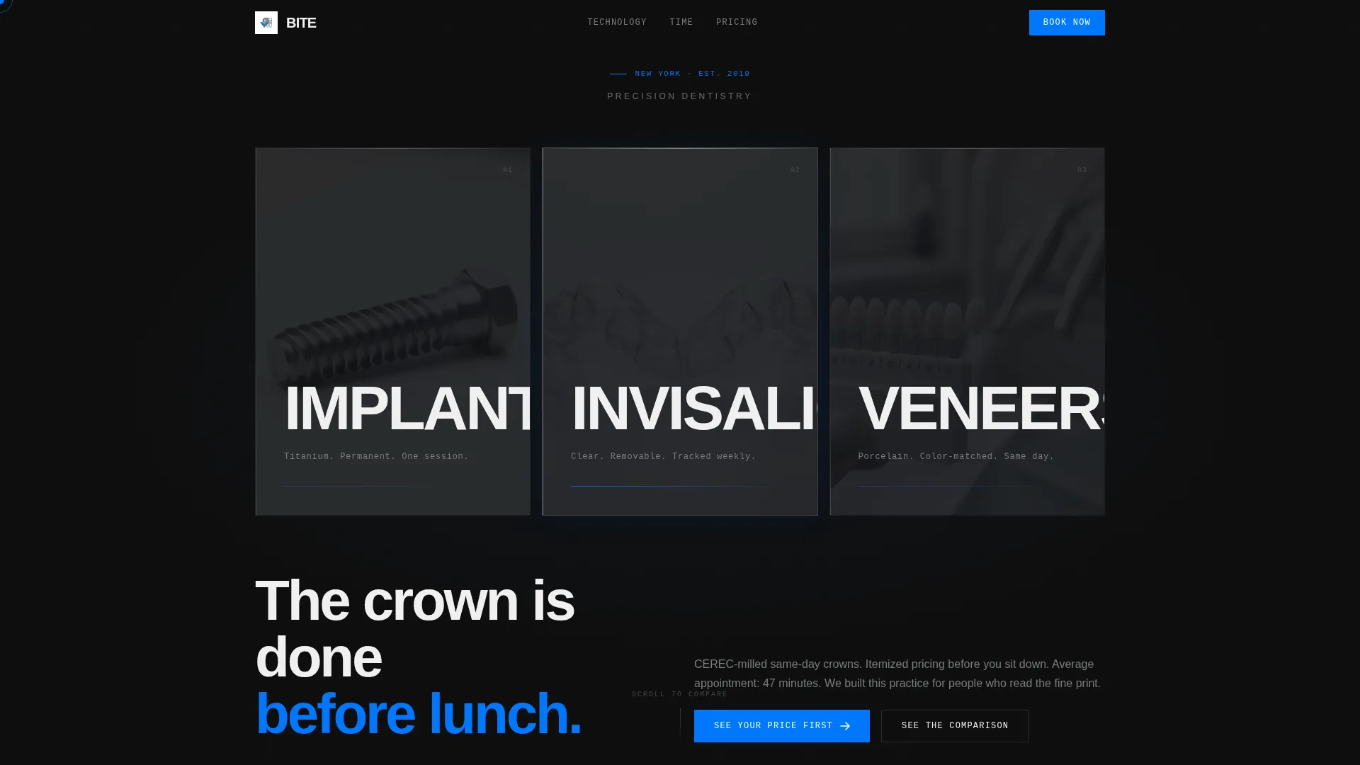
- A dark glass panel hero header with three service spotlights and subtle parallax-style edge-light effects
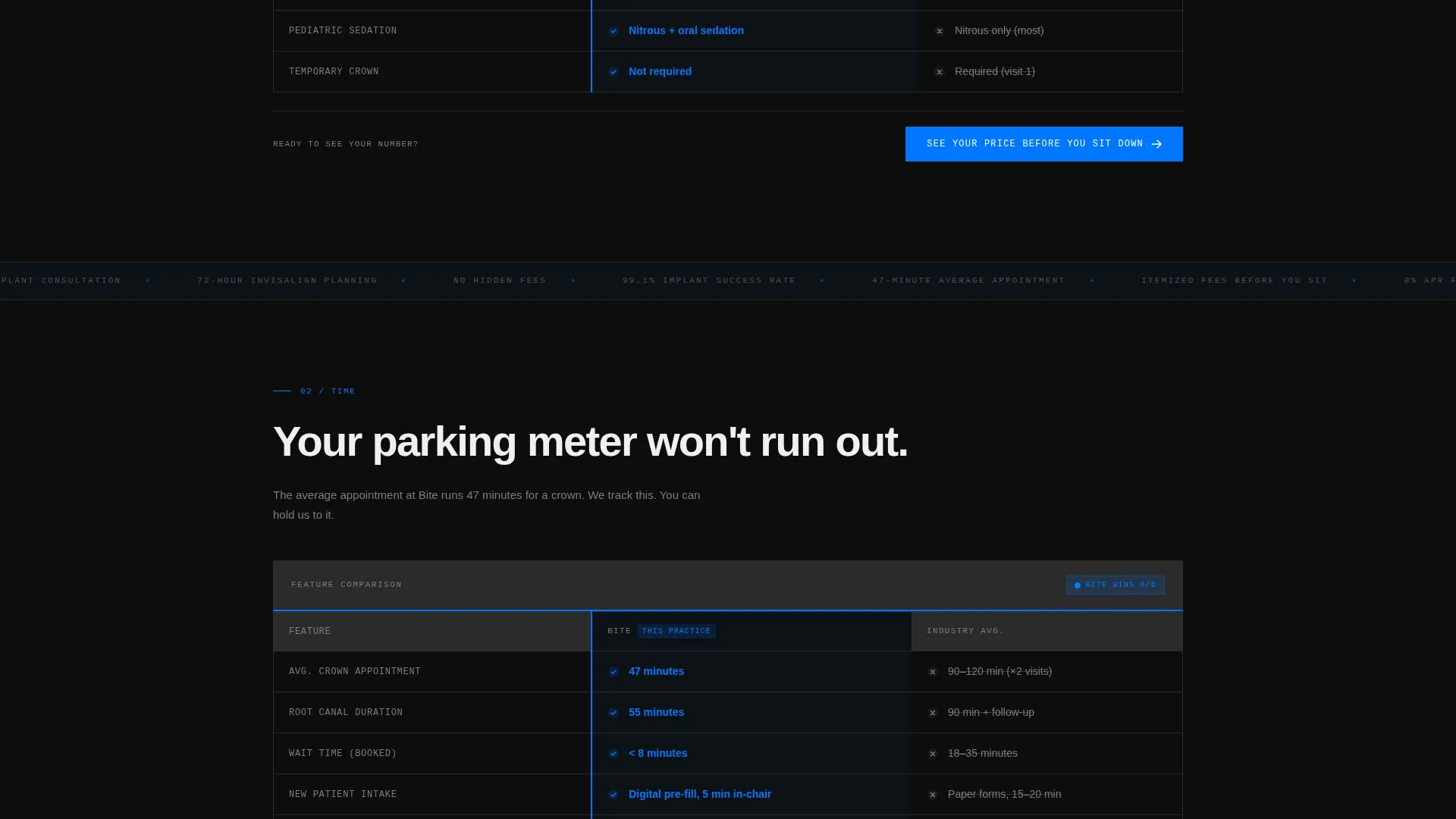
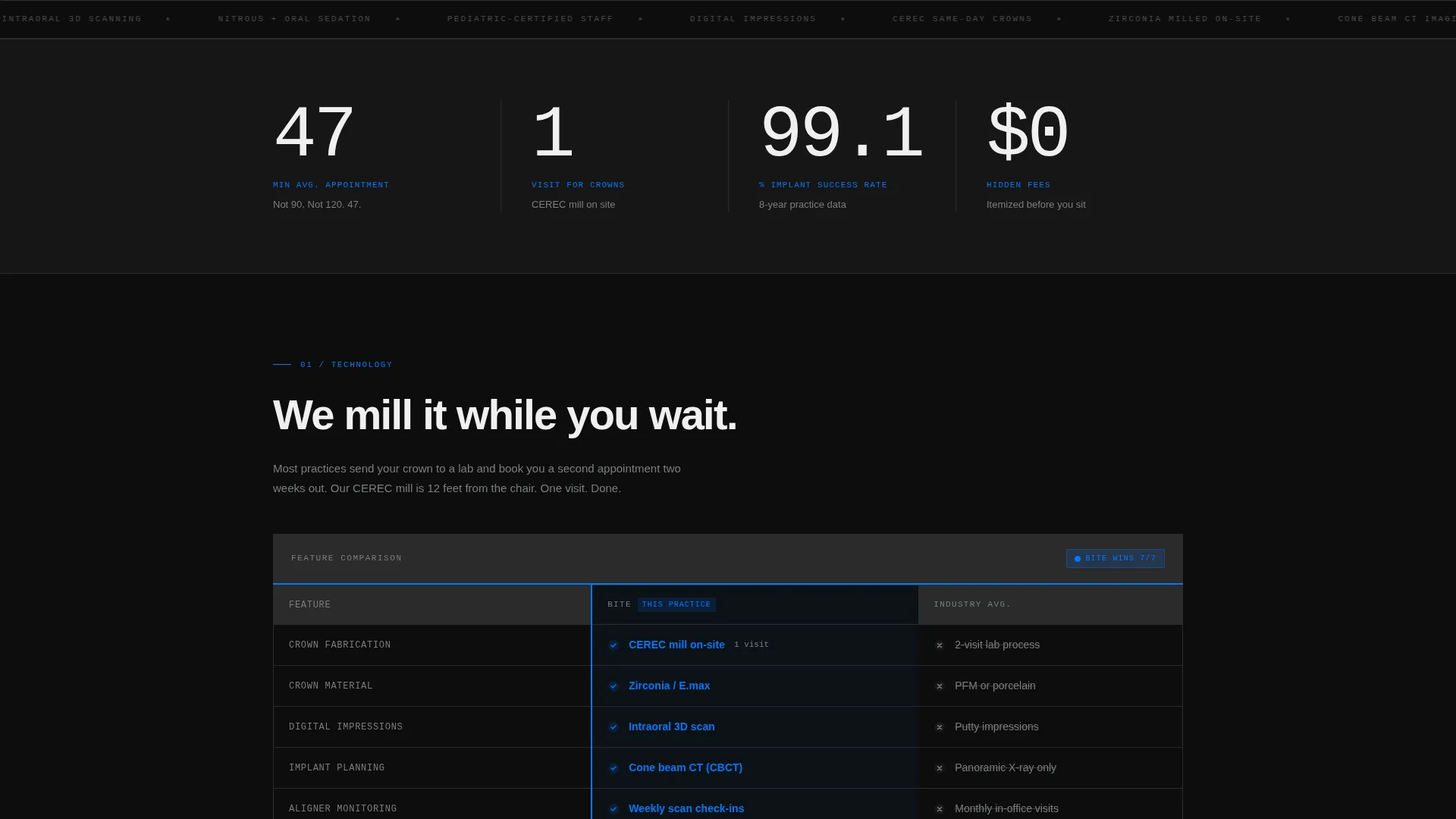
- Multiple side-by-side comparison tables covering technology, appointment time, fee transparency, and financing
- A two-step lead capture form with an icon selector, insurance toggle, and preferred appointment window field
- A secondary email-gate conversion path for research-mode visitors who want a downloadable comparison document
Feature list
A paragraph introducing the feature set is useful here. Each component below is drawn directly from the template brief and represents a distinct, built-in capability.
Dark Glass Panel Hero Header
Three tall, near-black translucent panels float against a deep cockpit black background. Each panel holds one oversized service label: IMPLANTS, INVISALIGN, or VENEERS. Slow-motion macro footage loops behind each panel, and a faint edge-light reflection responds to cursor movement for a physical, depth-forward feel.
Sequential Comparison Tables
The page delivers four distinct comparison tables in escalating order: technology, appointment time, fee transparency, and financing options. Each table pits the practice directly against the industry average with fully populated cells and no asterisks or hidden fine print.
Brutalist Snap-Scroll Animations
Columns enter the viewport with a hard snap on scroll and no easing curves. This deliberate, tension-forward motion style matches the overall bold brutalist theme and keeps the reading pace urgent rather than passive.
Sticky Bottom Call-to-Action Bar
The primary call to action, "See Your Price Before You Sit Down," is locked to the bottom of every comparison table. It appears in surgical blue on black and links directly to the two-step lead form, maintaining conversion momentum throughout the scroll.
Two-Step Lead Capture Form
Step one uses an icon selector for service choice and a toggle for insurance status, removing dropdown friction. Step two collects name, phone number, and preferred appointment window. The two-step structure keeps the form approachable while capturing the details a practice needs to follow up.
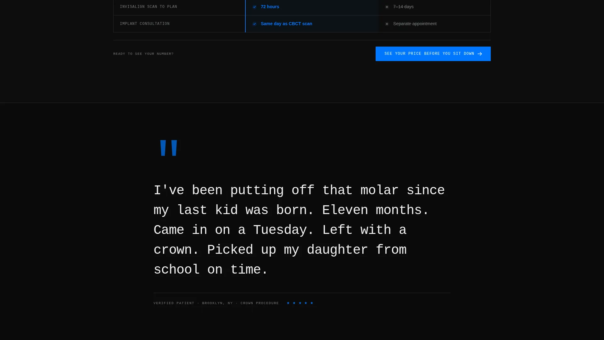
Mid-Page Quote Interrupt Panel
A full-width dark panel breaks the comparison flow at the midpoint. It displays a single patient quote in large monospace type, white on black, with no photo or name attached. The stripped-back format adds credibility without the visual noise of a traditional testimonial block.
Page sections overview
| Section | Purpose |
|---|---|
| Dark Glass Header | Introduces three core services with looping macro footage and cursor-reactive edge-light panels |
| Technology Comparison | Contrasts same-day milling technology against standard two-visit lab crown workflows |
| Appointment Time Comparison | Shows 47-minute average visit length against a 90-minute industry benchmark |
| Fee Transparency Comparison | Displays itemized in-table pricing against competitors who require a phone call for quotes |
| Mid-Page Quote Panel | Full-width patient quote in mono type; breaks the data flow with a single credibility moment |
| Financing Comparison | Pits financing options against competitor alternatives with every cell fully populated |
| Two-Step Lead Form | Captures service interest, insurance status, contact details, and appointment preference |
| PDF Download Gate | Offers a detailed comparison document behind an email-only field for research-phase visitors |
Design & branding system
The visual system is built on a Carbon Fiber color palette. Every color choice is functional: depth signals trust, the single accent color signals action, and nothing decorative survives the layout.
- Core palette: deep cockpit black (#0D0D0D), woven graphite (#2B2B2B), titanium mid-tone (#7A7D80), clinical white (#F0F0F0), and surgical blue (#0077FF) reserved exclusively for interactive elements, calls to action, and comparison winner checkmarks
- Typography uses condensed, ultra-bold type for section headers and monospace type for the mid-page quote panel, reinforcing the clinical precision tone throughout
- The bold brutalist theme eliminates decorative elements entirely; every layout decision, from column width to panel spacing, is load-bearing
Mobile & speed optimization
The template is designed to translate the brutalist grid into a readable, tap-friendly mobile layout without compromising the comparison structure. Comparison tables reflow for narrower screens so data remains scannable.
- Snap animations are retained on mobile to preserve the brand's urgent, tension-forward pacing
- The two-step form is thumb-friendly by design, using icon selectors and a toggle instead of small dropdown menus
- The sticky call-to-action bar remains pinned at the bottom of the viewport on all screen sizes
How this template helps you convert
The conversion architecture assumes visitors arrive already in comparison mode. The page meets them with data first, then earns the form submission.
- Each comparison table answers a specific objection before it forms, covering technology, time, cost, and financing in sequence so the visitor never needs to leave the page to find an answer.
- The primary call to action appears locked below every table, so the booking prompt arrives exactly when conviction is highest, not at the end of a long scroll.
- The secondary PDF download path captures email addresses from visitors who are not yet ready to book, turning research-phase traffic into a follow-up opportunity.
Other information about this template
This template sits within the dental practice lead capture landing page niche and is designed to serve as a standalone conversion page rather than a full practice website. It works especially well as a paid-traffic destination or a direct-response page linked from social and search ads.
- The template style is classified as a Comparison Table layout within the Bold Brutalist theme family
- The Carbon Fiber color system and Launch Energy creative direction are specifically matched to a high-intent, research-ready audience
- The Dark Glass Panels header concept and the Comparison/Versus landing page direction are paired to create maximum perceived authority on first scroll
- This template is well-suited to practices using technologies like CEREC same-day milling, where the speed and precision advantage can be demonstrated numerically in a table format
Theme
Bold Brutalist
Creative direction
Launch Energy
Color system
Carbon Fiber
Style
Comparison Table
Direction
Comparison/Versus
Page Sections
Dark Glass Panel Hero Header
Sequential Comparison Tables
Brutalist Snap-scroll Animations
Sticky Call-to-action on Tables
Two-step Lead Capture Form
Email-gated PDF Download Path
Related questions
Can I replace the comparison table data with my practice's real numbers?
Does the template include the downloadable PDF comparison document?
Is this template suitable for a single-service dental practice?
How does the two-step form lower friction for new patient leads?
What traffic source works best with this landing page template?



