Dental Treatment Cost Estimator Website Template
Chairside is a split-screen dental practice landing page built around a live treatment cost estimator. Visitors select a procedure, toggle insurance, and adjust payment terms before they ever scroll. Every section pairs a service deep-dive with real anonymized patient outcome data. The result is a transparent, data-forward page that moves patients from curiosity to a scheduled appointment with confidence.
by Rocket studio
Quick summary
Chairside is a single-page dental practice services landing page with a Data Command visual identity. The layout opens on a 50/50 split-screen cost estimator, then walks visitors through a tiered service showcase, from routine cleanings to full-arch implants, each paired with real anonymized outcome data. The entire page is designed to eliminate pricing anxiety and route patients toward booking.
Who this template is for
This template suits modern dental practices that compete on transparency. It works best for offices already offering a range of services and willing to share pricing context with prospective patients.
- General and cosmetic dentists who want to convert web visitors into booked appointments
- Practices offering implants, Invisalign, veneers, or sedation dentistry alongside routine care
- Office managers or marketing leads looking for a credible, data-forward patient experience
What problem this template solves
Most dental practice pages bury pricing, hide timelines, and give patients no way to estimate costs before calling. That gap creates anxiety, drives comparison shopping, and loses appointments to practices that answer questions first.
- Patients leave without booking because they cannot predict out-of-pocket cost or treatment length
- Practices lose trust when the only call-to-action is a generic "contact us" form with no upfront value
- Complex services like implants or full-arch restorations feel risky without visible success data to anchor the decision
What you get with this template
You get a fully structured, single-page dental services landing page ready to present your practice as the most informed choice in your area. Every section is designed to deliver value before asking for a click.
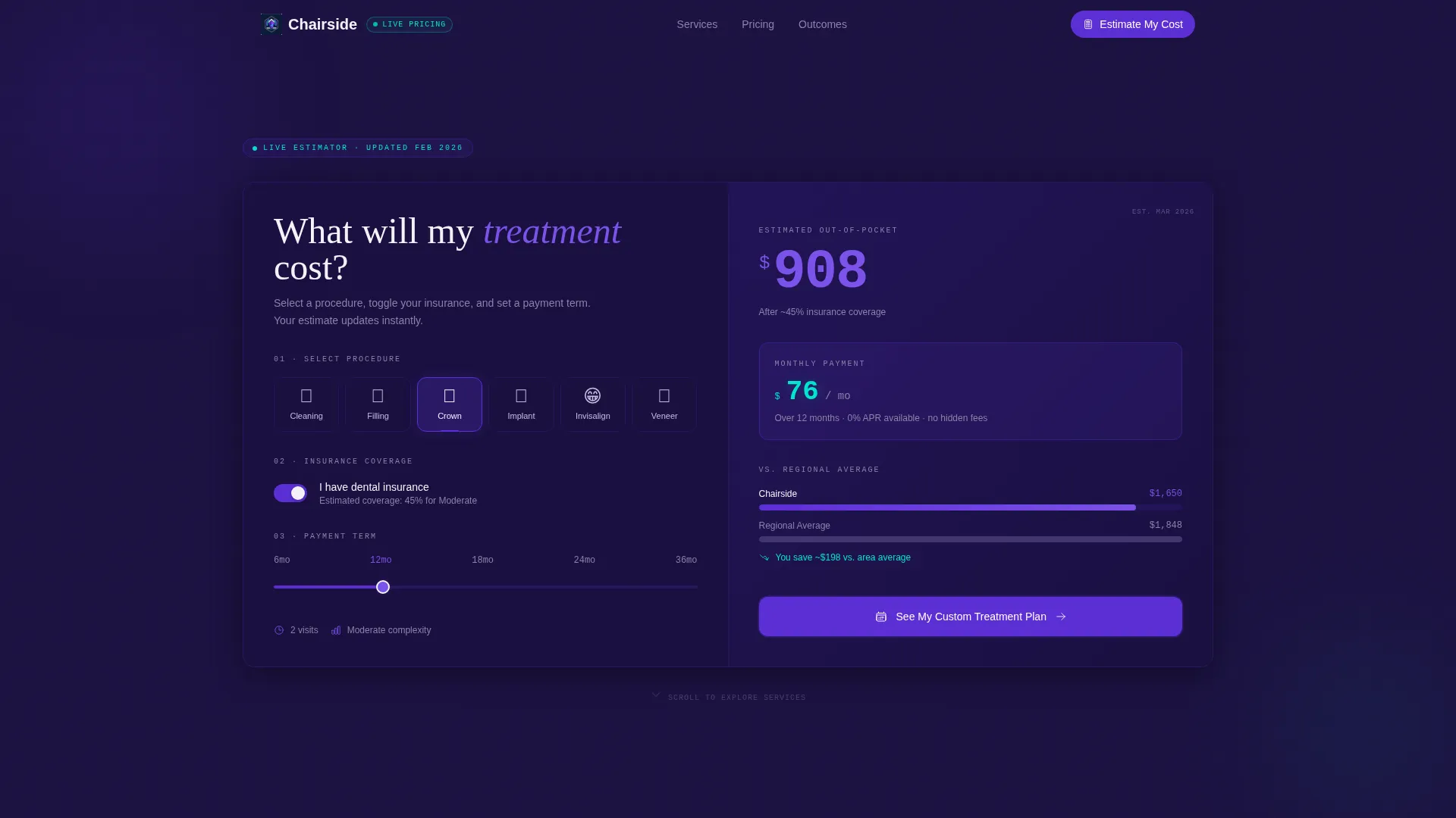
- A live-interaction cost estimator in the hero that lets visitors explore procedure costs, insurance impact, and monthly payment options before scrolling
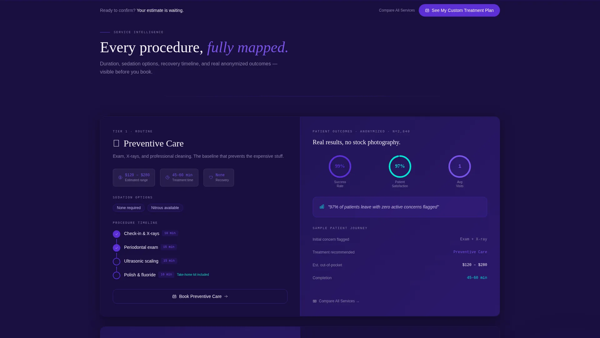
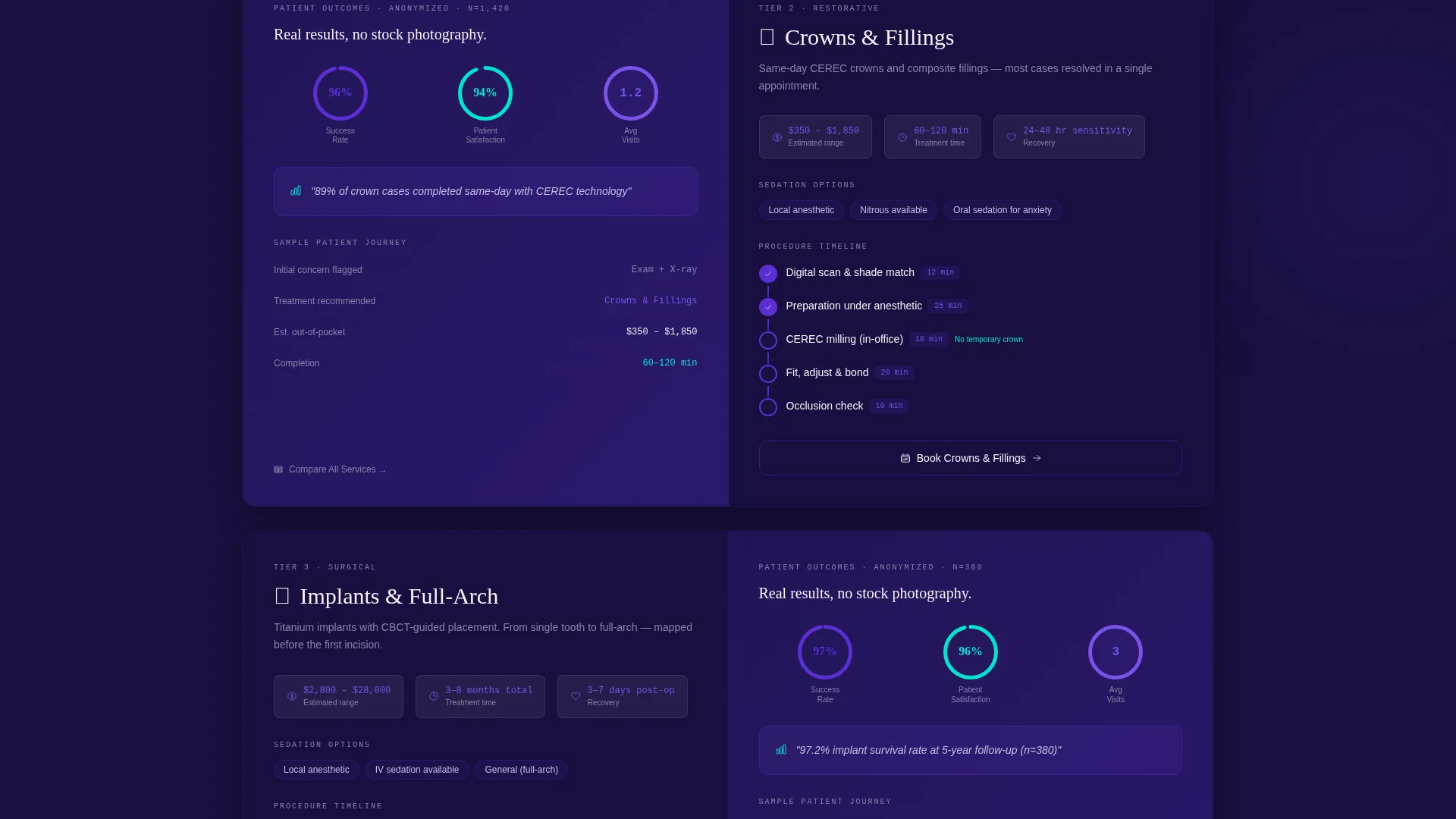
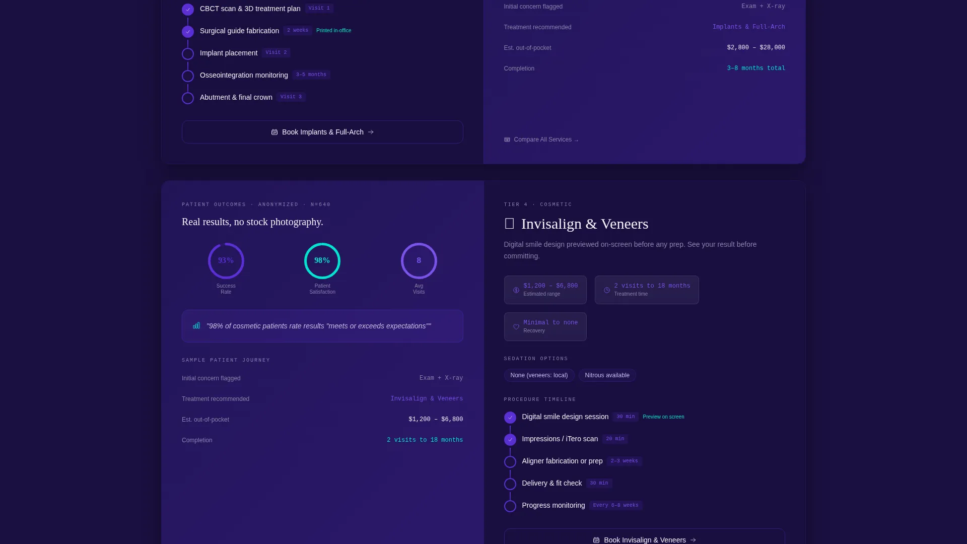
- Tiered service sections pairing procedure details with anonymized patient outcome cards covering success rates, appointment counts, and satisfaction scores
- A pinned click-through path that routes visitors to a scheduling page pre-filled with the procedure they explored
Feature list
This template is built around a small set of high-impact components. Each one is grounded in the brief and serves a specific role in the patient conversion flow.
Interactive Treatment Cost Estimator
The hero section holds a split-screen estimator. Visitors choose a procedure using illustrated icons, toggle insurance on or off, and slide a payment-term control. The right panel updates with estimated out-of-pocket cost in large indigo numerals, a cyan monthly payment breakdown, and a bar comparing the practice's price to the regional average.
Tiered Service Section Blocks
Below the estimator, each service gets its own split-screen block. The left panel shows procedure duration, sedation options, and a visual recovery timeline track. The right panel displays an anonymized patient data card with success rates, average appointments to completion, and satisfaction scores. Sections escalate from routine care to complex restorations.
Pinned Primary Call-to-Action
The "See My Custom Treatment Plan" button stays pinned at the bottom of the estimator and reappears after every service section. Each instance routes the visitor to a scheduling page pre-filled with the procedure they last explored, removing re-selection friction entirely.
Pricing Transparency Table
A secondary path labeled "Compare All Services" expands a full pricing table with toggle filters for insurance type. This gives cost-conscious patients a single reference point without navigating away from the page.
Micro-Interaction Visual Cues
Progress rings fill as visitors scroll through service tiers. Cost counters tick upward when the estimator updates. These motion details reinforce that the practice operates on evidence and keep the page feeling responsive and alive.
Data Command Visual Identity
The Electric Indigo color system uses deep navy for the page base, vivid indigo for interactive elements and data highlights, clinical white across content panels, and electric cyan exclusively for live calculator outputs and confirmation states. Monospaced typography renders cost figures like a financial terminal display.
Page sections overview
| Section | Purpose |
|---|---|
| Cost Estimator Hero | Opens the page with an interactive procedure cost and payment estimator |
| Routine Care Block | Showcases cleanings and fillings with duration, sedation, and outcome data |
| Restorative Services Block | Covers crowns and fillings with procedure timelines and patient data cards |
| Implant Services Block | Presents implant and full-arch options with success rates and appointment counts |
| Cosmetic Services Block | Details Invisalign, veneers, and smile makeovers with outcome data |
| Pricing Transparency Table | Expands a filterable full-service pricing comparison by insurance type |
| Scheduling Call-to-Action | Routes visitors to a pre-filled booking page based on explored procedure |
Design & branding system
The template uses an Electric Indigo palette that reads like a diagnostic screen in a dimly lit operatory. Every color has a specific role, and nothing is decorative without purpose.
- Deep dental-chair navy (#1A1040) forms the page base, vivid indigo (#5B2FD4) marks interactive elements and data highlights, and clinical white (#F4F2F8) fills content panels
- Electric cyan (#00E5CC) appears only on live calculator outputs and confirmation states, creating an instant visual cue for dynamic data
- Monospaced typeface renders all cost figures and numeric outputs, giving the interface a precise, financial-terminal quality with no stock smile photography in the hero
Mobile & speed optimization
The 50/50 split-screen layout is built to reflow cleanly on smaller screens so the estimator and service cards remain usable on a phone. Patients researching late at night, the exact audience described in the brief, are often on mobile.
- The estimator controls stack vertically on narrow viewports so procedure selection, insurance toggle, and payment slider stay accessible without pinching
- Service section cards reorder so the procedure detail panel leads and the outcome data card follows, preserving the intended reading sequence
- Micro-interactions are scoped to scroll-triggered cues so the page stays responsive and avoids layout shifts during interaction
How this template helps you convert
Every design decision on this page is aimed at shortening the distance between a first visit and a confirmed booking. The page gives value before it asks for anything.
- The estimator puts a real cost number in front of visitors within seconds of landing, replacing vague pricing anxiety with a specific, personalized figure they can act on
- Anonymized outcome data on each service card builds procedural credibility at exactly the moment a visitor is weighing whether to call, no generic testimonials, just visible success metrics
- The pre-filled scheduling path means the primary call-to-action feels like confirming a choice already made, not starting a new conversation
Other information about this template
This template was designed specifically for the dental practice niche and fits naturally into a broader dental practice website template library. It functions as a standalone services page or as the primary conversion surface within a larger site structure.
- The template style is Split Screen (50/50), which divides every major section into a left information panel and a right data or interaction panel for consistent visual rhythm
- The creative direction is Calculator-slash-Tool First, meaning visitor interaction begins before scrolling, which is particularly effective for high-consideration services where price is the primary barrier
- The header concept is a Calculator and Estimator rather than a photography hero, a deliberate choice that treats numeric transparency as the primary trust signal
- The landing page direction is Click-Through, guiding visitors from estimation to a dedicated scheduling page rather than attempting to convert directly on-page
- The theme is Data Command, a visual and structural framework that positions the dental practice as technology-forward and evidence-based, which resonates with patients comparing multiple offices before deciding
Theme
Data Command
Creative direction
Calculator/Tool First
Color system
Electric Indigo
Style
Split Screen (50/50)
Direction
Click-Through
Page Sections
Interactive Treatment Cost Estimator
Tiered Service Section Blocks
Pinned Click-through Call-to-action
Pricing Transparency Table
Micro-interaction Visual Cues
Data Command Color System
Related questions
Can I adjust the procedure list in the cost estimator?
Does the template include real patient data or placeholder content?
Is the pricing transparency table included in the base template?
How does the pre-filled scheduling path work?
Who should use this template instead of a general dental website template?



