Highconverting Art Landing Page Template
Byline is a modular card-grid landing page built for a Black-owned media company publishing documentary series, podcasts, and editorial content. The template delivers three distinct conversion paths, micro-interaction reveals, a floating app preview header, and a warm Cloud Canvas color palette, all inside one richly layered, single-page experience designed to feel like an independent magazine come to life.
by Rocket studio
Quick summary
Byline is a high-converting modular landing page for a Black-owned media house. It combines a card-grid layout with micro-interaction reveals, three native conversion paths, and a soft gradient visual identity rooted in the Cloud Canvas color system. The result is a single-page experience that feels editorial, unhurried, and genuinely alive.
Who this template is for
This template is built for media creators and cultural brands that need more than a basic promotional page. It speaks directly to teams who have compelling stories to tell and multiple audiences to reach at once.
- Black-owned media companies producing documentary series, podcasts, or editorial content
- Independent filmmakers seeking a distribution-ready landing page that also attracts brand partners
- Podcast creators and editorial platforms looking to convert listeners, collaborators, and sponsors in one place
What problem this template solves
Most media landing pages force visitors into a single funnel. That works for one audience but alienates the other two. Byline solves the multi-audience problem by housing three separate conversion paths inside one cohesive experience, so no visitor has to go looking for their entry point.
- A single generic contact page creates friction for brand partners, filmmakers, and listeners who each have different needs
- Standard scroll pages treat all visitors the same, causing drop-off before a relevant call to action appears
- Flat visual design fails to communicate the warmth and texture that culturally rooted media brands actually embody
What you get with this template
You get a fully structured, single-page layout built around a modular card grid. Every section, component, and interaction described below comes ready to adapt to your brand and content.
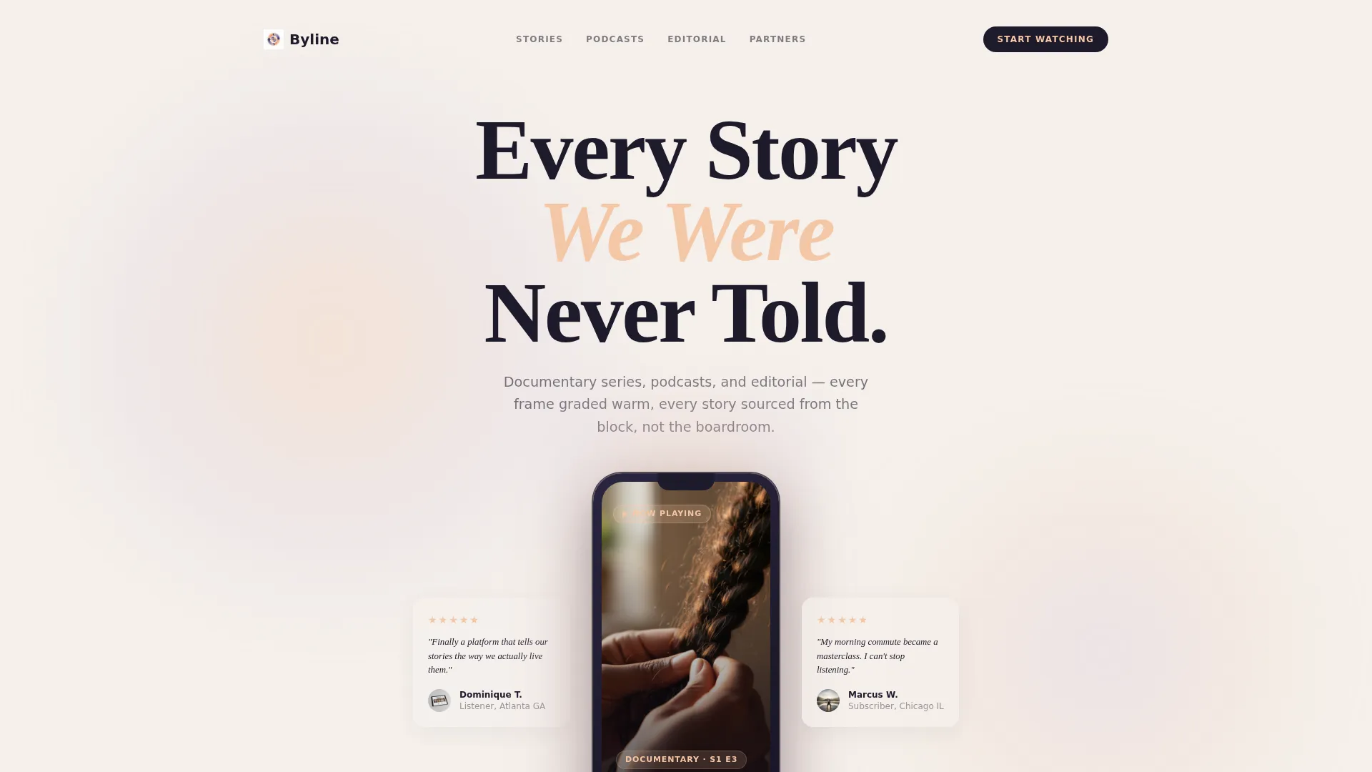
- A floating app preview header with a documentary thumbnail, pull-quote reviews, and a drifting headline
- A card grid where each card type reveals itself differently: podcast cards flip, documentary cards expand, and editorial cards peel
- Three native call-to-action paths embedded inside their own content cards, each with a lightweight inline form
Feature list
This template is built around a set of purposeful components. Each one serves a specific role in the visitor experience.
Floating App Preview Header
The header centres a device mockup showing the company's streaming and podcast app mid-play. A documentary thumbnail fills the screen, five-star listener pull-quotes flank the device, and the headline "Every Story We Were Never Told" drifts in above. The whole composition sits inside a soft gradient halo.
Micro-Interaction Card Grid
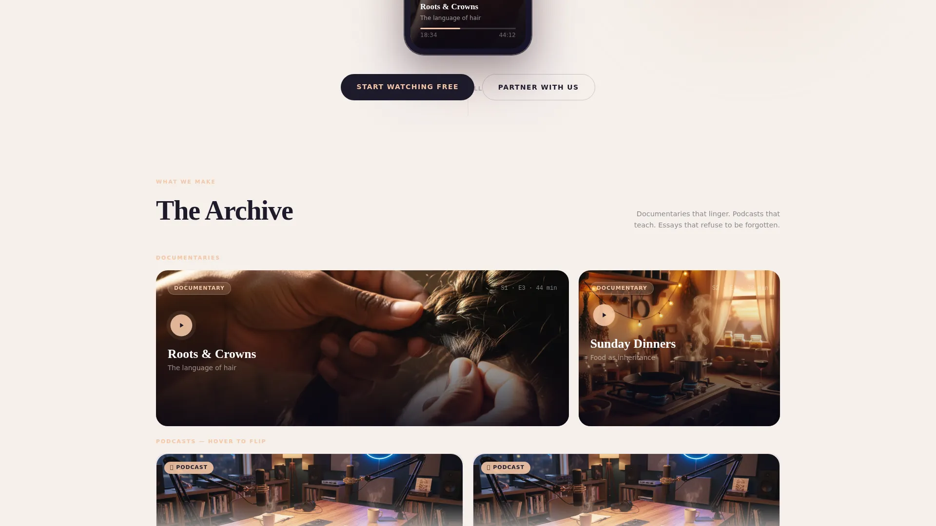
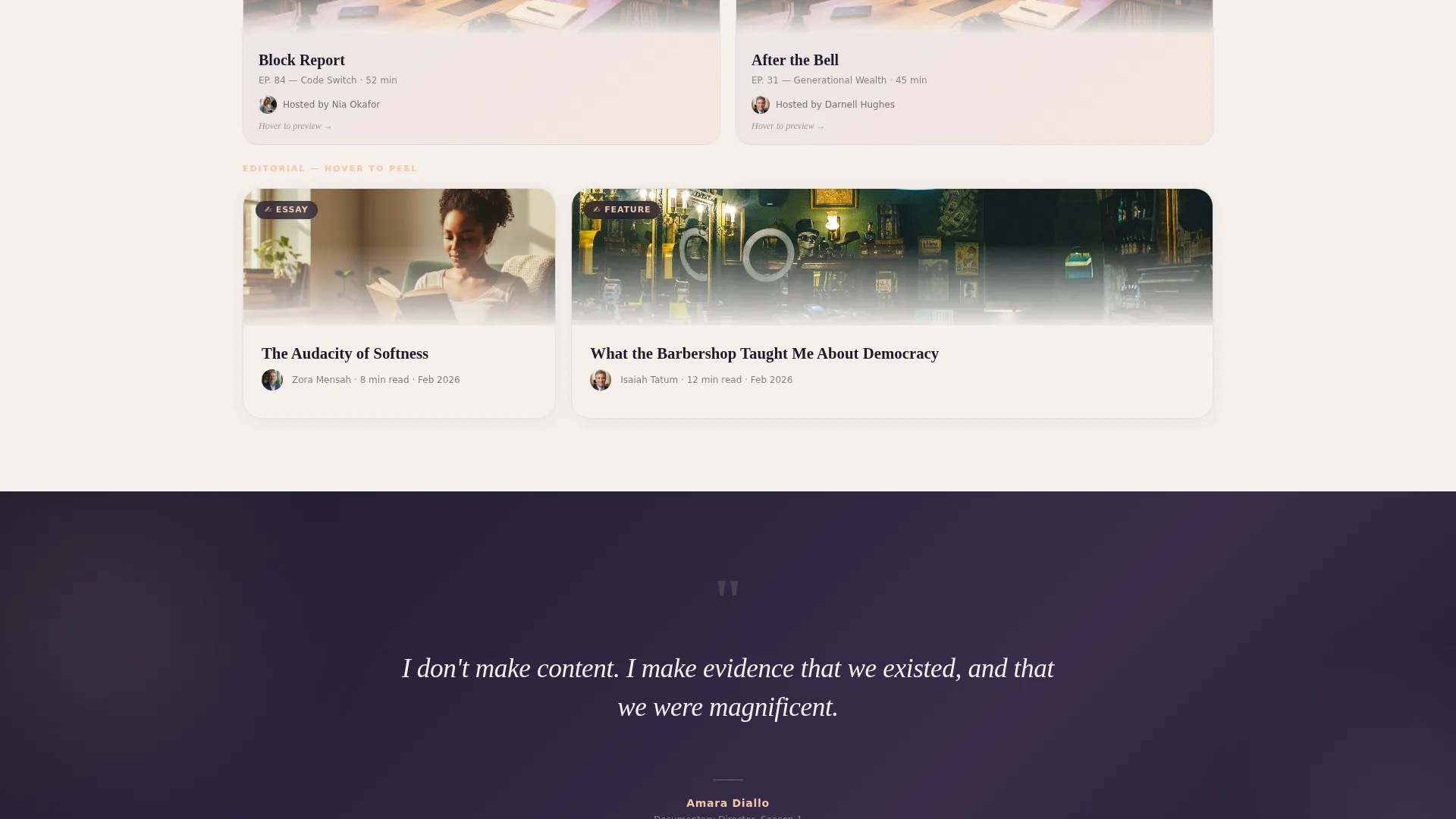
The modular card grid is the heart of the page. Podcast cards flip on interaction to reveal a waveform snippet with a three-second audio preview. Documentary cards expand into a mini-trailer on hover. Editorial cards peel back like a magazine page corner to show the opening paragraph. No two cards behave the same way.
Three Native Conversion Paths
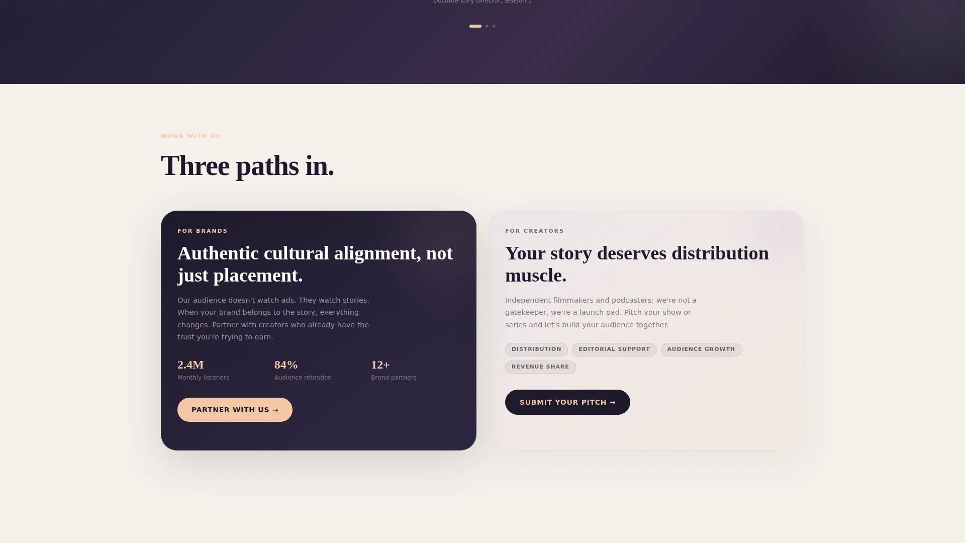
Viewers tap "Start Watching Free" directly on documentary cards. Brand partners hit "Partner With Us" on a dedicated collaboration card that opens an inline brief form requesting brand name, campaign goal, and budget range. Podcasters find "Submit Your Pitch" on a pitch card linked to a form asking for show concept, sample episode link, and audience size.
Gradient Interstitial Break
Midway through the page, a full-width gradient interstitial interrupts the card grid. It displays a single rotating quote from a featured creator, giving the visitor a moment to breathe before the next cluster of content cards draws them back in.
Cloud Canvas Color System
The palette uses warm cloud white, misted lavender, sunrise peach, and deep story ink. Gradients wash gently behind cards with peach bleeding into lavender at the edges. Ink-dark headlines carry editorial authority. Interactive elements glow in peach against the muted cloud background.
Inline Brief and Pitch Forms
Each conversion path uses a lightweight inline form embedded directly inside its native card. The brand partner form collects brand name, campaign goal, and budget range. The podcaster form collects show concept, a sample episode link, and audience size. Neither form redirects to a separate contact page.
Page sections overview
| Section | Purpose |
|---|---|
| App Preview Header | Anchors the page with the app mockup, documentary thumbnail, pull-quotes, and hero headline |
| Podcast Card Row | Flipping cards with waveform snippets introduce the podcast catalogue |
| Documentary Card Row | Hover-expand cards surface mini-trailers for the documentary series |
| Editorial Card Row | Page-peel cards reveal opening paragraphs from the editorial platform |
| Gradient Quote Break | Full-width interstitial with a rotating creator quote creates a visual pause |
| Brand Partner Card | Dedicated collaboration card with an inline brief form for brand partners |
| Podcaster Pitch Card | Pitch submission card with an inline form for independent podcasters |
Design & branding system
The visual identity is built on a Soft Gradient theme using the Cloud Canvas color system. Every color choice reinforces the editorial warmth the media brand represents.
- Core palette: warm cloud white (#F5F0EB), misted lavender (#D5C8E6), sunrise peach (#F4C6A5), and deep story ink (#1E1A2B)
- Gradients blend peach into lavender behind cards, evoking the sky ten minutes after golden hour
- Interactive elements such as play buttons, hover states, and bookmark icons glow in sunrise peach against the muted cloud background
Mobile & speed optimization
The card-grid layout is built to adapt gracefully to smaller screens. Modular structures reflow naturally, keeping the experience coherent on any device size.
- Cards stack vertically on mobile without losing their micro-interaction behavior
- The floating device mockup and gradient elements scale proportionally across screen widths
- Inline forms remain accessible and usable at touch-screen scale without requiring a page redirect
How this template helps you convert
This template converts by removing friction between discovery and action. Every path is native to the content the visitor is already engaging with.
- The three embedded conversion paths place the right call to action exactly where each audience type naturally lands, so viewers, brand partners, and podcasters never have to search for their next step.
- Micro-interactions extend time on page by rewarding curiosity, making it more likely a visitor moves from passive browsing to active engagement before reaching a call to action.
- The inline brief and pitch forms reduce drop-off by keeping the entire transaction inside the page, removing the friction of a redirect to a generic contact form.
Other information about this template
This template is a strong fit for any Black-owned business in the creative media space that needs to serve multiple audience types from a single landing page. The Soft Gradient theme and Cloud Canvas palette are versatile enough to carry editorial, entertainment, and commercial content without visual conflict.
- The template style follows a modular card-grid structure, making it straightforward to add, remove, or reorder content cards as your catalogue grows
- The Surprise and Delight scroll philosophy means each section rewards attention differently, which supports longer visit sessions
- This template is suited to Black-owned art gallery contexts and similar cultural creative businesses that want a landing page combining storytelling depth with direct conversion capability
Theme
Soft Gradient
Creative direction
Comparison Journey
Color system
Cloud Canvas
Style
Masonry/Pinterest
Direction
Direct Sales
Page Sections
Floating App Preview Header
Micro-interaction Card Grid
Three Native Conversion Paths
Inline Brief and Pitch Forms
Gradient Interstitial Quote Break
Cloud Canvas Color System
Related questions
Can I use this template for a media company that only has one content type?
How do the inline forms work for brand partners and podcasters?
Is the Cloud Canvas color palette adaptable to a different brand identity?
Do the micro-interaction card reveals work on mobile devices?
Who are the three audiences this landing page is designed to serve?



