Blacktop - Editorial Asphalt Landing Page Template
Blacktop is a split-screen editorial landing page built for a Surat-based paving and asphalt company. It pairs monumental serif typography with high-contrast crew portraits, creating a broadsheet-style experience that earns visitor trust before asking for anything. A pinned scheduling call-to-action and a clean two-step form make booking a site visit direct and frictionless.
by Rocket studio
Quick summary
Blacktop is a single-page editorial landing page for a professional asphalt and paving company based in Surat. The design uses a broadsheet newspaper aesthetic, enormous serif type, and a black-and-white crew portrait gallery to communicate craft and authority. A pinned amber call-to-action button drives visitors toward booking a site visit through a focused two-step form.
Who this template is for
This template is built for asphalt and paving businesses that want to lead with people, not price lists. It suits companies whose reputation is their strongest asset and whose clients expect professionalism before they hand over a project.
- Paving contractors and asphalt laying companies serving municipal, industrial, and residential clients
- Business owners who want a landing page that feels authoritative rather than generic
- Companies in Surat's construction and infrastructure services space targeting qualified project leads
What problem this template solves
Most contractor websites look interchangeable. They rely on stock photography, vague taglines, and buried contact forms that do nothing to build confidence. Blacktop solves that by making the crew the centerpiece and the typography do the heavy lifting.
- Visitors leave before contacting because the page feels anonymous and untrustworthy
- Municipal engineers, industrial managers, and housing society decision-makers need credibility signals before scheduling anything
- Generic contact forms fail to qualify leads, wasting time on both sides
What you get with this template
You get a complete, ready-to-customize single-page layout built around editorial design principles. Every section has a defined purpose and a clear visual hierarchy that guides visitors from the headline down to the booking form.
- A full-bleed giant headline section, a scrolling split-screen crew portrait gallery, and a two-step scheduling form
- A pinned viewport call-to-action button and a secondary voice-call text link
- An ink-and-paper color system with four defined values and a typographic identity that requires no images to hold attention
Feature list
A paragraph introduces the feature list below. Each feature described here is drawn directly from the template brief and represents a concrete, built-in design or layout decision.
Giant Centered Headline Section
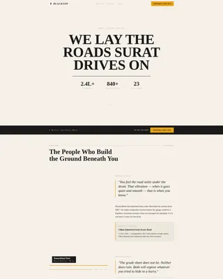
The page opens with an enormous tracked-wide serif headline set in manuscript black against full-bleed newsprint cream. A thin column-rule line sits below it, followed by a dateline-style subhead in small caps showing tonnage poured, kilometers laid, and years in operation. No photography competes for attention; the typography holds the entire viewport on its own.
Split-Screen Crew Portrait Gallery
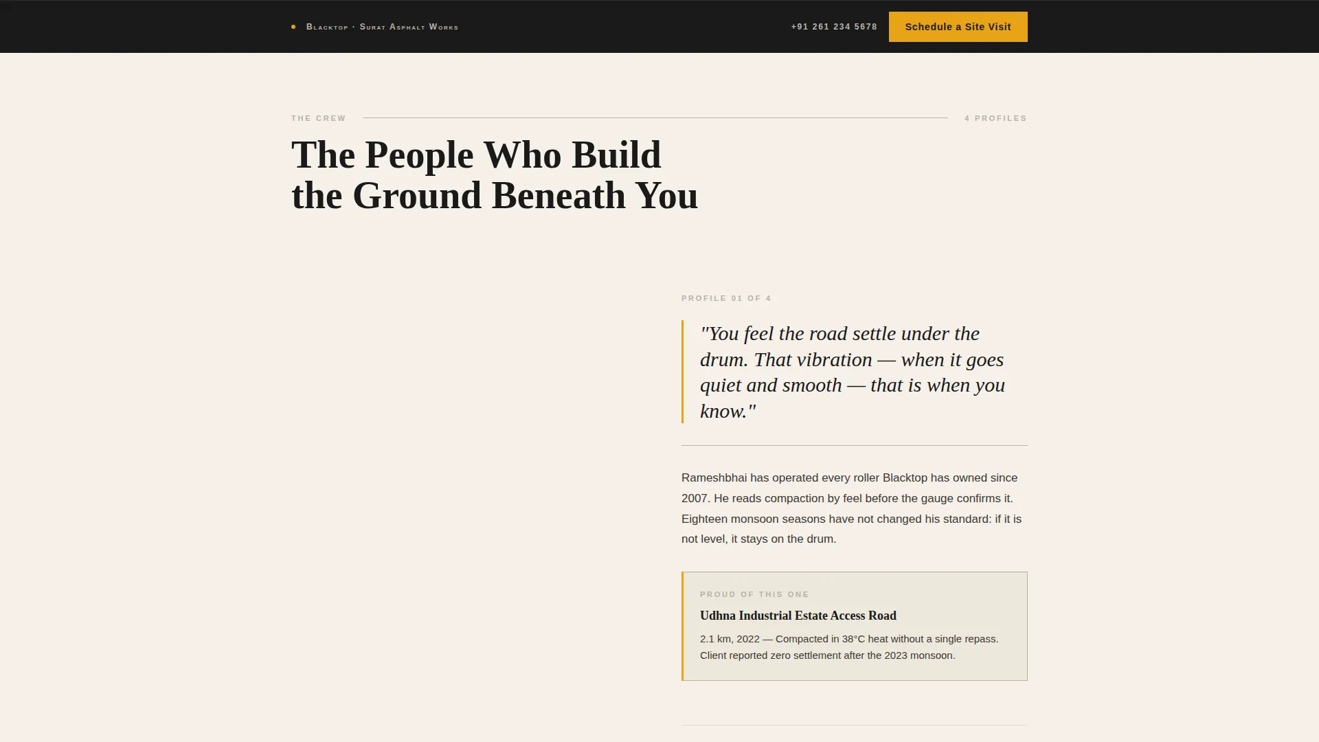
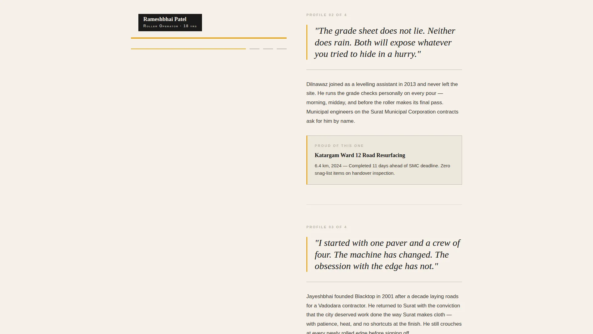
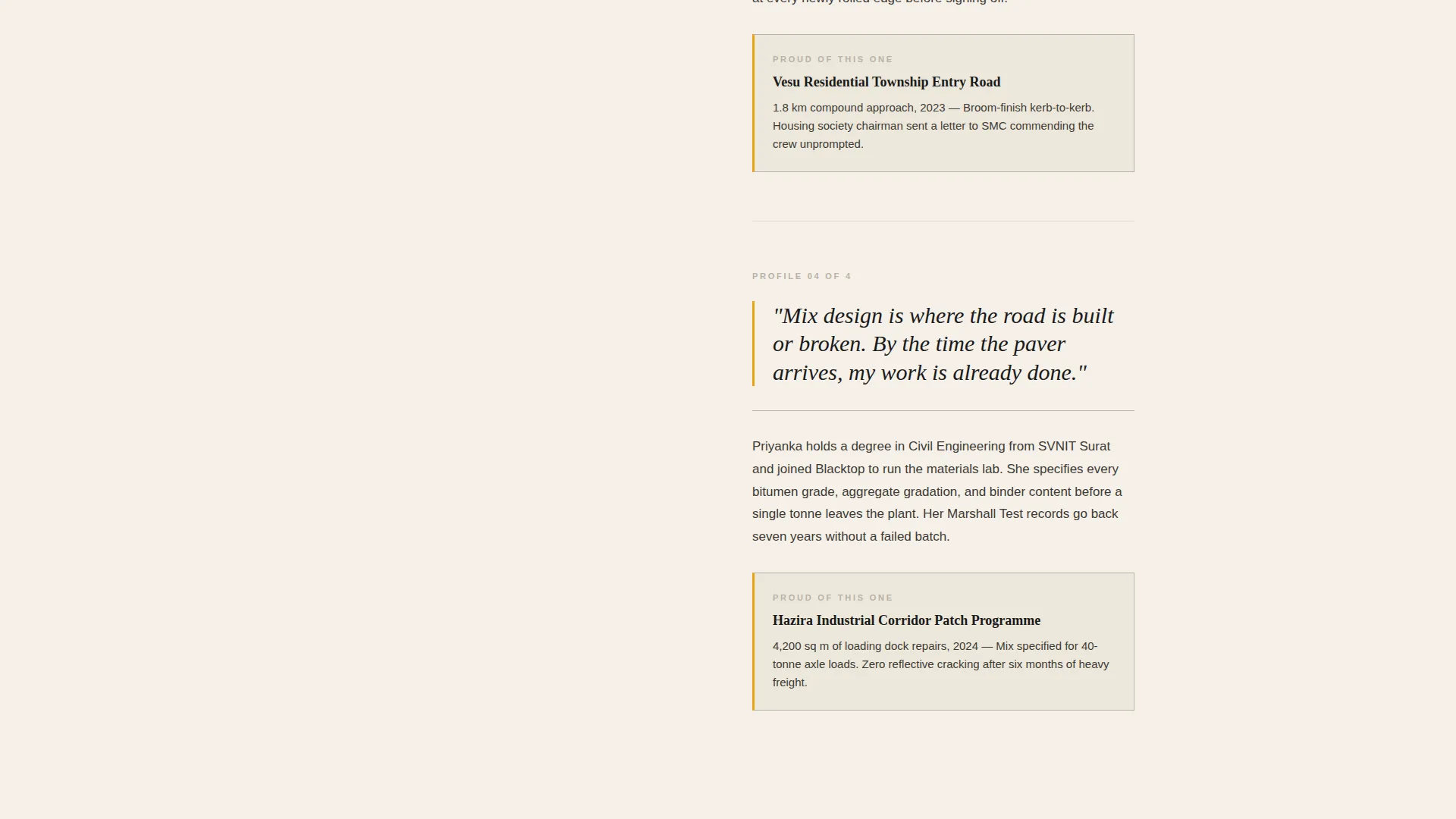
Once visitors scroll past the headline, the layout locks into a 50/50 split screen. The left panel displays large, high-contrast black-and-white portraits of individual crew members. The right panel carries each person's pull-quoted words in oversized italic serif, followed by a short editorial profile naming their role, years on crew, and one specific project they are proud of. Each scroll transition swaps the portrait and story.
Pinned Scheduling Call-to-Action
A "Schedule a Site Visit" button in road-marking amber on black is pinned to the bottom of the viewport throughout the page. It reappears at the editorial section's close, ensuring the conversion prompt is always within reach without disrupting the reading experience.
Two-Step Booking Form
Clicking the pinned button opens a clean two-step form. The first step asks for project type (road, compound, industrial yard, or patch repair) and approximate area in square meters. The second step presents a calendar picker for preferred visit dates and a phone number field. The form qualifies the lead before a site visit is ever confirmed.
Secondary Voice-Call Link
Beneath the booking form, a plain text link reads "Call the Office Directly." This gives visitors who prefer a phone conversation an immediate path without having to hunt for contact details elsewhere on the page.
Editorial Pull-Quote Typography
The color system reserves road-marking amber specifically for pull quotes, buttons, and hover states. Oversized italic serif pull quotes appear in the right panel of the crew gallery, giving each team member's words visual prominence that reinforces the editorial broadsheet atmosphere.
Page sections overview
| Section | Purpose |
|---|---|
| Giant Headline Block | Establishes brand authority through full-bleed serif typography and dateline statistics |
| Crew Portrait Gallery | Builds trust by introducing individual team members through split-screen portraits and editorial profiles |
| Pull Quote Panel | Amplifies crew voices with oversized italic serif quotes in the right split-screen panel |
| Pinned Booking Button | Keeps the primary call-to-action visible throughout the entire scroll journey |
| Two-Step Booking Form | Qualifies leads by capturing project type, area, preferred dates, and contact number |
| Secondary Call Link | Provides a direct voice-call path for visitors who prefer phone over form |
Design & branding system
The design language is rooted in editorial print. Every color choice, type decision, and spacing rule traces back to the aesthetic of a freshly printed broadsheet, high contrast and precise, with no decorative clutter.
- Four-value ink-and-paper palette: manuscript black (#1A1A1A), newsprint cream (#F5F0E8), column-rule gray (#B8B2A6), and road-marking amber (#E8A317) used exclusively for buttons, pull quotes, and hover states
- Typography drives the visual identity; oversized tracked serif headlines and small-caps dateline subheads replace hero photography entirely
- High-contrast black-and-white crew portraits reinforce the editorial print aesthetic and keep the color palette disciplined
Mobile & speed optimization
The template is designed with a clean layout structure that translates well across screen sizes. The split-screen panels and pinned button are built to function clearly on smaller viewports without requiring horizontal scrolling or layout breaks.
- The 50/50 split-screen adapts to a stacked single-column layout on mobile, keeping portrait and profile copy readable
- The pinned call-to-action button remains accessible at the bottom of the screen on mobile devices throughout the scroll
- The two-step form uses simple inputs with generous tap targets, making it straightforward to complete on a phone
How this template helps you convert
The editorial authority of the page does the persuasion work before the form ever appears. By the time a visitor has read through the crew profiles, scheduling a visit feels like a natural next step rather than a cold commitment.
- The monumental headline and dateline statistics establish immediate credibility, so visitors know exactly who they are dealing with before reading a single profile
- The scrolling crew gallery replaces abstract company claims with named individuals, specific projects, and direct quotes, making trust tangible and personal
- The always-visible pinned button means the conversion path is never more than one tap away, and the two-step form qualifies each enquiry so both sides arrive at the site visit prepared
Other information about this template
This template is categorized under Professional Services and Surat Local Services, making it a strong fit for local construction and infrastructure businesses that want a premium digital presence without a complex build. The intersection match score of 9 reflects close alignment between the editorial design approach and the target audience's expectation of authority and craft.
- The template style follows a split-screen layout rather than a zigzag alternating structure, keeping the crew gallery cohesive and immersive
- The booking form's project-type selector covers four categories: road resurfacing, compound entrance, industrial yard, and patch repair, which maps directly to the three core client types described in the brief
- The page requires no backend system to display; form behavior and calendar picker are layout-level components ready for developer connection to a preferred scheduling or contact tool
Theme
Corporate Precision
Creative direction
FAQ-Driven
Color system
Navy Authority
Style
Zigzag/Alternating
Direction
Partnership/B2B
Page Sections
Giant Editorial Headline Section
Split-screen Crew Portrait Gallery
Pinned Scheduling Call-to-action
Two-step Lead Qualification Form
Editorial Pull-quote Typography
Secondary Voice-call Link
Related questions
Who is the primary audience for this landing page template?
Can I replace the crew portraits with my own team photos?
What does the two-step booking form collect?
Do I need a developer to launch this template?
Can the call-to-action button color and label be changed?



