Blast - Executive Pressurewashing Landing Page Template
Blast is a single-page comparison table landing page built for commercial pressure washing services targeting facility managers and property operations teams in Bangalore. It pairs an oversized metrics header and team-profile sections with structured service tier tables, a sticky site-assessment form, and a gated rate card download to convert B2B decision-makers efficiently.
by Rocket studio
Quick summary
Blast is a B2B landing page template for a commercial pressure washing service operating across Bangalore's IT corridors. It opens with a bold metrics wall, introduces named crew leads, then presents a structured comparison table for three service tiers. Two conversion paths, a sticky assessment form and a gated PDF download, keep facility decision-makers moving toward a qualified conversation.
Who this template is for
This template is built for commercial exterior cleaning businesses that serve corporate and institutional clients. It fits providers who need to communicate professionalism, scale, and reliability to procurement-minded buyers rather than individual homeowners.
- Facility managers at IT parks in Whitefield and Electronic City who oversee large campus exteriors
- Property management companies handling multi-tenant office towers on Outer Ring Road
- Operations heads at co-working chains who need a clean, credible first impression at every campus entrance
What problem this template solves
Commercial cleaning providers often struggle to communicate the scope and reliability of their service to facility decision-makers. A generic website with a phone number and a photo gallery does not answer the structured questions that procurement teams ask.
- Buyers cannot easily compare service tiers, coverage area, response time, or pricing without a structured layout
- Providers appear indistinguishable from smaller residential operators, making it hard to win large-campus contracts
- Without a gated download or a qualified intake form, inquiries mix residential consumers with serious commercial leads
What you get with this template
The template delivers a complete single-page layout designed around the buying journey of a facility or operations professional. Every section is ordered to build trust progressively before asking for a commitment.
- A full-screen metrics header with three sequenced stat callouts and a low-opacity background video loop
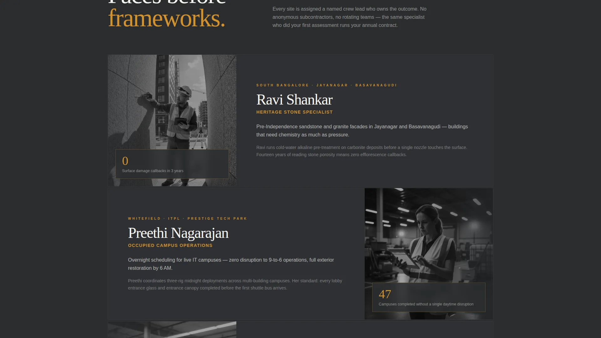
- Named team profile sections that pair crew leads with their specialties, building credibility before the data arrives
- A mid-page comparison table covering three service tiers across five attributes, plus two distinct conversion components
Feature list
The template is built around several purpose-designed components that work together to move a commercial buyer from awareness to inquiry.
Sequential Stats Header
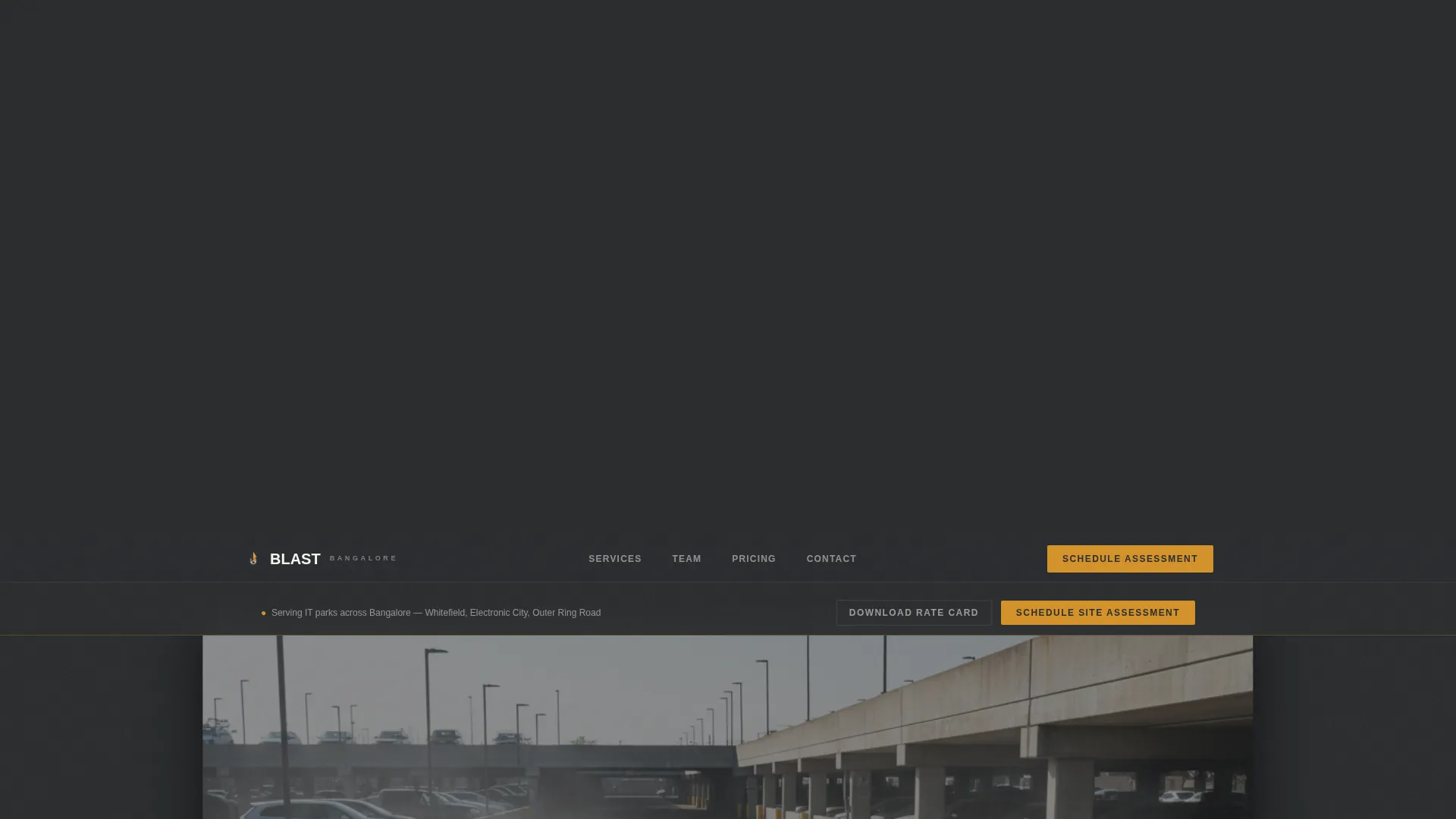
Three oversized numbers fade in one after another against a charcoal background. Each figure is set in a tall, thin typeface with an amber underscore. A slow-motion video plays behind them at fifteen percent opacity, showing a pressure wand clearing grime in a single arc. The combination signals scale before the visitor reads a single line of copy.
Named Crew Profile Sections
Each section pairs a photograph and name with a specific service specialty. Ravi handles heritage stone facades, Preethi manages overnight schedules for occupied campuses, and Suresh oversees fleet maintenance. This format turns an anonymous service into a team with accountable faces, which matters to facility managers who sign multi-year contracts.
Mid-Page Comparison Table
The comparison table lets buyers evaluate three service tiers side by side. Columns cover coverage area, service frequency, response time commitment, equipment grade, and per-square-foot pricing. The structured layout answers the most common procurement questions without requiring a sales call.
Sticky Site Assessment Form
After the first scroll, a subtle sticky bar activates at the top of the viewport. It holds the primary call to action, "Schedule a Site Assessment," and a compact form capturing company name, campus square footage via a slider, number of buildings, and a preferred date. It stays accessible without interrupting reading.
Gated Rate Card Download
A secondary conversion path offers a downloadable Annual Maintenance Contract rate card in exchange for a verified official email address. The gate filters out non-commercial visitors and passes pre-qualified facility decision-makers into the sales pipeline.
Executive Suite Visual Theme
The charcoal and amber color system, combined with linen white for body text and table cells, creates a boardroom-grade aesthetic. The palette signals that this provider operates at a corporate level, which builds immediate credibility with professional buyers.
Page sections overview
| Section | Purpose |
|---|---|
| Metrics stats header | Opens with scale, credibility, and proof |
| Background video loop | Adds atmosphere without distracting |
| Crew profile: Ravi | Introduces facade specialist and trust |
| Crew profile: Preethi | Highlights overnight campus scheduling |
| Crew profile: Suresh | Demonstrates fleet reliability commitment |
| Service comparison table | Enables structured tier evaluation |
| Sticky assessment bar | Keeps primary call to action always reachable |
| Rate card download | Captures qualified email leads |
Design & branding system
The visual identity follows an Executive Suite theme built around a Charcoal and Amber palette. Every color choice reinforces a sense of precision and corporate-grade professionalism rather than a trade-service aesthetic.
- Deep boardroom charcoal (#2B2D2F) and polished graphite (#4A4E54) dominate backgrounds and section dividers, creating a contained, serious tone
- Warm amber (#D4922A) fires up call-to-action buttons, hover states, and metric highlights, acting as the single warm accent against dark fields
- Crisp linen white (#F7F5F0) carries body text and table cell content, keeping data legible and open without feeling clinical
Mobile & speed optimization
The layout is designed to remain fully readable and functional on smaller screens. Compact form elements and the sticky bar are sized for touch interaction, so a facility manager reviewing the page on a phone between site visits can still complete an inquiry.
- The comparison table is structured to scroll horizontally on narrow viewports, preserving all data columns without collapsing information
- The background video header degrades gracefully, ensuring the metrics text and amber accents remain the focal point on any device
How this template helps you convert
The page is built around two complementary conversion paths that serve different stages of the commercial buying cycle. Every design and layout decision reinforces movement toward one of these two actions.
- The sticky "Schedule a Site Assessment" bar captures buyers who are ready to act. The form collects company name, campus square footage, number of buildings, and preferred date, so the sales team receives pre-qualified context before the first call.
- The "Download Our AMC Rate Card" path captures earlier-stage researchers. The email gate filters for official business addresses, which separates facility procurement contacts from casual browsers and keeps the pipeline focused.
Other information about this template
This template is designed specifically for the Bangalore commercial exterior cleaning market, where monsoon cycles, diesel particulate, and construction dust create a recurring and predictable maintenance need for large-format corporate properties.
- The template style is a comparison table landing page, making it well suited for any professional services provider that offers tiered pricing or service packages
- The B2B partnership direction means the page avoids consumer-oriented language and speaks directly to the decision-making language of operations and facilities roles
- The header concept is a stats and metrics wall, a format that works particularly well for services where scale and renewal rates are meaningful proof points for procurement teams
- The page is well matched to providers whose clients include IT parks, co-working campuses, and multi-tenant commercial towers, where long-term maintenance contracts are the primary commercial relationship


Theme
Executive Suite
Creative direction
Team & People
Color system
Charcoal & Amber
Style
Comparison Table
Direction
Partnership/B2B
Page Sections
Sequential Stats Metrics Header
Named Crew Profile Sections
Mid-page Comparison Table
Sticky Site Assessment Bar
Gated Rate Card Download
Executive Suite Color and Type System
Related questions
What type of business is this landing page template designed for?
Can I change the service tiers in the comparison table?
How does the sticky assessment form bar work?
Can I replace the crew profiles with my own team members?
Is the gated rate card download connected to an email delivery system?



