Affordable Florist Landing Page Template
Bloom is a masonry-style landing page template built for budget flower shops that want to look anything but budget. It combines a bold serif headline, a staggered photo grid, and a sticky call-to-action bar to move visitors from browsing to buying in one scroll. The design whispers luxury while the prices stay honest.
by Rocket studio
Quick summary
Bloom is a single-page florist landing page template designed to make affordable arrangements look editorial. A centered iPhone mockup anchors the header, a staggered masonry grid showcases the collection, and a persistent stem-green call-to-action bar keeps the path to checkout one tap away. It is built for shops where value and beauty live side by side.
Who this template is for
This template suits any budget-friendly flower shop that needs a polished, shoppable web presence without an overly complex build. It works equally well for a corner shop going online for the first time and an established florist refreshing a dated storefront.
- Independent florists and corner flower shops selling arrangements under forty dollars
- Office supply managers or event planners who order flowers on a regular basis
- Small retail flower vendors wanting a visual, grid-led page that drives direct orders
What problem this template solves
Affordable florists often struggle to look credible online. Low-budget photography or cluttered layouts signal "cheap" before a visitor even reads the price. Bloom solves this by letting the product photography do the persuading inside a curated, lookbook-style grid.
- Removes the perception gap between low price and high quality through editorial-style layout
- Eliminates friction by routing every tile tap directly into a checkout flow with the selected collection pre-loaded
- Gives repeat buyers a clear secondary path through a "Subscribe Weekly" option in the header
What you get with this template
Bloom delivers a complete, ready-to-customize landing page built around a masonry photo grid and a confident brand identity. Every layout decision is intentional, from the typography pairing to the color hierarchy.
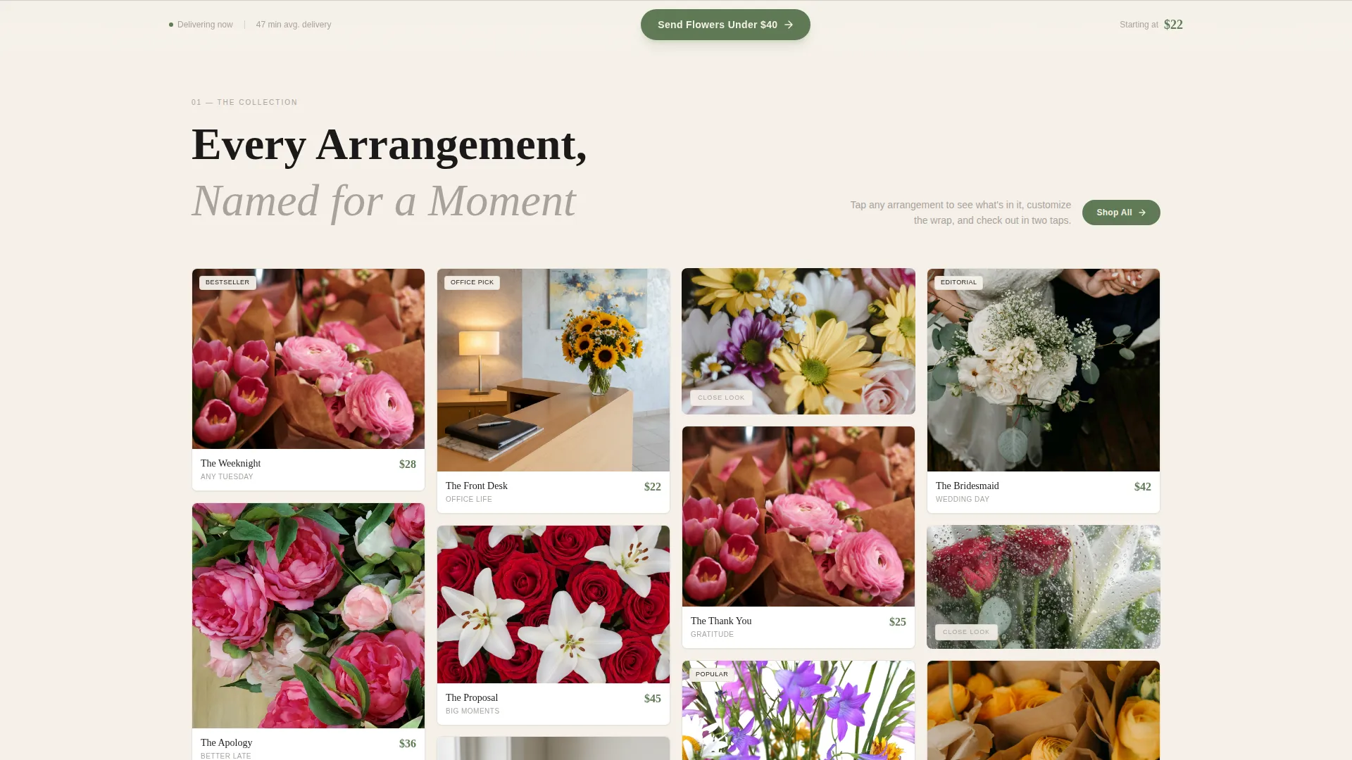
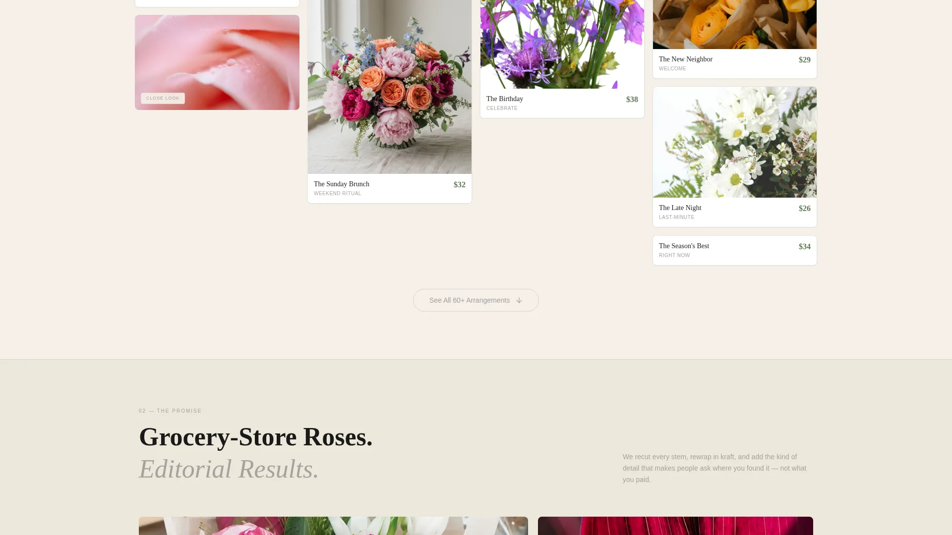
- A full masonry grid section with staggered tile heights and close-crop texture breaks every third card
- A sticky bottom call-to-action bar reading "Send Flowers Under $40" that appears after the first scroll
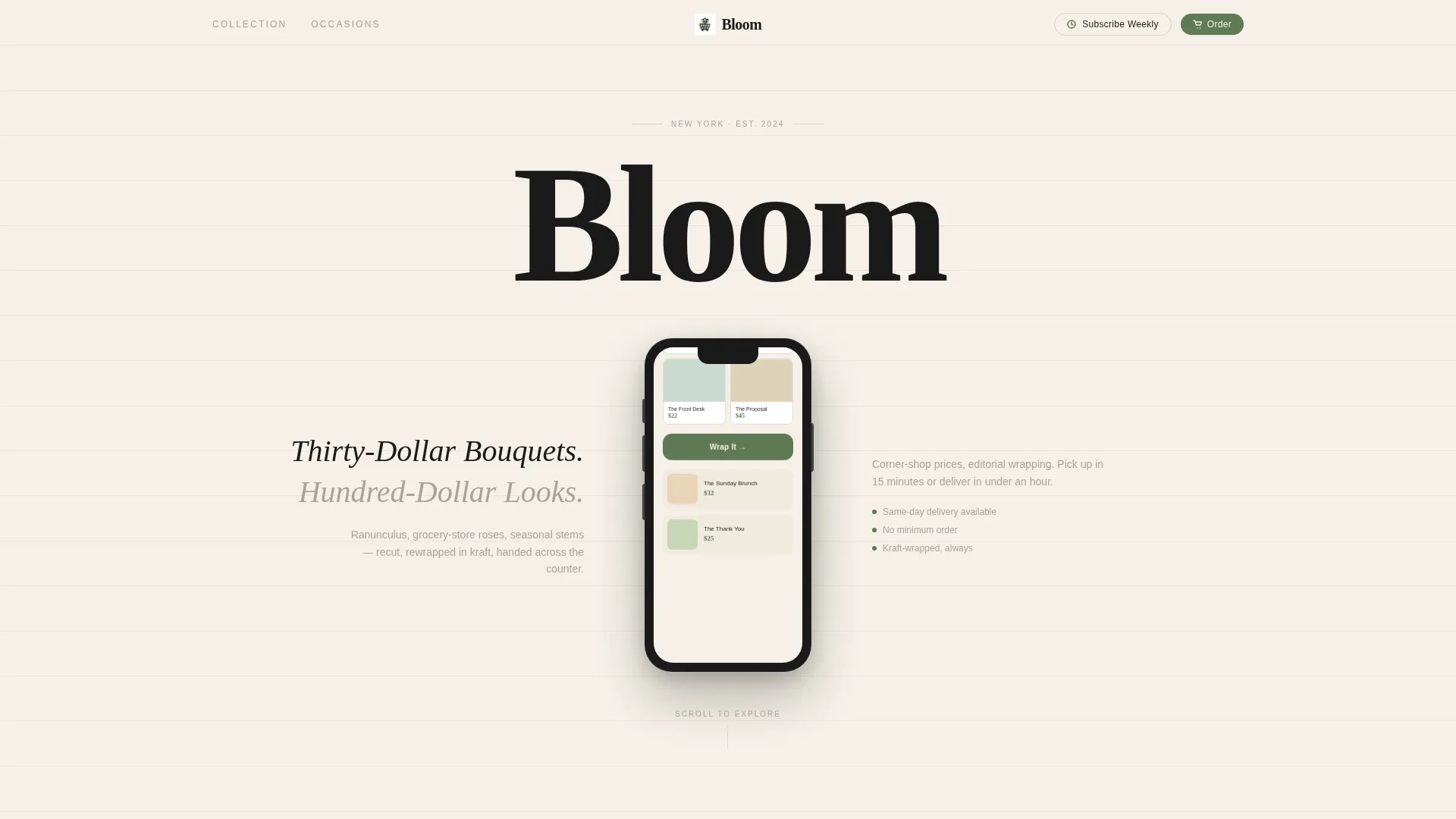
- A header featuring a centered iPhone mockup with flanking serif headline copy and a "Subscribe Weekly" pill link
Feature list
This template includes the following built-in design and layout features.
Staggered Masonry Product Grid
The core section is a Pinterest-style masonry grid where no two tiles share the same height. Each card shows a single overhead arrangement photo, a named bundle title such as "The Weeknight" or "The Apology," and a stem-green price tag. Every third tile swaps to a close-crop texture shot to maintain visual rhythm and keep the eye engaged as the visitor scrolls.
Centered iPhone Header Mockup
The header places a floating iPhone mockup at center stage against the warm paper-white background. The mockup screen scrolls through the shop's ordering interface, showing a seasonal bundle grid, a one-tap "Wrap It" button, and a delivery countdown timer. Two lines of tall serif type flank the device with the headline "Thirty-Dollar Bouquets. Hundred-Dollar Looks."
Sticky Call-to-Action Bottom Bar
After the first scroll, a fixed bottom bar locks into place. It carries the primary call to action in stem green with ink-black text. One tap loads the visitor directly into the checkout flow with a pre-selected collection, removing every step between interest and purchase.
Occasion and Season Collection Flow
The masonry grid is organized in a deliberate sequence: first by arrangement name, then by occasion, then by season, and finally by price tier descending. This teaches the visitor that range and variety live here, making the shop feel abundant rather than limited.
Subscribe Weekly Header Pill
A secondary conversion path sits quietly in the header as a small pill link. It targets repeat buyers such as office managers who want fresh flowers delivered on a regular frequency. Tapping it leads to a simple frequency picker, keeping the path short and clear.
Luxe Minimal Brand Identity System
The template ships with a fully defined color and type system. Heavy ink black, warm unbleached paper, pencil-sketch gray, and a single stem-green accent work together to create a visual language that feels like a hand-lettered chalkboard outside a Parisian flower kiosk.
Page sections overview
| Section | Purpose |
|---|---|
| Header Mockup Block | Anchors the page with the iPhone preview and flagship headline copy |
| Masonry Collection Grid | Showcases arrangements in a staggered, scrollable lookbook layout |
| Occasion Collection Tier | Groups tiles by event type to help visitors self-identify quickly |
| Seasonal Collection Tier | Shifts the grid context by season to signal freshness and variety |
| Price Tier Descent | Presents arrangements from high to low price to maximize browsing time |
| Texture Break Tiles | Close-crop detail shots inserted every third card to refresh visual pace |
| Sticky call to action Bar | Persistent bottom bar routing visitors to checkout after first scroll |
Design & branding system
The Bloom template follows a Luxe Minimal theme. The palette is deliberately restrained, using only four values, so no single element competes with the product photography.
- Ink black (#1A1A1A) for headlines and navigation; warm unbleached paper (#F5F0E8) as the dominant background; pencil-sketch gray (#A8A29E) for secondary text and dividers
- Stem green (#5E7A54) reserved exclusively for price tags and call-to-action buttons, giving every price and every action button a unified visual weight
- Typography uses tall, tight serif faces for headlines, letting the type carry confidence without decorative flourish
Mobile & speed optimization
The masonry grid and sticky bar are laid out with a mobile-first mindset. The iPhone mockup in the header directly signals to mobile visitors that the ordering experience was designed for their device.
- Staggered tile heights reflow naturally for narrower viewports without losing the grid's visual rhythm
- The sticky call-to-action bar remains accessible at the bottom of the screen on all device sizes, keeping the checkout entry point within thumb reach at all times
How this template helps you convert
Bloom is built around a single conversion principle: show the product first, ask for the sale second. Every layout decision pushes toward that goal.
- The masonry grid loads thirty or more arrangement tiles before any purchase prompt appears, building proof of range and quality before asking for a tap
- The sticky bottom bar makes the primary call to action persistent without interrupting browsing, so the decision moment arrives on the visitor's own terms
Other information about this template
Bloom sits inside the Retail and E-Commerce category, specifically under the Budget Business subcategory. A few practical notes for anyone evaluating this template:
- The template is classified as a single landing page, not a multi-page website, so all content lives in one scrollable flow
- The masonry layout style is well suited to platforms and builders that support variable-height card grids
- Bloom is designed around a click-through landing page direction, meaning its goal is to push visitors into an external or linked checkout, not to capture a form submission on the page itself
- The "Subscribe Weekly" pill is a lightweight secondary path and does not require a complex backend; it links to a simple frequency picker flow
- The template's visual identity is versatile enough to support rebranding with a different accent color if stem green does not match an existing shop palette
Theme
Luxe Minimal
Creative direction
Curated Collection
Color system
Cloud Canvas
Style
Overlap/Layered
Direction
Upsell/Upgrade
Page Sections
Staggered Masonry Product Grid
Centered Iphone Header Mockup
Sticky Call-to-action Bottom Bar
Occasion and Season Grid Sequencing
Subscribe Weekly Header Pill
Luxe Minimal Brand Identity System
Related questions
Is Bloom suitable for a florist with no web design experience?
Does this template include a checkout or payment system?
Can I change the accent color from stem green to match my brand?
How many arrangement tiles can the masonry grid hold?
Who is the Subscribe Weekly feature designed for?



