Nurturing Preschool Daycare Landing Page Template
Nurture is a single-column daycare landing page template built for childcare centers that want to earn parent trust fast. It combines an editorial magazine aesthetic with a confidence-first layout: logo wall credibility, transparent pricing previews, and a streamlined free estimate form. The result feels warm, unhurried, and purposefully designed for busy families making a big decision.
by Rocket studio
Quick summary
Nurture is a single-column flow landing page template for daycare centers offering free estimates. It pairs a calm, editorial visual style with a booking-focused layout that guides parents from first impression to form submission. Every section earns trust before asking for anything, making the path from curious visitor to scheduled tour feel natural and pressure-free.
Who this template is for
This template is built for childcare businesses that want a polished, conversion-ready landing page without starting from scratch. It suits operators who serve modern families and want their first impression to feel as thoughtful as their care.
- Daycare center owners launching a free estimate or tour booking page
- Early childhood programs targeting dual-income families, single parents, and relocating households
- Childcare marketers who need a credible, visually refined page ready to publish quickly
What problem this template solves
Most daycare websites bury the most important information under layers of navigation and generic copy. Parents searching for care are already short on time and high on anxiety. A cluttered or low-trust page makes them bounce before they ever read the good stuff.
- Parents need to feel confident before they share contact details
- Generic templates do not reflect the warmth and care a childcare center actually provides
- Booking paths are often confusing, buried, or disconnected from the trust signals that earn them
What you get with this template
You get a complete, single-page layout designed specifically for daycare free estimate capture. Every section is sequenced to build confidence, then convert it into a scheduled tour or inquiry.
- A full single-column page flow from headline to form, including logo wall, philosophy section, classroom photography area, and pricing preview
- An inline booking form with child age dropdown, schedule preference selector, and a tour date picker
- A secondary contact path for parents who want to ask questions before committing to a tour
Feature list
This template includes purpose-built sections and components that work together to guide parents through a complete decision journey.
Giant Headline Centered Header
The header opens with oversized serif typography reading "They'll Call It School. You'll Call It Peace of Mind." Set in soft graphite against a vast white background, with an apricot underline accent and a single subtext line, this header communicates authority and warmth before a single scroll happens.
Logo Wall Authority Ribbon
Directly below the headline, a horizontal ribbon displays local pediatric office logos, employer partnership badges, state licensing seals, and early-education accreditation marks. All marks are desaturated to a sage-gray tone so the row feels curated and trustworthy rather than promotional.
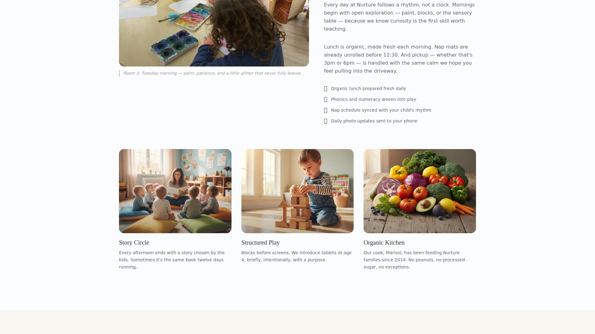
Editorial Scroll Sections
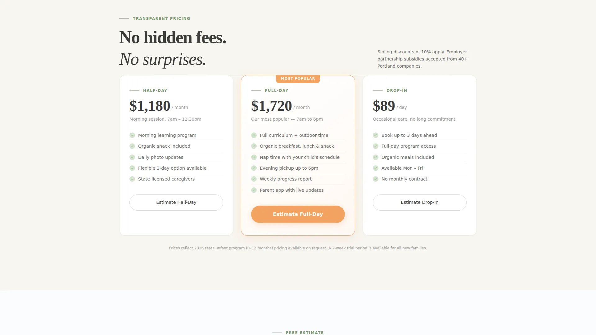
Each scroll section presents one idea per screen in a magazine-spread format. Sections move through daycare philosophy, full-bleed classroom photography with editorial captions, and transparent pricing tiers. This pacing lets parents absorb information without feeling rushed or sold at.
Inline Estimate and Booking Form
The primary call to action opens an inline form with three inputs: a child age range dropdown covering infant, toddler, and preschool options; a schedule preference selector for full-day, half-day, or drop-in; and a labeled tour date picker. The form is embedded in the page flow so parents never leave to complete it.
Sticky Mobile Booking Bar
On mobile devices, a persistent bottom bar keeps the primary call-to-action button visible at all times. This ensures parents scrolling on a phone one-handed never lose access to the booking path, regardless of where they are on the page.
Secondary Inquiry Path
A softer secondary option labeled "Just Have Questions?" opens a simple text input alongside a phone number capture field. This path serves parents who are not ready to schedule but still want to reach out, reducing drop-off from hesitant visitors.
Page sections overview
| Section | Purpose |
|---|---|
| Headline Header | Opens with trust-building typography and primary call-to-action button |
| Logo Wall Ribbon | Establishes credibility through partner and accreditation marks |
| Philosophy Editorial | Communicates the center's care approach in a magazine-style spread |
| Classroom Photography | Showcases the environment with full-bleed imagery and editorial captions |
| Pricing Preview | Provides transparent tier information before the form is shown |
| Inline Booking Form | Captures child age, schedule preference, and preferred tour date |
| Secondary Contact Path | Offers a low-pressure inquiry option for undecided parents |
Design & branding system
The visual identity follows an Editorial Magazine theme grounded in an Arctic White color system. The overall feel is generous, unhurried, and immediately legible, like a well-designed Scandinavian parenting publication.
- Color palette: vast snow-field white (#FAFBFC) as the dominant background, soft graphite (#3D3D3D) for headline type, muted sage (#A8BFA0) for dividers and trust badges, and warm apricot (#F4A261) reserved strictly for buttons and interactive highlights
- Typography: elegant serif faces for headlines paired with light sans-serif for subtext and body, creating a visual contrast that is both editorial and easy to read
- Layout rhythm: generous whitespace throughout, single-column flow, and one idea per scroll section to keep the page breathable and focused
Mobile & speed optimization
The template is designed with one-handed mobile use in mind. Parents are often browsing during a commute or between tasks, so the layout prioritizes legibility and tap-friendly interactions at every scroll depth.
- The sticky bottom bar on mobile keeps the primary booking button persistently visible without interrupting the reading experience
- Typography scales cleanly from desktop to mobile, maintaining the serif headline impact and sans-serif body clarity across screen sizes
- The single-column flow eliminates complex grid behavior, ensuring the layout renders predictably on any device
How this template helps you convert
The page is sequenced to earn trust before it asks for anything. Parents see credibility signals first, then content, then pricing, and only then the form. This order mirrors how a confident referral actually works.
- The logo wall and editorial sections establish authority and warmth before any personal information is requested, lowering the psychological barrier to submitting the form
- The inline booking form is embedded directly in the page rather than linked to an external page, reducing friction at the moment of decision and keeping parents in the flow
- The secondary inquiry path captures parents who are interested but not yet ready to schedule, giving the center a second conversion opportunity without pressure
Other information about this template
This template was built specifically for the daycare center free estimate landing page use case, sitting at the intersection of professional services marketing and early childhood education outreach.
- The template style is single-column flow, making it straightforward to customize section by section without disrupting the overall layout
- The Editorial Magazine theme and Arctic White color system are intentional choices for the childcare niche, where visual warmth and perceived quality directly influence parent trust
- The Logo Wall Authority creative direction is particularly effective for new or growing centers that want to signal community credibility quickly
- This template is suited for daycare centers, preschool programs, and early learning centers that offer a free estimate, consultation, or tour as their primary lead-generation offer


Theme
Editorial Magazine
Creative direction
Logo Wall Authority
Color system
Arctic White
Style
Single Column Flow
Direction
Booking/Scheduling
Page Sections
Giant Headline Centered Header
Logo Wall Authority Ribbon
Editorial Scroll Sections
Inline Estimate and Booking Form
Sticky Mobile Booking Bar
Secondary Inquiry Path
Related questions
Can I customize the form fields for my specific programs?
Does this template work for a preschool or early learning center?
How does the logo wall section work if my center is new?
Is the sticky booking bar always visible on mobile devices?
What type of daycare businesses is this landing page template best suited for?


