Nursery & Plant Farm Blog & Content Website Template
Bloom is a card grid landing page built for cut flower farms that sell direct to commercial buyers. It presents dahlias, ranunculus, and sweet peas through an immersive, editorial layout that guides florists, restaurants, and boutique shops from the growing fields to a season reservation form. The warm Parchment and Rust palette and organic spatial layout make the farm feel as alive as its harvest.
by Rocket studio
Quick summary
Bloom is a single-page, modular card grid landing page designed for a ten-acre cut flower farm. It connects commercial buyers with day-fresh, locally grown stems through an editorial visual journey. The layout moves visitors from the fields through the harvest process into a season reservation form, with a warm Parchment and Rust color system that keeps every section grounded and human.
Who this template is for
This template is built for cut flower farms that sell directly to commercial buyers who care deeply about stem quality and seasonal availability. It suits operations that grow multiple varieties and want a page that reflects the care behind every row.
- Event florists who source locally for weekend weddings and need reliable weekly stem volume
- Farm-to-table restaurants and boutique floral shops looking to replace imported flowers with fresher, field-cut alternatives
- Small-to-mid-scale flower farms ready to convert casual browsers into committed seasonal buyers
What problem this template solves
Commercial flower buyers are often stuck choosing between refrigerated imports that arrive tired and suppliers with no visible identity. A flower farm without a strong online presence loses those buyers before a single conversation starts. This template solves that gap directly.
- It gives the farm a visually credible, editorial home that earns trust before the buyer ever fills out a form
- It structures the page so visitors move naturally from admiring the product to understanding the process and then committing to a reservation
- It captures two types of leads at once: serious commercial buyers through the season reservation form and early-stage visitors through the Field Notes email list
What you get with this template
You get a fully designed, section-led landing page that doubles as a farm brand experience. Every section is built from the source brief and reflects a specific moment in the farm's story.
- A full-bleed cinematic hero with a single serif tagline, followed by an asymmetric bento card grid showcasing individual flower varieties and farm operations
- A harvest process section with a scrolling marquee break and a full-width close-up card, plus a mid-scroll email capture for the Field Notes list
- A three-panel use case section, a lead generation reservation form card styled like a seed order form, and a linear single-row footer
Feature list
This template delivers a set of distinct, purpose-built components drawn directly from the source brief.
Full-Bleed Cinematic Hero
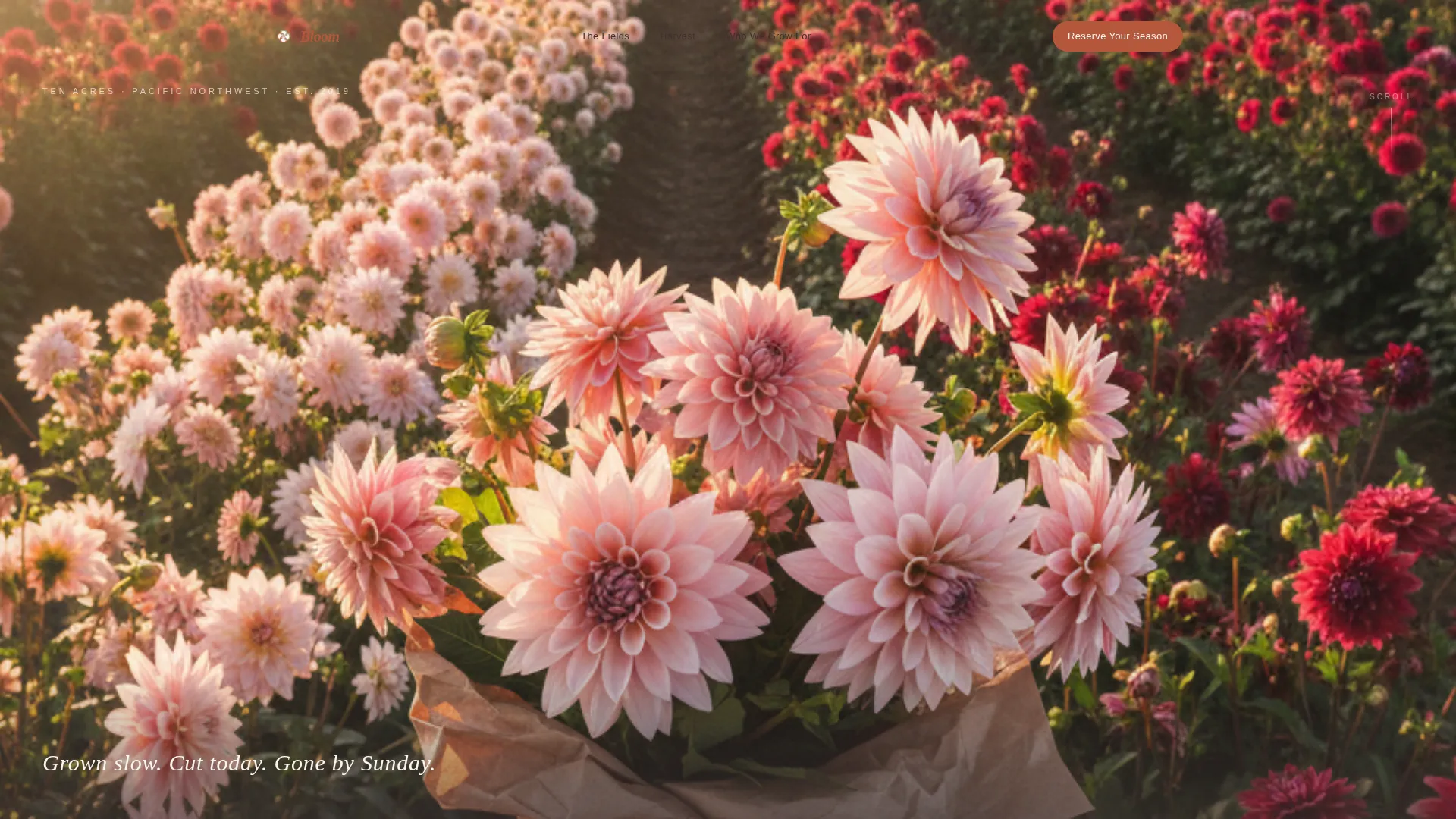
The header is a waist-height photo looking down a single row of dahlias, with morning light raking across from the left. No overlay gradient is used. A single serif line of text sits at the bottom edge of the frame, grounding the visitor immediately in the farm's voice and rhythm.
Asymmetric Bento Card Grid
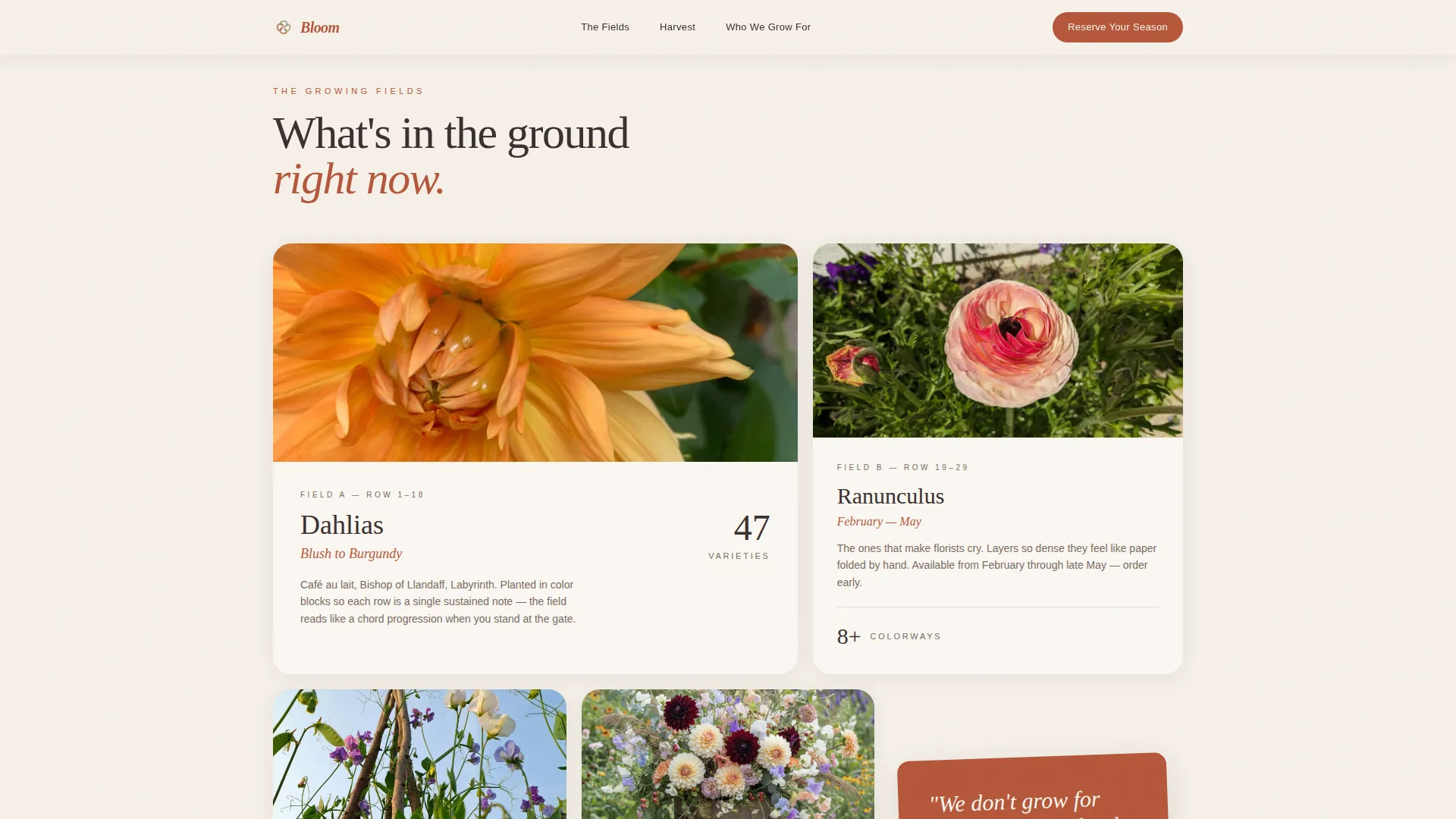
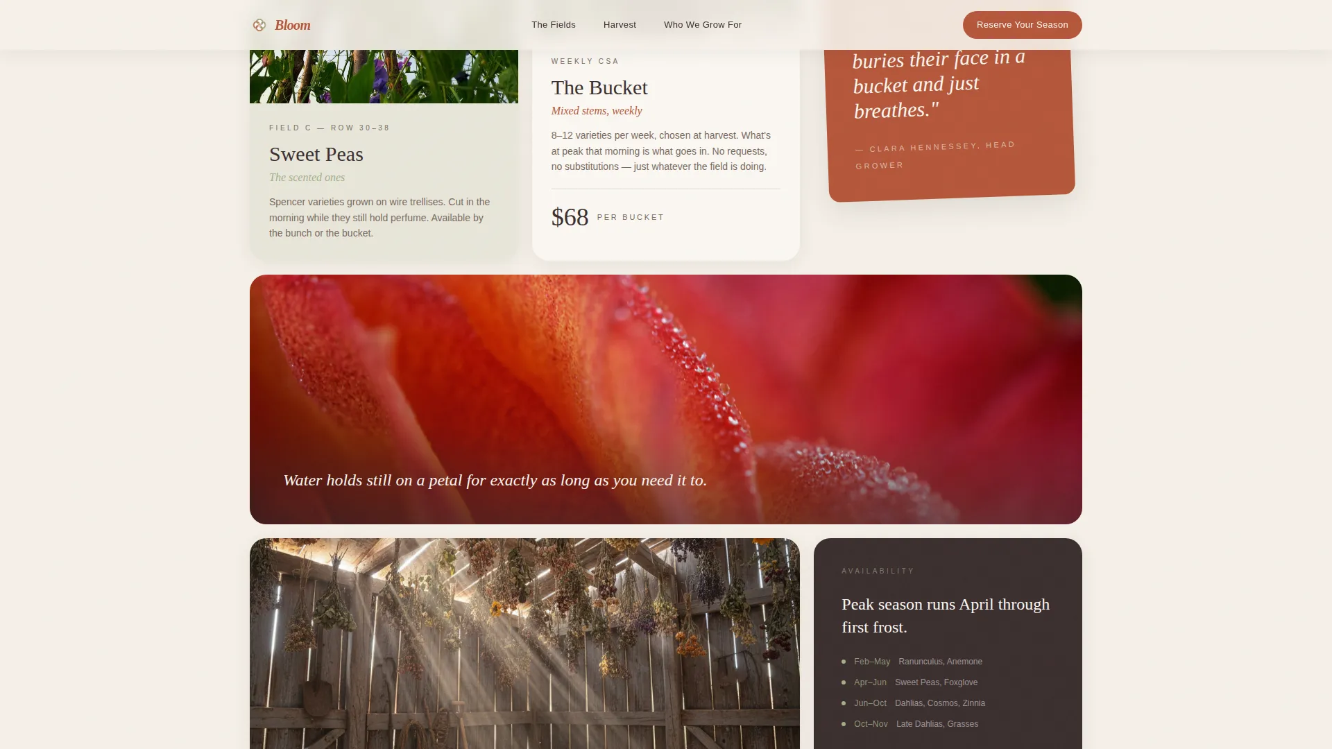
Cards are arranged in a breathing, non-uniform grid that moves like a garden bed rather than a spreadsheet. Each card represents a room in the farm operation, from the dahlia field to the drying barn, the packing shed, and the weekly CSA bouquet. Cards use generous padding, rounded corners, and subtle shadow.
Harvest Process with Marquee Break
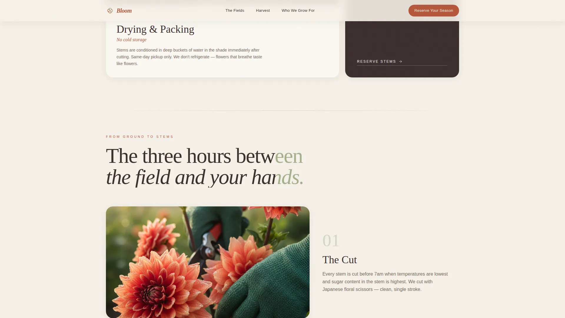
A dedicated section walks visitors through the journey from ground to stems. A scrolling marquee break interrupts the flow, followed by a full-width close-up card showing a macro farm detail. This pacing deliberately slows the visitor down the way a real garden does.
Field Notes Email Capture
A mid-scroll email signup sits after the harvest process cards have already built trust. It asks only for a first name and email address, making it low-friction for casual visitors who are not yet ready to reserve a full season.
Season Reservation Form Card
The primary lead generation form sits inside its own parchment-toned card at the bottom of the grid. It collects business name, stem volume as a buckets-per-week dropdown, primary use, and preferred pickup day. The form is styled to feel like filling out a seed order form.
GSAP Scroll Animations and Spotlight Hover
The template uses GSAP-powered scroll reveals, spotlight card hover effects, and scroll scrub animations to create a high-interactivity editorial experience. These interactions reinforce the sense that you are walking through a property, not scrolling a static page.
Page sections overview
| Section | Purpose |
|---|---|
| Hero, Full-Bleed Photo | Opens with a cinematic dahlia-row image and a single serif tagline to set the farm's voice immediately |
| The Fields Grid | Asymmetric bento cards introduce flower varieties and farm spaces |
| From Ground to Stems | Harvest process narrative with a marquee break and full-width close-up card |
| Field Notes Capture | Mid-scroll email signup for visitors not yet ready to reserve |
| Who We Grow For | Three-panel section addressing florists, restaurants, and boutique shops |
| Reserve Your Season | Lead gen form card styled as a seed order form |
| Footer | Linear single-row footer to close the page cleanly |
Design & branding system
The visual identity follows a Garden and Growth theme built around a Parchment and Rust color system. Every color choice references something you might find on a potting shed shelf: clay, dried earth, bleached linen, and creeping moss. The result is warm, editorial, and deliberately unpolished.
- Parchment (#F5F0E8) dominates the background, Rust (#B5573A) marks all headlines and active buttons, Loam (#3B2F2F) grounds the body typography, and Sage (#A3B18A) breathes through dividers and card borders
- Fraunces serif handles all display headlines for an organic, editorial weight, while DM Sans handles body copy for clean readability at small sizes
- Card components use rounded corners, subtle drop shadow, and generous internal padding to give each block a room-like sense of space and containment
Mobile & speed optimization
The template is built desktop-first, reflecting the reality that event florists typically browse on desktop while restaurant buyers often use mobile. The layout adapts gracefully so the card grid and form remain fully usable on smaller screens.
- Static-first architecture and optimized images keep load weight low without sacrificing visual quality
- Server Components handle layout rendering so the interactive GSAP layers sit on top of a fast, stable structural base
- The modular card grid reflows naturally at mobile breakpoints, keeping the spatial pacing intact on narrower viewports
How this template helps you convert
The page is built around two conversion paths that serve different buyer readiness levels. Neither path forces the visitor; the layout earns commitment through the quality of what it shows before it asks anything.
- The season reservation form targets ready buyers by collecting exactly what the farm needs to qualify a wholesale inquiry: business name, weekly stem volume, primary use, and preferred pickup day, all in a familiar seed-order format that feels appropriate for an agricultural context.
- The Field Notes email capture targets curious visitors mid-scroll, after the harvest process section has already demonstrated the farm's craft. A first name and email is a low bar that keeps the lead warm without demanding a full commitment.
Other information about this template
Bloom fits naturally within the broader category of agricultural and nursery marketing templates, sitting at the intersection of farm-direct commerce and high-craft visual storytelling. It is especially relevant for growers in the flower farm and specialty crop niche who want to position against commodity wholesale suppliers.
- The template style is Card Grid, also described as modular, making individual sections easy to swap, reorder, or expand as the farm's offerings grow across seasons
- The Spatial and Architectural creative direction means the page feels like a physical property walkthrough, a design approach that is well suited to experiential agricultural brands
- The lead generation direction is intentional: the page is not an e-commerce storefront but a relationship-first inquiry page, appropriate for farms that operate on seasonal wholesale contracts rather than individual retail transactions
- The full-bleed header concept and GSAP scroll interactivity together create a premium editorial impression that helps a small farm compete visually with larger, better-resourced floral supply brands
Theme
Garden & Growth
Creative direction
Spatial & Architectural
Color system
Parchment & Rust
Style
Card Grid (Modular)
Direction
Lead Generation
Page Sections
Full-bleed Cinematic Hero Section
Asymmetric Bento Card Grid
Harvest Process with Marquee Break
Two-path Lead Capture System
GSAP Scroll Reveals and Spotlight Hover
Three-panel Use Case Section
Related questions
Who is this flower farm landing page template built for?
Does the template include two separate lead capture points?
What does the reservation form ask buyers to fill in?
Can the card grid be adapted for different flower varieties or farm features?
What animation and interactivity does the template include?