Vegetarian Food & Dining Professional Website Template
Bloom is a hero-dominant landing page template for a small-batch vegetarian supplement brand. It guides ethically-conscious visitors through a scroll-driven botanical gallery before directing them to the product catalog. The design uses watercolor illustration, a Desert Rose color palette, and a contemplative Gallery Walk layout to build trust without a single form field.
by Rocket studio
Quick summary
Bloom is a click-through landing page template for a vegetarian supplement brand rooted in adaptogenic botanicals. It leads with a full-viewport illustrated hero, then carries visitors through a curated gallery of individual supplements. Every panel builds trust through origin notes, capsule counts, and practitioner testimonials, ending at a warm call to action that sends visitors to the product catalog primed and ready.
Who this template is for
This template is built for values-driven wellness brands that lead with ingredients and sourcing. It suits founders who want their landing page to feel like a considered editorial experience, not a hard sell.
- Vegetarian and vegan supplement brands that rely on clean-label trust to convert cautious buyers
- Studio apothecary owners, wellness practitioners, and direct-to-consumer founders selling adaptogenic or botanical products
- Small-batch brands whose customers read every ingredient panel and need reassurance before clicking through
What problem this template solves
Ingredient-conscious shoppers take time to trust a supplement brand they have never tried. A generic product page filled with feature bullets and discount banners feels wrong for a brand built on restraint and ethics. Bloom solves this by replacing the standard sales structure with a slow, gallery-style journey that lets the brand's sourcing story do the persuading.
- Visitors who distrust pushy layouts leave before reading; this template holds them with a contemplative, unhurried pace
- Brands with rich botanical stories have no good place to tell them; each full-width gallery room gives one supplement its own dedicated canvas
- Trust gaps before a first purchase close faster when named practitioners and origin provenance appear alongside each product, not buried in a footnotes page
What you get with this template
You get a complete single-page layout designed to move a first-time visitor from curiosity to confident click-through. Every section is purposeful and editorial, with no filler content and no form fields to interrupt the journey.
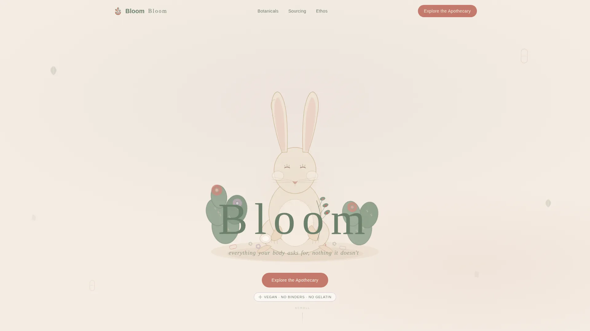
- A parallax hero section with a hand-illustrated desert hare mascot, a word-by-word tagline reveal animation, and a primary call-to-action button
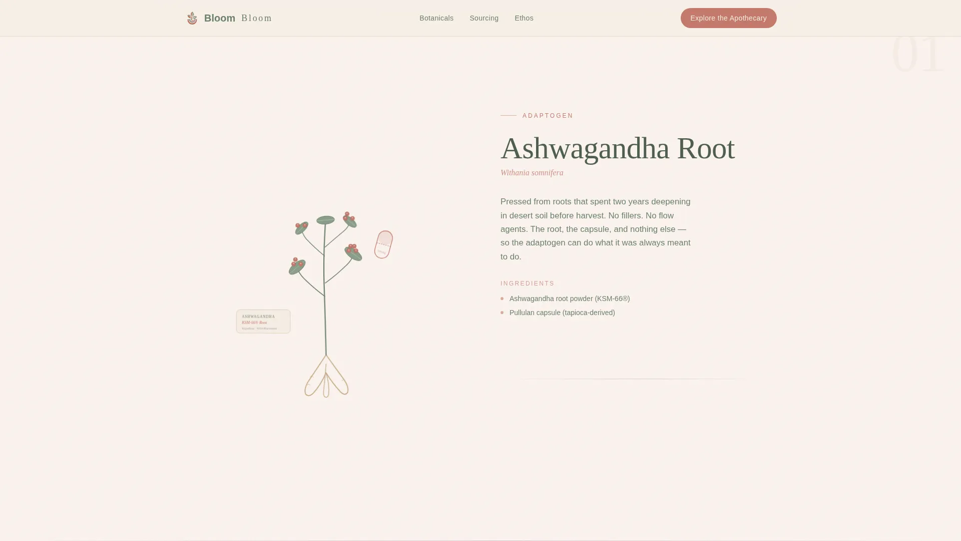
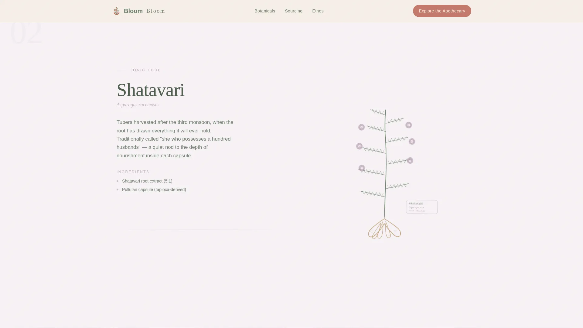
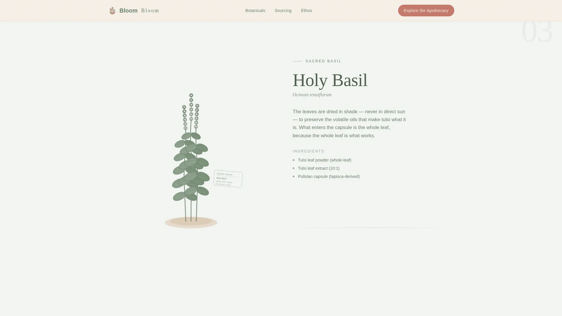
- Three full-width supplement gallery rooms for Ashwagandha, Shatavari, and Tulsi, each with a botanical illustration, origin note, capsule count, and a named practitioner micro-testimonial
- A persistent bottom call-to-action bar that appears after the third scroll section, anchoring the "Explore the Apothecary" prompt throughout the rest of the visit
Feature list
This template is built around a small set of carefully considered features. Each one serves the gallery walk experience and the click-through goal directly.
Parallax Illustrated Hero
The hero section fills ninety percent of the viewport with a soft watercolor illustration of a desert hare seated among prickly pear blooms and scattered capsules. A subtle parallax drift animates the illustration as the visitor arrives. The brand name appears letterpressed in sage beneath it, and the tagline reveals itself one word at a time.
Scroll-Driven Gallery Rooms
Each supplement gets its own full-width canvas section. A botanical illustration sits on one side while a sparse ingredient story, a single-line origin note, a capsule count, and a named practitioner testimonial occupy the other. Accent colors rotate across rooms so the palette stays alive without breaking visual continuity.
Persistent Click-Through Call to Action
After the visitor passes the third scroll section, a bottom-anchored bar appears and stays visible. It carries the primary "Explore the Apothecary" call to action in terracotta on linen. This keeps the next step always in view without interrupting the gallery experience.
Staggered Ingredient Reveals
As each gallery room enters the viewport, ingredient details stagger into view with scroll-linked transitions. This pacing mirrors the contemplative tone of the brand and rewards visitors who read closely.
Trust Strip with Ethos Pillars
Above the footer, a trust strip communicates the brand's core commitments in plain language. No icons, no claims beyond what the brand actually stands for. It gives ingredient-conscious visitors one final anchor before they click through.
Ultra-Minimal Footer
The footer follows a horizontal flow pattern with the lightest possible visual footprint. It keeps navigation and legal links accessible without pulling attention away from the gallery experience or the final call to action.
Page sections overview
| Section | Purpose |
|---|---|
| Hero with mascot | Introduces brand with parallax hare illustration and word-by-word tagline reveal |
| Ashwagandha gallery room | Full-width terracotta-accented canvas with botanical art, origin note, and testimonial |
| Shatavari gallery room | Full-width mauve-accented canvas with ingredient story and practitioner note |
| Tulsi gallery room | Full-width sage-accented canvas with origin story and capsule count |
| Persistent call to action bar | Bottom-anchored bar with "Explore the Apothecary" button appearing after section three |
| Trust strip | Ethos pillars reinforcing clean-label and sourcing commitments before the footer |
| Minimal footer | Horizontal flow pattern with navigation and legal links |
Design & branding system
The visual identity is built on a Pastoral Calm theme that feels warm, grounded, and unhurried. Every color decision, type choice, and spacing rule reinforces the brand's botanical character.
- Desert Rose color system: raw linen (#F5EDE3) dominates backgrounds, terracotta (#C4796B) marks calls to action, deep sage (#6B7F6A) carries body copy, and dried lavender mauve (#B8A0B4) appears only in hover states and divider lines
- Typography pairs Fraunces, a slow and organic serif, for headings with DM Sans, a clean and readable sans-serif, for body copy
- Generous whitespace between sections, no photography or stock imagery, and hand-rendered watercolor botanical illustrations give every panel a curated gallery feel
Mobile & speed optimization
The template is designed desktop-first given its illustration-heavy, editorial layout. It adapts gracefully to smaller screens without losing the gallery's considered pace.
- Illustrations and full-width gallery rooms reflow for mobile viewports while preserving the single-supplement-per-canvas structure
- CSS-driven animations and scroll-linked transitions keep motion smooth without relying on heavy scripts
- Server Components handle static gallery content so the page structure loads cleanly before animations begin
How this template helps you convert
Bloom is a click-through template, meaning the entire page exists to build enough trust that one click feels like the natural next step. Conversion happens through atmosphere, not pressure.
- The parallax hero and word-by-word tagline create an immediate emotional connection, setting a tone of calm confidence before any product information appears.
- Each gallery room layers in ingredient credibility through origin provenance, capsule counts, and named practitioner testimonials, so visitors arrive at the catalog already informed and reassured.
- The persistent call-to-action bar keeps the exit point visible at all times after section three, removing the need to scroll back up or hunt for a button when the visitor is ready to click.
Other information about this template
This template is a strong fit for the growing market of ethically-conscious wellness consumers who shop with intention and research their purchases carefully. The Gallery Walk creative direction is an editorial approach borrowed from art exhibition design, where each room commands full attention before the visitor moves on.
- The hero-dominant layout (90/10) means the mascot illustration and tagline carry the first impression; supporting copy is deliberately spare
- The click-through landing page structure means there are no opt-in fields, no checkout flows, and no embedded shop; the template's job is to warm and direct, not to transact
- The linen-dominant background, mauve dividers, and terracotta call-to-action system were chosen to feel like a clay bowl of dried petals on unbleached cotton, warm without sweetness, earthy without heaviness
- Localization is set to English (United States) with imperial measurements and no currency displayed, since pricing lives in the destination catalog
Theme
Pastoral Calm
Creative direction
Gallery Walk
Color system
Desert Rose
Style
Hero-Dominant (90/10)
Direction
Click-Through
Page Sections
Parallax Illustrated Hero
Scroll-driven Botanical Gallery
Persistent Click-through Call to Action Bar
Staggered Scroll-linked Reveals
Trust Strip and Ethos Pillars
Related questions
Does this template include a shop or checkout feature?
Can I replace the supplement gallery rooms with my own products?
Is the watercolor mascot illustration bundled with the template?
Does the persistent call-to-action bar show on mobile devices?
Is this template suitable for a brand with more than three supplements?


