Architecture & Design Firm Professional Website Template
The Atelier spatial architecture lead generation landing page template is built for commercial architecture studios that need to convert serious project inquiries. A split-screen layout, nine-image mosaic header, alternating project sections, a warm stone color palette, and a friction-light lead capture form work together to help architects turn website visitors into qualified leads.
by Rocket studio
Quick summary
This landing page template gives commercial architecture firms a focused, portfolio-forward presence optimized for lead generation. The page pairs immersive visual storytelling with a structured inquiry form, helping architects communicate scope, craft, and credibility to developers, facilities directors, and municipal agencies in a single compelling scroll.
Who this template is for
Architecture studios working at the commercial scale need a landing page that matches the weight of their work. This landing page template was built for that exact audience.
- Real estate developers holding entitled land and seeking a design partner for ground-up commercial or mixed-use building projects
- Corporate facilities directors consolidating campuses who need a qualified architecture company with documented scope experience
- Municipal agencies commissioning civic buildings and evaluating architects based on portfolio depth and process clarity
What problem this template solves
Most architecture company websites try to do too many things. The result is a page that looks impressive but fails to generate leads or capture the right audience. Visitors leave without taking action.
- Architects lose qualified leads because their portfolio page lacks a clear call to action or a low-friction inquiry form
- Developers and facilities directors cannot quickly assess building type experience, square footage history, or studio process from a generic company website
- The landing page offers no easy path for early-stage customers who are still researching and need a valuable resource before committing to a conversation
What you get with this template
This landing page template delivers a complete, ready-to-customize page built around lead generation for commercial architecture firms. Every section has a defined role in the process of capturing interest and moving visitors toward contact.
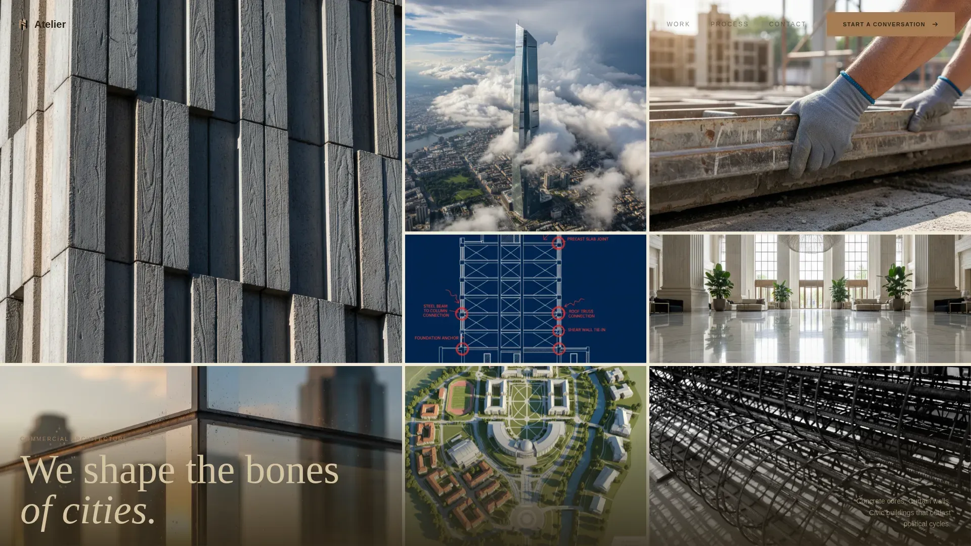
- A nine-image asymmetric Photo Grid Mosaic header that communicates portfolio range and studio craft instantly
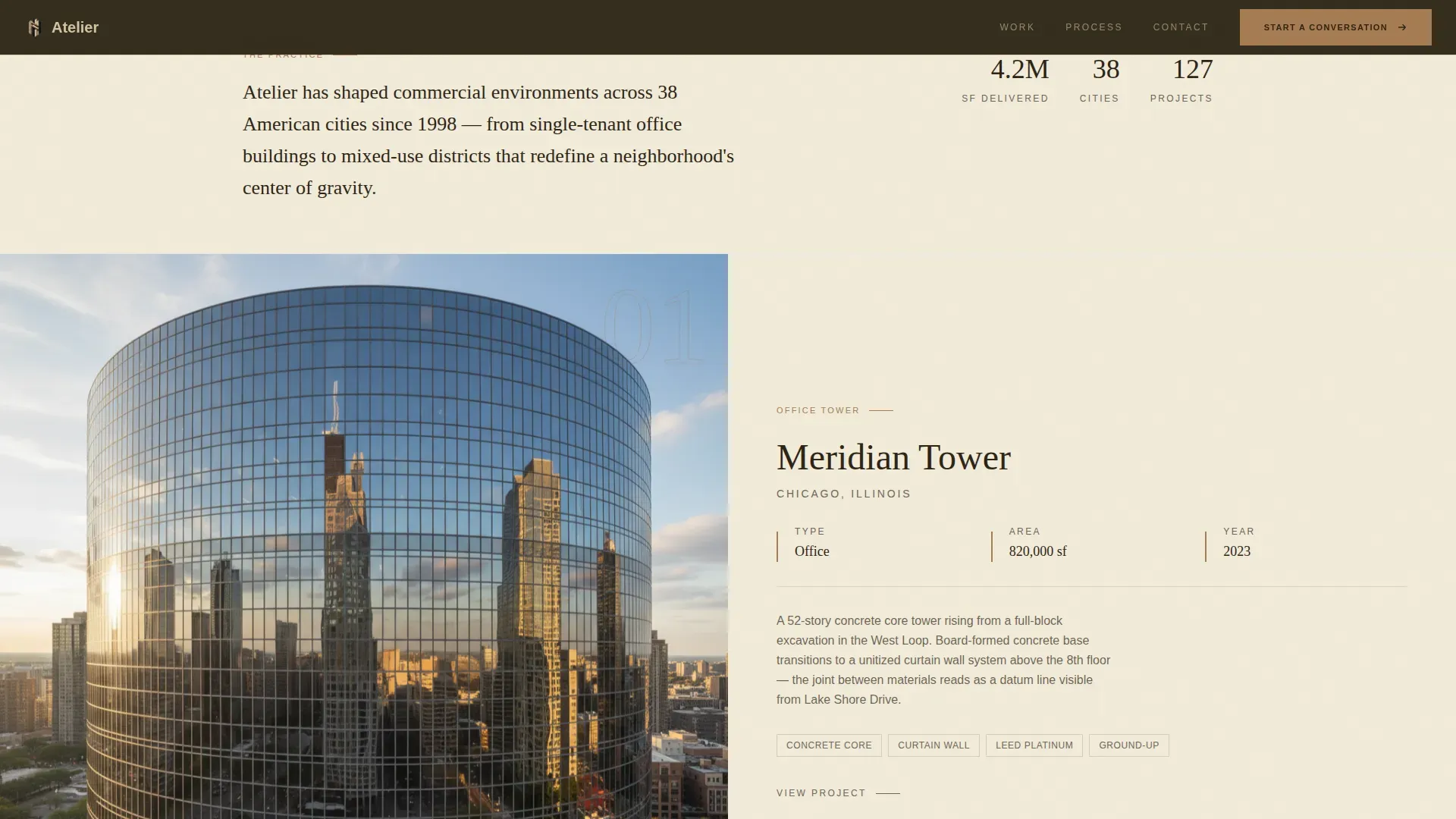
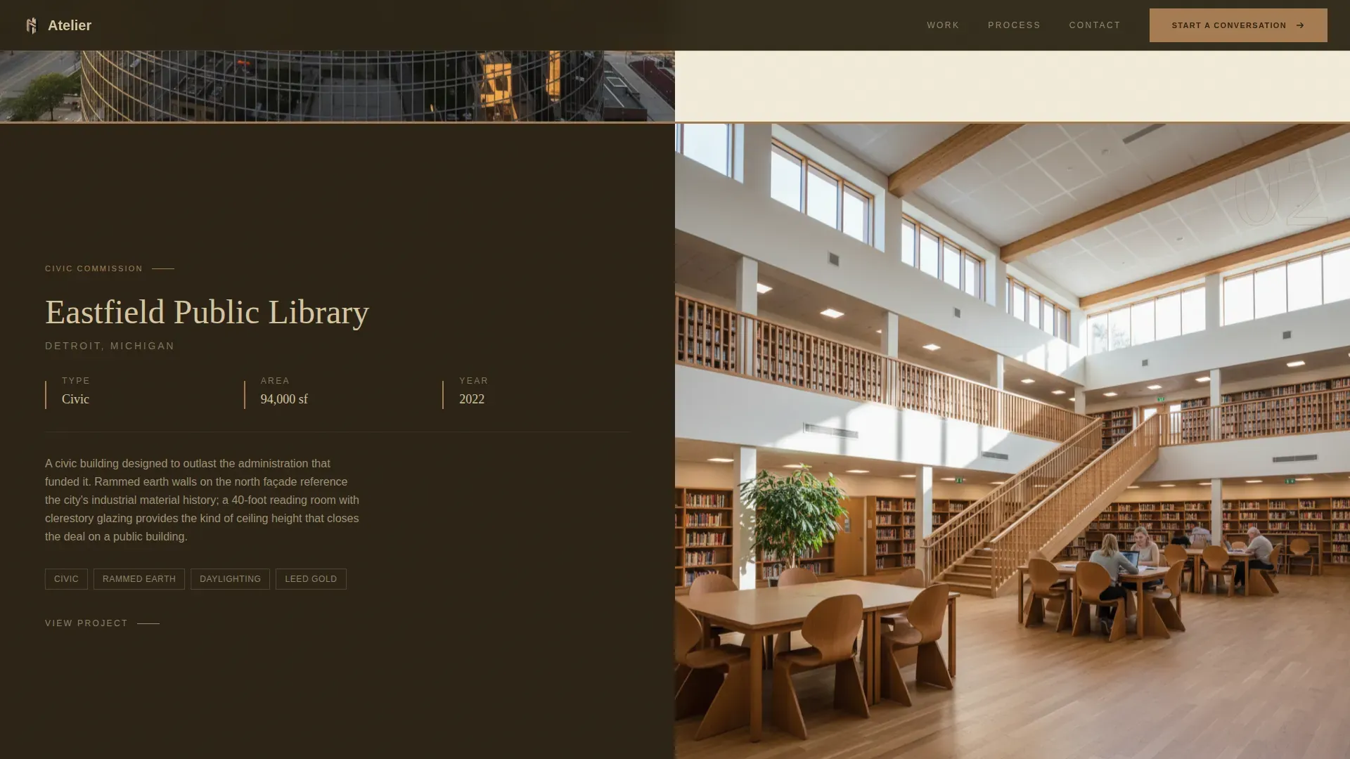
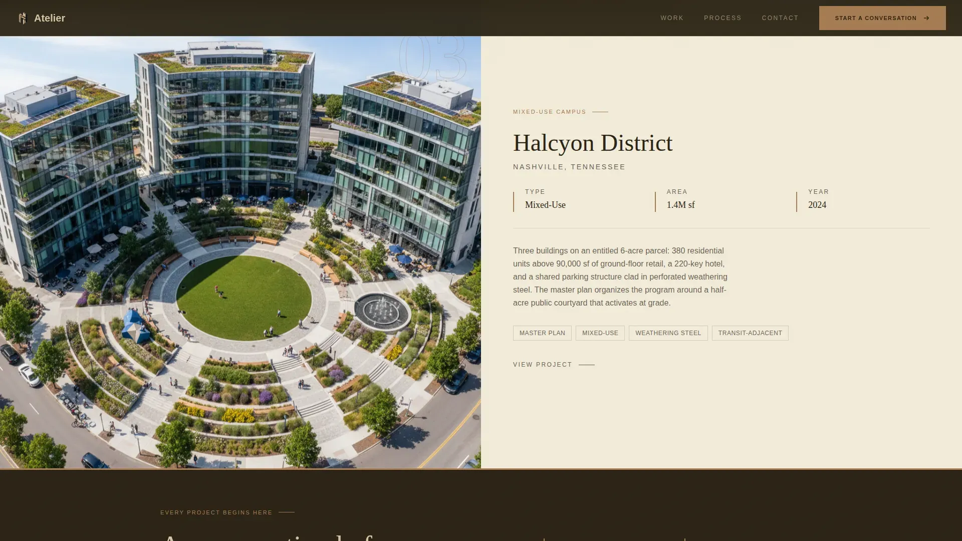
- Alternating 50/50 split-screen project sections that highlight building type, scope, and program details alongside project photography
- A dual-path lead capture section: a project dialogue form for ready buyers and a downloadable monograph for visitors still in the research phase
Feature list
This landing page template was designed around the key features that architecture studios actually need to generate leads from high-value customers.
Nine-Image Photo Grid Mosaic Header
The header is an asymmetric mosaic of nine precisely cropped architectural images. Details like board-formed concrete texture, aerial tower shots, and annotated section drawings sit alongside interior and construction photography. No single image dominates. Together, they communicate range and craft in seconds, answering the core landing page question: what does this studio do, and is it worth my time?
Alternating Split-Screen Project Sections
Each featured project uses a 50/50 split screen. Photography sits on one side; scope and program data sit on the other. As visitors scroll, the splits alternate sides, mimicking the experience of turning corners inside a building. Bronze divider bands separate each project section, adding rhythm and reinforcing material identity across the page.
Dual-Path Lead Capture Form
The primary form asks for project location, building type, approximate square footage via a range slider, and a free-text field. The form feels like the start of a design dialogue, not a sales funnel. A secondary path offers a downloadable project monograph PDF gated behind an email field, giving early-stage customers a valuable resource and the studio a way to build trust with the full audience.
Scroll-Linked Parallax and Clip-Path Animations
The page uses scroll-linked parallax movement and clip-path reveal animations to create the sensation of moving through a building. Scale shifts constantly across the page, from macro curtain wall details to full campus master plan views, keeping visitors engaged and reinforcing the studio's range.
Fixed Navigation with Primary Call to Action
The "Start a Conversation" call to action appears first after the third project section, then remains fixed in the navigation bar. This smart positioning ensures the clear call is always visible without interrupting the visual storytelling. Effective calls to action use specific, imperative language, and this placement keeps the invitation to engage in front of visitors at every stage of the scroll.
Social Proof Metrics Section
A dedicated scale and craft section highlights project scope data: square footage delivered, cities built in, and named building types. Social proof needs to be specific and strategic to build trust, and this section delivers exactly that. Displaying verifiable project data helps the studio position itself with confidence in front of developers and agencies evaluating multiple architecture firms.
Page sections overview
| Section | Purpose |
|---|---|
| Photo Grid Mosaic | Communicate portfolio range and studio craft through nine architectural image fragments |
| Split-Screen Projects | Alternate project photography with scope and program detail across three featured projects |
| Bronze Divider Band | Visually separate project sections and reinforce material identity with oxidized bronze |
| Start a Conversation | Primary lead generation call to action placed after the third project section |
| Scale and Craft | Highlight project scope metrics including square footage, building types, and cities |
| Lead Capture Form | Dual-path section with project dialogue form and gated monograph PDF download |
| Fixed Navigation Bar | Keep the primary call to action visible on scroll for continuous lead capture opportunity |
| Footer Arc Split | Logo and tagline left, navigation links right, in a clean Arc Browser Split pattern |
Design & branding system
The Warm Stone color system gives this landing page template a tactile, grounded identity that feels appropriate for an architecture studio working at civic and commercial scale. Typography pairs Fraunces, an editorial serif, with DM Sans, a functional sans-serif, creating contrast between headline presence and body clarity.
- Color palette: quarried limestone (#D5C4A1) for backgrounds, charred timber (#2C2416) for dark sections, shadowed travertine (#8B7D6B) for mid-tones, and oxidized bronze (#A67C52) reserved for hover states and section dividers
- Typography: Fraunces for display headings and editorial moments; DM Sans for body text, form labels, and navigation, ensuring usability across the full page
- Visual rhythm: generous gutters between mosaic images, alternating background tones across sections, and bronze reveal strips between project blocks create a page that feels spatially composed rather than assembled
Mobile & speed optimization
This landing page template is built desktop-first, reflecting how architecture clients typically review portfolio work on large monitors. The page remains fully responsive across tablet and mobile devices.
- Images are lazy-loaded to preserve speed across the full page, since fast loading speed is essential and a one-second delay can reduce conversions by 7%
- CSS scroll-driven animations are used where possible, reducing reliance on heavy JavaScript and keeping the page performant across devices
- The mosaic grid, split-screen sections, and form layout each adapt to smaller screens so the experience remains clear and the lead capture path stays complete
How this template helps you convert
A well-designed landing page template acts as a conversion engine, turning visitors into leads more effectively than ad-hoc designs. This template applies that principle to commercial architecture with three deliberate conversion mechanics.
- The hero mosaic answers the three essential landing page questions instantly: what is this studio, why should a developer care, and what is the value of reaching out? Compelling visual data replaces vague claims and captures attention within five seconds.
- The form is intentionally short. Using fewer fields reduces friction and increases the likelihood of conversion. The range slider for square footage and the open text prompt create a form that feels like the beginning of a strategic conversation, not a data extraction exercise.
- The monograph download gives early-stage visitors a valuable lead magnet, gathering email addresses from customers who are not yet ready to submit a full project inquiry. This secondary path expands the lead generation funnel without adding cost or complexity to the primary conversion flow.
Other information about this template
This page template was designed inside the Atelier Studio theme using the Spatial and Architectural creative direction. The landing page template supports the popularity of template-driven workflows among architecture designers who need to launch a compelling, optimized page without starting from scratch.
- Landing page templates streamline the design process and reduce development time and cost compared to building from scratch, making them smart tools for studios of any size
- AI-powered landing page builders automate content creation, layout, and optimization, and this template is structured to work within those workflows for teams that plan to iterate quickly
- Key features like A/B testing, analytics integration, and customization options are worth exploring alongside any landing page template tool; tracking and testing are essential for understanding what works and improving conversion rates over time
- A bad landing page can actively damage your business by signaling to Google that your site is not relevant, which can lower quality scores and increase ad costs, making a well-structured page template a smart long-term investment
- Companies with 31 to 40 landing pages generate seven times more leads than those with just 1 to 5, illustrating the growth value of building out a dedicated page strategy alongside this template
- Personalized calls to action can convert 202% better than generic ones, reinforcing why this template uses a tailored "Start a Conversation" prompt rather than a standard "Contact Us" button
- Professional certifications and design awards can be added to the page to establish authority, and incorporating testimonials or case study highlights builds additional confidence with prospective customers
- The template is localized for the United States market, using English copy and imperial measurements including square footage throughout all form fields and data displays
Theme
Atelier Studio
Creative direction
Spatial & Architectural
Color system
Warm Stone
Style
Split Screen (50/50)
Direction
Lead Generation
Page Sections
Nine-image Photo Grid Mosaic Header
Alternating Split-screen Project Sections
Dual-path Lead Capture Form
Scroll-linked Parallax Animations
Fixed Navigation with Primary Call to Action
Project Scope Metrics Display
Related questions
Who is this landing page template designed for?
What does the lead capture form include?
Can the template support both ready buyers and early-stage researchers?
How does the visual design reinforce the studio's credibility?
Is this a single landing page or a multi-page website?



