Interior Design Studio Cost Calculator Website Template
The Curate smart design cost comparison landing page template is built for interior design studios that lead with utility. A live Design Style Cost Calculator sits above the fold, followed by stacked glassmorphic comparison tables, vendor scorecards, and a sticky email-capture call to action. Aspiration meets transparency here: real renovation numbers, beautifully presented, before the first consultation.
by Rocket studio
Quick summary
The Curate template turns an interior design blog into a conversion engine. A live savings calculator greets every visitor above the fold, delivering real material costs, labor ranges, and timelines by room and style. Below it, glassmorphic versus cards stack into a powerful comparison page that rewards scrolling with increasingly specific, insider-grade renovation data.
Who this template is for
This template is purpose-built for interior design studios and renovation content publishers who want their landing pages to earn trust through utility rather than aesthetics alone. It suits any team publishing opinionated, data-led content and looking to grow an email subscriber base from high-intent readers.
- Homeowners mid-renovation who toggle between Pinterest boards and contractor quotes, needing a fast, trustworthy cost reference
- First-time buyers furnishing empty spaces on tight timelines who need a clear comparison page before committing to materials or vendors
- Design-curious renters and content studios seeking a visually engaging, tool-first format that converts casual browsers into sign ups
What problem this template solves
Most design blog landing pages ask visitors to trust a brand before proving any value. Readers arrive with urgent, specific questions about cost and quality, and they leave when the page gives them mood boards instead of numbers. This template solves that mismatch directly.
- Visitors get real cost data immediately, removing friction from the decision making process before the first scroll
- A structured comparison table layout makes feature differences instantly readable, ensuring users do not have to hunt for the information they need
- The sticky call to action bar and contextual email gates turn passive readers into subscribers without interrupting the content experience
What you get with this template
This template delivers a fully structured, single-page layout designed around three mutually reinforcing layers: an interactive tool, a cascade of comparison tables, and a conversion layer that collects leads without friction. Every section is built to serve a distinct role in guiding users toward the email form.
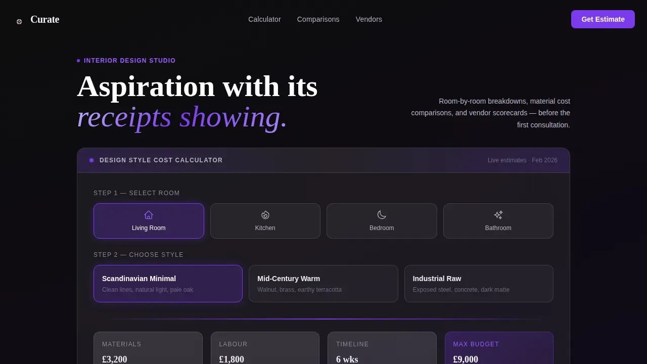
- An above-the-fold interactive Design Style Cost Calculator with animated number counters, room-type icons, and style-selection controls allowing users to generate personalized estimates in real time
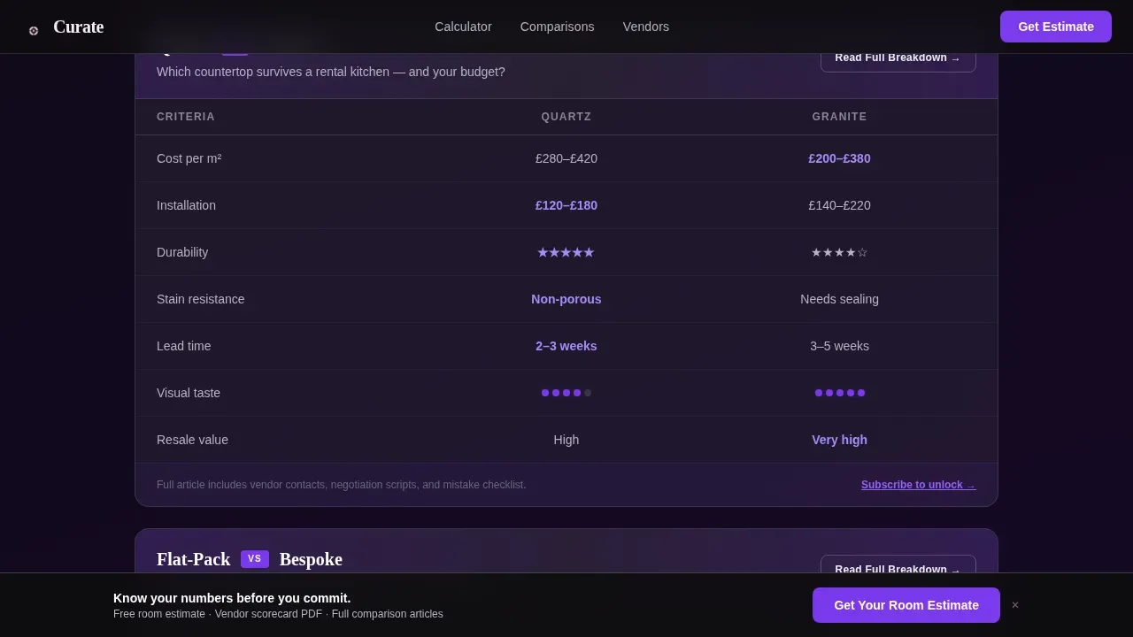
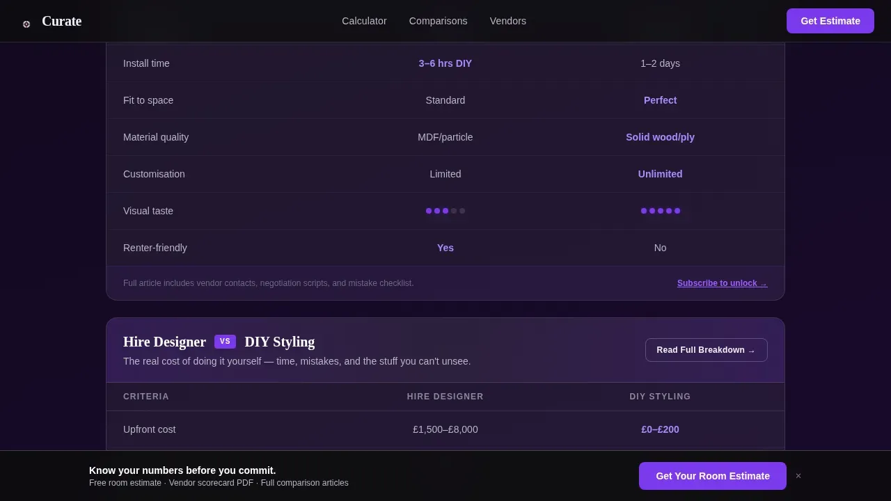
- A series of glassmorphic versus cards acting as a feature comparison table for material choices, build methods, and hiring decisions, each showing cost, durability, lead time, and taste rating
- A sticky frosted-glass call to action bar anchored at the bottom of the viewport plus a three-field email capture form, with contextual "Read the Full Breakdown" links threaded through each comparison section
Feature list
This template is constructed around five core capabilities drawn directly from the project brief. Each one serves the goal of making complex renovation data feel clear, credible, and visually compelling.
Live Design Style Cost Calculator
The calculator is the standout feature and the first thing every visitor sees. It presents two frosted-glass columns side by side, allowing users to pick a room type from an icon row and then select a design style. Estimated material costs, labor ranges, and timeline weeks populate in real time with ticker-style number animations. This savings calculator approach proves the blog's value within five seconds of arrival, functioning as a high-converting pricing page equivalent for renovation planning content.
Glassmorphic Versus Comparison Cards
Below the calculator, the page shifts into a stacked sequence of versus cards. Each card is an excellent example of a feature comparison table built for high stakes environments: material choices like quartz versus granite, build methods like flat-pack versus bespoke shelving, and approach decisions like hiring a designer versus do-it-yourself styling. Every card presents cost, durability, lead time, and a visual taste rating in a side by side comparison format inside glassmorphic containers that brighten on hover. A clear visual hierarchy guides the user's eye across each row, with smooth transitions keeping the experience visually engaging as visitors scroll deeper.
Vendor Scorecard Section
Insider vendor ratings sit within the comparison flow, adding a layer of social proof that competitor comparison landing pages rely on to build credibility. Each scorecard uses concise descriptions and structured feature lists to deliver cost, durability, and lead time data in a card based layout. This section draws attention to the blog's editorial authority and reinforces the value proposition that readers receive privileged information unavailable from generic renovation guides.
Sticky Conversion Bar with Email Gate
A frosted-glass sticky header bar anchors the primary call to action at the bottom of every viewport position. The three-field form requests room type, approximate square footage, and email address, keeping the ask minimal and the path to sign ups frictionless. Strategic cta placement ensures the call to action is always visible without interrupting the reading experience. Contextual "Read the Full Breakdown" links woven through each comparison section create a secondary conversion path, gating deep-dive articles behind a free email subscription.
Social Proof Stat Strip
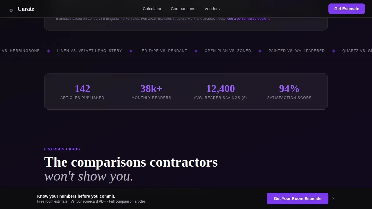
A reader stat strip carries concrete engagement numbers: articles published, average reader savings, and total readers. These figures function as customer testimonials in aggregate form, reinforcing trust at the moment potential customers are deciding whether to subscribe. Incorporating social proof at this point in the scroll mirrors best practices seen in high converting landing pages across content-driven industries.
Page sections overview
| Section | Purpose |
|---|---|
| Cost Calculator Hero | Delivers personalized room cost estimates above the fold via interactive tool |
| Versus Comparison Cards | Stacked material and approach comparisons with hover-activated glassmorphic detail |
| Vendor Scorecard Strip | Insider ratings for materials and suppliers with structured data rows |
| Social Proof Stats | Reader engagement numbers reinforcing editorial credibility and trust |
| Sticky Email Gate | Persistent call to action bar plus three-field subscription form |
| Page Footer | Horizontal flow footer with navigation and brand information |
Design & branding system
The visual identity follows a Glassmorphic Startup Velocity direction, combining frosted translucency with deep, rich backgrounds to create a feeling that sits between editorial luxury and digital precision. Every element is designed to feel weightless yet structured, like a glass desk in a loft studio at dusk. This pricing page design approach creates a strong visual hierarchy while maintaining the visual appeal of a premium editorial product.
- Color palette: obsidian black (#0D0D0D) backgrounds, frosted white (#FFFFFFB3) card surfaces, lavender-gray (#B8B5C5) for body text and secondary labels, and electric violet (#7C3AED) reserved for interactive states, hover glows, and active tool borders
- Typography: Fraunces serif display for headlines paired with DM Sans for body text, creating a pairing where aspiration meets utility and the professional tone stays warm rather than corporate
- Glassmorphic card treatment: 12px blur, 1px luminous borders, gradient backgrounds shifting from charcoal to deep plum, with ample white space inside each card ensuring users can scan content without visual fatigue
Mobile & speed optimization
The template is designed desktop-first, reflecting the reality that many users in this audience toggle between contractor quotes and reference material on larger screens late at night. Solid mobile support is built into the layout so the experience remains effective across all device sizes without sacrificing the visual consistency that defines the glassmorphic style.
- The sticky call to action bar and call to action buttons are sized for ease of use on mobile devices, with thumb-friendly tap targets ensuring users can convert without pinching or zooming
- The comparison table layout reflows cleanly for smaller screens, ensuring users on mobile can still read each side by side comparison with the same clarity as on desktop
- Client-side interactive components, including the calculator and hover states, are scoped to preserve rendering performance, while server-rendered static sections keep initial view load times efficient
How this template helps you convert
A compelling comparison page works because it removes uncertainty before asking for a commitment. The Curate template applies that logic to renovation content, ensuring users have already seen the blog think harder about their project than they have by the time the email form appears. The result is a genuinely high converting pricing page equivalent for design content: every section earns the next call to action.
- The calculator delivers immediate, personalized value above the fold, so potential customers experience the blog's depth within seconds rather than reading promises about it; this mirrors the above-the-fold clarity principle that places the primary value proposition and main call to action in the initial view without requiring a scroll
- Stacked versus cards and vendor scorecards build trust progressively as visitors scroll, with each comparison table revealing more specific data and guiding users toward the email gate naturally; social proof from the stat strip reinforces credibility at exactly the right moment in the decision making process, functioning the way customer testimonials and client logos function on high converting landing pages in software and services industries
Other information about this template
The Curate template occupies a position in the market that many design studios have not yet claimed: a comparison page that leads with a savings calculator and earns subscriptions through utility rather than persuasion alone. The following points address common questions about scope, cost considerations, and how the template fits into broader publishing and platform strategies.
- When evaluating costs for a curated landing page template, you are paying for conversion-focused design, ease of use, and integration capabilities; high-end templates in this category cost between $500 and $3,000 or more and are pre-vetted for high performance, reducing the need for extensive design work from scratch
- Mid-range templates cost between $50 and $300 per month and are typically curated templates with hosting and analytics included; basic templates from generic marketplaces cost between $0 and $50 but require significant customization effort to reach the same visual and functional standard as a purpose-built layout like this one
- Stock image and asset libraries in premium templates can save on content creation costs, and premium templates often come with video tutorials or maintenance update resources that reduce ongoing effort for the publishing team
- Key strategies for making the most of a cost-effective landing page template include using drag-and-drop builders and optimizing for mobile-first design; the best landing page builder environment for this template is one that supports client-side component rendering for the interactive calculator alongside server-side rendering for static content sections
- Platforms that allow for A/B testing, such as Unbounce or Instapage, can be paired with this template's design principles to test pricing page design variations, compare call to action button copy, or evaluate different elements of the comparison table layout against one another
- Competitor comparison landing pages are particularly effective in industries where multiple companies offer similar products or services, and this template's structure translates cleanly into saas comparison contexts, competitor comparison pages for software tools, and any saas companies looking to present feature differences in a visually engaging format
- Creating competitor comparison pages from this template gives design studios and digital publishers a modern layout that highlights customer testimonials, feature lists, and pricing structures in a way that is honest, transparent, and regularly updatable as market trends shift
- The visual hierarchy, visual cues, and card based layout principles embedded in this template reflect conversion rate optimization best practices: using size, color, and spacing effectively creates a strong visual hierarchy that guides the user's eye toward the conversion point; a one-second delay in loading time can reduce conversions by 7 percent, so ensuring users receive fast initial view rendering is important for any page built on this structure
- Authentic social proof such as customer testimonials, client logos, or reader stat figures enhances credibility; the template's social proof strip is designed to carry those signals at the moment potential customers are closest to subscribing
- Pricing strategies embedded in the template's structure, including progressive disclosure and a prominent free plan entry point via the email gate, reflect patterns common to high converting pricing pages across both editorial and software publishing contexts; effective pricing communication here means showing real numbers upfront rather than hiding costs behind a sales call
- Eliminating navigation elements from the main page body helps maintain the user's focus on a single goal, reducing cognitive load and keeping call to action buttons prominent; strategic placement of the sticky bar ensures the primary call to action remains visible across multiple points in the scroll journey
- Automated workflows for email delivery and subscriber management can be connected to the three-field form once the template is deployed within a compatible publishing environment; the template itself defines the front-end capture experience and layout, not the back-end processing
- The "Above the Fold" rule is applied directly in this template: the primary value proposition and main call to action appear in the initial view without requiring a scroll, ensuring that even visitors who leave quickly have already seen the core offer
Theme
Startup Velocity
Creative direction
Calculator/Tool First
Color system
Glassmorphic
Direction
Comparison/Versus
Page Sections
Interactive Design Style Cost Calculator
Glassmorphic Versus Comparison Cards
Vendor Scorecard Section
Sticky Conversion Bar and Email Gate
Social Proof Reader Stat Strip
Progressive Scroll Reveal Layout
Related questions
What kind of content works best inside the comparison table sections?
Can the Design Style Cost Calculator be updated with new room types or style options?
Does this template include social proof elements out of the box?
Is this template suitable for a saas comparison or software pricing context?
How does the sticky email capture bar work alongside the comparison content?



