Parametric Design Studio Landing Page Template
This algorithmic parametric computational design studio landing page template is built for firms that write the tools that draw the buildings. A reverse-chronology masonry scroll takes visitors from realized built works back to raw code, using warm atelier colors, staggered tile reveals, and a floating lead-capture form that never interrupts the design narrative.
by Rocket studio
Quick summary
This landing page template gives a computational design firm a monograph-quality presence online. The scroll moves backward through creation itself, from finished façades to blank script editors, letting the process speak louder than any pitch deck. Warm paper whites, graphite typography, and a single cerulean accent create a space that feels like an architect's desk at golden hour.
Who this template is for
This template is built for practices where computation and craft are inseparable. It speaks clearly to designers who work at the intersection of code and construction.
- Architecture studios in competition phase needing parametric facade design and complex tower geometry
- Fabricators who translate Grasshopper definitions into CNC toolpaths and need to display that capability confidently
- Cultural institutions and pavilion commissioners looking to explore geometry that pushes building boundaries
What problem this template solves
Most portfolio websites treat process as a footnote. They lead with polished images and bury the logic, algorithms, and parametric models that actually made the work possible. That silence costs trust with technically sophisticated clients who want to see how, not just what.
- Clients from competition-stage studios need evidence of computational methods, not just renders
- Fabricators assessing a partner need to see the full workflow, from parameters to fabrication-ready output
- Institutions commissioning art-engineering pavilions want to feel the ideas before they commission the work
What you get with this template
This template delivers a fully structured landing page built around a reverse-chronology masonry scroll. Every section is designed to create a sense of increasing intimacy, pulling visitors deeper into the design process with each row.
- A full-bleed hero with a two-second delayed caption reveal using a slideInBlur animation
- A CSS-only masonry column system with IntersectionObserver stagger reveals and lazy-loaded images
- A floating cerulean pill call-to-action and a minimal overlay form gated by project stage, timeline, and email
Feature list
This template includes purpose-built features for computational design firms. Each element supports both visual storytelling and lead generation without one undermining the other.
Reverse-Chronology Masonry Scroll
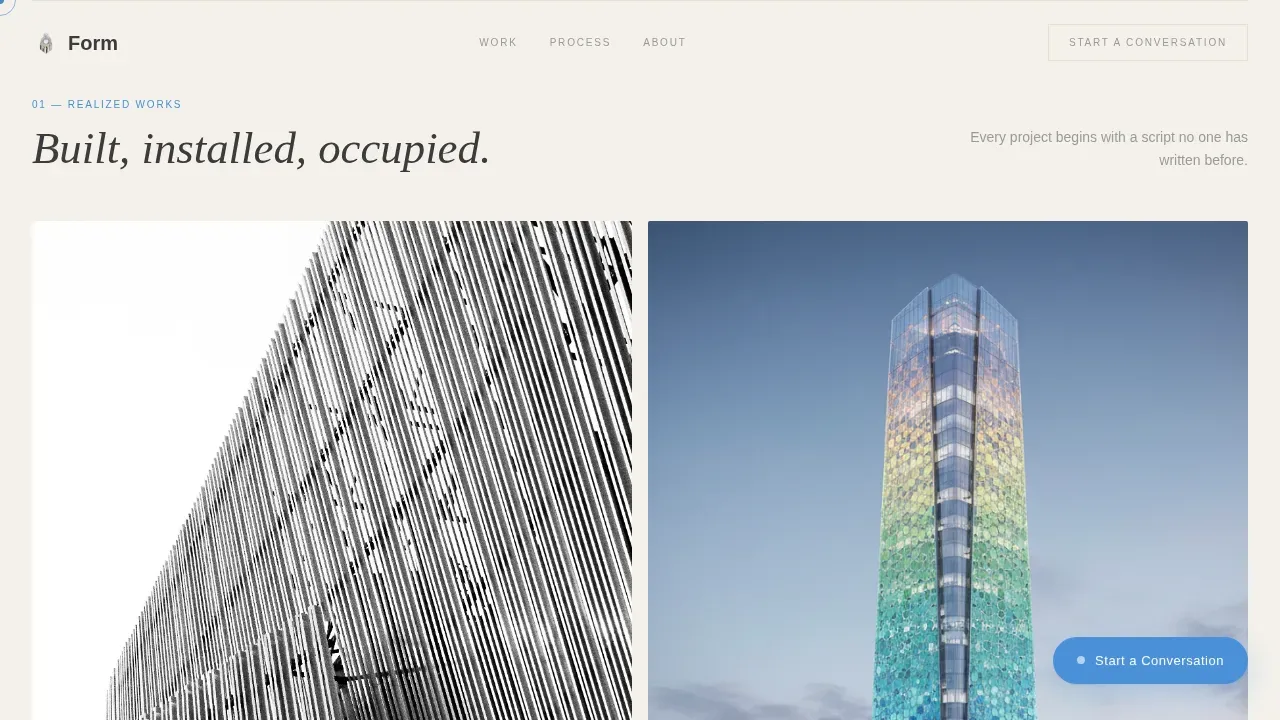
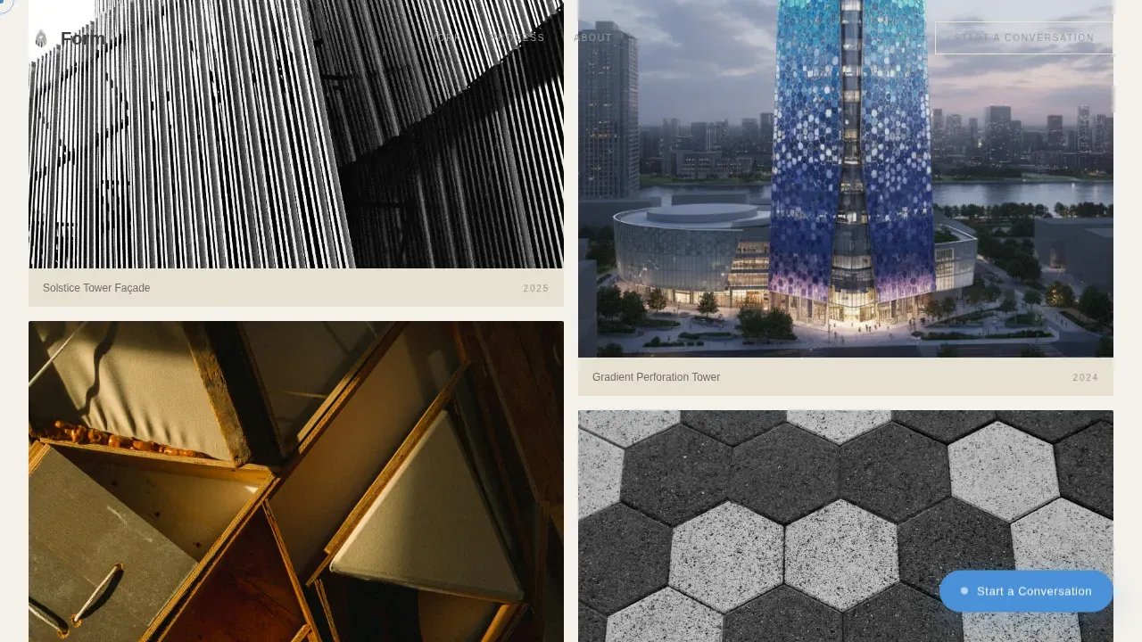
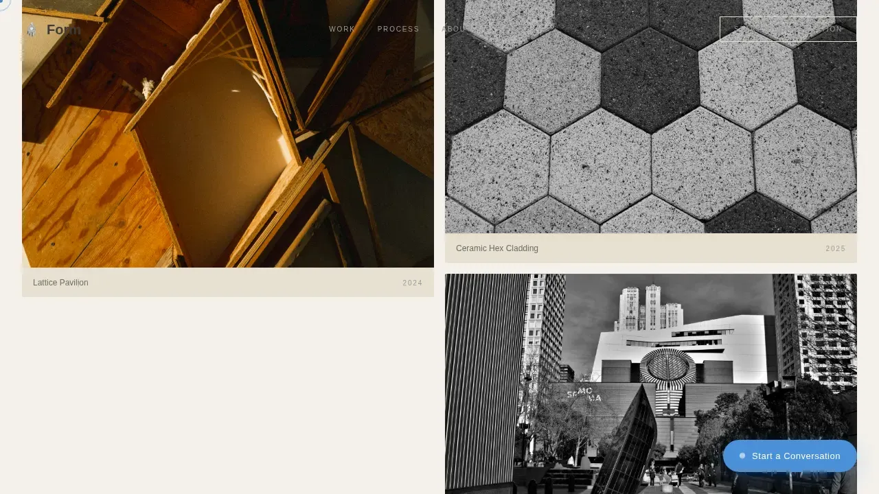
The page opens with large masonry tiles showing realized works, then shifts to medium process-artifact tiles, then small multiplying tiles of raw Rhino wireframes and failed iterations. The final tile is full-width: a blank script editor with a blinking cursor. This system rewards curiosity and builds trust through increasing intimacy. Computational design logic is visible at every scroll depth.
Floating Lead-Capture Form
A soft cerulean pill button floats in the bottom-right corner throughout the entire session. Clicking it opens a minimal overlay form. The first field is an open textarea asking visitors to describe what they are trying to make. Project stage, timeline, and email follow. No phone field, no budget dropdown. The form mirrors how designers actually talk to each other, reducing friction and improving conversion performance.
PDF Case Study Download Gate
Any project tile can trigger a secondary conversion path. Visitors who are not ready to commission but want to study the design process can download a PDF case study by providing their email only. This captures leads at an earlier stage and keeps the metrics pipeline full without requiring a hard sell.
SlideInBlur Hero Animation
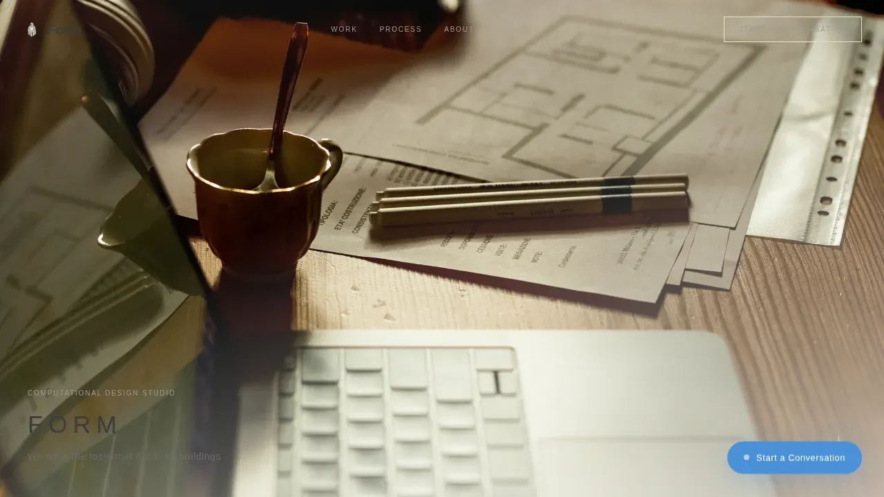
The hero is a full-bleed photo shot from above across the studio worktable. Physical models, a live computational canvas, and a hand holding a mechanical pencil over a plotted Voronoi diagram fill the frame. For the first two seconds, no headline appears. Then the firm name and tagline slide in with a blur-resolve animation, bottom-left, letter-spaced wide, like a caption in a monograph. The angle and timing are deliberate design decisions.
Cerulean Cursor Trail and Active States
The accent color, cerulean computation blue at hex 4A90D9, appears only in links, cursor trails, and active interface states. Every instance feels intentional. The cursor trail is the single most immersive element on the page. It signals that this is not a static brochure but a living design environment, setting the right tone for a practice that prizes real time responsiveness.
Tile Hover PDF Interaction
Hovering over any project tile in the masonry grid reveals a subtle overlay that invites the visitor to download a related case study. The interaction is lightweight and does not interrupt the scroll rhythm. It gives visitors a reason to linger on each tile, increasing time on page and surfacing the depth of the firm's design workflows without forcing a separate gallery page.
Page sections overview
| Section | Purpose |
|---|---|
| Full-Bleed Hero | Establishes studio atmosphere and delayed brand reveal |
| Realized Works Tiles | Displays finished façades, pavilions, and occupied interiors |
| Process Artifacts Grid | Shifts to algorithm flowcharts, slider studies, and plot drawings |
| Raw Computational Sketches | Multiplying small tiles of wireframes and failed iterations |
| Origin Script Editor | Full-width blinking cursor tile that closes the narrative loop |
| Floating call to action Pill | Persistent lead capture without interrupting scroll |
| Overlay Contact Form | Minimal form optimized for designer-to-designer communication |
| Footer | Horizontal flow pattern with minimal contact and social links |
Design & branding system
The visual identity follows an Atelier Studio theme built on the Cloud Canvas color system. The palette feels like trace paper layered over trace paper under a north-facing window, with one glowing screen among analog tools.
- Colors: warm paper white at hex F4F1EB, graphite pencil at hex 3B3B3B, drafting-vellum cream at hex E8E0D0, and cerulean computation blue at hex 4A90D9 reserved for links, cursor trails, and active states
- Typography: Fraunces serif for headlines and DM Sans for body and interface text, creating a system that feels like a well-set monograph
- Texture and space: backgrounds stay in warm whites and creams, generous whitespace separates tiles, and soft shadows inspired by natural light keep every element readable and calm
Mobile & speed optimization
The template is built desktop-first, reflecting how architecture studios and fabricators review work on large monitors. It scales responsively to tablet viewports without breaking the masonry logic.
- Images are lazy-loaded using IntersectionObserver, so the page starts loading quickly without waiting for the full masonry grid to resolve
- CSS-only masonry columns remove JavaScript layout dependencies, keeping the render path efficient and reducing potential errors on lower-powered devices
- Animations use CSS transitions and IntersectionObserver triggers rather than heavy JavaScript libraries, keeping the experience responsive across session types
How this template helps you convert
This template treats conversion as a byproduct of trust, not pressure. Visitors who scroll deeply are self-selecting as serious prospects, and the page is structured to meet them at the right moment.
- The reverse-chronology scroll creates an emotional arc that moves visitors from admiration to curiosity to genuine interest in the process, making the "Start a Conversation" action feel like a natural next step rather than an interruption.
- The dual conversion paths, the overlay form for ready commissioners and the email-gated PDF for researchers, optimize for leads at different stages without creating a cluttered or confusing page experience.
Other information about this template
This template is well suited for practices that want to introduce students, interns, or junior collaborators to the firm's computational logic through the same public-facing narrative that clients see. The reverse-chronology format is an education tool as much as a marketing one.
- The design process shown here follows a clear logic: parameters feed algorithms, algorithms generate geometry, geometry is optimized against environmental conditions, and output moves to fabrication. This flow is visible in the tile narrative without needing an explicit diagram.
- Computational design faces real challenges: balancing creativity and computation is difficult, parametric models can make small adjustments costly, and translating computational designs to buildable reality requires careful workflows. This template acknowledges that depth by showing process artifacts and failed iterations alongside finished work, building credibility through honesty rather than polish.
- Environmental analysis data, solar studies, and circulation metrics can be displayed directly in process-artifact tiles, letting the page serve as a live demonstration of how the firm uses environmental analysis to drive parametric facade design decisions.
- Large infrastructure, commercial building projects, and cultural pavilions all benefit from parametric design methods. This template is structured to showcase that range without forcing a single project type into the hero position.
- Parametric software expertise, including tools like Grasshopper for Rhino, can be surfaced naturally in tile captions and case study downloads rather than in a static skills list, keeping the page feel like a monograph rather than a resume.
- The template supports adaptability over time. Swapping tile content, adjusting caption text, or updating the PDF case studies requires no structural changes to the page. Designers can manipulate the content layer without touching the layout system.
- Future-facing practices that want to demonstrate how they generate design variations rapidly and how computation bridges design to fabrication will find this template structured to make that story legible to both technical and non-technical clients.
Theme
Atelier Studio
Creative direction
Origin Story
Color system
Cloud Canvas
Style
Masonry/Pinterest
Direction
Lead Generation
Page Sections
Reverse-chronology Masonry Scroll System
Floating Call to Action with Minimal Overlay Form
Tile-level PDF Lead Capture
Slideinblur Hero with Delayed Caption
Cerulean Cursor Trail and Active State System
Intersectionobserver Stagger Reveals
Related questions
Who is this landing page template designed for?
Can I use this template to showcase multiple types of building projects?
How does the contact form work for lead generation?
Is this template suitable for a firm that wants to introduce students to computational design?
What happens when a visitor clicks a project tile?



