New Construction Mortgage Broker Landing Page
Blueprint is a split-screen landing page template built for new construction mortgage brokers. It walks visitors through a real loan journey using a Before/After slider, scroll-driven case study, and a two-step lead capture form. Every section builds trust by showing the complexity of construction-to-permanent financing and positioning the broker as the expert who handles all of it.
by Rocket studio
Quick summary
Blueprint is a single-page mortgage brokerage template designed for the new construction financing market. It opens with a draggable Before/After slider, then guides visitors through a scroll-driven case study that follows one real deal from raw lot to certificate of occupancy. Two conversion paths capture leads at every stage of buyer readiness.
Who this template is for
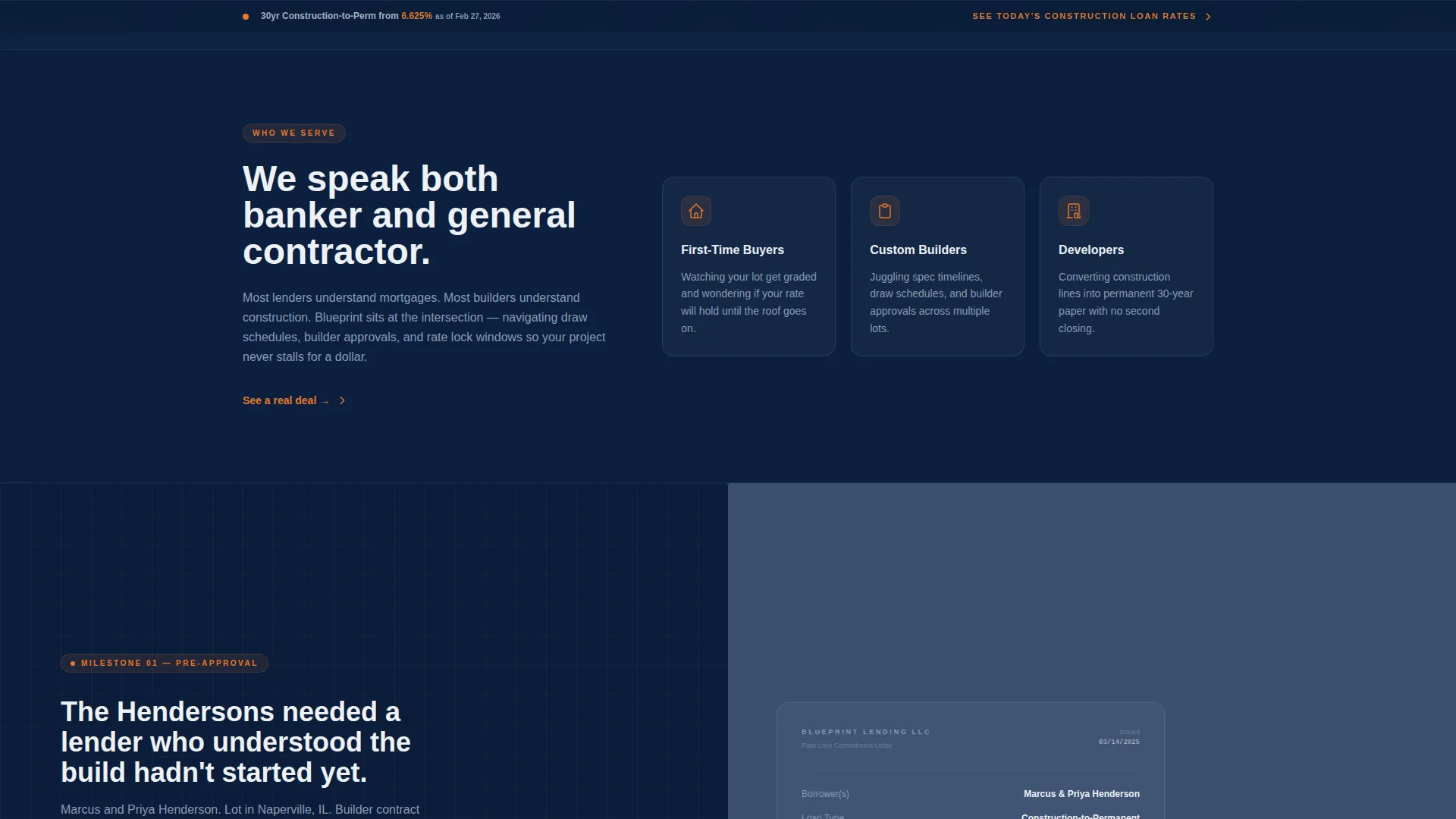
This template is built for mortgage brokers who specialize in new construction lending. It speaks directly to clients who need someone fluent in both construction timelines and permanent financing terms.
- First-time buyers financing a custom home build from the ground up
- Custom-home builders and developers managing spec timelines and construction draw schedules
- Mortgage brokers who handle construction-to-permanent loan conversions and builder approvals
What problem this template solves
Most mortgage landing pages treat every loan the same. New construction financing is a different process entirely, with draw schedules, rate lock windows, builder approvals, and a two-closing risk that standard pages never address.
- Buyers struggle to find a broker who understands both the construction phase and the permanent loan conversion
- Generic mortgage pages fail to show the real complexity, so prospects underestimate the value of specialist help
- Brokers lose leads because their site does not demonstrate expertise before the first conversation
What you get with this template
Blueprint gives you a fully structured, single-page layout designed to earn trust before asking for a commitment. Every section is purpose-built for the new construction mortgage niche.
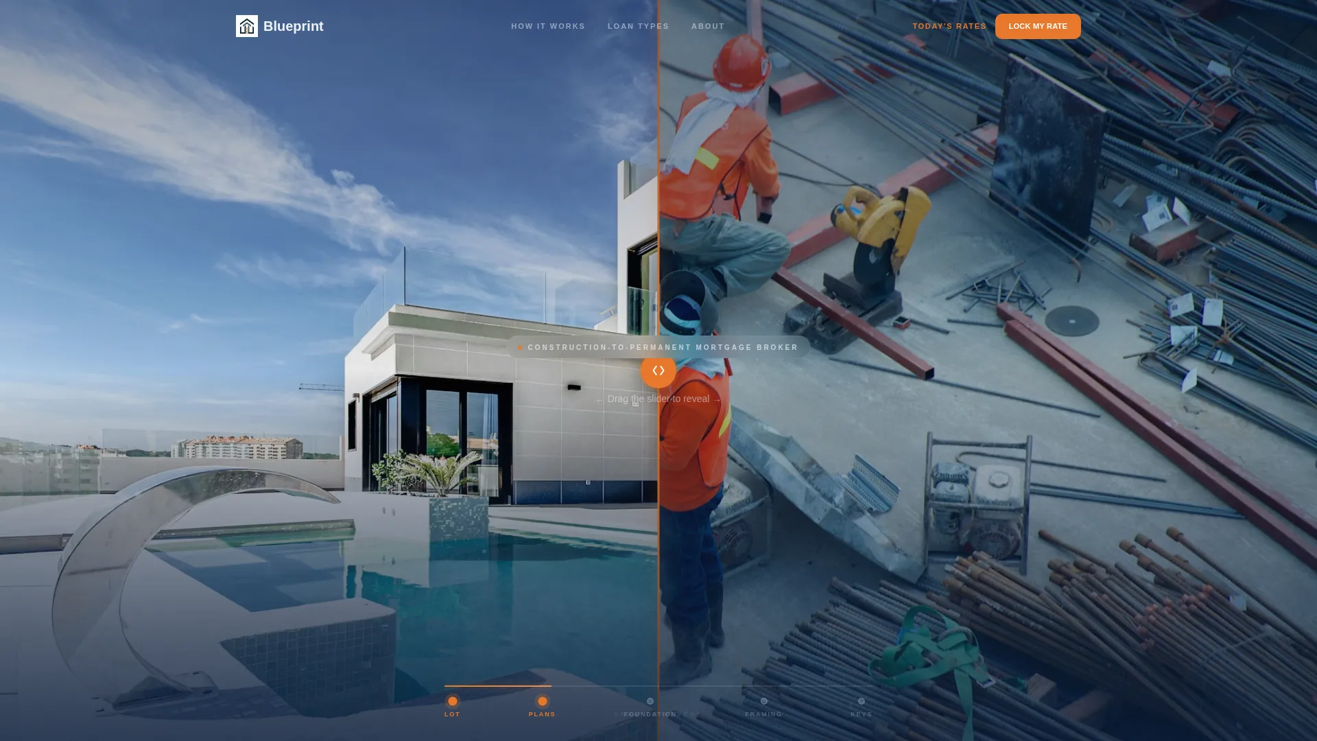
- A draggable Before/After header slider showing a cleared lot transforming into a finished home
- A scroll-driven case study with three milestone sections, a progress bar, and repeated inline calls to action
- Two lead capture paths: a two-step inline application form and a sticky rate-table bar for comparison shoppers
Feature list
Blueprint delivers a focused set of components that work together to move a hesitant construction loan prospect toward a confident first step.
Before/After Header Slider
The header uses a 50/50 split-screen slider. The left panel shows a drone-angle photo of a cleared lot with survey stakes and construction fence. The right panel reveals the finished home from the identical vantage point, landscaped and lit at dusk. Visitors drag the divider themselves, and a headline types itself across the seam as the finished home comes into view.
Scroll-Driven Case Study
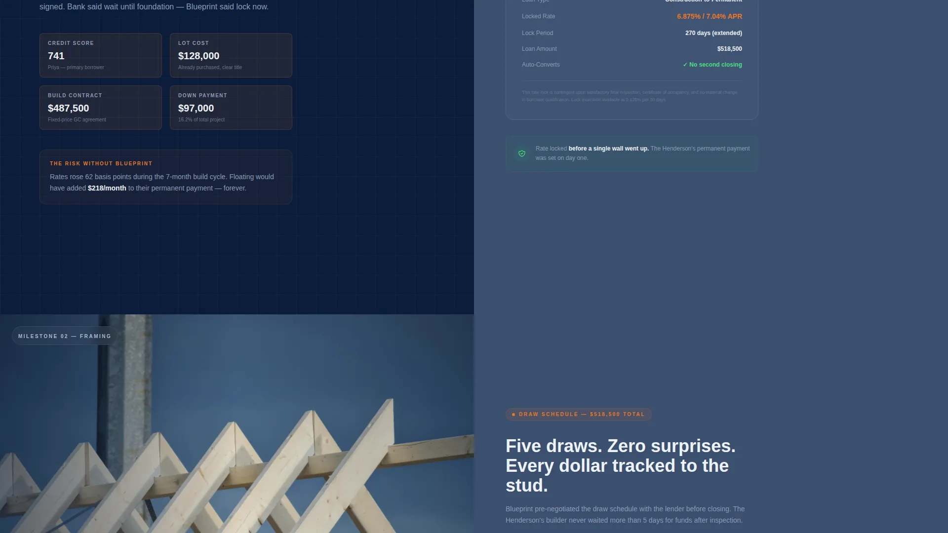
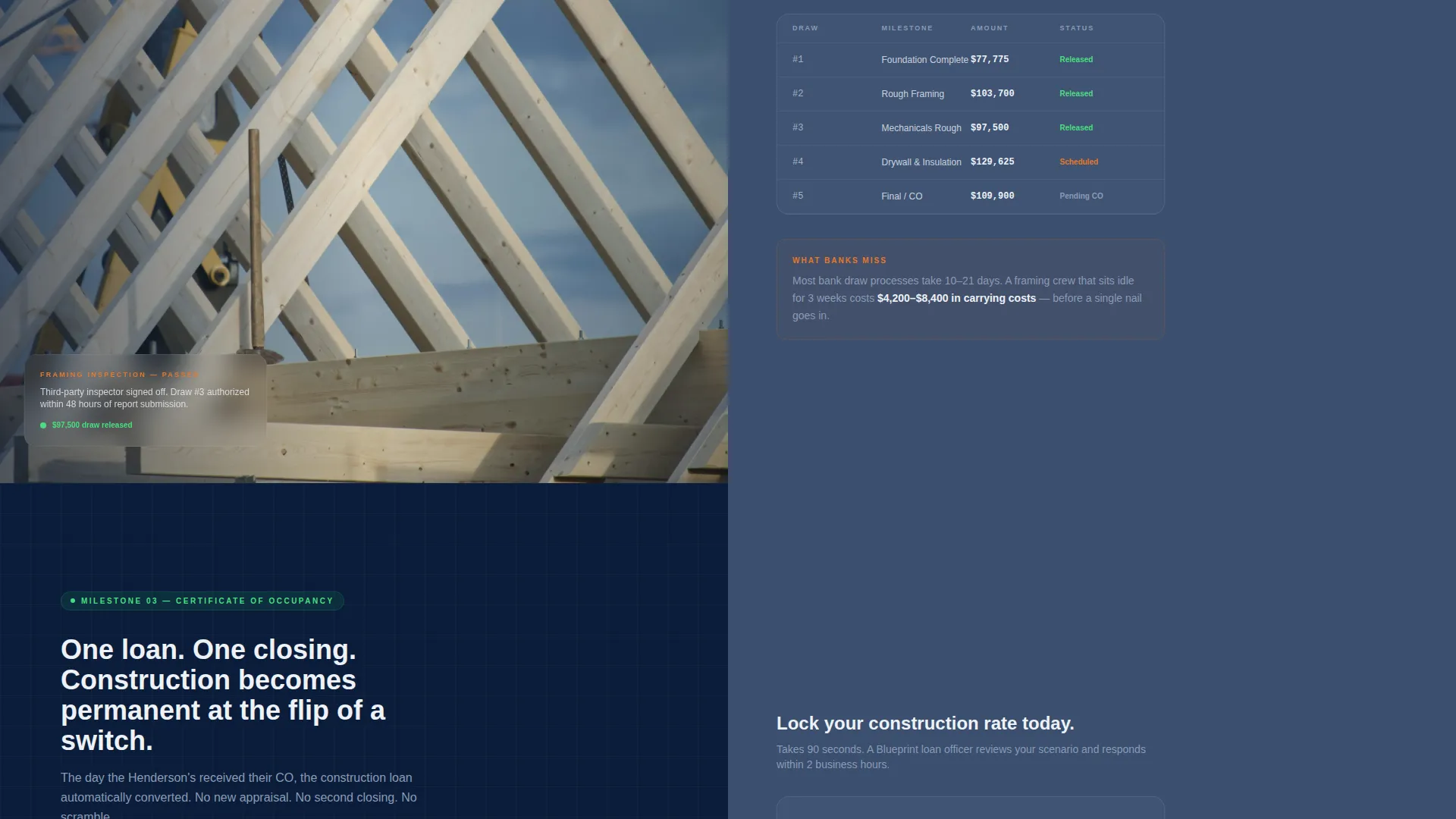
Three sequential sections follow one real transaction from pre-approval to final draw. Each section pairs a document or photo on one panel with the corresponding financing milestone on the other. A progress bar advances from "Lot" to "Keys" as the visitor scrolls, showing every stage where the deal could have failed and how each one was navigated.
Two-Step Inline Lead Form
The primary call to action opens a two-step inline form. Step one collects property zip code, estimated build cost, and current build stage. Step two asks for credit score range, down payment amount, and preferred contact method. The form appears first after the slider interaction and repeats after each case study milestone.
Sticky Rate Comparison Bar
A persistent bottom bar reads "See Today's Construction Loan Rates" and anchors to a live rate table section. Visitors who are not ready to apply can unlock specific rate numbers by entering only their email address. This captures comparison-stage leads without requiring a full application.
Surveyor Orange Accent System
The template reserves its single accent color strictly for calls to action, rate callouts, and the case study progress indicator. This creates a clear visual hierarchy where every orange element signals an action or a number worth noting, making the conversion path unmistakable at a glance.
Page sections overview
| Section | Purpose |
|---|---|
| Before/After Slider Header | Dramatizes the lot-to-home transformation and introduces the broker's core promise |
| Typed Headline Overlay | Reinforces the financing continuity message at the moment of slider engagement |
| Case Study: Pre-Approval | Shows real client numbers alongside the rate lock letter to establish credibility |
| Case Study: Framing Draw | Pairs a framing inspection photo with the draw schedule to demonstrate process fluency |
| Case Study: CO Conversion | Matches the certificate of occupancy with the permanent loan conversion terms |
| Scroll Progress Bar | Tracks deal stages from lot to keys, compounding stakes as the visitor scrolls |
| Two-Step Application Form | Captures qualified leads at three points along the case study scroll |
| Live Rate Table | Unlocks specific construction loan rates in exchange for an email address |
| Sticky Bottom Bar | Keeps the rate comparison path accessible without interrupting the main scroll |
Design & branding system
The visual identity follows a Corporate Precision theme. The palette is built around deep charter navy, polished slate, blueprint white, and a single surveyor orange accent. The overall effect is authoritative and meticulous, like a leather portfolio opened under a halogen desk light.
- Deep charter navy (#0B1D3A) anchors headers and hero backgrounds; polished slate (#3A4F6F) fills secondary panels; blueprint white (#EDF1F7) floods content areas
- Surveyor orange (#E8772A) appears exclusively on calls to action, rate callouts, and the scroll progress indicator, never as decoration
- No stock photography is used in the header; the specificity of survey stakes, a portable toilet, and a construction fence signals real transactions, not renderings
Mobile & speed optimization
The split-screen layout and slider interaction are structured to remain usable on smaller screens. The sticky bottom bar and inline forms maintain their function across device sizes.
- The 50/50 split-screen panels adapt to vertical stacking on mobile without losing the Before/After interaction logic
- The sticky rate bar remains anchored at the bottom of the viewport on all screen sizes, keeping the secondary conversion path always accessible
- The two-step form flow is compact by design, reducing friction on mobile by spreading fields across two short steps rather than one long form
How this template helps you convert
Blueprint does not ask for trust before earning it. The page builds a case over the course of a single scroll, then places a conversion option at every natural stopping point.
- The slider interaction creates an emotional hook before any copy is read, making the broker's value felt before it is explained.
- The case study shows a real deal's failure points and how each one was handled, making the broker's fee feel like protection rather than a cost.
- Two conversion paths serve two buyer types: the ready applicant gets the inline form, and the comparison shopper gets the rate table, so no lead leaves without a next step.
Other information about this template
Blueprint is designed as a standalone landing page for new construction mortgage brokerages. It is built for a niche where trust is hard to establish and the sales cycle is longer than a standard purchase mortgage.
- The template is suited to the new construction real estate category, including appraisal-adjacent services that need to demonstrate process knowledge before a client call
- The Corporate Precision theme and Midnight Blue color system make it appropriate for brokers serving developers and institutional buyers alongside individual homeowners
- The page's narrative structure, anchored by the case study and progress bar, is designed to work without ongoing content updates; the deal story does the selling
- The two-step form is intentionally split to reduce drop-off: a zip code and build stage feel low-stakes, making it easier for a hesitant prospect to complete step one before seeing the financial questions in step two
Theme
Executive Suite
Creative direction
Immersive Visual
Color system
Cloud Canvas
Style
Full-Width Immersive
Direction
Click-Through
Page Sections
Before/after Slider Header
Scroll-driven Case Study
Two-step Inline Lead Form
Sticky Rate Comparison Bar
Surveyor Orange Accent System
Corporate Precision Color Palette
Related questions
What type of mortgage business is this template built for?
Can I use this template without a completed case study?
How does the two-step lead form work?
What is the sticky rate bar and who is it for?
Is this template suitable for developers and builders, not just individual buyers?



