Complete Local Brick & Mortar Business Professional Website Template
Bodega is a vibrant convenience store landing page template built around a playful geometric visual identity and a warm sunset gradient palette. It features a full-bleed entrance photo, an interactive before-and-after reveal narrative, and a five-question personalized quiz that turns casual visitors into loyal regulars. It is ideal for local corner stores wanting a bold, character-driven online presence.
by Rocket studio
Quick summary
Bodega is a single-page convenience store landing page template with real personality. It pairs a full-bleed storefront photo with a scrolling before-and-after reveal and a five-question quiz that delivers a personalized product bundle. The design uses a sunset gradient palette and playful geometric shapes to capture the warm, chaotic charm of a real neighborhood corner store.
Who this template is for
This template is built for local convenience store owners who want an online presence that feels as alive as their physical shop. It suits anyone trying to turn walk-in regulars into online followers and new visitors into loyal customers.
- Independent corner store and bodega owners looking to go digital
- Small retail operators who want a bold, personality-driven landing page
- Local brick-and-mortar businesses promoting weekly deals and in-store finds
What problem this template solves
Most convenience store websites feel flat, generic, and completely disconnected from the real in-store experience. They fail to communicate the warmth, the quirk, and the neighborhood familiarity that keeps customers coming back every day.
- Generic retail templates strip away the character that makes a local store special
- Standard contact pages and product lists do not build emotional connection or loyalty
- No clear call-to-action means visitors leave without engaging or sharing their details
What you get with this template
You get a fully designed, section-led landing page that captures the energy of a real bodega from the first scroll to the final click. Every section has a specific job, and together they move a casual browser toward a personal connection with your store.
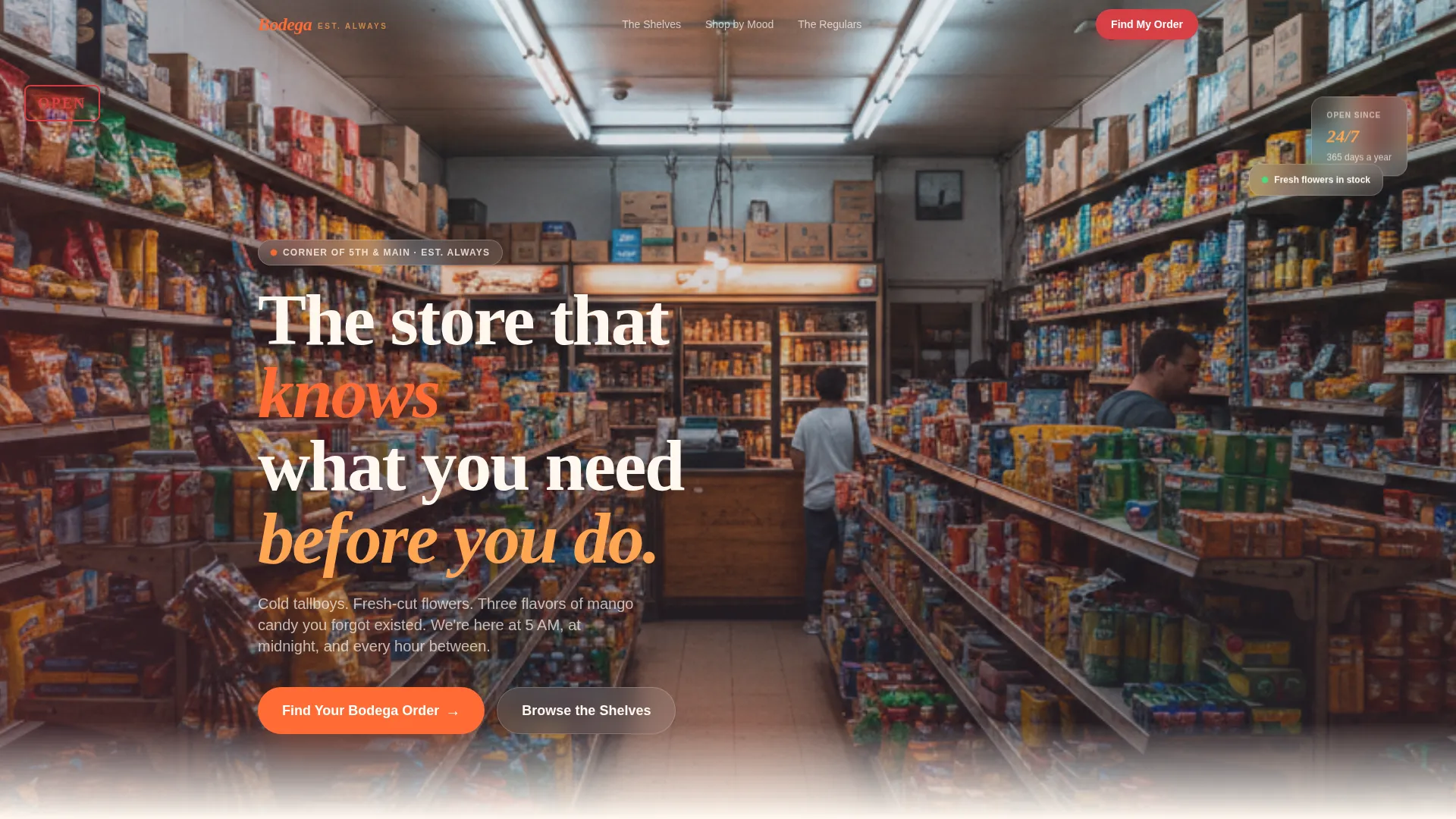
- A full-bleed entrance photo header that drops visitors straight into the store atmosphere
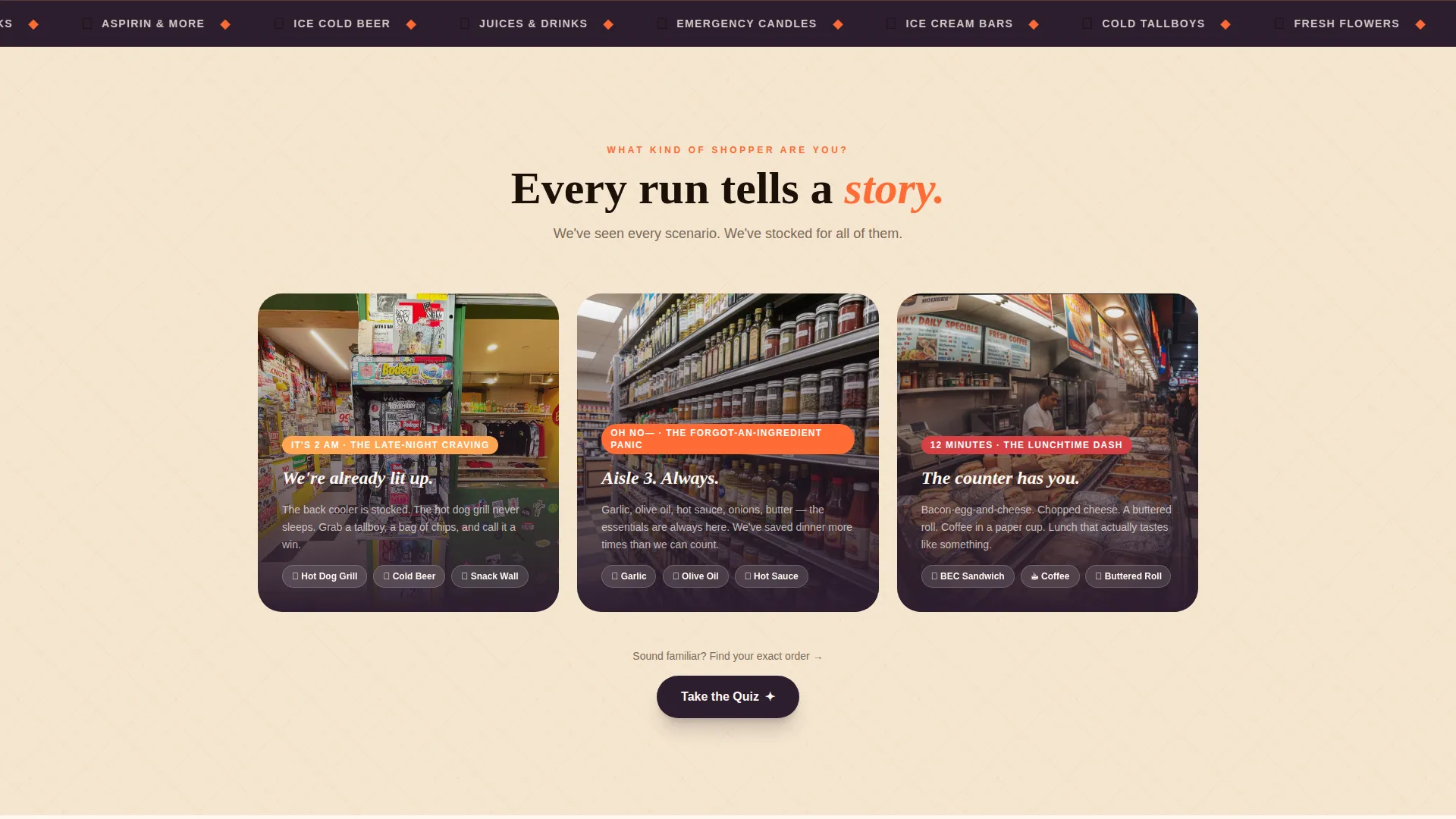
- A before-and-after reveal section that maps common shopper scenarios to real store solutions
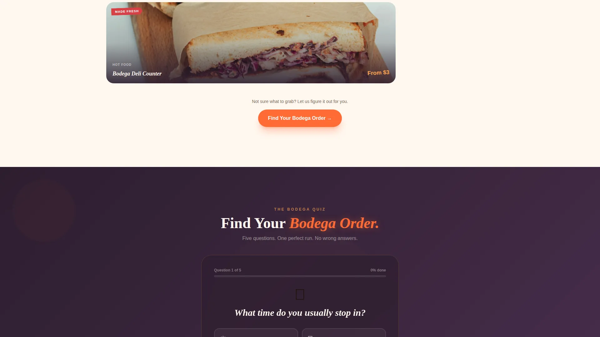
- A five-question illustrated quiz with a personalized product bundle result and email capture
Feature list
This template includes purposefully designed components that work together to build atmosphere, engage visitors, and earn a follow or a click.
Full-Bleed Entrance Header
The header is a wide-format photo taken from just inside the store entrance, looking down the main aisle. It captures shelf density, a glowing hot dog grill, lottery tickets, a sleeping cat, and mixed lighting from tungsten, fluorescent, and neon sources. No posed models, no styling. Just honest, atmospheric density.
Before-and-After Reveal Sections
Each reveal section opens with a common shopper scenario illustrated in a simple geometric style on the left. It then slides to show the store's actual solution on the right, using real product shots and shelf photography. The sequence escalates from casual browsing to emotional loyalty across multiple reveals.
Illustrated Quiz with Personalized Results
The primary call-to-action launches a five-question quiz with illustrated prompts covering visit time, flavor preference, drink choice, meal plan, and payment habit. Results deliver a curated "Your Bodega Run" product bundle with a shareable card. A secondary prompt captures an email address for the weekly deals flyer.
Playful Geometric Background System
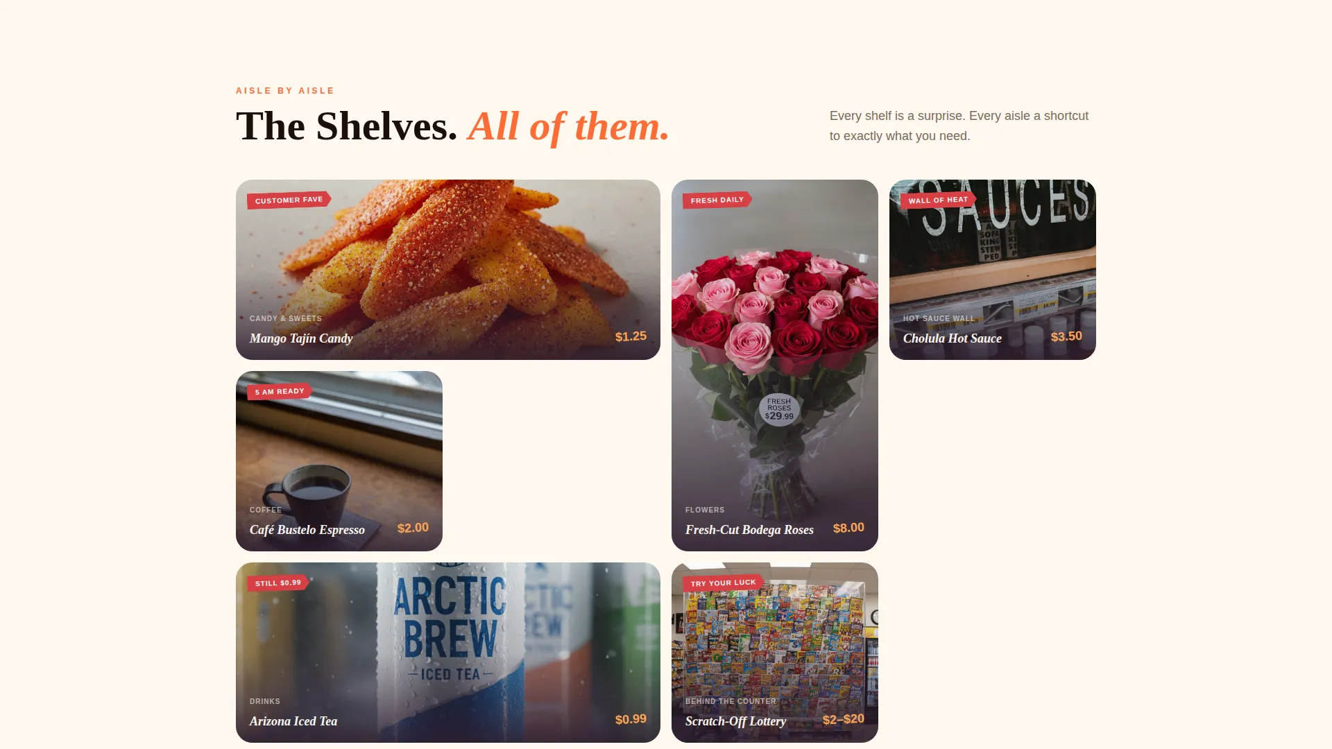
Triangles, circles, and half-moon shapes tile behind product cards throughout the page. They reference the mosaic floor patterns found in real corner stores and give the layout visual rhythm without relying on photography in every section.
Sunset Gradient Color System
Warm tangerine and ripe papaya wash across section backgrounds in soft diagonal gradients. Dusky rose punches through on buttons and price callouts. Deep bodega-night purple grounds the footer and main body typography. The palette feels cohesive and unmistakably bold.
Scenario-Led Narrative Flow
The page is structured around three real shopper scenarios: the late-night craving, the forgotten-ingredient panic, and the lunchtime dash. Each scenario builds the emotional case that this store belongs to the visitor, escalating toward the quiz as the natural payoff.
Page sections overview
| Section | Purpose |
|---|---|
| Full-Bleed Header | Drop visitors into the store atmosphere immediately |
| Before/After Reveal | Map shopper scenarios to real in-store solutions |
| Quiz Call-to-Action | Invite visitors to find their personalized bodega order |
| Quiz Result Bundle | Deliver a curated product card with a shareable result |
| Weekly Deals Capture | Collect email addresses via a secondary deal-flyer prompt |
| Footer with Navigation | Ground the page and provide store contact context |
Design & branding system
The visual identity follows a Playful Geometric theme that mixes bold warm color with structured shape work. Every design decision references the real textures and energy of a neighborhood convenience store.
- Color palette: warm tangerine (#FF6B35), ripe papaya (#FFA552), dusky rose (#D64045), and deep bodega-night purple (#2D1E2F)
- Geometric motifs including triangles, circles, and half-moons tile behind product cards as background texture
- Typography is grounded in deep purple for body text and footer, with dusky rose used for interactive elements and price callouts
Mobile & speed optimization
The layout is designed to translate naturally to smaller screens without losing the bold visual energy that defines the template. Section-led structure keeps the scroll experience clean and focused on one idea at a time.
- Full-bleed photo header scales responsively to maintain atmosphere on any screen width
- Quiz flow is structured to work as a simple tap-through experience on mobile devices
- Geometric background tiles are lightweight decorative elements that do not interfere with content legibility
How this template helps you convert
Every section of this landing page is built to move a visitor one step closer to a real action. The structure rewards curiosity and earns engagement before asking for anything.
- The before-and-after reveal builds emotional recognition by mirroring real shopper situations, making visitors feel understood before they reach the quiz.
- The five-question quiz reframes the email capture as a fun, personalized game rather than a sign-up form, lowering the friction of giving a contact detail.
Other information about this template
This template is part of the Retail and E-Commerce category with a focus on local brick-and-mortar businesses. It is designed for single-page deployment and works well as a standalone digital touchpoint for stores that do not need a full multi-page website.
- The template style follows a Masonry and Pinterest-inspired layout for product card arrangements
- The creative direction takes cues from an unboxing-style reveal experience applied to a neighborhood retail context
- The Neo-Retro theme connects the visual language of classic corner stores with contemporary geometric design sensibility
- This template suits stores that rely on foot traffic, word of mouth, and neighborhood regulars rather than large-scale digital advertising
Theme
Neo-Retro
Creative direction
Unboxing Experience
Color system
Citrus Burst
Style
Masonry/Pinterest
Direction
Marketplace/Multi
Page Sections
Full-bleed Entrance Photo Header
Before-and-after Reveal Narrative
Five-question Illustrated Quiz
Playful Geometric Shape System
Sunset Gradient Color Palette
Weekly Deals Email Capture
Related questions
Can I use this template without a physical store?
How does the quiz email capture work?
Can I replace the header photo with my own store image?
Is this template suitable for stores with a small product range?
Can the quiz questions be customized for my store?



